What Font Does Red Bull Use? The Red Bull Font Explained
Looking for the Red Bull font? The energetic “Red Bull” wordmark is custom bold italic lettering, designed specifically for the brand rather than typed from an off-the-shelf typeface. Its forward slant and heavy weight signal speed and energy — perfectly on-brand for a company built around extreme sport and motorsport. This guide covers the wordmark, the brand’s type language, and the free fonts that get you closest to the look.
Red Bull is a masterclass in using type to communicate motion and energy. For the wider context, see our overview of fonts used by famous brands.
What font is the Red Bull logo?
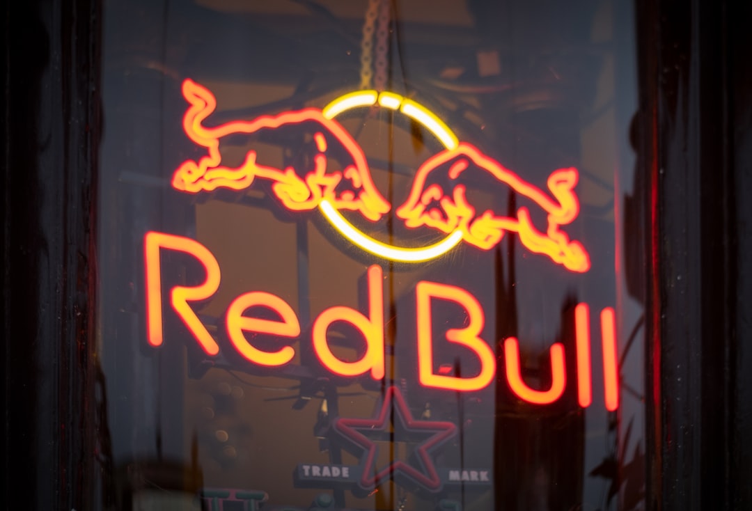
The Red Bull logo wordmark is custom bold italic lettering. The letters are heavy, forward-slanting, and tightly drawn, sitting beside the iconic two red bulls charging at a yellow sun. Because the lettering is bespoke and trademarked, it is not a font you can download, and the official mark cannot be legally reproduced. The italic slant is doing the heavy lifting here — it conveys speed and momentum, which is exactly the brand promise.
What typeface does Red Bull use in its branding?
Beyond the wordmark, Red Bull’s broader identity relies on custom and proprietary faces, typically bold, condensed, or italic sans-serifs that keep the energetic, sporty tone consistent across packaging, motorsport liveries, event branding, and digital. As with most major brands, the exact cuts are not publicly published and vary across applications, so it is most accurate to describe the family — bold, dynamic sans-serifs — rather than name one fixed retail font. The consistent thread is energy and forward motion.
Why does Red Bull use bold italic lettering?
Italics imply movement, and weight implies power — together they read as speed and intensity, the core of Red Bull’s “gives you wings” positioning. A heavy, slanted wordmark stands out on cans, race cars, and event signage alike, holding its impact at any size. This is the opposite end of the spectrum from the calm neutrality of corporate grotesques; compare it with our guide to the BMW font, which uses restraint to signal precision instead.
Free and paid alternatives to the Red Bull font
You cannot license Red Bull’s custom lettering, but you can recreate its energy with bold condensed and italic sans-serifs. For a free, high-impact match, Oswald Italic and Saira Condensed deliver the slanted, athletic feel. Paid options like a bold cut of a sporty grotesque get you closer still.
| Use case | Font | Free alternative |
|---|---|---|
| Red Bull-style wordmark | Eurostile Bold Oblique (paid) | Oswald Italic (free) |
| Energetic headline | Tungsten (paid) | Saira Condensed (free) |
| Bold packaging display | Knockout (paid) | Anton (free) |
| Clean supporting sans | Helvetica (paid) | Inter (free) |
If you license a paid display face like Tungsten or Knockout, confirm your license covers web and embedding, not just desktop. Our font licensing guide breaks down each tier so you buy exactly what your project needs.
How do I get the Red Bull look in my own design?
Use a bold condensed or italic sans like free Oswald Italic or Anton, set tight and slanted forward for momentum. Lean on a high-energy palette (Red Bull’s red, blue, yellow, and silver are instantly recognisable), keep the layout dynamic with diagonals, and pair the display type with a clean neutral sans for body copy. Build your own wordmark rather than copying Red Bull’s. For another energetic, type-led brand, see our piece on the Ferrari font.
How does Red Bull use type across its empire?
Red Bull is far more than a drinks can — it runs media, motorsport teams, music events, and extreme-sport productions, and the typography has to hold all of that together. The through-line is energy: bold, condensed, and italic sans-serifs that feel fast and confident whether they appear on an F1 livery, a video title card, or a festival stage. The custom wordmark anchors the brand, while supporting type keeps the same athletic, forward-leaning attitude across wildly different contexts. That consistency is what lets Red Bull behave like a media company while still reading as one coherent brand — the type does the unifying work that a single product never could.
Which free alternative fits your project?
It depends on the energy you want. Oswald Italic is the closest to the slanted wordmark feel — condensed, athletic, and free. Saira Condensed gives you a cleaner, more modern condensed sans with many weights, good for headlines and UI. Anton is the heaviest hitter: a single ultra-bold weight that dominates packaging and posters. For body copy and captions, drop back to a neutral free sans like Inter so the loud display type has room to breathe. Mixing one high-impact display face with one calm workhorse is exactly how energetic brands keep their layouts from becoming noise.
Frequently Asked Questions
What font does the Red Bull logo use?
The Red Bull logo uses custom bold italic lettering, not a downloadable font. The heavy, forward-slanting “Red Bull” wordmark beside the two charging bulls is bespoke, trademarked artwork created for the brand, so it cannot be legally reproduced with a retail typeface.
Is the Red Bull font free?
No. The Red Bull wordmark is proprietary custom lettering. For a free, legal alternative that captures the same bold, slanted energy, use Oswald Italic or Saira Condensed, or license a sporty display face such as Eurostile or Tungsten for a closer match.
What is the closest free alternative to the Red Bull font?
Oswald Italic is one of the closest free alternatives, offering the condensed, slanted, athletic feel of the Red Bull wordmark. Saira Condensed and Anton are strong free options for bold headlines and packaging-style display text.
What kind of typeface is the Red Bull font?
It is a custom bold italic sans-serif. The defining traits are heavy weight and a forward slant, which together communicate speed and energy. The brand’s wider identity continues that theme with bold, condensed, and italic sans-serifs.
Can I use the Red Bull font for commercial work?
You cannot use the actual Red Bull wordmark or logo commercially, as they are protected trademarks. You can use bold italic alternatives such as free Oswald Italic, or a licensed display face, for your own projects, provided you hold the correct license for your use.