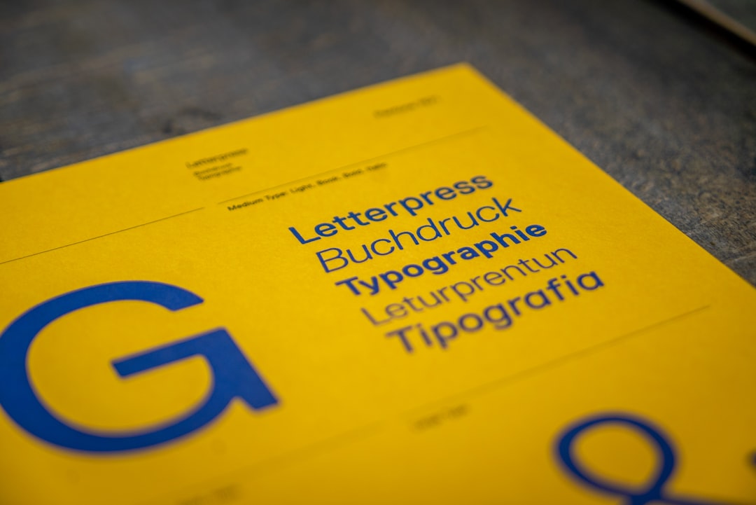
Best Fonts for Ebooks
Choosing the best fonts for ebooks differs from print because the text reflows: readers change the size, the screen, and often the font itself. Your job is to pick a face that renders cleanly on e-ink and LCD at any size, with a tall x-height and robust hinting, and to understand when embedding actually helps. This guide names the typefaces that ship on the major e-readers and the free faces that match them, with free-versus-paid notes throughout.
If you are pairing a chapter-heading face with body text, our font pairing guide covers it. For the wider craft see our notes on ebook design, and for print interiors our roundup of the best fonts for blogs shares many screen-readability principles.
What makes a good font for ebooks?
An ebook face is read on screens of wildly different resolution — 300ppi e-ink, retina tablets, cheap phones — so it must hold up everywhere. Prioritize a large x-height for legibility at small sizes, open counters that survive low-res rendering, strong hinting, and a true italic plus bold for emphasis. Because EPUB is reflowable, the reader app controls line length and often the font, so your embedded choice is a default, not a guarantee. Embed a font (with a license that permits it) only when the look matters and the format is fixed-layout or you want a consistent fallback. Serifs traditionally win for body text, though tall sans faces work well on screen too.
Best ebook fonts
Bookerly (Amazon, on-device)
Bookerly is Amazon’s default Kindle serif, commissioned specifically for digital reading — warm, with a large x-height and hinting tuned for e-ink. You cannot license it for embedding, but it is what most Kindle readers see, so design with it in mind. Free to use on Kindle devices and apps.
Literata (free)
Literata is the default for Google Play Books, a contemporary serif drawn for e-reading with a slightly quirky warmth and a full variable-font range. It is freely available on Google Fonts (OFL), so unlike Bookerly you can embed it. An excellent free default for EPUBs.
Georgia (free, system font)
Georgia was designed for screens and remains one of the most reliable ebook serifs — large x-height, sturdy serifs, and near-universal availability so it renders even without embedding. Free and pre-installed almost everywhere.
Bitter (free)
Bitter is a slab serif made specifically for comfortable on-screen reading, with a tall x-height and even stems that hold up on e-ink. A strong, embeddable free choice for EPUB body text. Free on Google Fonts (OFL).
Merriweather (free)
Merriweather was drawn to be pleasant on screen, with a large x-height and slightly condensed letters that read efficiently in reflowable text. A popular, embeddable free body serif for ebooks. Free (OFL).
PT Serif (free)
PT Serif is a transitional serif designed for comfortable body text with wide language coverage, rendering cleanly across e-readers. Pairs with PT Sans for headings. Free on Google Fonts (OFL), and embeddable.
Literata’s alternative: Lora (free)
Lora is a contemporary serif with brushed curves and moderate contrast that reads warmly on screen — a strong free pick for narrative ebooks and a good pairing partner for a sans heading. Free (OFL), embeddable.
Source Serif 4 (free)
Source Serif 4 is Adobe’s open-source serif with optical sizes and broad language support, a professional, embeddable free option for ebook body text. Free under the OFL.
Charter / Bitstream Charter (free)
Charter by Matthew Carter was engineered for low-resolution output and is exceptionally robust on screens. A free, embeddable transitional serif with sturdy serifs that survive e-ink rendering. Free for use.
Open Sans (free, for sans readers)
Open Sans is a humanist sans with open forms and a neutral voice — a strong free choice for readers who prefer sans body text, and especially helpful for accessibility on high-resolution screens. Free on Google Fonts (OFL), embeddable.
Vollkorn (free)
Vollkorn is a free old-style serif designed for body text, with a warm, sturdy build and generous x-height that reads comfortably on tablets and e-ink. A good embeddable alternative to Lora for narrative ebooks. Free on Google Fonts (OFL).
| Font | Style | Free/Paid | Why it works |
|---|---|---|---|
| Bookerly | Screen serif | Free on Kindle (not embeddable) | Kindle default, tuned for e-ink |
| Literata | Screen serif | Free | Play Books default, embeddable |
| Georgia | Screen serif | Free | Universal, robust without embedding |
| Bitter | Slab serif | Free | Built for on-screen reading |
| Merriweather | Screen serif | Free | Efficient, large x-height |
| PT Serif | Transitional serif | Free | Comfortable, multilingual, embeddable |
| Lora | Contemporary serif | Free | Warm narrative body text |
| Charter | Transitional serif | Free | Robust at low resolution |
Fonts to avoid for ebooks
Avoid high-contrast Didone faces like Bodoni and Didot for body text — their hairlines disappear on e-ink and shimmer on LCD. Skip decorative, script, and condensed display faces for running text; they break down at small reflowed sizes. Be cautious embedding fonts with hard widths or thin weights, since readers shrink and enlarge freely. Do not embed any font your license does not permit for distribution — most commercial fonts forbid EPUB embedding without a specific license, so check before shipping.
Tips and pairing for ebooks
Set a default body serif (Literata, Bitter, or Merriweather) but respect reflow — use relative units (em/%) and let the reader adjust size and leading. Pair a contrasting sans for chapter titles and headings (e.g., Merriweather body with a clean sans display), and keep the system to two faces. For reflowable EPUB, embedding is optional and adds file size, so embed only when the design depends on it and the license allows distribution; otherwise specify a serif stack with safe fallbacks. Test on real hardware before publishing: an e-ink Kindle, a tablet, and a phone render the same EPUB very differently, and a face that looks crisp on a retina screen can fill in on lower-resolution e-ink. Keep paragraph indents and spacing in relative units, avoid forcing tiny fixed sizes, and use the font’s true italics and bold rather than synthetic slanting. For fixed-layout children’s or photo books, embed your chosen display and body faces so the design holds. Confirm embedding rights in our font licensing guide, and find more screen-ready picks in our best Google Fonts roundup.
Frequently Asked Questions
What is the best font for an ebook?
For most ebooks, Literata, Bitter, or Merriweather are the best embeddable free choices — all screen-tuned serifs with large x-heights that read well on e-ink and tablets. On Kindle, readers see Bookerly by default. Georgia is the safest non-embedded fallback because it renders reliably almost everywhere.
What font does Kindle use?
Kindle’s default font is Bookerly, a serif Amazon commissioned specifically for digital reading, with a large x-height and e-ink-tuned hinting. Kindle devices also offer alternatives like Amazon Ember (sans), Caecilia, and Georgia. Bookerly is not licensable for embedding, so design your EPUB to read well in it.
Should I embed fonts in my ebook?
Only when the design depends on it and your license permits EPUB embedding. Reflowable ebooks let readers override fonts, so an embedded face is just a default and adds file size. Embed for fixed-layout books or a consistent fallback; otherwise specify a serif stack with safe system fallbacks like Georgia.
Serif or sans-serif for ebooks?
Serif is the traditional and most comfortable choice for ebook body text — faces like Literata, Bitter, and Merriweather were drawn for screens. Tall, well-hinted sans-serifs also read well on high-resolution displays and help readers with dyslexia. Offer or default to a serif, and pair a sans for headings.
Can I use Google Fonts in an ebook?
Yes. Google Fonts are licensed under the Open Font License, which permits embedding in EPUB files for commercial ebooks. Literata, Bitter, Merriweather, PT Serif, Lora, and Source Serif 4 are all good embeddable choices. Always keep the license file with your project and confirm the specific terms before distribution.


