What Font Does Prada Use?
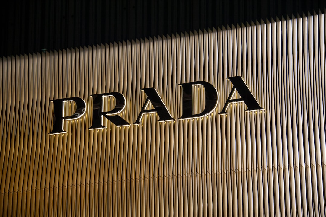
The Prada font is a textbook example of luxury Didone typography: a refined, high-contrast serif that signals heritage and prestige. While many people search for an exact name, the honest answer is that the wordmark is custom lettering most closely associated with Bodoni — not a downloadable “Prada font.” Below we break down the logo, the Bodoni connection, and the free alternatives that get you close. For more luxury breakdowns, see our hub on famous brand fonts.
What font is the Prada logo?
The “PRADA” wordmark is a custom high-contrast serif, set in capitals with the dramatic stroke contrast and flat, fine serifs that define the Didone style. It is widely linked to Bodoni, the classic Italian Didone — an appropriate lineage for a Milanese fashion house. The letterforms are precise and vertical, with hairline-thin connecting strokes against bold verticals, producing the crisp, elegant tension you see on Prada packaging, store signage, and campaigns. As with other luxury marks, the logo is refined bespoke artwork and a registered trademark, so it is best described as “Bodoni-style” rather than a single licensable font.
Is the Prada font really Bodoni?
Prada’s wordmark is most often associated with Bodoni, and the resemblance is strong — the vertical stress, extreme thick-thin contrast, and unbracketed serifs all point to the Didone tradition that Bodoni helped define. That said, brands routinely customize spacing, proportions, and serif shapes, so the logo should be understood as a Bodoni-inspired custom mark rather than plain Bodoni straight off the shelf. If you want the closest legitimate match, licensing a quality Bodoni cut is the way to go; we flag it as paid, not free.
Why does Prada use a Didone serif?
Didone serifs like Bodoni read as elegant, editorial, and prestigious because they descend from the refined printing of late-18th-century Europe and have anchored high fashion magazines and luxury branding ever since. The high contrast signals precision and craft; the vertical, geometric structure feels modern yet classic. This is why so many luxury houses converge on the Didone family. Our deep dive on the Bodoni font covers the typeface behind the Prada look, and the broader Didot font guide explains the wider Didone category that defines luxury typography.
Free fonts that look like the Prada font
You cannot use Prada’s custom wordmark, and authentic Bodoni cuts are typically paid. But free Didone serifs get you close to the high-contrast, elegant feel. Match the role: tall, high-contrast capitals for a wordmark look, a readable Didone for body.
| Use case | Prada uses | Free / paid alternative |
|---|---|---|
| Logo / wordmark look | Custom Bodoni-style serif | Playfair Display (free) |
| Closest exact match | Bodoni-style high-contrast serif | Bodoni (paid license) |
| Elegant headlines | High-contrast Didone | Cormorant (free) |
| Refined body serif | Brand serif system | EB Garamond (free) |
Playfair Display is the best free match — a high-contrast Didone with the vertical stress and elegant capitals that echo the Prada wordmark. Cormorant adds more delicate, fashion-forward hairlines for headlines, and EB Garamond handles refined body text; all are free on Google Fonts for commercial use. For the closest possible likeness, a licensed Bodoni cut is the right call — flag it as paid and not free.
How to recreate the Prada look
The Prada wordmark is a masterclass in disciplined Didone typography, and the key moves are easy to copy with free fonts. Set your name in capitals using a high-contrast serif such as Playfair Display, keep the weight regular rather than bold so the thin strokes stay hairline-fine, and add measured letter-spacing for that crisp, vertical, gallery-like presence. The Prada logo’s power comes from precision and air, not heaviness — every stroke looks deliberate and engineered.
For the rest of your system, do less. Prada pairs its serif wordmark with minimal sans-serif supporting type and a restrained palette, letting the logo carry the elegance. If you want the closest possible likeness to the real wordmark, a licensed Bodoni cut from a reputable foundry is the most accurate route — but flag it as a paid license, not a free download, and remember that imitating Prada’s exact identity still carries trademark risk. Used for your own original wordmark, though, a quality Bodoni or a free Didone like Playfair Display gives you the same elevated, editorial Italian-luxury character.
Can I use the Prada font for my own project?
No — not the logo. Prada’s wordmark is bespoke, trademarked artwork, and the brand name is protected; reusing the lettering risks both licensing and trademark issues. You can legitimately license Bodoni for your own work, but using it to imitate Prada’s identity still raises trademark concerns — our font licensing guide explains the difference between licensing a typeface and infringing a trademark. For your own brand, choose a free Didone above or pay for Bodoni. For more luxury type, see our siblings on what font Dior uses and what font Versace uses.
Frequently Asked Questions
What font does Prada use in its logo?
Prada uses a custom high-contrast serif most often associated with Bodoni and the Didone family — set in capitals with sharp thick-thin contrast and fine, flat serifs. The exact wordmark is bespoke, trademarked artwork rather than a single downloadable font.
Is the Prada logo Bodoni?
It is strongly associated with Bodoni and shares its vertical stress, extreme contrast, and unbracketed serifs. However, the logo is a customized, Bodoni-inspired mark rather than plain Bodoni from the shelf. Licensing a quality Bodoni cut is the closest legitimate match you can buy.
What free font looks like Prada?
Playfair Display is the closest free match — a high-contrast Didone with elegant capitals. Cormorant offers more delicate hairlines for headlines, and EB Garamond suits body text. All are free on Google Fonts for commercial use; for an exact match, license Bodoni (paid).
Can I download the Prada font?
No. The Prada wordmark is proprietary, trademarked lettering and is not available to download. Bodoni, which it resembles, can be licensed for a fee but is not free. Any “Prada font” on a free-font site is an unofficial imitation.
Why do luxury brands use Bodoni-style serifs?
Bodoni and other Didone serifs read as elegant and prestigious because they descend from refined late-18th-century European printing and have defined fashion magazines for generations. Their high contrast signals craft and precision, which is why Prada and many luxury houses favor them.