Khaki vs Olive: What’s the Difference?
The khaki vs olive mix-up happens because both are muted, earthy, military-associated colors that sit in the same yellow-green-brown corner of the spectrum. The difference is one of degree: khaki is a pale tan that only hints at green, while olive is a darker, fully committed yellow-green. Once you compare them side by side, khaki looks like a sandy neutral and olive looks like a green.
What is khaki?
Khaki is a pale, dust-colored tan with a faint green-yellow undertone. A representative value is #C3B091, though the name covers a wide range. The word comes from the Urdu and Persian for “dust” or “soil,” and the color still carries that sandy, sun-bleached military lineage. In practice khaki behaves like a warm neutral: it is light enough to pair with almost anything and muted enough to never dominate a palette. Its subtle green cast is what separates it from a clean tan.
If you want to see where khaki sits relative to a pure warm brown, our khaki vs tan comparison traces exactly where the green undertone enters. For the broader earthy green family, the shades of olive guide shows how these tones deepen.
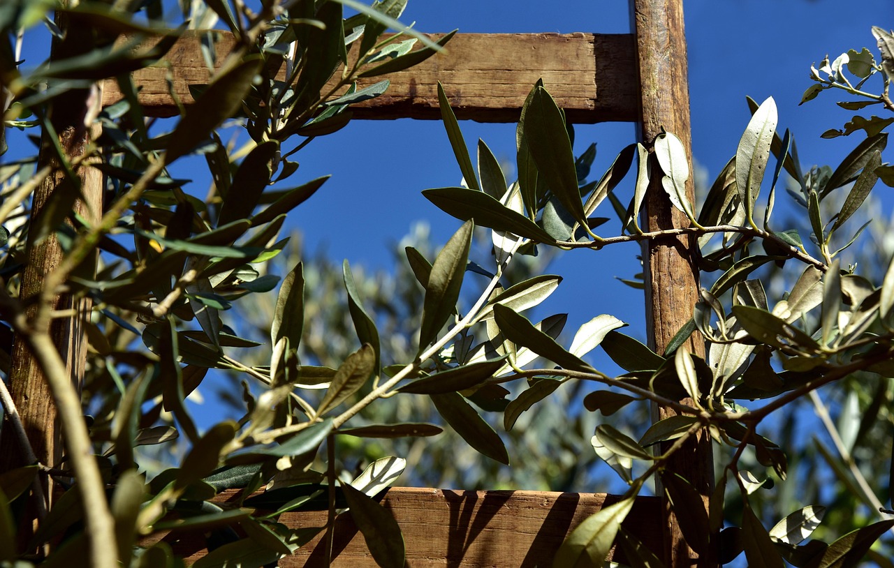
What is olive?
Olive is a dark, muted yellow-green named after the unripe fruit. The classic value is #808000, which is literally equal parts red and green with no blue — a true desaturated yellow-green. Unlike khaki, olive is dark enough and green enough to function as a green in its own right. It reads as natural, grounded, and slightly somber, which is why it anchors so many heritage, outdoor, and military-inspired palettes.
Olive is darker and far more saturated in its green than khaki. Where khaki could pass for a neutral on a wall or a pair of trousers, olive always announces itself as green.
What’s the difference between khaki and olive?
The defining differences are lightness and how much green dominates. Khaki is light, sandy, and only hints at green; olive is darker, deeper, and is fundamentally a yellow-green. Khaki leans toward brown-tan; olive leans toward green. Here is a side-by-side with representative values — exact hexes vary because neither name is standardized.
| Property | Khaki | Olive |
|---|---|---|
| Hex code | #C3B091 | #808000 |
| RGB | 195, 176, 145 | 128, 128, 0 |
| CMYK | 0, 10, 26, 24 | 0, 0, 100, 50 |
| Undertone | Warm tan with faint green-yellow | Yellow-green (true) |
| Hue family | Light earth neutral | Dark yellow-green |
| Best used for | Neutral backgrounds, chinos, soft earthy palettes | Military/outdoor branding, accents, grounding greens |
| Mood/feel | Calm, sandy, understated, classic | Earthy, rugged, natural, serious |
When should you use each?
Use khaki when you want a warm, low-contrast neutral that grounds a palette without drawing attention. It works as a background, a soft mid-tone, or a wardrobe staple, and it flatters warm and cool accents alike. Khaki pairs effortlessly with white, navy, brown, and olive itself.
Use olive when you want an actual green with earthy, rugged character. Its depth makes it a strong choice for branding, accent walls, and outdoor or heritage identities where you want nature and durability rather than brightness. Olive pairs well with cream, rust, mustard, brown, and black.
To tell them apart in practice, compare lightness first: khaki is clearly paler. Then look at the green — olive’s is obvious and dominant, while khaki’s is a faint cast you have to look for. If you are unsure whether your earth tones read warm or cool, our guide to warm vs cool colors explains how undertone shifts the whole mood.
How are khaki and olive used across design?
In fashion, khaki is the quintessential neutral trouser and trench color — polished, versatile, and easy to style. Olive is the color of field jackets, cargo pants, and military surplus, where its darker green signals utility and ruggedness. Both are wardrobe staples, but khaki dresses up while olive leans utilitarian.
In branding, khaki supports calm, natural, and heritage identities thanks to its soft neutrality — it sits well behind logos and text. Olive supports outdoor, adventure, sustainability, and military-modern brands, where its grounded green communicates durability and connection to nature. The depth difference maps directly onto these personalities.
In interiors and web design, khaki makes a warm, forgiving background or wall color, pairing with cream and wood for a relaxed scheme. Olive works as a richer feature color — an accent wall, a sofa, or a header band — that adds depth without the intensity of a bright green. Because both are muted, they let accent colors lead.
A useful mental model is to treat khaki as a neutral and olive as a color. In a palette, khaki can do the job a beige or taupe would — quietly filling space and unifying brighter elements — while olive needs to be placed more deliberately, the way you would position any saturated green. This is why a room or layout can carry large expanses of khaki without feeling committed to a color scheme, whereas a large field of olive immediately establishes an earthy, green-led identity. Knowing which role you need usually settles the choice between them.
Do khaki and olive go together?
Yes — they are natural partners in an earth-tone palette. Khaki’s light warmth and olive’s darker green create a built-in light-to-dark contrast that keeps a tonal scheme from looking flat. This pairing is a staple of heritage menswear, outdoor gear, and natural-product packaging. Add brown, cream, or rust to round it out. For another earthy green matchup in this batch, see how the military greens compare in our olive vs army green comparison, and explore color psychology for why these earth tones feel grounding.
Frequently Asked Questions
Is khaki the same as olive?
No. Khaki is a pale tan with a faint green-yellow cast, while olive is a darker, fully saturated yellow-green. They share the same earthy corner of the spectrum, which causes confusion, but khaki reads as a light neutral and olive reads as a genuine green.
Is khaki lighter than olive?
Yes, considerably. Khaki sits high on the lightness scale (around #C3B091), behaving like a sandy neutral, while olive is a dark yellow-green (around #808000) that sits much lower. The clearest way to separate them is to compare brightness side by side.
What is the hex code for olive?
The classic CSS web color “olive” is #808000, an equal mix of red and green with no blue, producing a dark, muted yellow-green. Fashion and paint olives vary widely around this value, often lighter or grayer, since the name is not a fixed standard.
What colors go with olive?
Olive pairs well with cream, tan, rust, mustard, brown, navy, and black. Its earthy yellow-green works as a grounding base for outdoorsy, heritage, and autumnal palettes, and it makes warm accent colors like terracotta and gold feel rich rather than loud.
Is khaki a warm or cool color?
Khaki is a warm color. Its tan base gives it golden warmth, and even its faint green cast leans yellow rather than blue. That warmth is why khaki pairs so naturally with other warm neutrals like cream, brown, and olive in earthy palettes.


