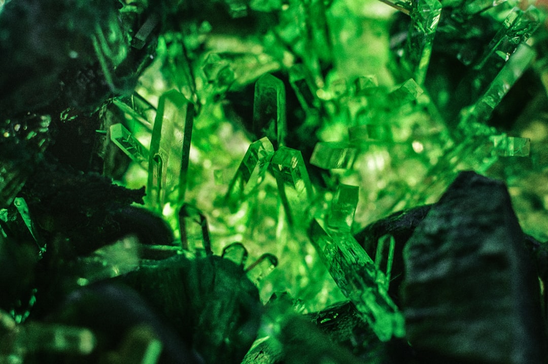
Colors That Go With Emerald Green
Emerald is a deep, saturated blue-green — a true jewel tone — which is why it pairs so well with metallics and rich anchors. The best colors that go with emerald include warm gold, deep navy, soft blush, and clean neutrals like gray, cream, and ivory. Below are exact hex codes, ready palettes, and notes on using emerald in branding and interiors.
What colors go with emerald green?
Emerald (around #046307) is intense and slightly cool, so it loves warm metallics for contrast and deep, calm neutrals for grounding. As a jewel tone, it behaves like a saturated statement color. The strongest partners are:
- Gold (#D4AF37) — a warm metallic that makes emerald read rich, regal, and luxurious.
- Navy (#1B2A4A) — a deep blue that harmonizes with emerald’s cool side for a moody, refined scheme.
- Blush pink (#F4C9C2) — a soft warm tint that adds romance and modern contrast.
- Gray (#9AA0A6) — a neutral that calms emerald and keeps a scheme from feeling heavy.
- Cream (#F5EFE6) — a warm off-white that softens emerald for an elegant, organic look.
- Ivory (#FFFFF0) — a creamy neutral that brightens emerald without the starkness of pure white.
- Deep purple (#4B0082) — a second jewel tone for a bold, opulent pairing.
Best color combinations for emerald
Emerald is a confident, saturated green, so it wants partners that either match its intensity (gold, navy, purple) or step back as quiet neutrals (cream, ivory, gray). Gold sits in the warm half of the color wheel opposite emerald’s cool green, giving the kind of warm-cool tension that reads as a near-complementary color contrast. Blush is a tinted, low-saturation warm that softens emerald, while navy is an analogous cool that deepens it. To understand emerald’s exact undertone, it helps to compare emerald vs teal. For a deeper, earthier green in the same family, see the partners in our colors that go with forest green guide.
Emerald + gold + cream (luxe classic)
The signature jewel-box look. Emerald as the hero, gold as the metallic accent, and cream to keep it breathable — ideal for weddings, beauty, and premium branding.
Emerald + navy + ivory (refined moody)
A deep, sophisticated pairing. Navy and emerald share a cool base, so they layer into a rich, library-like palette that ivory lifts.
Emerald + blush + gray (modern romantic)
Softer and more current. Blush warms emerald while gray neutralizes it, making this combination great for contemporary interiors and editorial brands.
Emerald color palettes (with hex codes)
| Pairing color | Hex | Why it works / mood |
|---|---|---|
| Gold | #D4AF37 | Warm metallic; regal and luxurious |
| Navy | #1B2A4A | Cool deep anchor; moody and refined |
| Blush pink | #F4C9C2 | Soft warm tint; romantic and modern |
| Gray | #9AA0A6 | Quiet neutral; calms and balances |
| Cream | #F5EFE6 | Warm off-white; elegant and organic |
| Ivory | #FFFFF0 | Creamy bright neutral; soft contrast |
| Deep purple | #4B0082 | Second jewel tone; bold and opulent |
Three ready palettes to copy:
- Luxe classic: Emerald #046307 · Gold #D4AF37 · Cream #F5EFE6 · Ivory #FFFFF0
- Refined moody: Emerald #046307 · Navy #1B2A4A · Ivory #FFFFF0 · Gold #D4AF37
- Modern romantic: Emerald #046307 · Blush #F4C9C2 · Gray #9AA0A6 · Cream #F5EFE6
How to build a balanced emerald palette
Because emerald is highly saturated, it works best as an accent or a single dominant surface rather than spread evenly across a scheme. A reliable structure is roughly 60% neutrals (cream, ivory, gray), 30% emerald, and 10% a metallic or jewel accent (gold or deep purple). That keeps emerald feeling rich rather than overwhelming.
Watch emerald’s undertone before committing. A true emerald (near #046307) leans slightly blue-green and cool; warmer “emeralds” tip toward kelly or forest green and pair better with brass and warm wood than with cool gray. If you want a teal-leaning version, lean into navy and silver; for a classic gem look, stay with gold and cream.
For digital and brand work, confirm contrast. Emerald is dark enough to carry white or ivory text cleanly, but gold-on-emerald can fail accessibility ratios at small sizes, so reserve gold for large display type, rules, and decorative elements rather than body copy.
Think about proportion across the whole system, not just the hero pairing. Emerald rewards a “one rich anchor, one metallic, two neutrals” approach: let emerald and cream do most of the work, bring in gold only at moments that deserve emphasis, and hold navy or deep purple in reserve for a secondary surface like a footer or packaging interior. Spreading three saturated jewel tones evenly across a layout almost always reads as busy, whereas a single dominant emerald with disciplined accents looks intentional and expensive. The same logic scales from a logo lockup to a full room.
Colors to avoid with emerald
Emerald is striking but a few pairings undercut it:
- Bright lime or chartreuse — too close in hue and far brighter, making emerald look muddy by comparison.
- Muddy olive or khaki — drains emerald’s jewel quality and reads dull next to it. Keep greens either clearly muted (sage) or clearly rich.
- Hot orange — technically complementary but so loud it turns emerald garish; soften to terracotta or gold instead.
Using emerald in branding vs interiors
In branding, emerald signals luxury, growth, prosperity, and confidence, which is why it appears across finance, beauty, and premium hospitality brands. Pair it with gold for a high-end feel and cream or ivory for legibility, using a single accent rather than competing jewel tones. Building a system? Our guide on how to choose brand colors explains anchoring on a saturated hue like emerald.
In interiors, emerald is a popular feature color for velvet upholstery, cabinetry, and accent walls because it reads opulent yet calming. Layer it with brass or gold fixtures, cream walls, and warm wood; add blush textiles for softness. For a flexible base to build around emerald, see our neutral color palette guide.
Frequently Asked Questions
What is the best color to pair with emerald green?
Gold (#D4AF37) is the best all-around partner for emerald because its warmth contrasts emerald’s cool green and makes the palette read rich and luxurious. For a softer look, blush pink (#F4C9C2) adds modern warmth, while navy (#1B2A4A) deepens emerald for a refined, moody scheme.
Does emerald green go with gray?
Yes. Soft and mid grays (around #9AA0A6) calm emerald’s intensity and keep a scheme from feeling heavy, which is why gray is a popular neutral base for emerald interiors and branding. Cool blue-grays especially flatter emerald’s blue-green undertone.
What metal goes best with emerald?
Gold and brass are the classic metals for emerald because their warmth balances its cool green and reinforces the jewel-tone effect. Silver and chrome also work for a cooler, more modern feel, pairing emerald with navy and gray rather than cream.
Is emerald green a warm or cool color?
Emerald is a cool color because it’s a blue-leaning green. That coolness is why it harmonizes so easily with navy and gray, and why warm accents like gold and blush create such effective contrast against it in both branding and interiors.