What Font Does Nissan Use?
The Nissan font question splits into the logo lettering and the typeface that carries the rest of the brand. Nissan’s 2020 rebrand introduced a custom-drawn wordmark alongside its simplified, flat circular emblem, and its wider identity runs on a bespoke face called Nissan Brand. Below we separate the logo from the brand typeface, flag what is proprietary, and recommend free alternatives. For how other marques handle type, see our hub on famous brand fonts.
What font is the Nissan logo?
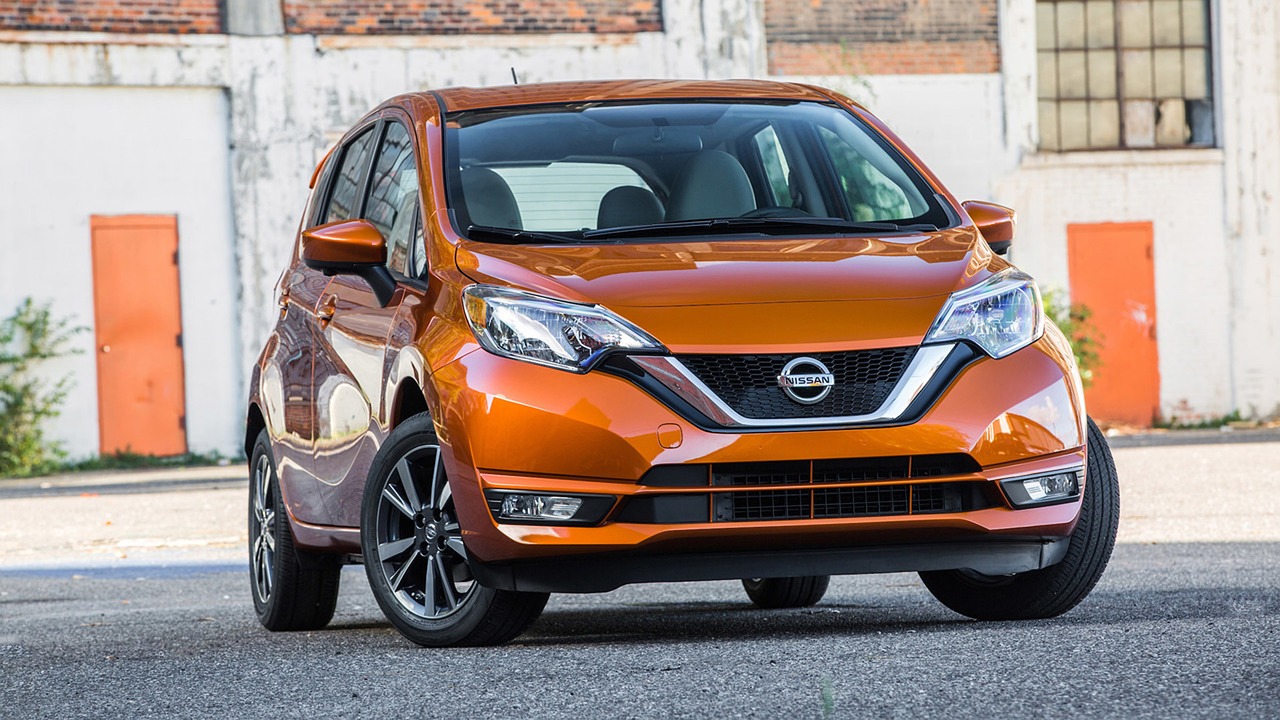
The “NISSAN” wordmark from the 2020 rebrand is custom lettering rather than a font you can buy off the shelf. The letterforms are a clean, modern capitalised sans with even strokes, open spacing, and slightly humanist details that read as approachable but contemporary — a deliberate update from the older, heavier mark. The wordmark was redrawn to sit cleanly beside the new flat, screen-friendly emblem. Because the lettering is bespoke and trademarked, it isn’t distributed as a downloadable typeface. Any file labelled “Nissan font” on a free-font site is an unofficial recreation, not the brand’s actual artwork.
What typeface does the Nissan brand use?
Beyond the logo, Nissan’s communications run on Nissan Brand, a custom corporate typeface built for the marque. It sits in a clean, modern grotesque tradition — neutral enough for specs and interfaces, but tuned to feel friendly and distinctly Nissan. As a bespoke face it is licensed to the company, not sold publicly. Where a given weight or specimen isn’t documented openly, treat “Nissan Brand, a custom grotesque” as the accurate description and verify against official brand assets if you need certainty. The tone to aim for is clean, even, and approachable.
Is the Nissan font available to download?
No. The custom wordmark and Nissan Brand typeface are proprietary to Nissan and licensed exclusively to the brand — neither is free or publicly available. The emblem and wordmark are trademarked assets and should never be reused to imitate the marque. Our font licensing guide explains the difference between a free webfont, a commercial license, and a bespoke commission like Nissan Brand.
Free fonts that look like the Nissan font
You can get close to Nissan’s clean, modern character with free grotesque sans-serifs. Match the role: an even, contemporary sans for the wordmark feel and a readable grotesque for body, specs, and UI.
| Use case | Nissan uses | Free / paid alternative |
|---|---|---|
| Logo / wordmark | Custom lettering | Inter (free, tracked wide) |
| Headlines | Nissan Brand | Arimo (free) |
| Body / specs | Custom grotesque | Source Sans 3 (free) |
| UI / configurator | Clean brand sans | Inter (free) |
Inter, tracked wide in capitals, is the strongest free match for the Nissan wordmark’s even, modern feel and renders crisply on screen. Arimo is a metric-compatible grotesque that gives a dependable tone for headlines, and Source Sans 3 adds a slightly warmer humanist option for body and spec text. All are free for commercial use, so you can build a Nissan-style system at no cost. For the broader neutral-sans tradition, see our Helvetica font guide.
Where do you see the Nissan font?
Nissan’s custom wordmark and Nissan Brand typeface appear on the car’s emblem and badging, the configurator and website, owner’s manuals and press materials, dealership signage, and the in-car interface. The redrawn wordmark and flat emblem were designed to work on screens as well as on metal, which is why the 2020 rebrand leaned cleaner and lighter. On functional surfaces, Nissan Brand keeps specs and menus legible. When you recreate the look, prioritise even spacing and a modern, restrained palette, just as Nissan’s system does.
Why does Nissan use a custom font?
Commissioning Nissan Brand and custom lettering gives the marque an ownable, trademark-protectable identity and lets designers tune the letterforms to its exact personality — modern, friendly, and clean. A bespoke face keeps every touchpoint consistent across cars, print, and screens. It’s the same logic behind other mainstream marques; compare our siblings on what font Ford uses and what font Volkswagen uses.
How to recreate the Nissan look
To echo Nissan’s identity for free, set a wordmark in Inter capitals with wide tracking, run headlines in Arimo, and keep body and spec text in Source Sans 3. Keep spacing generous and the palette modern — flat tones, plenty of white, and a single accent suit the post-2020 look. Avoid copying the emblem or wordmark; use these free faces to build your own original identity, not an imitation of Nissan.
Frequently Asked Questions
What font does Nissan use?
Nissan uses a custom wordmark introduced in its 2020 rebrand and the bespoke Nissan Brand typeface across its broader communications. Both are proprietary and not available to the public. Free alternatives like Inter and Arimo capture a similar clean, modern look for your own projects.
Is the Nissan font available to download?
No. The Nissan wordmark is custom, trademarked lettering and the Nissan Brand typeface is licensed only to the company. Any free “Nissan font” download is an unofficial copy. For a similar look you can legally use, choose Inter, Arimo, or Source Sans 3 from Google Fonts, all free and licensed for commercial projects.
What font is the new Nissan logo?
The 2020 Nissan rebrand uses a custom-drawn wordmark — a clean, modern capitalised sans designed to sit beside the new flat emblem and read well on screens. It is bespoke and not a retail font. Free grotesques like Inter, tracked wide in capitals, approximate its even, contemporary character.
Does Nissan use Helvetica?
Nissan’s identity sits in the clean, neutral grotesque tradition that Helvetica defined, but its brand runs on the custom Nissan Brand typeface rather than Helvetica itself. Where exact specimens aren’t publicly documented, treat this as context and verify against official assets. Free Helvetica-like alternatives include Inter and Arimo.
Can I use the Nissan font for my project?
Not the official artwork. Nissan’s wordmark, emblem, and Nissan Brand typeface are trademarked and proprietary. For your own branding, use a free grotesque like Inter or Arimo, which deliver a similar clean, modern feel and are licensed for commercial use. Build an original identity rather than imitating Nissan.