What Font Does Volkswagen Use?
The Volkswagen font question has a tidy answer: the brand runs on a custom family — VW Head for headlines and VW Text for body — created with the agency MetaDesign, while the circular VW monogram is a separate custom mark. This guide explains what VW uses, why it’s proprietary, and which free fonts reproduce the approachable, modern feel.
Volkswagen’s typography is built to feel human and accessible rather than cold — fitting for a “people’s car” brand. For how this compares with other major logos, see our pillar on famous brand fonts and what the big logos use.
What font is the Volkswagen logo?
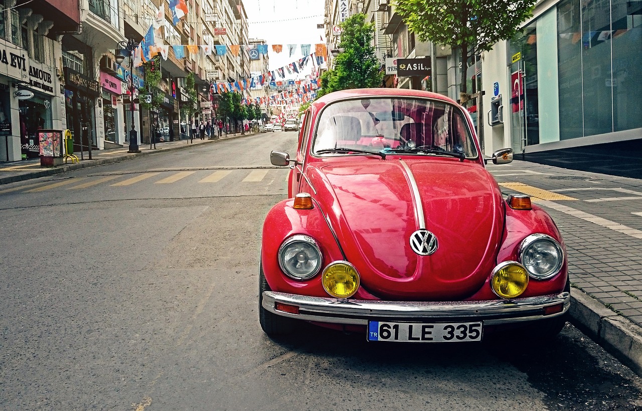
The Volkswagen logo is the circular “VW” monogram — a custom mark, not type. The interlocking V over W inside the ring is a bespoke device, refined over the brand’s history and flattened into a cleaner, simpler form in the 2019 rebrand. There is no “Volkswagen wordmark font” in the logo itself; the brand name when spelled out is set in the custom VW typeface family. So the logo is a monogram, and the typography around it is proprietary type.
A font-identifier tool will point you toward friendly humanist sans faces, but it won’t return the monogram, because that mark isn’t a font at all.
What are VW Text and VW Head?
VW Head and VW Text are Volkswagen’s proprietary corporate typefaces, a humanist sans-serif family developed with MetaDesign. VW Head is tuned for headlines and display use; VW Text is optimized for smaller sizes and body copy. The family is warmer and more open than a strict neo-grotesque, giving the brand an approachable, modern voice that matches its mass-market positioning. As commissioned faces, they’re not sold publicly or available for free download. As of 2026, this VW family remains the core of the brand’s typography across web, print, and signage.
Before licensing any commercial typeface for your own work, check our font licensing guide.
Can you download the Volkswagen font?
No. VW Text and VW Head are proprietary and the roundel is a custom mark, so there’s nothing official to download for free. Fan-made “Volkswagen” fonts exist online, but reproducing the VW monogram or brand type is a trademark issue regardless of which font you use. For commercial work, use a licensable or free humanist sans rather than a logo clone.
What’s a free Volkswagen font alternative?
The VW look is defined by friendly, open, humanist sans letters that stay clean at any size. The best free options are:
- Inter (free) — a highly legible humanist-leaning sans on Google Fonts with a large x-height; an excellent free stand-in for VW Text in UI and body copy, and free for commercial use.
- Source Sans (free) — Adobe’s open-source humanist sans; warm, open, and clean, close to the approachable VW tone for headlines and body.
- Open Sans (free) — a friendly, neutral humanist sans that mirrors VW’s accessible, mass-market feel.
Pair any of these with our font pairing guide, and for a sibling comparison see what font Audi uses or what font Porsche uses.
Volkswagen fonts vs. the free alternatives
| Use case | Volkswagen font | Style | Free alternative |
|---|---|---|---|
| Logo | VW roundel (custom) | Bespoke monogram, not a font | Not applicable |
| Headlines | VW Head | Humanist display sans | Source Sans |
| Body / web type | VW Text | Humanist text sans | Inter |
| General UI | VW Text | Open, friendly sans | Open Sans |
What makes the Volkswagen type system distinctive?
The character of VW’s typography is warmth without softness. The humanist sans has open counters and a generous x-height, so it stays friendly and readable from a billboard down to a dashboard label. Splitting the family into VW Head and VW Text means headlines feel confident while small text stays clear — a practical system for a brand that communicates at every scale. There’s no decoration; the approachability comes from the letterforms themselves. For most projects this is easy to echo, because open, humanist, even-weight qualities are all reproducible with a free font.
How to get the Volkswagen look on a budget
To capture VW’s approachable, modern type feel without proprietary fonts, follow this approach:
- Start with Inter for text and Source Sans for headlines. Together they mirror the VW Text / VW Head split.
- Favor open spacing and a large x-height. These are what make the type feel friendly and legible.
- Keep weights simple. A regular and a bold cover almost everything VW does.
- Use a clean, confident layout. The accessible tone comes from clarity — see our font pairing guide.
This delivers a friendly, modern, mass-market look that’s entirely original and safe to use commercially.
Frequently Asked Questions
What font does the Volkswagen logo use?
The Volkswagen logo is the circular VW monogram, a custom bespoke mark rather than a font. When the brand name is spelled out, it’s set in Volkswagen’s proprietary type. For a free match to that approachable look, use a humanist sans like Inter or Source Sans.
What is the Volkswagen brand font called?
Volkswagen’s corporate typefaces are VW Head (for headlines) and VW Text (for body copy), a humanist sans family developed with the agency MetaDesign. They’re proprietary commissioned faces, so they aren’t sold publicly or available for free download. Inter and Source Sans are the closest free alternatives.
Is the Volkswagen font free to download?
No. VW Text and VW Head are proprietary, and the roundel is a custom mark, so there’s no official free download — online “Volkswagen” fonts are unofficial lookalikes. Reproducing the monogram or brand type is a trademark issue. For a similar feel, use free fonts like Inter, Source Sans, or Open Sans.
What font is closest to Volkswagen’s typeface?
Inter is the closest free match to VW Text because it shares the open, humanist, large-x-height qualities that keep VW’s type friendly and legible. Source Sans works well as a free stand-in for VW Head in headlines. Both are free for commercial use, unlike logo-clone fonts.
Can I use the Volkswagen font for my business?
No. VW Text, VW Head, and the roundel are proprietary or trademarked, so imitating them risks infringement. For a similar approachable, modern look on your own original branding, use a free humanist sans like Inter and design a distinct mark. Review our font licensing guide before choosing a commercial typeface.