Best Fonts for Gyms and Fitness: Bold, Strong Type With Energy
Picking the best fonts for gyms is about projecting strength and momentum at a glance — a name that hits hard on a wall, a hoodie, and a phone screen. Great fitness typography signals whether you are a heavy-iron strength gym, a high-energy boutique studio, or a sleek performance brand before anyone reads a single word. Below are ten real, well-tested typefaces, each with where to get it and why it works, plus the pairings and pitfalls that keep your branding consistent from the front sign to the app.
For the wider identity picture, see our guides to gym branding and fitness logo design. Once you have chosen a display face, our font pairing guide will help you match it to a clean body font for class schedules and the web.
What makes a good font for a gym?
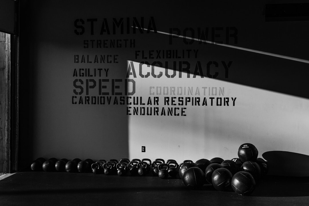
Gym branding rewards power and clarity over delicacy. The best choices share a few traits: heavy weights or tall condensed caps that command a wall and read across a busy floor, an athletic or technical edge that signals performance, and legibility on apparel, signage, and small app text. A condensed structure also helps long names and motivational slogans fit a single bold line.
Practically, that means leading with a strong display face and backing it with a clean, neutral workhorse for schedules and pricing. Avoid anything thin, delicate, or fussy — a gym should feel like force and forward motion, not a boutique or a spreadsheet.
Best gym and fitness fonts
Anton (free, Google Fonts)
Anton is a single-weight, ultra-bold condensed sans built for headlines that shout — the definitive heavy-iron gym logo face. It dominates a wall mural or a hoodie back print and reads instantly across a floor. Free on Google Fonts. Use it large and tight; it has no light weights, so keep it to display roles only.
Bebas Neue (free, Google Fonts)
Bebas Neue is a tall, all-caps condensed sans with strong, urban energy. It is perfect for stacked class names (“HIIT,” “STRENGTH,” “SPIN”) and bold signage where you need impact in a narrow column. Free on Google Fonts. Pair it with a neutral sans for schedules so the look stays clean and readable.
Oswald (free, Google Fonts)
Oswald is a refined condensed sans inspired by classic gothic faces, with a full range of weights. It gives a gym a modern, sporty edge and works across a sign, headers, and labels from one family. Free on Google Fonts. Because it spans light to bold, it is the most flexible single choice on this list.
Archivo Black (free, Google Fonts)
Archivo Black is a heavy, grotesque sans with a confident, blocky presence that is bold without being condensed. It suits a performance brand or boutique studio that wants strength with a contemporary, app-ready feel. Free on Google Fonts. Use it for logos and big headers; pair with a lighter sans for body.
Teko (free, Google Fonts)
Teko is a tall, narrow sans with a sharp, modern-athletic character and a tech edge. It is excellent for performance dashboards, big stat callouts, and energetic class titles. Free on Google Fonts, with multiple weights. Its extreme height makes it great for impactful headers but less suited to long paragraphs.
Rajdhani (free, Google Fonts)
Rajdhani is a squarish, semi-condensed sans with a technical, sci-fi-sport feel. It works for modern fitness apps, supplement-style branding, and performance studios that want a digital, high-tech tone. Free on Google Fonts. Its angular forms read as precise and athletic; use it for headers, labels, and UI.
Saira Condensed (free, Google Fonts)
Saira Condensed is a clean, modern condensed sans with a wide weight range and an athletic, contemporary character. It is a versatile pick for gym signage, class schedules, and apparel where you want a sleek condensed look without Bebas Neue’s all-caps-only structure. Free on Google Fonts and excellent across print and web.
Montserrat (free, Google Fonts)
Montserrat is a geometric sans that serves as the clean counterweight to a heavy display face. Use its Black weight for punchy headers and its regular weights for schedules, pricing, and web body. Free on Google Fonts, with a wide range that covers everything from captions to bold section titles in one family.
Fjalla One (free, Google Fonts)
Fjalla One is a medium-contrast condensed sans with a sturdy, display character. It sits between Oswald and Anton in weight, making it a strong choice for headers and signage that need impact with a bit more refinement. Free on Google Fonts. It is a single weight, so treat it as a display face.
Eurostile (paid, commercial foundry)
Eurostile is a classic squarish technical sans with mid-century, machine-age credibility — a premium step up for a performance brand that wants a distinctive, ownable, high-tech wordmark. It is a paid family licensed per use. Worth it when you need polish and a unique athletic-tech voice across signage, apparel, and app.
Gym and fitness font comparison table
| Font | Style | Free/Paid | Why it works |
|---|---|---|---|
| Anton | Ultra-bold condensed | Free | Dominant heavy-iron gym logos |
| Bebas Neue | Condensed caps | Free | Punchy class names and signage |
| Oswald | Condensed sans | Free | Flexible, sporty, full weight range |
| Archivo Black | Heavy grotesque | Free | Strong, contemporary, app-ready mark |
| Teko | Tall athletic sans | Free | Stat callouts and energetic headers |
| Rajdhani | Square technical sans | Free | Tech, performance-app branding |
| Saira Condensed | Condensed sans | Free | Sleek signage and schedules |
| Montserrat | Geometric sans | Free | Clean schedules, pricing, web body |
| Fjalla One | Condensed display | Free | Sturdy headers with refinement |
| Eurostile | Square technical sans | Paid | Ownable, high-tech athletic wordmark |
Fonts to avoid for gyms
Skip anything that undercuts strength or energy. Papyrus and Comic Sans instantly cheapen a fitness brand, and delicate scripts or thin hairline serifs vanish on a wall and feel out of place beside heavy iron. Ultra-light weights lack the impact a gym wants, and default system sans families make a performance brand feel generic. Overused “muscle” novelty fonts with literal weights or flames date fast — choose strength over gimmick.
Pairing tips for gym branding
The reliable formula is one heavy display face plus one clean workhorse. Try Anton or Bebas Neue for the logo and big headers with Montserrat for schedules and web body, or Oswald headers over a neutral sans for a flexible single-family-leaning system. For a tech feel, pair Teko or Rajdhani headers with Montserrat body — but avoid stacking two condensed display faces at once.
Keep your hierarchy to two or three type styles total, lock in consistent sizes for class times and pricing, and test everything at wall distance, on apparel, and at phone size before you commit. For more free combinations, our best Google Fonts roundup is a strong starting point, and check terms in our font licensing guide before printing apparel or merchandise. Branching into wellness? Our best fonts for spas and best fonts for salons guides cover neighboring self-care styles.
Frequently Asked Questions
What font do most gyms use?
Many gyms favor heavy condensed sans faces like Anton, Bebas Neue, and Oswald for logos and signage because they read powerfully from across a floor and look strong on apparel. Performance brands often add a technical face like Teko or Rajdhani. The combination signals strength and energy while staying legible.
Are these gym fonts free for commercial use?
Most listed here — Anton, Bebas Neue, Oswald, Archivo Black, Teko, Rajdhani, Saira Condensed, Montserrat, and Fjalla One — are free for commercial use under the SIL Open Font License via Google Fonts. Eurostile is a paid font. Always confirm the current license before using any font on apparel or signage.
What font is best for a gym logo?
Anton and Bebas Neue are the strongest logo choices for impact, since their heavy condensed forms dominate a wall and read across a busy floor. Archivo Black suits a bold, app-ready mark, while Teko or Rajdhani give a tech-performance edge. Pick one display face and keep the wordmark strong and simple.
What font looks strong and athletic?
For a strong, athletic look, use heavy condensed sans faces like Anton or Bebas Neue, or technical squarish faces like Teko and Rajdhani for a performance-tech feel. Oswald and Saira Condensed offer flexible athletic options with multiple weights. Pair any of them with a clean sans like Montserrat for readable body copy.
How many fonts should a gym use?
Two is ideal: one heavy display font for the logo and headers, and one clean workhorse like Montserrat for schedules, pricing, and web body text. You can add a technical accent for a performance feel, but three or more competing display faces make a gym brand look cluttered and weaken its impact.


