Best Fonts for Quotes and Captions
The best fonts for quotes balance two things at once: enough personality to make a line feel worth saving, and enough legibility to read it at a glance on a phone. That means leaning on elegant serifs and one carefully chosen script, then attributing the source in a quiet, modern sans. Below are real typefaces — almost all free — plus the pairings and mistakes that separate a screenshot-worthy quote graphic from a cluttered one.
Whether you are building a quote card for Instagram, a pull quote in an article, or typographic wall art, the picks here read clearly and feel intentional. For layout ideas beyond type, see our notes on quote graphic design.
What makes a good font for quotes?
A quote is short, emotional and usually displayed large, so you can use expressive faces that would tire the eye in a paragraph. The best quote fonts have clear personality in just a few words, high enough contrast to feel deliberate, and a generous set of weights for building hierarchy between the quote and its attribution. Readability still rules: a quote nobody can read instantly is a quote nobody shares.
The reliable structure is a two-font system — an expressive display or serif for the words themselves, and a clean, quiet sans for the author line and any small print. Our font pairing guide shows how to combine a statement face with a calmer companion so the pairing reads as intentional rather than accidental.
Best quote and caption fonts
Playfair Display — free (Google Fonts / Canva)
Playfair Display is the default elegant serif for quote graphics. Its thin hairlines, sharp brackets and refined ball terminals give any line an editorial, fashion-magazine authority. Set the quote large in Regular or Bold, and avoid using it small where the delicate strokes vanish.
Cormorant — free (Google Fonts)
Cormorant is a display serif inspired by Garamond, with even more dramatic contrast and tall, graceful capitals. It feels literary and timeless, perfect for poetry, wedding quotes and anything that should read as quietly luxurious. Use it at large sizes to let the fine details breathe.
Lora — free (Google Fonts / Canva)
Lora is a balanced contemporary serif with moderate contrast that stays readable even at smaller sizes. It is the workhorse for longer quotes and pull quotes inside articles, offering warmth and credibility without the fragility of a high-contrast display serif.
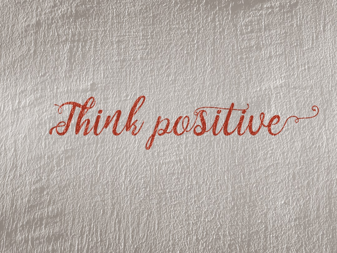
Great Vibes — free (Google Fonts / Canva)
Great Vibes is a flowing formal script for a single accent word or a short, romantic line. It is ideal for wedding quotes, love notes and elegant headers, but use it sparingly — scripts lose legibility fast, so never set a whole multi-line quote in it.
Caveat — free (Google Fonts / Canva)
Caveat is a casual, marker-pen handwriting font that adds warmth and a personal touch. It suits motivational and lifestyle quotes where a human, hand-written feel beats polish. Keep it for short lines and pair it with a clean sans for the attribution.
Amatic SC — free (Google Fonts / Canva)
Amatic SC is a tall, thin, condensed hand-drawn face that reads as friendly and crafty. It works beautifully on minimalist quote cards with lots of white space, and its narrow letters let you stack a longer quote without it feeling heavy.
Cormorant Garamond — free (Google Fonts)
Cormorant Garamond is the more text-friendly member of the Cormorant family, with slightly sturdier strokes. Choose it when a quote runs to a few lines and you want the old-style elegance of Cormorant without losing readability at medium sizes.
Montserrat — free (Google Fonts / Canva)
Montserrat is the clean, geometric sans to set your attribution line in. Used in a lighter weight and smaller size beneath an elegant serif quote, it provides the modern contrast that makes the pairing feel designed. It also works for the whole graphic when you want a crisp, contemporary tone.
EB Garamond — free (Google Fonts)
EB Garamond is a classic old-style serif with gentle contrast and genuine literary heritage. It is the right call for bookish, intellectual quotes and long-form pull quotes where you want timeless authority rather than fashion-forward drama.
Quote fonts comparison table
| Font | Style | Free/Paid | Why it works |
|---|---|---|---|
| Playfair Display | High-contrast serif | Free | Elegant, editorial, screenshot-worthy |
| Cormorant | Display serif | Free | Literary, dramatic, timeless |
| Lora | Serif | Free | Warm and readable for longer quotes |
| Great Vibes | Formal script | Free | Romantic accent for a single line |
| Caveat | Handwriting | Free | Personal, motivational warmth |
| Amatic SC | Condensed hand-drawn | Free | Friendly, minimalist quote cards |
| Montserrat | Geometric sans | Free | Clean attribution and modern contrast |
| EB Garamond | Old-style serif | Free | Bookish, intellectual quotes |
How to pair fonts for quote graphics
The classic move is a serif-plus-sans pairing: set the quote in Playfair Display or Cormorant and the author line in Montserrat or another quiet sans. For a softer, more personal card, swap the display serif for a script accent like Great Vibes on one keyword and keep the rest in a clean serif so the line stays readable. Whatever you choose, lock yourself to two fonts per graphic and reuse them across a series so your quote feed feels cohesive.
These same elegant pairings translate directly to other display work. The serifs that anchor a strong quote card also make excellent book title fonts, and the bold, legible approach carries over to watermark fonts when you sign your work. For more statement faces, browse the best display fonts.
Fonts to avoid for quotes
Avoid setting an entire quote in a script or handwriting font — even beautiful ones like Great Vibes become a struggle to read across multiple lines. Skip thin, hairline weights for text shown over busy photos, where the strokes disappear. Steer clear of novelty and cliché faces such as Comic Sans, Papyrus and the default Brush Script, which instantly undercut the sentiment. And resist stacking three or more fonts on one card; it reads as cluttered and amateurish.
Tips for typesetting quotes
- Lead with hierarchy. Make the quote dominant and the attribution clearly smaller and quieter — usually a different font and a lighter weight.
- Mind the line breaks. Break lines on natural phrases, not wherever the box runs out, so the quote reads with the right rhythm.
- Use real quotation marks. Curly typographic quotes (” “) look professional; straight inch marks look unfinished.
- Check contrast over photos. Add a subtle overlay or shadow so light serifs stay legible on busy backgrounds.
- Confirm the license. Before using a font on merchandise or paid promotions, verify the terms in our font licensing guide.
Frequently Asked Questions
What is the best font for inspirational quotes?
For inspirational quotes, Playfair Display and Lora are the safest strong choices because they read as credible and elegant at large sizes. If you want warmth, Caveat adds a hand-written, personal feel. Pair whichever you pick with a clean sans like Montserrat for the attribution line.
What font should I use for quote captions on Instagram?
Use a bold, legible serif or sans that survives thumbnail size, such as Playfair Display, Lora or Montserrat. Reserve scripts like Great Vibes or Caveat for a single accent word. Keep the design to two fonts so the quote stays clean and readable in a fast-scrolling feed.
Are these quote fonts free for commercial use?
Yes. Every font listed here is on Google Fonts under an open license that permits commercial use, including paid ads and printed products. They are also bundled in Canva. Keep a record of each license; our font licensing guide explains exactly what to retain.
How many fonts should a quote graphic use?
Two is the sweet spot: one expressive display or serif for the quote itself, and one quiet sans for the attribution and any small print. A third font is rarely necessary and usually makes the card feel cluttered. Build contrast through size and weight instead.
What font pairs well with Playfair Display for quotes?
Montserrat is the classic companion — its clean geometry contrasts nicely with Playfair Display’s high-contrast serif strokes. Lato and Raleway also work well for attribution lines. Pair the elegant serif quote with a quieter, lighter sans so the hierarchy reads clearly.


