Festival Branding: Identity for Events
Festival branding is not a poster — it’s an entire identity system that has to flex across dozens of surfaces, from a 40-foot main stage backdrop to a 1-inch wristband and a phone-sized app icon. A festival lives for a few days but its brand must work everywhere at once, in print and screen, at huge and tiny scale. This guide covers how to build a system that holds together across all of it.
Festival branding draws on the same foundations as any brand. If you’re building the underlying system, our guides to visual identity design and the logo design process are essential groundwork. For the single-poster end of the spectrum, see our film poster design guide, which covers hierarchy and composition that transfer directly to festival key art.
Why a Festival Needs a System, Not a Logo
A logo is a fixed mark. A festival brand is a flexible identity system — a kit of parts that can be recombined for endless contexts without losing coherence. The same brand appears on lineup posters, multiple stage names, merchandise, wristbands, signage, the website, the mobile app, social templates, and sponsor lockups. A single logo can’t carry all of that; a system can.
The core deliverable is a brand toolkit: a logo and its variations, a color palette, typography, a set of graphic devices or patterns, and rules for how they combine. Everything downstream is assembled from this kit.
The Components of a Festival Identity
- Logo system — a primary mark plus simplified, stacked, and single-color variants for small sizes and merch. The mark must work in one color on a wristband and full color on a billboard.
- Color palette — a primary set plus secondary accents. Festivals often refresh accent colors per edition (each year gets a new feel) while keeping a recognizable core.
- Typography — usually a distinctive display face for headlines and lineup, plus a clean, legible sans for body, schedules, and the app. Choose a pairing with real contrast; our font pairing guide covers how.
- Graphic devices — patterns, shapes, textures, or an illustration style that can fill backgrounds, frame photos, and tie disparate items together.
- Photography / art direction — a consistent treatment for crowd shots, artist photos, and atmosphere.
Designing for Flexibility
The hardest part of festival branding is scale and surface range. The same identity must survive being huge, tiny, printed, screen-lit, and applied by many different people. Design for that from the start:
- Build a responsive logo. A detailed primary mark for large formats, a simplified version for medium sizes, and a minimal icon or monogram for favicons, app icons, and wristbands.
- Test at extremes early. Mock the logo at billboard scale and at one inch on day one. If it dies at small size, fix it before anything else is built.
- Define clear-space and minimum-size rules. Festivals are applied by vendors, sponsors, and volunteers — leave nothing to interpretation.
- Make the system additive. A new stage, a new sponsor, a next-year edition should slot in without breaking the look.
Applying the Brand Across Surfaces
| Surface | Constraint | Design priority |
|---|---|---|
| Main lineup poster | Dense text, big format | Hierarchy: festival name, headliners, then full lineup |
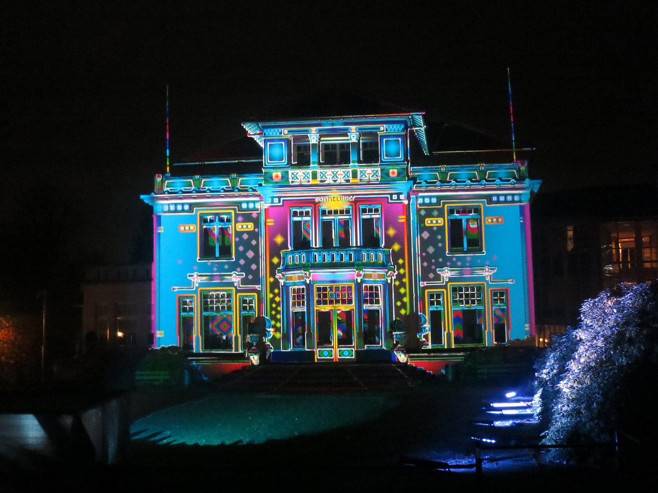
| Stage backdrops | Viewed from far, often at night, on screens | Bold, high-contrast, simplified marks |
| Wristbands | ~1 inch, single or two-color print | Minimal logo variant, maximum legibility |
| Merch (tees, totes) | Limited print colors, fabric | Strong single-color lockups and graphic devices |
| Mobile app & site | Small screens, interactive | Legible sans, accessible color contrast, icon-scale logo |
| Wayfinding / signage | Quick reading, outdoors | Clear typography, consistent color coding per area |
| Social templates | Many posts, many hands | Reusable, locked layouts anyone can fill |
Notice the recurring theme: the identity simplifies as the surface shrinks or the print process limits color. A robust festival brand is designed so each step down still reads as the same festival.
The Lineup Poster
The lineup poster is the signature artifact of festival branding and a hierarchy challenge in itself. The festival name and headliners sit at the top of the visual order; the long tail of supporting acts is set smaller, often in tiered type sizes that reflect billing. This tiered scaling is contractually and commercially meaningful — bigger acts get bigger names. Keep the typography tight and the alignment disciplined so the dense block still feels designed rather than dumped.
Consistency Through a Brand Guide
Because so many people touch a festival brand — internal designers, merch vendors, sponsors, app developers — a brand guide is what keeps it coherent. At minimum, document:
- Logo variants, clear space, minimum sizes, and misuse examples.
- Exact color values (CMYK for print, RGB/HEX for screen, and Pantone for merch).
- Type styles, hierarchy, and the licensed fonts (with usage rights noted).
- Pattern and graphic-device usage.
- Photography and social-template rules.
Tools
Build the core system in Illustrator (vector logo, patterns, scalable lockups), use Photoshop for art-directed imagery and mockups, and assemble multi-page deliverables — the lineup poster, programs, and the brand guide — in InDesign. Keep a single source-of-truth asset library so every application pulls from the same files.
Evolving the Brand Year Over Year
Recurring festivals face a unique tension: each edition needs to feel fresh and new, yet still be instantly recognizable as the same event. The solution is a clear split between the permanent core and the seasonal layer. The logo, primary wordmark, and underlying structure stay fixed across years — that’s what builds long-term recognition. The accent colors, graphic patterns, illustration style, and campaign theme refresh annually, giving each edition its own identity.
This is why strong festival systems are built to be additive from the start. When the core is stable and the seasonal layer is well-defined, a new year’s look can be developed quickly without renegotiating the entire identity. Practical tactics for sustainable evolution:
- Lock the non-negotiables. Document which elements never change so each year’s designers know the boundaries.
- Theme the variable layer. Give each edition a concept that drives its palette and patterns while the logo stays put.
- Keep an archive. Past editions become part of the brand’s story and merch value, so maintain a consistent treatment of year markers.
- Plan for sponsors. Build a flexible sponsor-lockup zone into the system so partner logos never break the layout.
Related Reading
A festival is the largest scale of event design, but the craft connects across the cluster. For single events, see event poster design; for the marks that headline acts bring with them, see DJ logo design.
Frequently Asked Questions
What is festival branding?
Festival branding is a flexible visual identity system built for a live event — not a single logo, but a kit of parts (logo variants, color, typography, and graphic devices) that flexes across stages, merch, wristbands, signage, the website, and the app. The goal is one coherent look across every surface and scale.
Why does a festival need a system instead of just a logo?
A festival appears on dozens of surfaces at wildly different sizes and print processes — from a 40-foot stage backdrop to a one-inch wristband. A single fixed logo can’t serve all of them, so designers build a system of variants and reusable elements that can be recombined while staying recognizable.
How do you design a logo that works on a tiny wristband?
Build a responsive logo with multiple variants: a detailed primary mark for large formats and a simplified, single-color icon or monogram for tiny and limited-color applications. Test at one inch early, define a minimum size, and ensure strong contrast so the mark stays legible when printed small on fabric or plastic.
What should a festival brand guide include?
At minimum: logo variants with clear-space and minimum-size rules, exact color values (CMYK, RGB/HEX, and Pantone), type styles and licensed fonts, graphic-device usage, and photography and social-template rules. Because vendors, sponsors, and volunteers all apply the brand, the guide must leave nothing to interpretation.
What tools are used for festival branding?
Illustrator builds the vector logo system, patterns, and scalable lockups; Photoshop handles art-directed imagery and mockups; and InDesign assembles multi-page deliverables like the lineup poster, programs, and brand guide. A shared source-of-truth asset library keeps every application consistent across the team.


