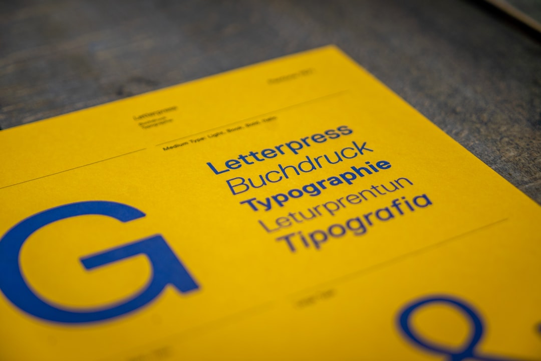
Font Anatomy: The Parts of a Letter
Font anatomy is the vocabulary type designers and typographers use to name every part of a letter — from the invisible baseline all letters sit on to the tiny terminal at the end of a stroke. Learning these terms is not academic trivia: it is what lets you describe why one typeface feels different from another, evaluate a font before you use it, and draw letters of your own with precision.
This is the working glossary behind our pillar on type design and how typefaces are made. Once you can name the parts, the whole craft of type opens up.
The Invisible Guidelines
Before the strokes, there are the lines letters are built against. These guidelines define proportion and are the framework every glyph is drawn to.
- Baseline — the invisible line all letters sit on. The single most important reference in typography.
- X-height — the height of lowercase letters without ascenders or descenders, measured from the baseline to the top of a lowercase x. A large x-height generally improves legibility at small sizes.
- Cap height — the height of capital letters from the baseline.
- Ascender — the part of a lowercase letter that rises above the x-height, as in b, d, h, and k.
- Descender — the part that drops below the baseline, as in g, j, p, q, and y.
- Overshoot — the small amount by which round letters extend past the guidelines so they appear the same size as flat ones.
The Strokes and Their Parts
The actual marks that form a letter have their own names. These are the terms you will use most when describing or drawing letterforms.
| Term | What it is | Found in |
|---|---|---|
| Stem | The main vertical or dominant stroke of a letter | l, I, the uprights of h, n |
| Bowl | The fully closed, rounded stroke enclosing space | o, b, d, p |
| Counter | The enclosed or partly enclosed white space inside a letter | o, e, a, the loops of g |
| Serif | The small finishing stroke projecting from a main stroke | serif faces like Times, Garamond |
| Terminal | The end of a stroke that has no serif | the curl ending of a, c, f |
| Aperture | The opening of a partially enclosed counter | the gap in c, e, s, a |
| Crossbar | A horizontal stroke connecting two stems or crossing one | A, H, e, t, f |
| Spine | The main curved stroke of the letter S | S, s |
| Ear | The small projection on the upper right of some letters | lowercase g, r |
| Tail | The descending stroke, often decorative | Q, R, g, j, y |
Stems, bowls, and counters
The stem is a letter’s backbone — its main weight-bearing stroke. The bowl is the closed curve that creates the body of letters like o, b, and d. The space the bowl encloses is the counter. Counters do enormous work for legibility: open, generous counters keep letters distinct at small sizes, while cramped counters can fill in and turn muddy. When type designers talk about a font reading well in tiny captions, they are often talking about its counters.
Serifs, terminals, and apertures
A serif is the small projecting stroke at the end of a main stroke — the feature that divides typefaces into serif and sans-serif families. Where a stroke ends without a serif, that ending is a terminal, and its shape (sheared, rounded, ball-shaped) is a strong part of a typeface’s personality. The aperture is the size of the opening in letters like c, e, and s; wide apertures aid legibility, while tightly closed apertures can look elegant but reduce clarity at small sizes. These are exactly the kinds of details our guide to what makes a good font weighs when judging quality.
Crossbars, spines, ears, and tails
Several parts are letter-specific. The crossbar is the horizontal stroke that joins the two stems of an A or H, or crosses an e or t. The spine is the central S-curve of an S — one of the hardest shapes in all of type to draw well. The ear is the little flag on the upper right of a lowercase g or r, and the tail is the descending flourish on a Q, R, or y. Small as they are, these details carry much of a typeface’s character.
Connections and Special Forms
Beyond single strokes, anatomy includes how letters relate and combine.
- Ligature — two or more letters joined into a single glyph, most commonly the “fi” and “fl” pairs, where the dot of the i or the hook of the f would otherwise collide.
- Shoulder — the curved stroke that connects a stem to a leg, as in the arch of an h, m, or n.
- Leg — the lower diagonal stroke of letters like k and R.
- Apex and vertex — the point where two strokes meet at the top (apex, as in A) or bottom (vertex, as in V).
- Link — the stroke connecting the upper and lower bowls of a double-story g.
Why Font Anatomy Matters in Practice
This vocabulary is not just for naming things. It is the toolkit for three real jobs. When you choose a font, anatomy lets you predict behavior — a high x-height and open apertures signal good small-size legibility. When you pair fonts, matching features like x-height and contrast keeps combinations harmonious, which is the foundation of our font pairing guide. And when you make a font, every term above is a decision you have to make on purpose; our guide to making a font walks through drawing these parts in practice.
Anatomy is also how designers communicate. Telling a type designer “open the aperture on the c and lighten the crossbar on the e” is precise and actionable. “Make it look nicer” is not. Once you own the words, your feedback and your eye both get sharper.
Frequently Asked Questions
What is the most important term in font anatomy?
The baseline is the foundation — every letter is positioned relative to it. After that, x-height is the term with the biggest practical impact, because it strongly influences how legible a font feels at small sizes and how well two fonts pair together.
What is the difference between a counter and an aperture?
A counter is the enclosed or partially enclosed white space inside a letter, like the hole in an o. An aperture is specifically the opening that connects a partially enclosed counter to the outside, as in the gap of a c or e. Wider apertures generally improve legibility.
What is a ligature?
A ligature is a single glyph that combines two or more letters to avoid awkward collisions, most often “fi” and “fl.” The dot of an i or the arm of an f would otherwise clash with the next letter, so the typeface provides a unified, cleaner combined form.
Do I need to know font anatomy to use fonts well?
You can use fonts without it, but knowing anatomy makes you dramatically better at choosing, pairing, and critiquing type. It turns vague impressions into specific, repeatable judgments — and it is essential if you ever want to design letters yourself or give precise feedback to a type designer.
What is the difference between a serif and a terminal?
A serif is the small finishing stroke that projects from the end of a main stroke in serif typefaces. A terminal is the end of a stroke that has no serif — its shape can be rounded, sheared, or ball-like. Sans-serif fonts have terminals but, by definition, no serifs.


