Mixtape Cover Design: Ideas and How-To
A mixtape cover has the same one-second job as any release art — stop the scroll and signal the vibe — but it comes with more creative freedom. Mixtapes are looser, faster, and often more DIY than a flagship album, which is exactly what makes the cover fun to design. This how-to covers the right size, the fonts that work, layout ideas, and the steps to make a mixtape cover that hits at thumbnail scale.
The fundamentals carry straight over from album cover design: design for the small size first, keep the hierarchy clear, and build a true square. A mixtape just lets you be bolder and rougher in how you get there.
Mixtape Cover Size and Specs
Mixtapes almost always live on streaming and download platforms, so they follow streaming cover rules. Build a true square at a minimum of 3000 × 3000 pixels, in RGB, saved as JPG or PNG. That high resolution gives platforms room to downscale cleanly and keeps you ready if you ever press physical copies.
| Spec | Requirement |
|---|---|
| Dimensions | 3000 × 3000 px minimum, perfectly square |
| Color space | RGB (screen) |
| File type | JPG or PNG |
| Avoid | URLs, contact info, third-party logos (distributors reject these) |
If you later make physical copies (CD or cassette), you’ll need a separate CMYK 300 DPI version with bleed — a CD front is about 4.75 inches square and a cassette J-card is a small folded panel.
Mixtape Cover Ideas and Styles
Mixtape culture has a strong, recognizable visual language, especially in hip-hop. Lean into a direction that matches your sound:
- Bold type-only: the artist name and tape title as the entire design — loud, fast, unmistakable.
- Photo + heavy text: a strong portrait with the title slammed across it in a big, high-contrast face.
- Collage / scrapbook: torn paper, tape, stamps, and stickers for a raw mixtape feel.
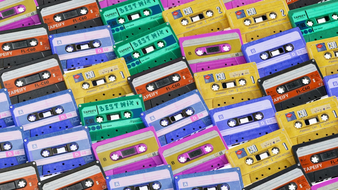
- Retro / cassette homage: a literal tape graphic or vintage label aesthetic.
- Minimalist: one strong image or color block and tight type for a clean, modern look.
The DIY energy is a feature, not a flaw — but “DIY” still means deliberate. Rough texture and hand elements work best when the hierarchy underneath them is clean.
How to Make a Mixtape Cover: Step by Step
- Set up a square canvas at 3000 × 3000 px, RGB.
- Pick your concept and style from the directions above — commit to one.
- Place the focal element (photo, color block, or big type) and build hierarchy around it.
- Add the title and artist name with strong contrast against the background.
- Shrink to ~75px and check legibility — this is the make-or-break test.
- Refine contrast, spacing, and color, then export a high-quality JPG or PNG.
Typography for Mixtapes
Type usually carries a mixtape cover, so make it count. You can go heavier and more aggressive than on a polished album — bold condensed sans, distressed display faces, and graffiti-inspired lettering all fit the format. Keep it to one or two faces and use a big size difference between the title and the artist name. For combining a loud display face with a clean supporting one, our font pairing guide shows how to keep contrast working in your favor.
- Go bold. Thin, delicate type disappears at thumbnail size and clashes with mixtape energy.
- Maximize contrast between text and background — add a knockout panel or scrim if a photo is busy.
- Test small constantly. If the title doesn’t read at 75px, push the size and weight up.
- Check the font license if you’re using a commercial display face on a release.
Make It Pop as a Thumbnail
Mixtapes live almost entirely as small tiles in feeds and playlists, so thumbnail performance is everything. The same logic applies to Spotify cover art: keep critical elements toward the center, away from corners that get cropped, and rely on a strong silhouette or dominant color for instant recognition. Simplify detail until the small version is undeniable, then let the full-size art reward a closer look.
Color That Sets the Mood
Because mixtapes are delivered for screens in RGB, you can push brighter, more saturated color than print allows — and a mixtape is exactly the place to do it. A single dominant hue is one of the fastest ways to make a tile recognizable in a crowded playlist. Pick a tight palette of two to four colors that matches the tape’s energy: hot, high-key color for an upbeat party tape; moody, desaturated tones for something darker and more introspective.
- Lean on one dominant color for instant recognition at thumbnail size.
- Watch streaming compression — heavy gradients and very dark, detailed shadows can band or smear, so simplify.
- Make text contrast hard against the background so the title never gets lost.
- Reuse the palette across singles and socials so the whole project reads as one drop.
Build a Mini Visual System
A mixtape is rarely a single asset anymore. The same artwork has to flex into a square streaming tile, a story-sized vertical, and promo posts in the run-up to release. Design the cover so its key elements — the title, the focal image, the dominant color — can be re-cropped without breaking. Keep critical type toward the center so a vertical or circular crop doesn’t slice it off.
Building a tiny system as you go saves enormous time: lock your hex values, your one or two fonts, and your central motif, then reuse them everywhere. This is what makes an independent mixtape look like a coordinated release rather than a one-off upload, and it carries straight into any future projects from the same artist.
Free Tools to Design a Mixtape Cover
- Canva: templates and easy type — fast for a clean, modern look.
- GIMP: free, Photoshop-style control for photo-based and collage covers.
- Photopea: a browser-based editor that opens PSDs, great for quick work.
- Inkscape: free vector tool for crisp type-only covers.
The tool matters far less than the fundamentals. A bold idea, clear hierarchy, and a cover that reads at 75 pixels will beat a busy design made in expensive software every time.
Frequently Asked Questions
What size should a mixtape cover be?
Make it a true square at a minimum of 3000 × 3000 pixels in RGB, saved as JPG or PNG, since mixtapes live on streaming and download platforms. Avoid URLs, contact info, and third-party logos, which distributors reject. For physical copies, create a separate CMYK 300 DPI version with bleed.
How do I make a mixtape cover for free?
Use free tools like Canva for templates, GIMP or Photopea for photo and collage work, or Inkscape for type-only covers. Set up a 3000 × 3000 px square in RGB, build a clear focal point and bold title, then test the design at thumbnail size before exporting a high-quality JPG or PNG.
What fonts work best on a mixtape cover?
Bold, high-impact faces — condensed sans, distressed display type, and graffiti-inspired lettering all suit the format and read at small sizes. Use just one or two fonts with a big size contrast between the title and artist name. Avoid thin, delicate type, which vanishes at thumbnail scale.
Do I need a photo on a mixtape cover?
No. Type-only mixtape covers are extremely common and effective, with the artist name and title forming the whole design. A photo can work well with heavy text over it, but a strong color block or bold lettering alone is often more striking and easier to read as a small thumbnail.
How do I make my mixtape cover stand out in a feed?
Design for the thumbnail first: keep key elements centered away from cropped corners, use a dominant color or strong silhouette for instant recognition, and maximize contrast between text and background. Simplify detail until the cover reads clearly at about 75 pixels wide, then refine the full-size version.


