Moss Green vs Olive: What’s the Difference?
The moss green vs olive comparison is about two earthy greens that are easy to confuse because both are muted and nature-inspired. Moss green has a soft, grayed-down, slightly cool quality; olive is warmer, more golden, and a touch more saturated. Below we compare hex values, undertones, and where each earthy green performs best.
What is the difference between moss green and olive?
Both colors live in the muted yellow-green territory, but they differ in gray content and warmth. Moss green carries more gray, which softens it and pulls it slightly cooler — it evokes the velvety green of moss on a shaded rock. Olive has less gray and more yellow, giving it a warmer, more golden, almost brownish character closer to the unripe fruit. Moss feels gentle and atmospheric; olive feels rich and grounded. As usual, these are informal names, so hex values vary.
| Attribute | Moss Green | Olive |
|---|---|---|
| Hex code | #8A9A5B | #808000 |
| RGB | 138, 154, 91 | 128, 128, 0 |
| CMYK | 10, 0, 41, 40 | 0, 0, 100, 50 |
| Undertone | Cool-ish, gray-yellow | Warm, yellow-gold |
| Hue family | Muted yellow-green | Yellow-green |
| Best used for | Soft natural palettes, interiors, wellness | Fashion, food/organic brands, warm interiors |
| Mood/feel | Soft, calm, atmospheric | Earthy, warm, sophisticated |
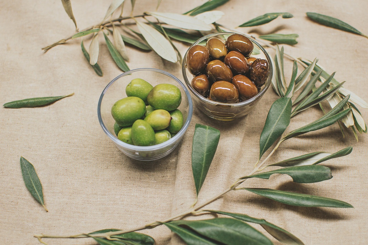
What does moss green look like?
Moss green is a soft, grayed yellow-green. The representative value #8A9A5B blends green and yellow with enough gray to mute the whole thing, producing a calm, understated tone that feels organic and a little weathered. It is lighter and gentler than a saturated green, and its gray content keeps it from ever looking loud.
Moss green shines in soft, naturalistic palettes — biophilic interiors, wellness and skincare brands, and earthy editorial designs that want a quiet, grounded green. It pairs beautifully with terracotta, blush, warm white, and other muted earth tones. For a closely related soft-green comparison, see our sage vs olive green guide.
What does olive green look like?
Olive is the warmer, more golden of the two. The web value #808000 — equal red and green, no blue — is essentially a dark yellow with a green read, which gives olive its rich, earthy, almost brownish warmth. It is more saturated and assertive than moss green, carrying a sophisticated, Mediterranean character.
Olive is a fashion and packaging favorite, popular for organic food brands, warm earthy interiors, and autumn palettes. Its golden warmth pairs naturally with cream, mustard, terracotta, and warm browns. Because it is darker and more saturated than moss, it can anchor a palette where moss would only accent. For how olive sits against military greens, see olive vs army green.
When should you use moss green vs olive?
Choose based on warmth and weight. Moss green’s gray softness makes it the better pick for gentle, atmospheric, calming designs where you want green to recede. Olive’s golden warmth and stronger saturation make it the right choice when you want an earthy green that feels rich and can carry a palette.
- Use moss green for: biophilic interiors, wellness and skincare, soft natural editorial, muted earth-tone palettes.
- Use olive for: organic food and beverage, warm fashion, autumnal interiors, packaging that wants depth and warmth.
- Use them together: moss as a soft, cool highlight against olive’s warmer base creates a layered, foraged-from-nature palette.
Olive leans clearly warm, while moss sits more neutral-to-cool — that contrast is what makes them work together. To balance warm and cool earthy greens in a scheme, our warm vs cool colors guide helps. For the soft, cool end of the green spectrum entirely, compare mint vs seafoam.
How do moss green and olive perform across media?
Both muted greens are relatively print-stable because they are desaturated, though olive’s strong yellow component can warm up further in CMYK — proof it on your stock. Moss green’s gray content makes it forgiving in both print and web. On screen, moss works as a soft section background or accent, while olive can serve as a deeper anchor color. Both pass contrast comfortably against white when used at full strength, but check lighter tints carefully.
Which colors pair well with moss green and olive?
Both are earthy greens, but their different warmth points to different companions. Moss green sits in soft, naturalistic palettes, pairing beautifully with blush, warm white, oatmeal, and dusty rose for a calm, biophilic feel. Its grayed softness also lets it sit beside other muted tones — clay, soft terracotta, and pale ochre — without any one color shouting. Because moss recedes, it makes an excellent background or supporting tone that lets warmer accents come forward gently.
Olive is warmer and more saturated, so it anchors richer, more grounded palettes. It pairs naturally with cream, mustard, terracotta, and warm brown, and it gains depth next to deep burgundy or rust for an autumnal scheme. Olive can carry a palette as a lead color, where moss would typically support, so use olive when you want the green itself to feel substantial and present.
When choosing between them, weigh softness against warmth. Moss green suits gentle, atmospheric, wellness-leaning designs; olive suits warm, rich, earthy ones. The two also layer well together — moss as a cooler, lighter highlight over olive’s warmer base — for a foraged, nature-derived palette that feels both calm and grounded.
Frequently Asked Questions
Is moss green grayer than olive?
Yes. Moss green (around #8A9A5B) contains more gray, which softens it and pulls it slightly cooler. Olive (around #808000) has less gray and more yellow, giving it a warmer, more golden, more saturated character. Side by side, moss looks muted and atmospheric while olive looks rich and earthy.
Which is better for a calming, natural brand?
Moss green is usually the stronger choice for calm, natural, biophilic branding because its grayed softness recedes and soothes. Olive can feel natural too, but its warmer, more saturated golden tone reads as richer and more assertive. For wellness and quiet earthiness, moss; for warm, grounded depth, olive.
Do moss green and olive go together?
Yes. They share a muted, earthy yellow-green character but differ in warmth, so moss acts as a cooler, softer highlight against olive’s warmer base. The combination feels organic and layered, and both pair well with neutrals like cream, terracotta, and warm brown for a nature-inspired palette.
Are these hex codes official standards?
Only partly. Olive is an official web color at #808000, but moss green has no single standard and varies widely — #8A9A5B is a common representative value. Because both names are used loosely in design, confirm against your brand guidelines or a Pantone reference for any production work.


