Olive vs Green: What’s the Difference?
The olive vs green comparison is a member-versus-category question with a temperature twist. Olive is a dark, muted yellow-green named after the unripe fruit, carrying a warm, brownish earthiness; pure green is the balanced reference hue with no yellow or blue bias. Side by side, olive reads warm, dusty, and earthy while pure green reads clean and neutral.
What is olive?
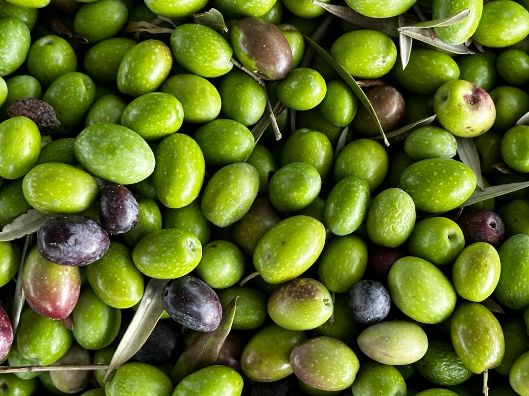
Olive is a dark, muted yellow-green named after the fruit. The CSS keyword “olive” is #808000 — essentially a darkened, grayed yellow that tips into green, giving it a warm, earthy, almost brownish character. That muted, military-adjacent quality is why olive anchors utilitarian and natural palettes: army and outdoor gear, autumn fashion, and grounded, organic branding. Because it is dark and low in chroma, olive carries large areas comfortably and reads as sophisticated and understated rather than fresh or vivid.
If you are weighing olive against neighboring earthy greens, our comparisons of olive vs army green and mint vs sage cover how muted, gray-leaning greens differ in warmth and lightness.
What is green?
Green in its pure form is the secondary hue made from equal blue and yellow, sitting opposite red on the color wheel. The CSS keyword “green” is #008000 — a mid-dark, balanced green with no obvious lean toward yellow or blue. As a hue family, “green” spans lime, mint, emerald, forest, and olive; olive is one warm, yellow-leaning, muted point within it. Pure green is the neutral reference against which we describe other greens as warmer, cooler, brighter, or grayer.
The defining contrast: olive is one specific, warm, muted, yellow-leaning shade, while green is the entire hue category. For the full spectrum, our shades of green guide maps how greens move from yellow-leaning to blue-leaning.
What’s the difference between olive and green?
The defining differences are scope, temperature, and saturation. Olive is a narrow, warm, yellow-leaning, grayed shade; pure green is the broad, balanced, fully saturated parent hue. Olive reads earthy and understated; green reads natural and neutral. Here is a side-by-side with representative values — neither is a fixed brand standard, so exact hexes vary.
| Property | Olive | Green |
|---|---|---|
| Hex code | #808000 | #008000 |
| RGB | 128, 128, 0 | 0, 128, 0 |
| CMYK | 0, 0, 100, 50 | 100, 0, 100, 50 |
| Undertone | Warm, yellow/brown lean (muted) | Balanced, neutral |
| Hue family | Yellow-green (earthy) | Green (the parent hue) |
| Best used for | Military/outdoor, autumn fashion, earthy branding | Natural/eco branding, signage, broad fills |
| Mood/feel | Earthy, grounded, utilitarian, understated | Natural, balanced, fresh, universal |
When should you use each?
Use olive when you want an earthy, grounded green with a warm, muted character. Its yellow-brown lean suits military and outdoor brands, autumn fashion, organic and heritage identities, and sophisticated UI where the green should feel understated rather than fresh. Olive pairs especially well with rust, cream, burgundy, and warm browns.
Use pure green when you want a balanced, universally readable color that signals nature, growth, or “go.” It suits eco and outdoor branding, wayfinding and signage, success states in UI, and any context where the green should feel clean and grounded. Pure green pairs reliably with white, brown, and earthy neutrals.
To tell them apart in practice, check temperature and saturation. Olive is warmer, browner, and more muted; pure green is cleaner and more neutral. If you are balancing these greens against warm accents, our guide to warm vs cool colors explains how to keep a green palette balanced.
How are olive and green used across design?
In branding, olive signals nature, utility, and grounded heritage — it appears in outdoor, military-inspired, and organic brands that want an earthy, understated identity. Pure green signals nature, health, and trust, favored by eco, grocery, and outdoor brands that want a clean, approachable feel. The choice maps onto whether a brand reads rugged-earthy or fresh-natural, a distinction explored in our green color meaning guide.
In fashion, olive is a wardrobe staple for jackets, trousers, and utility wear, reading rugged and versatile. Pure green is more of a clean, everyday color for casual and workwear pieces. Both are green, but olive adds earthy sophistication while pure green stays comfortably neutral.
In interiors and web design, olive works beautifully over large areas — accent walls, upholstery, cabinetry, calm UI surfaces — because its muted depth is restful and grounding. Pure green is better for high-visibility signage and outdoor branding where a clear, balanced green communicates instantly. Print behavior is worth noting: olive’s grayed, yellow-leaning mix reproduces reliably across stocks, while a fully saturated pure green can shift between RGB and CMYK, so brand-critical greens benefit from a proof.
Do olive and green go together?
Yes — because olive belongs to the green family, it harmonizes naturally with pure green in a tonal scheme. Pure green provides a cleaner mid-tone base while olive adds a warm, earthy, muted layer, creating depth and a subtle warm-cool interplay within one hue. Add rust, cream, or warm brown to round it out. Keep a clear hierarchy: let olive carry broad areas and use pure green for cleaner accents. See our color psychology guide for why layered greens feel natural and reassuring.
Frequently Asked Questions
Is olive the same as green?
No. Olive is a specific dark, muted yellow-green with an earthy, brownish cast (around #808000), while “green” is the broad hue family and its pure reference value (around #008000). Olive is always green, but most greens are not olive. The difference is scope plus olive’s warm, yellow-leaning, grayed character.
Is olive a warm or cool green?
Olive is a warm green. Its strong yellow lean and brownish, muted quality place it on the warm, earthy side of the green family. Pure green is more balanced and neutral, neither distinctly warm nor cool. So olive reads noticeably warmer and dustier than pure green in direct comparison.
What is the hex code for olive?
The CSS keyword “olive” is #808000, a dark, muted yellow-green. Olive is not limited to one value, so brand and paint versions vary around it, some lighter or browner. The CSS keyword “green” is the separate #008000, a balanced mid-dark green. Confirm against brand guidelines for production work.
Why does olive look brown or yellow?
Olive looks brownish-yellow because it is essentially a darkened, grayed yellow that only just tips into green — its RGB value has equal red and green with no blue. That heavy yellow component, dimmed down, reads as earthy and almost brown, which is why olive feels muted rather than fresh like pure green.
Do olive and green go together?
Yes, very well. Because olive is part of the green family, the two form a natural tonal pairing with a subtle warm-cool interplay. Pure green gives a cleaner base while olive adds a warm, earthy layer. Round it out with rust, cream, or warm brown, and keep a clear light-to-dark hierarchy.


