Rustic Color Palette: Hex Codes and Ideas
A rustic color palette takes its cues from the countryside — sun-faded clay, dried herbs, aged wood, and homespun linen. The signature set is terracotta (#C36F4E), olive (#6B7A3F), mustard (#D4A017), cream (#F3E9DC), walnut (#5C4433), and sage (#9CAF88). The named palettes and hex table below are ready to copy; the sections beneath cover how to combine these warm, weathered tones without making a design feel dated.
Rustic schemes are a warmer, more textured cousin of our earthy color palette, and they lean heavily on shades of brown for depth. For the psychology behind why these tones feel grounding, see color psychology; for a tidier, lighter alternative, our Scandinavian color palette is the natural counterpoint.
What colors are in a rustic palette?
Rustic colors are warm, muted, and slightly weathered — the look of materials that have aged in sunlight and weather rather than fresh, saturated pigment. The unifying trait is a warm undertone and gentle desaturation, which is what makes the palette feel handmade and lived-in. Core members are terracotta (#C36F4E), a clay-red; olive (#6B7A3F), a dusty yellow-green; mustard (#D4A017), a golden ochre; cream (#F3E9DC), a soft warm neutral; walnut (#5C4433), a deep wood brown; and sage (#9CAF88), a gentle gray-green.
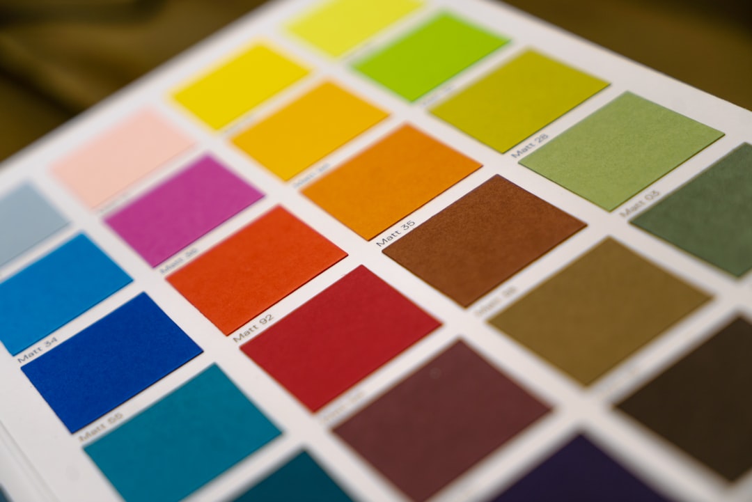
| Color name | Hex | RGB | Role |
|---|---|---|---|
| Terracotta | #C36F4E | 195, 111, 78 | Primary / accent |
| Olive | #6B7A3F | 107, 122, 63 | Secondary |
| Mustard | #D4A017 | 212, 160, 23 | Accent |
| Cream | #F3E9DC | 243, 233, 220 | Background / neutral |
| Walnut | #5C4433 | 92, 68, 51 | Anchor / text |
| Sage | #9CAF88 | 156, 175, 136 | Supporting |
5 rustic palettes with hex codes
Each scheme balances a warm neutral with weathered mid-tones and one richer accent. Copy the hex codes directly.
1. Classic Rustic
The signature farmhouse mix — warm, grounded, and timeless.
Terracotta #C36F4E Olive #6B7A3F Mustard #D4A017 Cream #F3E9DC Walnut #5C4433
2. Farmhouse Sage
Soft greens and creams for a calm, cottage-kitchen feel.
Sage #9CAF88 Olive #6B7A3F Cream #F3E9DC Oatmeal #C9B79C Walnut #5C4433
3. Autumn Harvest
Warm terracottas and mustards evoking a fall barn or harvest table.
Terracotta #C36F4E Mustard #D4A017 Burnt Sienna #A8431E Wheat #E8D5B0 Walnut #5C4433
4. Rustic Wedding
Soft, romantic naturals popular for barn weddings and invitations.
Sage #9CAF88 Dusty Terracotta #D8A290 Cream #F3E9DC Taupe #B8A282 Soft Walnut #7A5C44
5. Modern Rustic
A cleaner, contemporary take pairing rustic warmth with crisp neutrals.
Terracotta #C36F4E Sage #9CAF88 Off-White #F5F1E8 Charcoal #3A3A38 Walnut #5C4433
Which rustic colors go together?
Rustic colors harmonize easily because they share a warm, gently faded quality, but a few pairings define the look. Terracotta (#C36F4E) and Sage (#9CAF88) are the signature rustic combination — a warm clay-red against a cool gray-green — and they work because the cool sage tempers terracotta’s warmth without fighting it, which is exactly why the pair dominates weddings and farmhouse interiors. Mustard (#D4A017) and Olive (#6B7A3F) make a richer, more golden pairing that reads as autumnal and rustic in equal measure.
Cream (#F3E9DC) and Walnut (#5C4433) form the structural backbone of almost any rustic scheme: a soft warm neutral to dominate, a deep wood brown to anchor text and shadows. The reliable formula is one warm accent (terracotta or mustard), one grounded green (sage or olive), a cream or oatmeal neutral to carry the largest area, and walnut for depth. Because every color is muted and warm-leaning, you can layer four or five of these together without the palette feeling busy — the same forgiving quality that makes the broader earth-tone family so flexible. Avoid pairing rustic warms with cool, blue-based grays; a greige with a brown undertone blends far more naturally.
How to use a rustic palette in design
Rustic palettes work because every color shares a warm, slightly muted quality — the visual equivalent of natural materials weathered by use. Build your scheme around a warm neutral like Cream (#F3E9DC) and anchor it with Walnut (#5C4433) for text and grounding. A reliable structure is 60% warm neutral, 30% a grounded mid-tone (olive or sage), and 10% a richer accent (terracotta or mustard).
The single biggest mistake is using rustic colors at full saturation, which tips the palette toward 1970s kitsch. Keep terracotta and mustard slightly dusty, and lean on texture — wood grain, linen, kraft paper, hand-lettering — to do the heavy lifting. To keep a rustic scheme feeling current rather than dated, introduce one crisp off-white or a single cool neutral for breathing room, the same trick that modernizes our earthy color palette. For more wood and clay tones to extend any scheme, the shades of brown reference is the companion page.
Rustic palette for weddings, branding, and interiors
For weddings — especially barn, vineyard, and outdoor celebrations — rustic palettes are perennial favorites: sage and dusty terracotta with cream make soft, romantic invitations and table settings. In branding, rustic schemes signal craft, authenticity, and small-batch quality, which is why bakeries, breweries, coffee roasters, and artisanal makers reach for them. See how to choose brand colors to match these tones to a handmade or heritage brand story.
For interiors, rustic palettes are a staple of farmhouse and country design: terracotta and clay walls, olive and sage textiles, walnut wood, and cream linens layer into a warm, inviting room. Because the colors come from natural materials, the look reads as timeless rather than trendy — and it photographs beautifully against real wood and stone. On the web, use cream backgrounds, walnut or charcoal text, and a terracotta accent for calls to action, checking contrast meets accessibility standards.
For print and packaging, rustic palettes shine on uncoated and kraft stock, where the slightly absorbent surface deepens the muted tones and reinforces the handmade feel — ideal for coffee bags, soap wraps, and menu cards. Pair the colors with a warm serif or a hand-lettered display face, and let the unprinted paper itself stand in for the cream neutral. The same warmth that makes rustic schemes feel cozy can read as heavy if every element is saturated, so reserve the deepest walnut and burnt sienna for small areas and let the lighter wheat, oatmeal, and cream tones carry the largest surfaces.
Frequently Asked Questions
What colors are considered rustic?
Rustic colors are warm, weathered naturals: terracotta (#C36F4E), olive (#6B7A3F), mustard (#D4A017), cream (#F3E9DC), walnut (#5C4433), and sage (#9CAF88). They share a warm undertone and gentle desaturation that makes the palette feel handmade, cozy, and lived-in.
What is the difference between rustic and earthy colors?
The two overlap heavily, but rustic leans warmer and more weathered — think faded barn red, aged wood, and dried mustard — while earthy is a broader category of all nature-derived tones. Rustic palettes also pair more often with sage and cream for a farmhouse feel.
What colors go with rustic terracotta?
Terracotta (#C36F4E) pairs beautifully with sage green (#9CAF88), cream (#F3E9DC), olive (#6B7A3F), and walnut (#5C4433). Sage is the standout partner — the cool gray-green balances terracotta’s warmth, which is why the combination dominates rustic weddings and interiors.
What rustic colors are trending in 2026?
Terracotta and sage remain the dominant rustic pairing as of 2026, increasingly balanced with crisp off-whites and charcoal for a cleaner, modern-rustic read. The trend favors muted, dusty versions of these tones over the heavily saturated browns and oranges of past decades.


