T-Shirt Design: A Complete Guide for 2026
Strong t-shirt design sits at the intersection of graphic design and manufacturing. A great concept can be ruined by a file that does not print, and a flawless print file is worthless without an idea worth wearing. This guide covers both sides — the creative and the technical — so your designs look as good on a chest as they do on screen.
Apparel graphics borrow heavily from illustration and lettering. If you want to push the visual style further, our guide to illustration styles is a useful companion, and once your design is done, our guide to using mockups shows how to present it on a realistic shirt before printing a single unit.
Start With a Wearable Idea
The best t-shirt design starts with a concept someone would actually choose to wear. A shirt is a statement worn in public, so the idea has to mean something to the wearer — humor, identity, a cause, an aesthetic, a fandom. Decorative graphics that say nothing rarely sell, no matter how polished.
Before opening any software, define who the shirt is for and what it says. A concept that nails a specific audience beats a generic “cool” graphic every time. Sketch a few directions on paper first; the idea is cheaper to fix as a rough sketch than as a finished file.
Composition and Placement
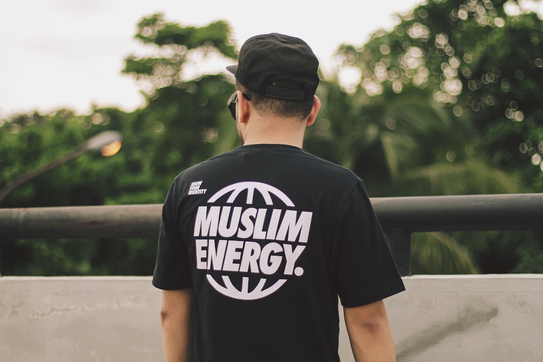
Shirt graphics are not posters — the canvas is a curved, moving surface, and placement changes everything. The standard placements each carry a different feel:
- Full center chest — the classic, high-impact placement for bold graphics and statements.
- Left chest — small, subtle, often used for logos and minimal designs with a premium feel.
- Back print — large area for detailed artwork, often paired with a small front graphic.
- Sleeve and pocket — accents that add detail without dominating.
Size the design for the body, not the artboard. A graphic that looks balanced on screen can feel oversized or lost on an actual shirt, so always check it against real garment dimensions and a mockup.
Typography on Apparel
Type is at the heart of most t-shirt design. Because the graphic is read from a distance and on a moving surface, legibility and impact matter more than subtlety. Bold, characterful display faces tend to work better than delicate ones. Condensed and heavy sans-serifs read well across a chest, and a strong slab or hand-lettered style adds personality.
Keep the type count low — one or two faces, used decisively. If you are setting a phrase, give it a clear hierarchy so the punchline or key word lands first. And convert text to outlines before sending to print so the printer does not need your fonts and nothing reflows.
Color and the Garment
Color in apparel works differently than on screen because the shirt color is part of the design. A light graphic disappears on a white shirt; a dark one vanishes on black. Always design against the actual garment color, and remember that every additional ink color can raise the printing cost in some methods.
Practical color guidance:
- Limit your color count where possible — fewer colors often means cheaper, cleaner prints.
- Design with the garment color as an active element, letting it show through as part of the artwork.
- Ensure enough contrast between the design and the shirt so it reads from across a room.
- Test the design on multiple garment colors if you plan to offer the shirt in a range.
Setting Up the Print File
This is where good designs go to die if you are careless. Each printing method has its own file requirements, but the fundamentals hold:
- High resolution. Raster artwork should be at least 300 DPI at the actual print size, or use vector art that scales without loss.
- Correct color mode. Many print methods need specific color setups — confirm with your printer whether they want spot colors, CMYK, or RGB.
- Transparent background. Export with a transparent background (usually PNG) unless the printer specifies otherwise.
- Outlined type. Convert all text to outlines so fonts are not a dependency.
When in doubt, ask the printer for their exact specs before you finalize. Five minutes of clarification prevents a reprint.
Printing Methods Compared
| Method | Best for | Notes |
|---|---|---|
| Screen printing | Bulk runs, bold limited-color designs | Cost drops at volume; each color adds a screen and cost |
| Direct-to-garment (DTG) | Small runs, full-color or photographic art | No color limits; cost stays similar per unit at low volume |
| Heat transfer / vinyl | One-offs, names and numbers, simple shapes | Quick and flexible; texture can feel heavier on the fabric |
| Embroidery | Logos, premium left-chest marks | Durable and upscale; not suited to fine detail or gradients |
Choose the method before you finalize the design, because it constrains your color count, detail, and effects. A photographic design suits DTG; a two-color logo suits screen printing for a bulk order.
Present It on a Mockup
Before printing, show the design on a realistic shirt mockup. Seeing the graphic on an actual garment — at the right placement and on the right shirt color — catches sizing and contrast problems no flat artboard reveals, and it makes the design far easier to sell to a client or audience. Our mockup guide walks through how to drop your artwork into a template and make it look real.
Designing for Distance and Movement
A t-shirt is read differently from anything on a screen or a page. People see it from across a room, on a body that moves and folds the fabric, and only for a moment. That changes what works. Fine detail, thin lines, and subtle gradients that look great on a monitor can disappear or muddy on a shirt. Bold shapes, clear contrast, and confident type read at distance and survive the wrinkles of real wear.
Test your design at the size and distance it will actually be seen. Shrink it down, step back from the screen, and check whether the core message still lands. If the punchline of a phrase or the recognizable part of a graphic is lost at small scale, simplify until it holds. Restraint is almost always the right instinct in apparel — a single strong idea executed boldly beats a busy design crammed with detail nobody can make out.
Trends Versus Timelessness
Trend-driven shirts can sell well in a moment, but they date fast, and printing a large run of a fad you cannot sell next month is a costly mistake. There is a balance to strike: ride a trend deliberately and in small quantities, or invest in designs with a longer shelf life built on solid type, strong concepts, and clean execution. The most durable apparel graphics tend to be the ones grounded in a genuine idea or identity rather than a passing aesthetic, because people keep wearing what still means something to them.
Frequently Asked Questions
What file format is best for t-shirt printing?
Vector files (AI, EPS, SVG) are ideal because they scale without losing quality, especially for screen printing. For full-color or photographic designs going to DTG, a high-resolution PNG at 300 DPI with a transparent background works well. Always confirm the exact requirements with your printer first.
How many colors should a t-shirt design have?
It depends on the print method. For screen printing, fewer colors usually means lower cost, so bold designs with two to four colors are economical. Direct-to-garment printing has no real color limit, making it better for full-color or photographic artwork at small volumes.
What is the best placement for a t-shirt graphic?
It depends on the design’s purpose. A full center chest suits bold statement graphics, a small left chest suits minimal logos and premium looks, and a back print suits detailed artwork. Always size the graphic against real garment dimensions rather than the artboard.
What size should a t-shirt design be?
Size it to the body, not the screen. A common front print fits within roughly the chest width of the garment, but the right size varies by placement and shirt size. Check the design on a mockup of the actual garment to confirm it looks balanced before printing.


