Screen Printing Basics for Designers
Screen printing is the workhorse of apparel merch: durable, vivid, and the cheapest method per unit once you order in volume. But it is also the most constrained, every color needs its own screen, and you design in flat spot colors rather than free full-color art. Understanding how the process works lets you design files that print clean the first time and control your costs. This guide covers the fundamentals every designer should know before sending art to a screen printer.
Screen printing is one production method among several. To see how it stacks up against on-demand options and which suits each product, start with our complete merch design guide, then use this article for the screen-printing specifics.
How Screen Printing Works
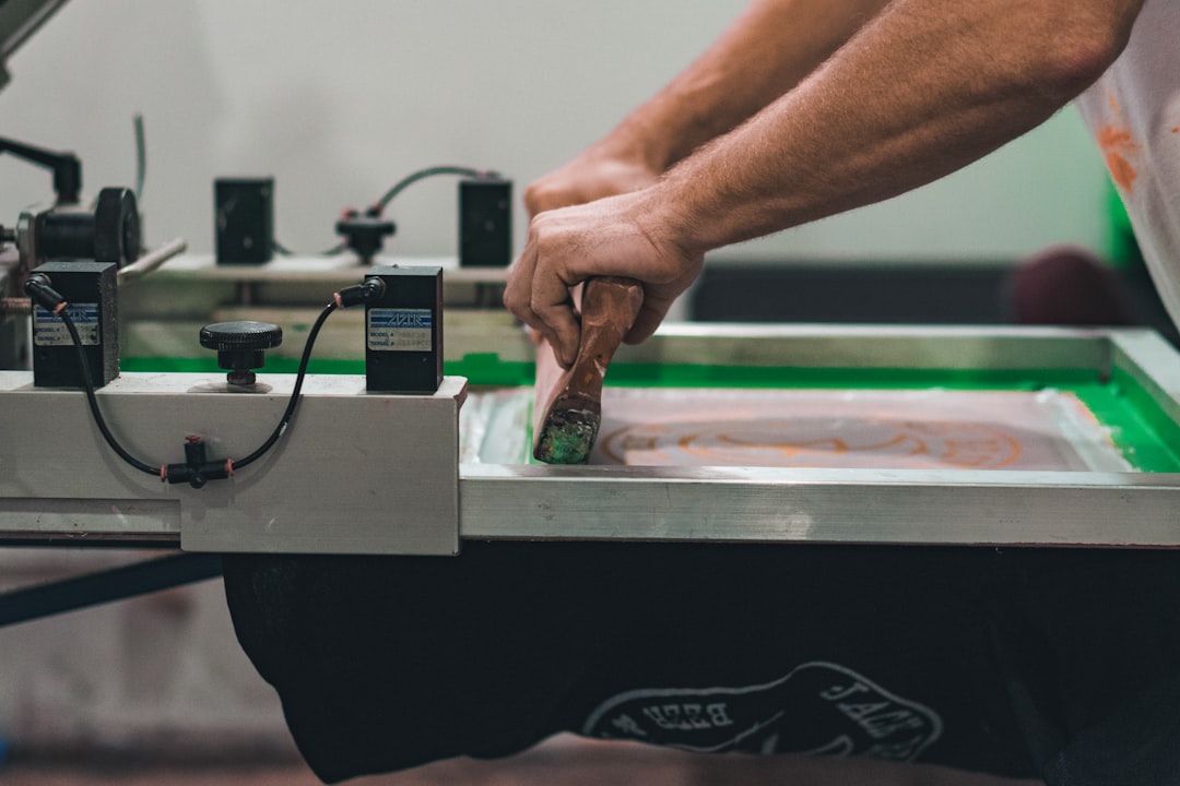
A stencil of your design is created on a fine mesh screen, blocking ink everywhere except the image area. Ink is then pushed through the open mesh onto the garment with a squeegee. Crucially, each color requires its own separate screen, lined up (registered) so the colors stack correctly. This one-screen-per-color reality drives everything: the more colors, the more screens, the more setup cost, which is why a simple two-color design is dramatically cheaper than a six-color one.
Why Color Count Drives Cost
Because each color is a separate screen with its own setup, color count is the single biggest cost lever in screen printing. This is also why screen printing is so cheap at volume: the setup cost is fixed per design, so spreading it across hundreds of shirts makes the per-unit price tiny, while the same job over a dozen shirts is expensive per shirt. The opposite of print on demand, which has no setup but a higher fixed cost per item.
- Keep the palette tight — Design in as few flat spot colors as the concept allows.
- Use the garment as a color — Leaving areas unprinted lets the shirt color show, effectively a free “ink.”
- Order in volume — The whole economic advantage of screen printing appears at quantity.
Spot Color vs Halftones
Screen printing is built for spot color: solid, flat areas of a single ink, ideally specified as Pantone (PMS) colors the printer mixes to match. You cannot print a smooth gradient with one screen. Instead, gradients and shading are faked with halftones, tiny dots that vary in size to simulate tone, the same way newspapers reproduce photos. Halftones let you imply a gradient with one ink, but they add complexity and small dots can be tricky to hold, so use them deliberately. Full photographic art is possible (via four-color process or simulated process) but is advanced and costly; for full color on demand, DTG or DTF is usually the better fit.
Color Separations
Color separations are how your artwork is split into one printable layer per ink. For clean spot-color art this is straightforward, each flat color becomes its own separation. For gradients, the separation includes the halftone screening. Many printers handle separations for you if you supply clean vector art, but understanding them helps you design files that separate cleanly:
- Build art in vector (Illustrator/Affinity) with each color as a distinct, solid shape.
- Avoid overlapping semi-transparent colors, blends, and drop shadows that do not map to a single ink.
- Note where colors abut, the printer may add a small trap or underbase so registration shifts do not reveal gaps.
Screens, Mesh, and Ink
A few production terms worth knowing so you can talk to your printer:
| Term | What it means | Why it matters to you |
|---|---|---|
| Mesh count | Threads per inch on the screen | Higher mesh holds finer detail and thinner ink; lower mesh lays down heavier, bolder ink |
| Plastisol ink | The common, durable PVC-based ink | Vivid, opaque, sits on top of the fabric |
| Water-based / discharge ink | Soaks into the fabric | Softer hand-feel, more “vintage,” best on cotton |
| Underbase | A white layer printed first on dark garments | Makes colors opaque on dark fabric; counts as an extra screen |
For bold, durable prints, plastisol is the default. For a soft, broken-in feel, ask about water-based or discharge inks, just know they work best on cotton and behave differently on dark garments.
Preparing Files for Screen Printing
- Vector, flat color — Build the design in vector with each color as a clean solid shape, in CMYK or with Pantone spot colors specified.
- Outline your fonts — Convert all text to outlines so the printer needs no fonts.
- Mind minimum line weight — Keep lines and small text above roughly 1–1.5pt; very thin elements can break up or fill in.
- Set the print size and placement — Standard front prints are about 11–12 in wide; use the printer’s placement template.
- Flag dark garments — Tell the printer if an underbase is needed so colors stay opaque.
- Confirm color count — Know exactly how many screens your design needs, including any underbase, before you get a quote.
Costs and When to Use It (as of 2026)
Screen printing’s economics are all about setup spread over volume. As of 2026, there is typically a per-screen setup fee plus a per-garment print cost, so small runs feel expensive per shirt while large runs become very cheap per unit. A one- or two-color design over several dozen or more shirts is where screen printing shines, often landing in the rough range of a few dollars to under ten dollars per shirt at quantity. Treat these as planning estimates and get a real quote based on your color count and run size.
Use screen printing when you have a bold design, a tight color palette, and enough volume to justify the setup. For low quantities, full-color art, or no-inventory selling, print on demand with DTG or DTF is the smarter route. The same logic applies whether you are printing tees, hoodies, or a canvas tote bag.
Frequently Asked Questions
What is screen printing and how does it work?
Screen printing pushes ink through a fine mesh stencil onto a garment, with each color requiring its own separate screen registered to align correctly. It produces durable, vivid prints and is the cheapest method per unit at volume, because the fixed setup cost spreads across the run. It is built for bold, flat spot-color designs rather than full-color photographic art.
How many colors can a screen-printed design have?
Technically many, but each color needs its own screen and setup, so cost rises with every added color. Designers keep palettes tight, often one to four flat spot colors, and use the unprinted garment as a free color. A white underbase on dark garments counts as an extra screen, so factor it into your color count.
Can screen printing do gradients?
Not directly with a single ink. Gradients and shading are simulated using halftones, tiny dots that vary in size to imply tone, the same technique newspapers use. Halftones add complexity and small dots can be hard to hold. For smooth full-color gradients, DTG or DTF printing is usually a better and more economical choice than screen printing.
What is a color separation in screen printing?
A color separation splits your artwork into one printable layer per ink, so each color can be burned onto its own screen. Clean flat vector art separates easily; gradients require halftone screening within the separation. Build art in vector with each color as a solid shape and avoid blends or transparencies that do not map to a single ink.
When should I use screen printing instead of print on demand?
Use screen printing when you have a bold design, a tight color palette, and enough volume to justify the per-screen setup, typically dozens of garments or more, where the per-unit cost becomes very low. For small quantities, full-color or photographic art, or no-inventory selling, print on demand with DTG or DTF is the smarter, lower-risk route.


