Hoodie Design: Templates, Placement, and Tips
Hoodie design is where apparel brands make their margin and their statement — a heavyweight fleece is the best canvas you can decorate, with five distinct print zones and a perceived value far above a tee. The catch is that hoodies are unforgiving: thick seams, a kangaroo pocket, and a hood all complicate placement and printing. Get the blank, the placement, and the method right and the hoodie carries the whole brand.
This guide is part of our apparel cluster — for the full picture on building the label around it, see our pillar on clothing brand design and building a label.
Choosing the Blank
The blank decides the product. Fleece weight, measured in ounces or gsm, is the first lever: lighter fleece (8–9 oz) is cheaper and softer for fashion fits, while heavyweight fleece (10–13 oz) reads as premium, holds a big print cleanly, and survives heavy wear. Cotton-rich blends feel better and take water-based ink well; high-poly blends are cheaper but trickier to cure.
- Pullover hoodie — the classic canvas. Uninterrupted back panel, kangaroo pocket on the front to design around.
- Zip-up hoodie — splits the front graphic down the middle, so center-front art rarely works; favor chest and back placements.
- Cropped / oversized cuts — change the available print area and where a graphic visually sits; always check the template against the actual cut.
Order samples in every colorway before committing. “Black” varies between mills, and pocket and hood construction differ enough to break a placement you designed blind.
The Five Print Placements
A hoodie offers more real estate than any other common garment. Plan placements deliberately rather than slapping one logo on the chest.
| Placement | Typical use | Watch out for |
|---|---|---|
| Front (full / centered) | Main graphic on pullovers | The kangaroo pocket — keep art above it |
| Left chest | Logo, ~3.5–4 inches wide | Sits higher than on a tee |
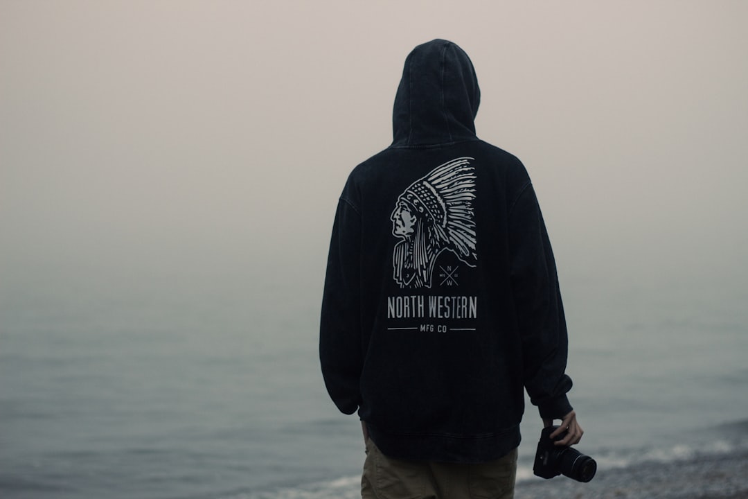
| Full back | Hero graphic, up to ~12×16 inches | Hood seam at the top |
| Sleeve | Text, repeating logo | Print area is narrow; small art only |
| Hood | Text on the hood or back-of-neck | Curved, double-layer fabric |
The kangaroo pocket is the single biggest constraint on a pullover. A full-front graphic must clear it or be designed to interact with it intentionally; printing across the pocket seam usually fails. The hood seam similarly limits how high a back graphic can sit.
Using Templates Correctly
A hoodie template is a flat mockup (usually a layered PSD or vector file) showing the garment with marked print areas and seam lines. Use one to design, but treat its print-area boxes as gospel and verify against the actual blank’s spec sheet.
- Drop your artwork into the template’s smart-object layer to preview scale and position on the real cut.
- Confirm the back graphic clears the hood seam and the front clears the pocket.
- Export a clean mockup for the lookbook and product page, and a separate production file sized to the actual print dimensions.
Print-on-demand platforms like Printful and Printify provide their own templates and exact print-area dimensions per product — design to those numbers, not a generic template, or your art will be auto-scaled.
Decoration Methods for Hoodies
Thick fleece changes how each method behaves. Heat and pressure that work on a thin tee can scorch or under-cure on a hoodie.
- Screen printing — the standard for bold spot-color graphics at volume. Vector art, color-separated, Pantone spot values. Water-based ink soaks into cotton fleece for a soft hand; plastisol pops on dark fabric. See our screen printing basics for curing on heavy fabric.
- Embroidery — excellent on heavyweight fleece for logos and chest hits; high perceived value and durability. Needs a digitized stitch file and proper backing to avoid puckering.
- DTF — full-color film transfers, good for small runs and mixed fabrics; press settings must suit the fleece weight.
- DTG — works on cotton-rich hoodies but the thick pile can muddy fine detail; best for full-color low-volume runs.
Whatever the method, wash-test a sample. Under-cured plastisol cracks, DTF peels if pressed wrong, and embroidery puckers without stabilizer. Approve a physical sample before any bulk run.
File Specs
Match the file to the method. For screen printing and embroidery, supply vector art (Illustrator) with fonts outlined; embroidery additionally needs a digitized stitch file such as .DST, simplified for the fleece pile. For DTG and DTF, supply a transparent PNG at 300 DPI at final print size. Design back graphics at the real dimension — a 13-inch back piece is built at 13 inches, not enlarged from a small file. Keep the adult back print area within roughly 12×16 inches.
Design Tips That Make a Difference
- Mind the pocket. Design the front around the kangaroo pocket from the first sketch, not after.
- Go big on the back. The back is a hoodie’s best feature; a strong back graphic outsells a timid chest logo.
- Use the hood and sleeves. Back-of-hood text and sleeve hits add the brand-world detail that justifies a premium price.
- Account for fabric color. On dark fleece, screen printing needs a white underbase; factor that into ink count and cost.
- Keep type readable. Heavy pile eats fine detail — thicken strokes and open up small text.
Where the Hoodie Sits in the Range
The hoodie is usually a brand’s margin driver and its loudest statement piece, sitting above the tee in price and below outerwear. Pair it with graphic tees as the entry product and caps as a high-margin accessory — our hat and cap design guide covers the embroidery side. For graphic-led labels, the hoodie is the centerpiece of the streetwear graphics and branding approach. Then present the whole line in a cohesive lookbook with strong layout and photography.
Frequently Asked Questions
What fleece weight is best for a hoodie design?
For a premium feel, choose heavyweight fleece around 10–13 oz — it holds large prints cleanly and survives heavy wear. Lighter 8–9 oz fleece is softer and cheaper for fashion fits. Cotton-rich blends take water-based ink and embroidery best; high-poly blends are cheaper but harder to cure.
Where can you print on a hoodie?
There are five common zones: full or centered front (above the kangaroo pocket), left chest, full back, sleeve, and the hood or back-of-neck. The pocket limits front placement on pullovers, and the hood seam limits how high a back graphic can sit. Plan all five deliberately.
How do I design around the kangaroo pocket?
Keep front graphics above the pocket or design them to interact with it intentionally — printing across the pocket seam usually fails. Use a hoodie template to preview scale and position, and verify the art clears the pocket on the specific blank before sending it to production.
What file do I need for a hoodie print?
For screen printing and embroidery, supply vector art with outlined fonts; embroidery also needs a digitized stitch file like .DST. For DTG or DTF, supply a transparent PNG at 300 DPI sized to the final print dimensions. Always design back graphics at their actual size rather than scaling up a small file.
Can you screen print on a hoodie?
Yes — screen printing is the standard for bold graphics on hoodies at volume. Thick fleece needs careful curing, and dark fabric requires a white underbase, which adds an ink layer and cost. Water-based ink gives a soft hand on cotton fleece; plastisol pops harder on dark colors. Always wash-test a sample.


