Lookbook Design: Layout and Photography
Lookbook design is what turns a rack of garments into a brand people want to belong to — it is the editorial document that gives your collection a mood, a world, and a reason to care beyond the product grid. Done well, it does more for perceived value than any single graphic. The two levers are the same as any editorial work: layout and photography, working together to a consistent point of view.
This guide is part of our apparel cluster — for the full label-building picture, see our pillar on clothing brand design and building a label.
What a Lookbook Is (and Isn’t)
A lookbook is an editorial, mood-driven presentation of a collection — styled, art-directed, and sequenced like a magazine. It is not a catalog. A catalog documents products on white seamless with prices; a lookbook sells a feeling and a context, showing how the pieces live together on real people in a real world. You may need both, but never confuse their jobs: the lookbook builds desire, the catalog closes the transaction.
Photography Direction Comes First
The photography is 80% of a lookbook. No layout rescues weak, inconsistent images. Direct the shoot before you design the pages.
- Concept and mood — define the world: location, casting, styling, season, and reference imagery. Every frame should feel like it belongs to one story.
- Consistent color grade — a single, deliberate color treatment across all images is the fastest way to read as a real brand. Mismatched grades read as amateur.
- Shot variety — plan full-length looks, detail crops (embroidery, prints, labels, fabric texture), and lifestyle/context frames. The mix gives a layout rhythm.
- Real context — for streetwear and apparel, on-figure shots in environment beat studio isolation. Show the garment worn and moving.
Shoot more than you need and at high resolution so you can crop into full-bleed spreads without losing quality. The detail shots are where decoration work — a crisp embroidery hit or a textured print — earns its perceived value.
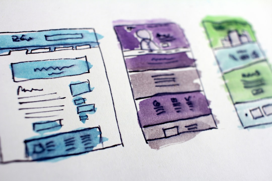
Layout and the Grid
Editorial layout lives on a grid — an underlying column-and-margin structure that keeps every spread aligned and intentional. A consistent grid is what makes a multi-page document feel designed rather than assembled.
- Set a column grid (commonly a flexible 12-column or a simple 2–3 column system) and stick to it across spreads.
- Use generous margins and white space. Editorial restraint reads as premium; crowding reads as a sale flyer.
- Vary the rhythm. Alternate full-bleed single images, two-up comparisons, and image-plus-text spreads so the eye keeps moving.
- Design in spreads, not pages. A lookbook is read as facing pairs; compose left and right together.
Spread types to mix
- Full-bleed hero — one strong image edge to edge to open a section.
- Two-up — a pair of images in dialogue across the gutter.
- Detail grid — three or four crops showing fabric, print, and label.
- Editorial text page — a quote, manifesto, or collection name with deliberate negative space.
Typography in the Lookbook
Type sets the voice. Use your brand’s display face for collection titles and section openers, and a clean, readable workhorse for any body copy, captions, or product lists. Keep the type system tight — one or two families — and let it sit quietly against the images. Captions and any product index should be small, consistent, and out of the way; the photography leads.
Sequencing the Story
A lookbook is read in order, so sequence it like a narrative: open with a strong hero, group looks into a coherent flow (by mood, color story, or chapter), build to highlight pieces, and close on a memorable frame or the logo. Pacing matters — alternate loud full-bleeds with quieter spreads so nothing feels relentless. This is where the hero garments earn their place: lead with the hoodie and standout streetwear graphics that define the drop.
Formats and Specs
Decide where the lookbook will live, because it changes the build.
| Format | Specs | Notes |
|---|---|---|
| Print booklet | CMYK, 300 DPI, bleed + crop marks, export PDF/X | Premium, tactile; budget for paper stock |
| Digital PDF | RGB, screen-resolution, hyperlinked | Easy to send to buyers and press |
| Web / scroll | RGB, optimized images, responsive | Lives on the site, drives sales directly |
| Social / vertical | 9:16 crops from the same shoot | Repurpose lookbook frames for feed and stories |
For print, work in CMYK at 300 DPI with proper bleed and export to PDF/X for the printer. For digital and web, work in RGB at screen resolution and compress images so pages load fast. Shooting at high resolution from the start lets one shoot feed all four formats.
Tools and Workflow
Lay out multi-page lookbooks in Adobe InDesign — it is built for grids, master pages, and print export in a way Photoshop and Canva are not. Retouch and color-grade images in Photoshop (or Lightroom for the grade), keep all images in one consistent treatment, and place them into the InDesign grid. Keep a packaged folder with linked images and fonts so the file moves cleanly to a printer.
Tying It Together
The lookbook is the capstone of the apparel system: it presents the garments, the decoration craft, and the brand world as one coherent statement. Whether the line is graphic streetwear, embroidered caps, or heavyweight hoodies, the lookbook is where customers decide the brand is real. For the wider merch ecosystem, our merch design guide covers how it all connects.
Frequently Asked Questions
What is the difference between a lookbook and a catalog?
A lookbook is an editorial, mood-driven presentation that sells a feeling and shows garments styled on real people in context. A catalog documents products on plain backgrounds with prices to drive transactions. The lookbook builds desire and brand world; the catalog closes the sale. Many brands produce both for different jobs.
What software is best for lookbook design?
Adobe InDesign is the standard for multi-page lookbooks — it handles grids, master pages, spreads, and print-ready export far better than Photoshop or Canva. Use Photoshop or Lightroom to retouch and color-grade the images consistently, then place them into the InDesign grid and package the file for the printer.
How many photos should a lookbook have?
Quality and consistency matter more than quantity, but a focused lookbook usually runs 10–30 strong images mixing full-length looks, detail crops, and lifestyle frames. Shoot more than you need at high resolution so you can crop into full-bleed spreads and repurpose frames for web and social without losing quality.
What resolution do I need for a print lookbook?
Work in CMYK at 300 DPI with proper bleed and crop marks, and export to PDF/X for the printer. Shoot at high resolution so images stay sharp at full-bleed sizes. For digital or web versions, use RGB at screen resolution and compress the images so pages load quickly without visible quality loss.
How do I make a lookbook look professional?
Three things: a consistent color grade across all photography, a disciplined grid with generous white space, and a tight typography system of one or two faces. Direct the shoot to one clear mood, sequence the spreads like a story, and let the images lead while type stays quiet. Consistency reads as premium.