Texture in Design Explained
Texture in design is the quality that makes a surface look or feel a certain way — gritty, soft, woven, paper-like — and it is one of the most underused tools for adding depth and interest. A flat design can read as cold or generic; the right texture gives it warmth, tactility, and a sense of the physical world. The two core categories are visual and tactile texture, and learning to deploy them without cluttering a layout is part of our wider design principles guide. It pairs naturally with composition in design, where surface quality supports the overall arrangement.
What is the difference between visual and tactile texture?
Texture splits into two fundamental types, and the distinction matters because it changes how and where you can use it.
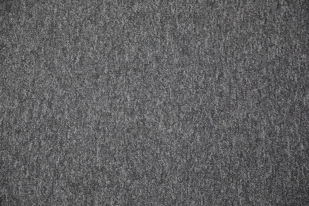
- Visual texture is the illusion of texture — a printed or digital surface that looks rough, grainy, or woven but is physically smooth. A photo of weathered wood, a grain overlay, or a subtle paper background all create visual texture. This is the type designers work with on screens and most print.
- Tactile texture is real, physical texture you can actually feel — embossing, letterpress impressions, spot UV varnish, raised foil, the weave of a cotton card stock. It exists only in physical objects, and it adds a sensory dimension no screen can replicate.
On the web and in flat graphics you are almost always creating visual texture; in premium print and packaging you can add genuine tactile texture. Both aim at the same goal — making a surface feel less flat and more real.
What does texture actually do for a design?
Texture earns its place by adding qualities that flat color and shape cannot. It creates depth, evokes mood and material, and gives the eye subtle detail to linger on. A grainy film texture signals nostalgia; a clean linen texture signals craft and quality; a concrete texture signals industrial modernity. Texture, in other words, carries emotional and material associations instantly.
| Texture type | What it adds | Common use |
|---|---|---|
| Grain / noise | Warmth, analog nostalgia, depth | Posters, illustration, gradients |
| Paper / canvas | Craft, tactility, authenticity | Branding, stationery, packaging |
| Photographic texture | Realism, material association | Backgrounds, hero images |
| Overlays / patterns | Subtle interest without clutter | Web sections, social graphics |
| Embossing / foil (tactile) | Premium, sensory quality | Business cards, luxury print |
Used well, texture is the difference between a design that feels mass-produced and one that feels considered and tangible.
How do grain and noise add depth?
Grain (also called noise) is fine, scattered speckling layered over a design. It is having a major moment in contemporary work because it counteracts the sterile flatness of pure digital gradients and solid colors. A light grain overlay on a gradient prevents banding, adds analog warmth, and gives the surface a film-like depth.
The key is restraint: grain works best when it is felt more than noticed, sitting at low opacity so it enriches the surface without competing with content. Push it too hard and it reads as a defect rather than a finish. This subtlety is what separates tasteful texture from visual noise that undermines your hierarchy.
How do paper and material textures build authenticity?
Paper texture — and its cousins like canvas, linen, and kraft — instantly signals craft, warmth, and authenticity. A faint paper background warms up a layout that would otherwise feel clinical, which is why so much branding for artisanal, wellness, and heritage products leans on it. The texture borrows the credibility of a physical, handmade object.
In print you can go further and make the texture literally tactile, choosing an uncoated, toothy stock or adding embossing so the audience feels the quality. That sensory layer is a genuine differentiator — a letterpressed business card communicates care before a single word is read. When you want a design to feel grounded and human rather than slick and digital, material texture is the fastest route there, and it complements warm, natural palettes like those in our balance in design discussion.
How do you use texture without cluttering a layout?
Texture’s biggest risk is competing with content. The discipline is to treat texture as a supporting layer, not a star: keep it low-contrast, low-opacity, and confined to backgrounds or accents rather than over critical text. A textured background behind clean type works; texture laid directly over body copy destroys readability.
Three working rules keep texture in check. First, contrast matters — never let texture reduce the legibility of text or the clarity of a focal point. Second, consistency matters — pick one texture language and use it throughout, rather than mixing grain, paper, and pattern at random. Third, less is more — a hint of texture reads as premium, while heavy texture reads as busy. Applied this way, texture deepens a design without disturbing the layout principles holding it together.
Where does texture fit alongside the other design principles?
Texture rarely works alone; it amplifies the other principles. It can reinforce a focal point (a textured panel that frames the subject), support balance (texture as visual weight on one side of an asymmetric layout), or strengthen movement (a directional grain that nudges the eye). Think of it as a finishing layer applied after structure, hierarchy, and composition are already sound.
That sequencing is the takeaway: get the bones right first — grid, hierarchy, and composition — then add texture to give the finished piece warmth and depth. A texture cannot rescue a weak layout, but it can elevate a strong one from correct to memorable. For the structural foundation that should come first, start with our grid principles guide.
Frequently Asked Questions
What is texture in design?
Texture in design is the perceived surface quality of an element — rough, smooth, grainy, woven, or layered. It comes in two forms: visual texture, which only looks tactile, and tactile texture, which can be physically felt. Texture adds depth, warmth, and realism, lifting flat designs off the page.
What is the difference between visual and tactile texture?
Visual texture is the illusion of a surface — a grain overlay or photo of wood that looks rough but is physically smooth, used on screens and most print. Tactile texture is real and can be felt, like embossing, letterpress, or textured paper stock, and exists only in physical objects.
Why is texture important in graphic design?
Texture adds depth, warmth, and material association that flat color and shape cannot provide. It signals mood instantly — grain for nostalgia, paper for craft, concrete for industrial modernity — and gives the eye subtle detail. Used well, it makes a design feel considered and tangible rather than mass-produced.
How do you add texture without cluttering a design?
Keep texture low-contrast and low-opacity, confined to backgrounds and accents rather than over critical text. Use one consistent texture language throughout, and remember less is more — a hint reads as premium while heavy texture reads as busy. Never let texture reduce the legibility of text or the clarity of a focal point.
What is grain texture in design?
Grain, also called noise, is fine scattered speckling layered over a design. It counteracts the flat, sterile look of pure digital gradients and solid colors, adding analog warmth and film-like depth while preventing color banding. It works best at low opacity, felt more than noticed, so it enriches without competing with content.


