Spotify Cover Art: Sizes and Design Tips
Spotify cover art has to win at two extremes: the crisp full-resolution view and the tiny square thumbnail that’s the size of a fingernail on a phone. If your art doesn’t read at that small size, it doesn’t matter how beautiful it looks zoomed in. This guide gives you the exact Spotify dimensions for releases, playlists, and profiles, plus the design tips and safe zones that make cover art work at thumbnail scale.
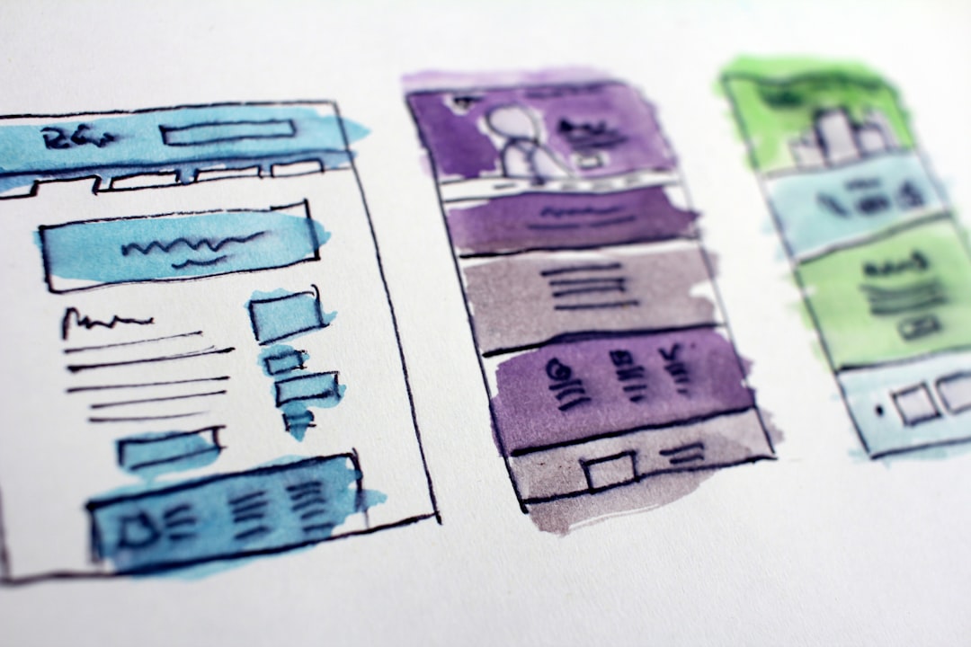
Everything here builds on solid album cover design — the same square, the same need for hierarchy and legibility. Spotify just enforces specific specs and crops that you have to design around.
Spotify Cover Art Sizes
Spotify and the distributors that deliver to it all require a square image. Release cover art (uploaded through your distributor) must be at least 3000 × 3000 pixels in RGB, as JPG or PNG. Other Spotify image slots have their own dimensions:
| Image type | Recommended size | Shape / notes |
|---|---|---|
| Release cover art (single/album) | 3000 × 3000 px (min) | Square; RGB JPG/PNG; via distributor |
| Playlist cover | 300 × 300 px (min) | Square; uploaded in-app/desktop |
| Artist profile image | ~750 × 750 px or larger | Often shown in a circular crop |
| Canvas (looping visual) | 1080 × 1920 px | Vertical 9:16 video/still loop |
When in doubt, upload larger than the minimum and keep the image square. Spotify and your distributor downscale from your file, so a bigger, sharp source produces cleaner thumbnails.
What Spotify (and Distributors) Reject
Cover art gets bounced for content reasons, not just size. Before you submit, make sure your art avoids the common rejection triggers:
- No URLs, web addresses, or social handles.
- No contact info or pricing.
- No third-party logos or trademarks you don’t own.
- No blurry, pixelated, or non-square images.
- No misleading text (e.g., other artists’ names you’re not featuring).
These rules come from the streaming platforms and distributors, so they apply across services, not just Spotify. Double-check spelling too — a typo on the cover means re-uploading and waiting on re-review.
Design for the Thumbnail First
On a phone, your cover most often appears as a tiny square in search, playlists, and the now-playing bar. That small size is the real design target. The discipline is the same one good mixtape cover art relies on: build for small, then make sure it still rewards a closer look.
- Shrink your canvas to ~75px wide and design while watching that preview.
- Use a strong focal point or dominant color for instant recognition.
- Keep type bold and high-contrast; thin hairline fonts disappear.
- Simplify detail until the small version is unmistakable.
Safe Zones and Cropping
Spotify displays your square art in several contexts, and a few of them crop it. Profile images and some UI elements use a circular crop, which cuts off the corners of a square. Cover art is generally shown square, but keeping margins is still smart.
- Keep critical elements centered, away from the corners and edges.
- Assume a circular crop for any profile-style image — nothing important in the corners.
- Leave a small safe margin so titles and faces never hug the edge.
- Avoid edge-to-edge fine text; it’s the first thing lost in compression and cropping.
Color and Legibility Tips
Spotify cover art is delivered in RGB, so you can use brighter, more saturated screen colors than print allows — lean into that for thumbnail punch. A dominant hue is one of the fastest recognition cues a listener has. Just watch out for streaming compression: heavy gradients and very dark, detailed shadows can band or smear, so simplify where you can.
For type, contrast is everything at small size. Separate text from the background with value, a solid panel, or a subtle scrim. If you’re choosing a display-and-text pairing for the cover, our font pairing guide covers how to keep two faces legible and balanced.
Where Your Cover Art Actually Appears
It’s worth knowing the real contexts your square has to survive, because each one stresses the art differently. Designing with these in mind is what separates covers that “look fine in Photoshop” from covers that perform in the app.
- Search results: a small square next to text — recognition has to be instant.
- Playlist and album lists: tiny stacked thumbnails competing with dozens of others.
- Now-playing bar: a fingernail-sized square at the bottom of the screen.
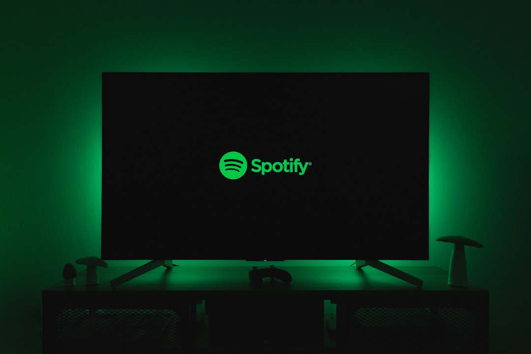
- Full now-playing screen: the one place the art gets to be large and rewarding.
- Profile and circular crops: corners cut off, so center your key elements.
The lesson is consistent: the large, beautiful view is the exception, not the rule. Most impressions are tiny, so the small size is the design that matters. Win the thumbnail and the full-size view takes care of itself.
Building a Consistent Cover System
Your Spotify presence isn’t one image — it’s a release cover, single covers, playlist art, a profile image, and optionally a Canvas. Treat them as a family. Shared palette, shared type, and a recurring motif make an artist instantly recognizable as listeners scroll, and they make a small catalog look intentional and established.
A simple way to build this is to design the flagship release cover first, then derive the rest from it: pull the same dominant color and typeface into the singles, echo the motif on playlist covers, and reuse it on the profile image while respecting the circular crop. Lock your hex values and font names in a tiny style note so every future upload stays on-brand without guesswork.
Use Spotify Canvas
Beyond the static cover, Canvas is Spotify’s short looping visual (vertical 1080 × 1920) that plays behind a track on the now-playing screen. Treat it as an extension of your cover’s visual world — same palette, same motif, same type — so the static art and the loop reinforce one identity. Keep it simple; a subtle moving texture or a slow loop reads better than a busy clip.
Frequently Asked Questions
What is the correct size for Spotify cover art?
Release cover art must be a square image at least 3000 × 3000 pixels, in RGB, saved as JPG or PNG, and uploaded through your distributor. Playlist covers can be as small as 300 × 300 pixels. Always upload larger than the minimum and keep the image perfectly square for clean thumbnails.
Why was my Spotify cover art rejected?
Common reasons are including URLs, social handles, contact info, pricing, or third-party logos and trademarks you don’t own. Blurry, pixelated, or non-square images and misleading text also get rejected. Fix the flagged issue, double-check spelling, re-export at 3000 × 3000 px RGB, and resubmit through your distributor.
What is Spotify Canvas?
Canvas is a short, looping vertical visual (1080 × 1920, 9:16) that plays behind a song on the now-playing screen. Use it as an extension of your cover art — same palette, motif, and type — so the static and moving visuals reinforce one identity. Keep the loop simple and subtle rather than busy.
How do I make my cover art readable as a thumbnail?
Design at thumbnail scale by shrinking your canvas to about 75 pixels wide and checking constantly. Use a strong focal point or dominant color, keep type bold and high-contrast, and simplify detail until the small version is unmistakable. Thin fonts and fine textures disappear, so push weight and contrast up.
Should Spotify cover art be RGB or CMYK?
RGB, because Spotify is a digital, screen-only platform. RGB lets you use brighter, more saturated colors than print allows, which helps thumbnails pop. CMYK is only for printed formats like vinyl jackets and CD booklets. If your release has both, prepare separate RGB and CMYK versions of the art.