Halloween Poster Design: Spooky Done Right
A great Halloween poster is built on contrast and confidence — not clip-art cobwebs. The difference between “atmospheric” and “cheap” comes down to a disciplined high-contrast palette, bold display type, and one strong focal image. This guide covers the color, typography, sizes, and print specs that make spooky read at a glance from across a room.
Posters live or die on impact at distance, so Halloween’s loud, theatrical conventions are a gift — use them deliberately. For the wider seasonal toolkit, see our holiday design guide, then come back here for the Halloween playbook.
What Makes a Halloween Poster Work
Posters are read fast and from far away. Everything else flows from three priorities:
- One focal point — a single dominant image or headline that grabs attention before anything else registers.
- Extreme contrast — Halloween’s whole mood depends on it. Light shapes on near-black backgrounds, or glowing accents against deep shadow.
- A clear hierarchy — event name, then date and time, then venue and details, in descending size order so the eye flows top to bottom.
If a viewer can read the event and the date from across a room, the poster is doing its job. Everything decorative is in service of that.
The most common way Halloween posters fail is not being too plain — it is being too busy. Designers reach for fog, spiderwebs, bats, skulls, dripping blood, and three horror fonts all at once, and the result is visual noise where nothing reads. The antidote is brutal editing: pick one hero element, build the darkness around it, and delete every decorative thing that does not make that hero stronger. Atmosphere comes from contrast and restraint, not from cramming the frame.
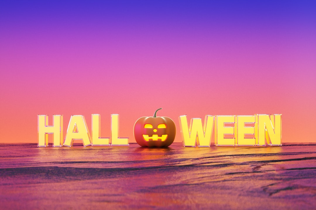
Halloween Color: High-Contrast Orange and Black
The defining Halloween palette is orange and black, and the emphasis is on contrast more than the specific hues. Build on a deep, near-black base and let a single glowing color cut through it. Strong accent options:
- Pumpkin orange — the classic, warm and unmistakable.
- Acid or toxic green — eerie, great for a “potion” or zombie angle.
- Deep purple — mysterious and slightly more upscale.
- Blood red — high-drama, for horror-leaning events.
Avoid mid-tones and muddy mixes — they flatten the drama. Pure darks against one bright accent is what makes Halloween look intentional rather than amateur. For print, build in CMYK; for a poster going online or on social, build in RGB so the glowing accents stay vivid on screen.
You can also tune the sub-genre with color alone. Pumpkin orange on black skews fun and family-friendly — think trick-or-treat and party. Acid green or blood red on black skews toward genuine horror. Deep purple and black feels mysterious and a touch upscale, good for a masquerade or an adult event. Decide which Halloween you are throwing, then let the accent color carry that decision before any imagery does. A glow or light-bloom effect on the accent — text or a shape that looks lit from within against the dark — is the single most effective way to make a Halloween poster feel atmospheric rather than flat.
Halloween Typography
Halloween is where loud type belongs. The two faces that define the season are bold display fonts (heavy, condensed, or hand-drawn horror styles) and blackletter (the gothic, medieval texture that reads as old, dark, and ominous). Use one of these for the event name at large size, then pair it with a clean condensed sans for the date, time, and details so the practical information stays legible.
The rule still holds: one expressive display face, one neutral workhorse. A poster set entirely in a distressed horror font becomes unreadable. For pairing the right display face with a legible support font, our font pairing guide is the reference to use.
Halloween Poster Sizes
Standard poster sizes fit frames, printer presets, and display stands without custom trimming. Pick by where the poster will live:
| Size | Dimensions | Best for |
|---|---|---|
| Tabloid | 11 × 17 in | Shop windows, flyers, bulletin boards |
| Standard poster | 18 × 24 in | The default event poster |
| Large poster | 24 × 36 in | Movie-poster scale, maximum impact |
Match size to viewing distance. An 11 × 17 works pinned to a board people walk past closely; a 24 × 36 earns its size on a wall seen from across a venue. A useful gut check: stand back at the distance people will actually view the poster, shrink the design on your screen to match, and confirm the event name and date still read. If they vanish, your headline is too small or your contrast is too weak — fix it before printing, not after.
Print Specs for Halloween Posters
Dark designs are the most likely to show printing problems — banding, muddy shadows, washed-out blacks — so the specs matter even more here:
- Resolution: 300 DPI for print.
- Color mode: CMYK. For deep blacks, use a rich black build rather than 100% K alone so large dark areas print solid.
- Bleed: 0.125″ on every edge; keep critical text at least 0.25″ inside the trim.
- File: press-ready PDF with crop marks for commercial printing; high-resolution JPG or PNG for in-house or online printers.
Digital and Social Versions
Most Halloween posters also need a social life. Build the print poster first in CMYK at 300 DPI, then export a separate RGB version resized for screen — do not just upload the print file. Common targets:
- Instagram post: 1080 × 1080 px (square) or 1080 × 1350 px (portrait).
- Story / Reel cover: 1080 × 1920 px (vertical).
- Facebook event cover: roughly 1200 × 628 px.
When resizing, re-check that the headline and date are still legible at thumbnail scale — what reads on a 24-inch poster can vanish on a phone.
Tools for Halloween Poster Design
- Adobe Photoshop — best for atmospheric, photo-based and textured horror compositions.
- Adobe Illustrator — best for bold, vector, type-led posters that scale to any size.
- Adobe InDesign — best for posters with structured detail blocks and precise print setup.
- Canva — fastest for quick event flyers and social-only versions from templates.
Designing for a different season next? The same impact-first thinking carries into festive work like Christmas card design and the romantic register of Valentine’s Day design.
Frequently Asked Questions
What colors are best for a Halloween poster?
High-contrast orange and black is the defining Halloween palette. Build on a deep, near-black base and add one glowing accent — pumpkin orange, acid green, deep purple, or blood red. Avoid muddy mid-tones, which flatten the drama and make the poster look amateur.
What fonts work for Halloween design?
Use a bold display font or blackletter for the event name to set a loud, gothic, ominous tone. Pair it with a clean condensed sans for the date, time, and venue so the practical details stay legible. Limit yourself to one expressive face plus one neutral workhorse.
What size should a Halloween poster be?
Common sizes are 11 × 17 inches for flyers and windows, 18 × 24 inches for the standard event poster, and 24 × 36 inches for maximum wall impact. Match the size to viewing distance — larger posters for spaces seen from across a room.
How do I get deep blacks to print well?
Build print files at 300 DPI in CMYK and use a rich black mix rather than 100% K alone for large dark areas, so they print solid instead of washed-out. Add 0.125 inch bleed and keep critical text at least 0.25 inch inside the trim line.
How do I make a spooky design that doesn’t look cheap?
Commit to one strong focal image, use extreme contrast rather than clip-art clutter, and limit yourself to one display font plus one clean support font. Restraint and a clear hierarchy read as intentional and professional; piling on every spooky motif reads as cheap.


