Thank You Card Design: Ideas and Wording
A great thank you card design gets out of the way of the message. The whole point is sincerity, so the design should feel calm, refined, and personal — a quiet frame for the words that matter. This guide covers the color, typography, sizes, and print specs that read as genuine, plus wording examples for both personal thank-yous and business notes.
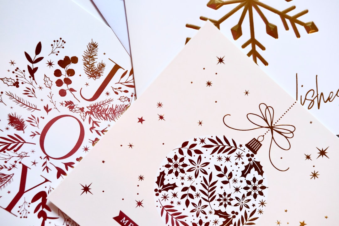
Where a birthday card can be loud, a thank-you card earns trust by being understated. For the wider seasonal and occasion toolkit, see our holiday design guide, then use this page for thank-you specifics.
Thank You Card Ideas
The best thank-you cards lean simple. Pick one calm direction:
- Minimal type-led — “Thank You” set in an elegant script or refined serif, centered, with generous white space. Timeless and works for any occasion.
- Subtle pattern — a soft botanical, geometric, or hand-drawn motif behind quiet type, in a muted palette.
- Branded business card — your logo, brand colors, and a short professional message, for client and customer thank-yous.
- Photo note — a small photo (event, product, or team) with a brief handwritten-style line.
- Letterpress-inspired — deep impression type on heavy stock for a premium, tactile feel.
Restraint is the whole strategy. A thank-you card crowded with motifs and bright colors undercuts the sincere tone it is meant to convey.
Thank You Card Color and Typography
Keep the palette quiet and warm: soft neutrals, cream, sage, dusty blue, blush, or a single muted brand color. Avoid high-saturation brights — calm color reads as sincere, loud color reads as a sale. For business cards, stay on-brand but dial saturation down a notch from your usual marketing palette.
For type, pair a subtle script or refined serif for the “Thank You” headline with a quiet serif or sans for the body. The headline can carry a touch of warmth; the message stays plain and legible so it feels like a real note, not a poster. Two typefaces is the ceiling. Our font pairing guide covers choosing a script or serif that feels sincere rather than fussy.
Thank You Card Wording: Personal
The design frames the words, but the words do the work. A good thank-you note names the gift or gesture, says what it meant, and looks forward. Examples you can adapt:
- For a gift: “Thank you so much for the beautiful vase — it has already found a home on our table. We’re so grateful you thought of us.”
- For help: “I can’t thank you enough for stepping in last week. It made all the difference, and I won’t forget it.”
- For hospitality: “Thank you for having us — the dinner, the company, all of it. We left feeling thoroughly spoiled.”
- Short and warm: “Thank you for your kindness. It meant more than you know.”
Always name the specific thing. “Thank you for the gift card” beats “thank you for the gift” — specificity is what makes a note feel real.
Thank You Card Wording: Business
Business thank-yous build relationships, so keep them warm but professional. Adapt these:
- New customer: “Thank you for your order — we’re thrilled to have you as a customer and can’t wait for you to enjoy it.”
- Client: “Thank you for trusting us with this project. It was a genuine pleasure to work with your team.”
- After a meeting: “Thank you for your time today. We’re excited about the path ahead and will follow up shortly.”
- Loyalty: “Thank you for your continued support — customers like you are the reason we do what we do.”
Sign with a real name where possible; a handwritten signature on a printed business card turns a transaction into a relationship.
Thank You Card Sizes and Print Specs
Thank-you cards favor smaller, refined formats. Standard sizes fit stock envelopes and printer presets:
| Size | Dimensions | Best for |
|---|---|---|
| A2 (folded) | 4.25 × 5.5 in | The classic thank-you size, fits A2 envelopes |
| Standard (folded) | 5 × 7 in | A larger, more formal note |
| Flat card | 4 × 6 or 5 × 7 in | Single-sided printed note |
| Mini / enclosure | 3.5 × 5 in | Gift and order inserts |
Production rules:
- Resolution: 300 DPI for print, 72 DPI for screen.
- Color mode: CMYK for print, RGB for digital.
- Bleed: 0.125″ on every edge; text at least 0.125″ inside the trim.
- File: press-ready PDF with crop marks for a printer; high-quality JPG or PNG for home printing.
- Stock: a heavier, uncoated or textured stock reinforces the sincere, tactile feel.
For a folded card, design the flat sheet at double the finished width — 8.5 × 5.5 for an A2 card — as four panels: front, inside-left, inside-right, back. Leave the inside-right clear for a handwritten line.
Digital Thank You Cards
For an emailed thank-you or e-card, export an RGB version at 1200–1500 px wide as a JPG, or use a 600 px-wide banner inside an email. Build the print version first and export the digital one separately. Even digitally, a short personal line beats a polished template message — sincerity scales poorly when it sounds automated.
Tools for Thank You Card Design
- Canva — fastest for simple type-led cards and business thank-yous, with print ordering built in.
- Adobe Illustrator — best for refined vector type and brand-consistent cards.
- Adobe InDesign — best for folded cards and batch business runs.
- Adobe Photoshop — best for photo notes and textured backgrounds.
Designing personal cards across occasions? See birthday card design for a step-by-step build, and Christmas card design for the festive version of the same craft.
Frequently Asked Questions
What size is a standard thank you card?
The classic thank-you card size is the A2 folded card at 4.25 × 5.5 inches, which fits standard A2 envelopes. A 5 × 7 inch card is used for more formal notes, and 3.5 × 5 inch mini cards work as gift and order enclosures. Design folded cards at double the finished width.
What should I write in a thank you card?
Name the specific gift or gesture, say what it meant to you, and look forward. For example: “Thank you for the beautiful vase — it’s already on our table, and we’re so grateful you thought of us.” Specificity is what makes a thank-you note feel genuine rather than generic.
What colors work for a thank you card?
Use quiet, warm tones — cream, soft neutrals, sage, dusty blue, or blush — or a single muted brand color for business cards. Avoid high-saturation brights, which read as a sales message. Calm color supports the sincere tone a thank-you card is meant to convey.
How do I write a business thank you card?
Keep it warm but professional: thank the customer or client specifically, mention what you valued, and sign with a real name. For example: “Thank you for trusting us with this project — it was a genuine pleasure to work with your team.” A handwritten signature adds a personal touch.
What fonts are best for a thank you card?
Pair a subtle script or refined serif for the “Thank You” headline with a quiet serif or sans for the message. The headline carries warmth while the body stays plain and legible, so the card reads like a sincere note. Limit yourself to two typefaces.


