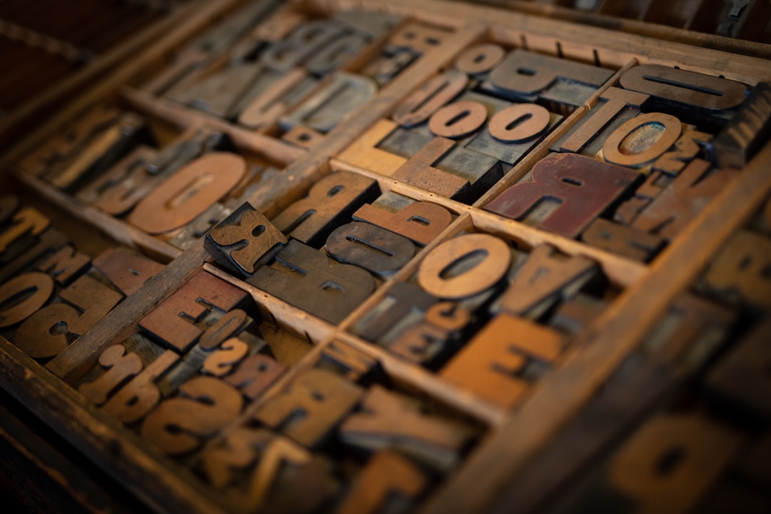
What Makes a Good Font?
What makes a good font is rarely “it looks nice.” A genuinely good font is one whose drawing, spacing, and technical build all serve its intended purpose — whether that purpose is a 9px caption, a billboard headline, or a body of running text. The qualities below are the criteria professional designers actually use to judge type, and once you know them you can evaluate any font in under a minute.
This article is the evaluator’s companion to our pillar on type design and how typefaces are made — the maker’s side of the same coin. Understanding what good looks like is what makes you a better chooser and a better maker.
1. Legibility and Readability Are Not the Same Thing
These two words get used interchangeably, but they measure different things, and good fonts respect both. Legibility is how easily you can distinguish individual characters — can you tell a capital I from a lowercase l from the number 1? Can you separate an O from a 0? Readability is how comfortably you can read whole words and paragraphs over time, which depends heavily on spacing, rhythm, and proportion.
A font can be legible but exhausting to read in long passages, or comfortable in paragraphs but ambiguous when you need to read a single password. The best fonts balance both for their use case. Features that support legibility — open apertures, distinct letter shapes, a generous x-height — come straight from the vocabulary in our guide to font anatomy.
2. Spacing and Kerning Quality
This is the quality amateurs overlook and professionals notice instantly. Even, confident spacing creates a steady rhythm so words read as smooth units rather than clumps of letters. Clean kerning handles awkward pairs like “AV”, “To”, and “We” so no gap jumps out.
Spacing is the single most reliable tell of a font’s quality. A beautifully drawn alphabet with bad spacing reads poorly; an averagely drawn alphabet with excellent spacing reads well. To test a font quickly, set a paragraph of real text and look for uneven gaps, letters that crash together, or words that seem to pulse. If the rhythm is even, the font was built by someone who cared.
3. Consistent Stroke Modulation
Stroke modulation is the way thickness varies within and across letters. In a good font, that variation follows a consistent logic: every stem shares a weight, every thin stroke thins by the same amount, and the contrast between thick and thin is uniform across the whole alphabet. When stroke weight wobbles from letter to letter, the typeface looks unsteady even if you cannot say why.
Check this by setting the lowercase alphabet and scanning the vertical stems of n, m, h, and r. They should all read as the same weight. Inconsistent modulation is one of the clearest signs of an amateur or auto-generated font.
4. Adequate Glyph and Language Coverage
A font is more than 26 letters. A professional font includes the full character set you will actually need:
- Accented characters for the languages you support — é, ñ, ü, ç, and many more.
- Punctuation done properly — real curly quotes, en and em dashes, not just the typewriter basics.
- Numerals, ideally with both lining and old-style figures, plus currency symbols.
- Ligatures like “fi” and “fl” to avoid letter collisions.
- Multiple weights and an italic so the font can carry a whole project.
A font that only covers basic English will fail the moment you need a name with an accent or a price in another currency. Broad glyph coverage is a hallmark of serious type. This matters most when you license a font for real work — see our font licensing guide for how to confirm what a license and a font actually include.
5. Proper Hinting and Technical Quality
A good font is built correctly under the hood. Hinting — instructions that tell screens how to render outlines on the pixel grid — keeps text crisp at small sizes, especially on lower-resolution displays. Beyond hinting, a quality font has clean vector outlines with no stray points, correct metrics, and well-formed files in the right formats.
If you are choosing a font for the web, the technical side decides whether it loads fast and renders sharply. Our guide to font file formats explains which files (WOFF2 for the web, OTF/TTF for desktop) signal a properly packaged, modern font.
6. Fit for Purpose
This is the quality that overrides all the others: a good font is good for its job. There is no universally best font, only the right font for a context. A face engineered for tiny UI labels is wrong for a wedding invitation, and a romantic script is wrong for a data table.
| Use case | What to prioritize |
|---|---|
| Long-form body text | High x-height, open counters, even rhythm, comfortable readability |
| UI and small captions | Strong legibility, distinct I/l/1, good hinting, wide spacing |
| Headlines and display | Distinctive character, tight kerning at large sizes, personality |
| Branding and logos | Distinctiveness, broad weights, clear licensing for commercial use |
This is why pairing matters as much as choosing: a good font becomes a good system when matched well with others, the subject of our font pairing guide. And when a project’s purpose is unique enough, the best-fitting font may be one made on purpose — see custom font design for brands.
A Quick Test for Any Font
Put a font through this fast checklist before you commit:
- Set a paragraph of real text — is the spacing even and the reading comfortable?
- Type “Illinois 1lI0O” — can you tell the ambiguous characters apart?
- Scan the stems — is the stroke weight consistent across letters?
- Check for accents, curly quotes, and multiple weights — is coverage complete?
- View it at the size you will actually use — does it hold up there?
If a font passes all five, it is a good font for your purpose. If you are choosing where to get fonts that meet this bar, our roundup of where to download fonts points to reputable sources.
Frequently Asked Questions
What is the most important quality in a good font?
Fit for purpose comes first — the best font is the one suited to its specific job. After that, even spacing is the most reliable single indicator of quality, because professional spacing is hard to fake and instantly affects how comfortably text reads.
What is the difference between legibility and readability?
Legibility is how easily you can distinguish individual characters from one another. Readability is how comfortably you can read words and paragraphs over time. A font can be legible yet tiring to read at length, so good fonts are designed to balance both for their intended use.
Are free fonts ever good fonts?
Yes. Many free fonts, especially from curated libraries, are professionally made with strong spacing and wide coverage. Quality is about the build, not the price. Always check the license, though — a good free font still needs the right license for commercial use, as our licensing guide explains.
How can I tell if a font is poorly made?
Look for uneven spacing, letters that crash or drift apart, inconsistent stroke weight, missing accents or curly quotes, and only a single weight. Bumpy curves with too many points and ambiguous characters (I, l, 1, O, 0 looking alike) are other clear signs of low-quality type.
Does a good font need multiple weights?
For real projects, usually yes. A family with regular, bold, and an italic can carry headings, body text, and emphasis on its own, keeping a design coherent. Single-weight display fonts are fine for one-off headlines but limiting for anything that needs typographic hierarchy.


