Streetwear Design: Graphics and Branding That Actually Land
Streetwear design is graphic-led apparel where the artwork, the typography, and the drop are the product — the blank is just the canvas. The best labels win on a point of view delivered through bold graphics, a tight logo, and disciplined releases, then back it with prints that survive the wash. This guide covers the graphics, the branding, and the production reality.
If you are building the wider business around these graphics, start with our pillar on clothing brand design and building a label — this piece zooms in on the streetwear-specific craft.
What Makes Streetwear Different
Streetwear inverts the logic of a basics brand. A basics line sells fit and fabric with the logo whispered; streetwear sells the graphic and the story, with the garment as a vehicle. That changes every design decision. You spend on large-format prints, statement back hits, and limited runs rather than on an invisible woven label.
Three forces drive the category: scarcity (limited drops create demand), identity (wearing the brand signals belonging to a subculture), and graphics (the art has to stop a scroll and read across a room). If a design does not do at least two of those, it is just a printed tee.
Building the Graphic Language
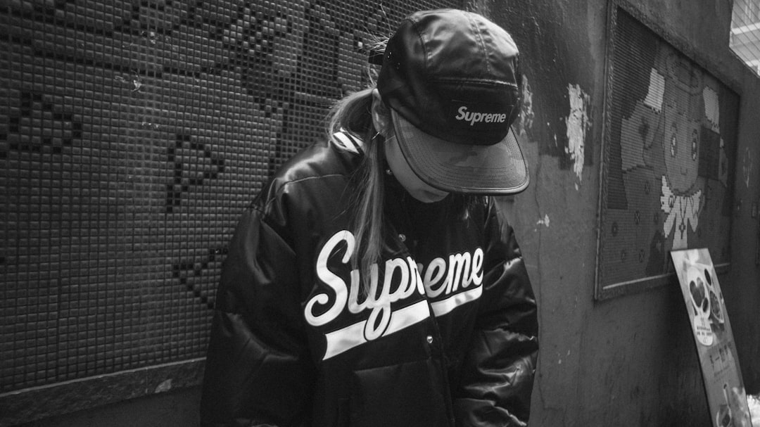
Strong streetwear has a recognizable visual grammar that repeats across drops. Customers should clock your brand from the back of a hoodie before they read the logo.
- A signature motif — a recurring symbol, character, or mark that shows up across releases and builds equity over time.
- A type voice — distorted serifs, gothic blackletter, condensed grotesques, or hand-drawn lettering. Type is often the entire design in this category.
- Placement system — large back graphics, small chest hits, sleeve text, and back-of-neck details used consistently so the line reads as a family.
- A controlled palette — most heat comes from restraint. Two or three colors per graphic also keeps screen printing affordable.
Treat tonal references seriously: thrift-shop nostalgia, Y2K, blackletter and religious iconography, military surplus, anime, and bootleg-band-tee energy are all live veins. Pick a lane and own it rather than sampling all of them.
Typography Carries the Weight
In streetwear, typography often is the graphic. Slogan tees, varsity arches, blackletter back pieces, and stretched logotypes all lean on type doing the heavy lifting. A few working principles:
- Use a display face with attitude for graphics and a clean workhorse for size runs, care labels, and the lookbook.
- Distress, stretch, and warp deliberately — but keep counters open enough to read at thumbnail size on a product page.
- Outline all fonts before sending to print so the decorator does not substitute or break your type.
Drop Strategy and Branding
The release model is part of the design. A drop is a limited, time-boxed release — a finite quantity, a hard on-sale, and rarely a restock. Scarcity is engineered, not faked: small runs, numbered pieces, and seasonal capsules make each release feel like an event and protect resale value, which fuels the next drop.
The branding around the drop matters as much as the garment: the announcement graphic, the lookbook, the packaging, and the woven neck label all reinforce that this is a label, not a print shop. Consistency across those touchpoints is what separates a brand with a following from a Teespring store.
Production: Make It Survive
Heat dies fast if the print cracks after three washes. Streetwear lives and dies on decoration quality.
| Method | Best for | Feel |
|---|---|---|
| Plastisol screen print | Bold graphics on dark garments | Slightly raised, vivid, durable |
| Water-based screen print | Soft, vintage, faded look | Soaks in, soft hand, premium feel |
| DTF | Full-color art, small runs, mixed fabrics | Smooth film, flexible quantities |
| DTG | Photographic, low quantity | Soft but muted on dark garments |
| Embroidery | Logos, hats, premium hits | Textured, high perceived value |
For bold spot-color graphics at volume, screen printing is the workhorse — vector art, color-separated, with Pantone spot values. Water-based ink delivers the soft, broken-in look so prized in the category, while plastisol pops harder on black. For full-color art at low volume, DTF and DTG keep setup costs off the table. Our screen printing basics guide covers mesh, ink, and curing so your prints actually last.
Files and Specs
Send production-ready files every time. For screen printing and embroidery, work in vector (Illustrator) with fonts outlined and each spot color separated. For DTG and DTF, supply a transparent PNG at 300 DPI at final print size. Keep the adult back print area within roughly 12×16 inches, and design at the actual print dimensions so a 14-inch back graphic is built at 14 inches, not scaled up from a thumbnail.
Garments and Range
Streetwear leans on heavyweight blanks — a 6.5–8 oz boxy tee and an 8–13 oz hoodie read as premium and hold a big print better than thin fast-fashion blanks. Build your range across price points: graphic tees as the entry, hoodies as the margin driver and the canvas for back pieces, and caps as a high-margin logo carrier. Plan hoodie placements deliberately with our hoodie design templates and tips, and treat the cap as its own product using our hat and cap design guide.
Sampling Before You Commit
Heat evaporates the moment a print cracks, so never run a drop off an unproven sample. Order a physical proof of every graphic and wash-test it: under-cured plastisol fractures across folds, DTF lifts at the edges if pressed at the wrong temperature, water-based ink can look patchy on dark fleece without a proper underbase, and embroidery puckers without stabilizer. Approve a washed sample, not a fresh one — the customer will wash it, and so should you. Only after a sample survives several cycles do you commit to the run.
Pacing the Brand Across Drops
A single drop is a moment; a brand is a sequence. The labels that last treat each release as a chapter that builds on the last — a recurring motif evolving, a color story shifting with the season, a back graphic that nods to an earlier piece. Resist the urge to dump every idea into one drop. Holding designs back gives you a roadmap, keeps customers anticipating, and lets you learn from each release before committing capital to the next. Reorder the proven winners, retire what underperformed, and let the visual language compound over time. That discipline, more than any single graphic, is what turns a viral tee into an actual label.
Presenting the Drop
Photography sells streetwear as much as the graphic does. A consistent, editorial lookbook with intentional layout and photography turns a printed hoodie into a covetable object and gives each drop a recognizable world. Shoot on real people, in context, with the same color grade across the season.
Frequently Asked Questions
What print method is best for streetwear?
Screen printing is the standard for bold spot-color graphics at volume — durable and cost-effective per unit. Water-based ink gives the soft, vintage feel the category loves; plastisol pops harder on dark garments. For full-color art in small runs, DTF or DTG avoid setup costs while still printing the whole range of color.
How many colors should a streetwear graphic use?
Two to three colors per graphic is the sweet spot. Restraint reads as intentional and confident, and because screen printing prices by color count, fewer colors keep production affordable. Save full-color photographic art for DTG or DTF, where color count does not change the cost.
What is a drop in streetwear?
A drop is a limited, time-boxed release: a finite quantity, a scheduled on-sale, and usually no restock. Engineered scarcity creates urgency and demand, makes each release feel like an event, and protects resale value, which in turn builds anticipation for the next drop.
What garment weight should I use for streetwear?
Use heavyweight blanks: a 6.5–8 oz tee and an 8–13 oz hoodie read as premium, hold a large print cleanly, and resist the thin, fast-fashion feel. Heavier fleece also handles big back graphics and embroidery far better than lightweight blanks, justifying the higher price point.
How do I make a streetwear brand stand out?
Commit to a clear point of view and a recurring visual motif, then express it consistently across graphics, typography, drops, and lookbook photography. Restraint, quality blanks, and durable prints beat volume. A recognizable graphic language customers can spot across a room is what builds a real following.


