Hat and Cap Design: A Practical Guide
Hat design is the highest-margin, most logo-friendly product most apparel brands make — a cap is a wearable billboard with construction choices that change everything about how your mark looks. Get the crown structure, the brim, and the decoration method right and a cap carries your brand harder than any tee. Get them wrong and a beautiful logo collapses on a curved front panel.
This guide is part of our apparel cluster; for the wider business around it, see our pillar on clothing brand design and building a label.
Cap Anatomy and Construction
Before any artwork, decide the blank. Two construction choices dominate how a cap looks and how your logo sits.
| Choice | Options | Effect on design |
|---|---|---|
| Crown | Structured vs. unstructured | Structured holds a tall, firm front panel for clean embroidery; unstructured slouches and curves the art |
| Profile | High, mid, low | Higher crowns give more front-panel area |
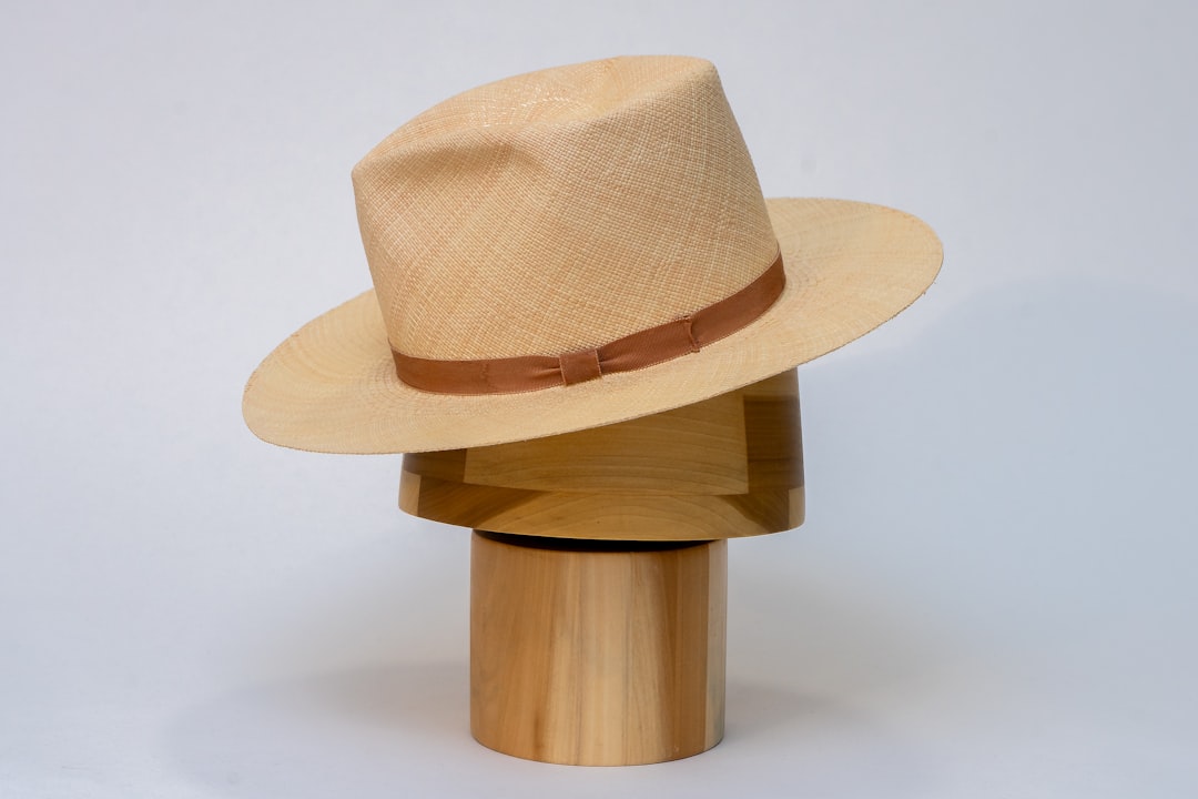
| Brim | Flat vs. curved (pre-curved) | Flat reads as snapback/skate; curved reads classic/dad-cap |
| Closure | Snapback, strapback, fitted, velcro | Affects fit, price, and audience |
| Panels | 5-panel vs. 6-panel | 6-panel has a center seam; 5-panel gives a flat front for bigger art |
A structured cap uses buckram backing to keep the front panel firm and upright — the best surface for crisp embroidery. An unstructured cap (the dad-cap style) is soft and slouchy, so detailed logos can distort. A 6-panel cap has a seam down the center front that splits any logo crossing it, while a 5-panel offers a flat, seamless front for wider art.
The Front-Panel Constraint
The usable embroidery area on a cap front is small — typically around 2 to 2.5 inches tall and roughly 4–5 inches wide, and on a 6-panel cap the center seam eats the middle. This is the defining constraint of hat design. A logo that looks great at 12 inches on a back panel must survive shrinking to two inches on a curved, seamed surface.
- Simplify detail aggressively — fine lines and tiny gaps disappear at cap scale.
- On a 6-panel cap, keep the design clear of the center seam or split it intentionally across both front panels.
- Test logo legibility at the actual 2-inch height before committing.
Decoration Methods
Caps are decorated differently from flat garments. The curved, often double-layer front rules out most ink-on-fabric methods.
- Embroidery — the default for caps. Durable, premium, and built for the structured front panel. Requires a digitized stitch file (.DST is the universal standard). Flat embroidery sits smooth; 3D puff embroidery adds raised foam under the stitches for a bold, high-crown look.
- Woven or leather patch — a pre-made patch sewn or heat-pressed to the front, common on trucker and snapback styles; carries detail that embroidery cannot.
- DTF / heat-applied transfer — possible for full-color art on flat-front caps, but less premium and durability varies with the fabric.
- Screen printing — rare and limited to flat-front, flat-brim styles; embroidery and patches dominate the category.
For the stitch side in depth — digitizing, stitch counts, and file types — see our guide to embroidery design, digitizing, and files.
Embroidery Specs for Caps
Cap embroidery has hard technical limits. Digitizing converts your vector logo into a stitch file, mapping every needle path. The decorator runs that file on a cap-specific machine.
- Minimum text height ~5mm. Smaller lettering fills in and becomes an unreadable blob of thread.
- Stitch count drives cost. Embroidery is priced per thousand stitches; dense fills and large logos cost more, so simplify.
- Thread colors are physical. Map brand colors to thread systems like Madeira or Isacord; most cap jobs run 1–6 thread colors.
- Backing matters. Proper stabilizer prevents puckering on the firm front panel.
Supply the decorator a clean vector logo (Illustrator) for digitizing, plus your target thread colors and the final embroidery dimensions. A good digitizer will flag detail that will not survive at cap scale.
Style Direction
The construction telegraphs the brand before anyone reads the logo. Match the cap to the audience:
- Flat-brim snapback — skate, streetwear, sport. Reads young and graphic.
- Curved-brim dad cap — minimal, classic, lifestyle. Reads understated and premium.
- Trucker (mesh back, foam front) — casual, outdoorsy, ideal for woven patches.
- 5-panel camp cap — fashion-forward, flat front for bigger art.
For a graphic-led label, the cap is a key part of the streetwear graphics and branding lineup, and it pairs naturally with the hoodie as the brand’s accessory tier.
Choosing the Right Blank Supplier
The cap blank matters as much as the decoration. Established headwear makers offer a range of crown heights, panel counts, and brim shapes in consistent quality, and decorators are familiar with how their blanks sew. Order samples of the exact style and colorway before you commit, and check three things by hand: how firm the structured front panel actually is, whether the seam construction suits your logo, and how the brim holds its shape. A soft front on a cap you assumed was structured will distort embroidery, and a slightly different black between batches will undermine a tidy lineup. Lock the blank, then digitize to it.
3D Puff vs. Flat Embroidery
Caps are the one product where raised embroidery is common and worth understanding. Flat embroidery sits smooth against the panel and suits detailed logos, small text, and fine shapes. 3D puff embroidery places a layer of foam under the stitches so bold lettering and simple shapes stand proud of the cap — the classic high-crown sport look. Puff demands simpler artwork: it swallows fine detail and small text entirely, so it works for thick block letters and chunky marks, not delicate logos. The digitizing differs too, since the stitches must wrap and cap the foam cleanly, so tell your digitizer upfront which look you want.
Sampling and Production
Always approve a physical sew-out before bulk production. The first stitched sample reveals whether the digitizing held up, whether the text is legible at size, and whether the thread colors match your intent. Adjust the stitch file, re-sample if needed, then run the batch. Print-on-demand platforms like Printful and Printify offer embroidered caps with fixed front-panel dimensions — design to their exact specs to avoid auto-scaling.
Presenting the Cap
A cap photographs well and anchors a brand’s accessory story. Shoot it on-figure and detail-close in a consistent lookbook with intentional layout and photography so it reads as part of the line rather than an afterthought. For the full merch ecosystem around caps, our merch design guide maps the options.
Frequently Asked Questions
What is the difference between a structured and unstructured cap?
A structured cap uses buckram backing to keep the front panel firm and upright, giving a clean surface for crisp embroidery. An unstructured cap (the dad-cap style) is soft and slouches, so detailed logos can distort on its curved front. Choose structured for sharp logos, unstructured for a relaxed look.
What is the best way to put a logo on a hat?
Embroidery is the default — durable, premium, and built for a cap’s structured front panel. It needs a digitized stitch file. Woven or leather patches carry more detail and suit truckers and snapbacks. Screen printing is limited to flat-front styles, so embroidery and patches dominate cap decoration.
How big can a logo be on a cap front?
The usable front-panel embroidery area is small — roughly 2 to 2.5 inches tall and 4–5 inches wide. On a 6-panel cap the center seam splits the middle, so designs must clear it. Simplify detail and keep text at least 5mm tall so it stays legible at that scale.
What file do I need for hat embroidery?
Supply a clean vector logo (Illustrator AI/EPS) so the decorator can digitize it into a stitch file. The universal stitch format is .DST. Provide your target thread colors mapped to a system like Madeira or Isacord, plus the final embroidery dimensions, and approve a sew-out sample before production.
What does flat brim vs curved brim signal?
A flat brim reads as snapback and streetwear — young, graphic, sport-influenced. A pre-curved brim reads classic and understated, the dad-cap lifestyle look. The brim shape is a branding decision: match it to your audience before choosing crown structure and decoration method.


