Sports Jersey Design: Kits and Numbers
Good jersey design has to win two games at once: it must look great in a close-up photo and stay readable from the back row of the stands. A kit is a piece of functional graphic design where number legibility, print method, and color contrast against opponents matter as much as style. This guide breaks down how to design jerseys that perform on the field and on camera.
Jersey design is the canvas where a team identity lands, so it pairs directly with our guide to sports team logo design, and it sits inside the wider athletic-brand world covered in our pillar on gym branding.
The Anatomy of a Kit
A jersey is a layout problem with fixed zones. Every element has a conventional home, and fans and officials expect them there:
- Front number / crest: the team mark on the chest, sometimes a small front number.
- Back number: the largest element, sized to be read across the field.
- Player name: arched above the back number (the “name bar”).
- Sleeve marks: secondary logo, league patch, or sponsor.
- Sponsor / manufacturer: placed without competing with the number.
Design the whole kit as a set — home, away, and often a third or alternate — so they share a layout language but stay clearly distinct on the field.
Numbers: Legible at Distance Above All
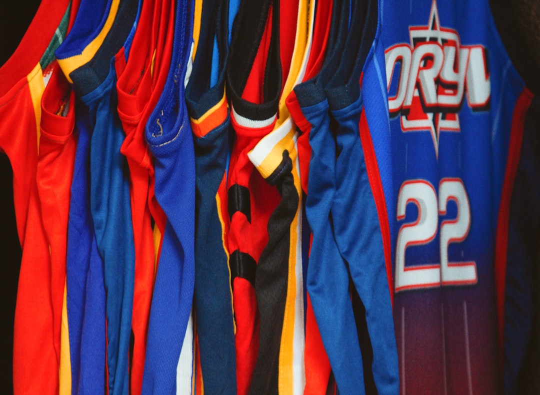
The number is the most important graphic element on a jersey, because it identifies the player for referees, broadcasters, scorekeepers, and fans. Legibility at distance beats style every time. Practical rules:
- Use a bold, simple numeral. Heavy block or rounded numbers read far better than thin or heavily styled ones.
- Maximize contrast. The number must stand out hard against the jersey color; add a contrasting outline if the base color is busy.
- Size for the venue. Back numbers are typically very large — they need to read from the opposite end of a field or court.
- Avoid ambiguous shapes. Some stylized fonts make 3 look like 8 or 6 like 5 at distance. Test before committing.
- Coordinate with the wordmark. The number font should feel like the same family as the team logo and name.
Name and Number Placement
Placement follows strong conventions, and many leagues have exact rules on size and position, so check the governing body’s spec sheet before finalizing. The standard layout is the player name arched above a large back number, with a smaller number on the front or the upper chest. Keep clear space around each element — crowding the name into the number bar kills legibility and looks amateur.
Print Methods: Design for Sublimation
How a jersey is manufactured shapes what you can design. The dominant method for modern polyester sports kits is dye sublimation, where the design is printed into the fabric itself.
| Method | Best for | Design implications |
|---|---|---|
| Sublimation | Polyester kits, all-over graphics | Full-color, gradients, and edge-to-edge patterns are all fine; durable and lightweight |
| Screen print | Cotton tees, simple logos | Limited colors per pass; flat shapes only; cracks over time on stretch fabric |
| Heat-transfer / tackle twill | Stitched names and numbers | Bold flat shapes, premium feel, but heavier and limited detail |
Sublimation’s big advantage is that it lets you run all-over patterns and gradients with no extra cost per color, because the whole design is printed at once — so modern kits can be far more graphic than screen-printed ones. Set up artwork at full size and high resolution, build in CMYK, and add bleed so patterns run cleanly to the seams. Because sublimation only works well on light polyester, very dark all-over designs can shift color, so proof a physical sample.
Color Rules: Contrast With the Opponent
A kit does not exist in isolation — it shares a field with another team and with officials. The core rule is contrast:
- Home vs. away: design a light kit and a dark kit so the two teams never clash on the field.
- Against officials: avoid colors that match common referee uniforms (often black-and-white stripes or bright yellow).
- Number contrast: the number must read against the jersey under stadium lighting and on broadcast.
- Brand consistency: all kit variations should still read as the same team — usually by keeping the crest, type, and one anchor color constant.
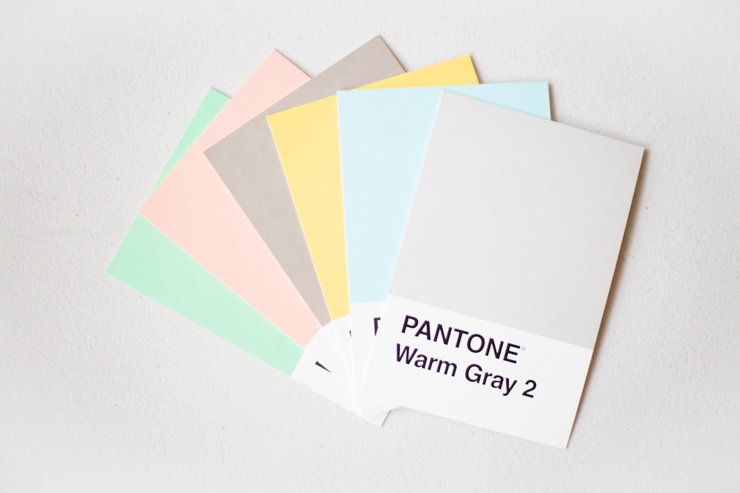
Document exact color values (HEX, RGB, CMYK, and Pantone) so the manufacturer matches your approved colors across fabric batches.
Typography and Graphics
The jersey number font and the name font should belong to the same athletic family as the team wordmark — bold condensed or block faces with a varsity heritage read best and reproduce cleanly. Beyond the essentials, sublimation lets you add identity-carrying graphics: side panels, shoulder yokes, subtle all-over patterns, or a watermark of the crest. Use these to reinforce the brand, not to compete with the number.
Designing Across the Whole Kit
A jersey rarely ships alone. A full kit usually includes the shirt, shorts, and socks, and often a warm-up layer, so design the set as a coordinated system. Shorts typically carry a small logo or number on one leg, and socks pick up an accent stripe or the crest. The pieces should clearly belong together without being identical — a shared palette and one or two repeating graphic devices (a stripe pattern, a shoulder yoke, a side panel) tie them into a family. Plan home, away, and alternate versions at the same time so the alternates feel intentional rather than bolted on later.
Fit, Fabric, and Function
Jersey design is functional apparel, not just graphics on a flat canvas. The artwork wraps around a moving body, so account for how panels, seams, and stretch affect the design. Patterns that line up perfectly on a flat template can break across a side seam, and a number can distort over the curve of a back. Modern athletic polyester is chosen for breathability and moisture-wicking, which is also why sublimation is the natural print partner — the design becomes part of a fabric built to move and breathe. Always check your artwork on the manufacturer’s 3D or garment-shaped mockup, not just the flat layout, before signing off.
Common Jersey Design Mistakes
- Style over legibility: an over-stylized number that looks great in close-up but is unreadable from the stands.
- Low number contrast: a number that disappears against a busy or similar-toned jersey under stadium lights.
- Ignoring the opponent: a kit that clashes with common away colors or referee uniforms.
- Designing flat only: patterns that break across seams or distort over body curves because they were never tested on a garment mockup.
- No physical proof: approving colors on screen and being surprised when the sublimated sample shifts.
Tools for Jersey Design
Build kit artwork in Adobe Illustrator for crisp vector logos, numbers, and patterns, and use Photoshop for photographic effects and realistic fabric mockups so you can preview the kit on a player before production. Many manufacturers supply garment templates — drop your design onto those to ensure seams, panels, and bleed line up. Always request a physical sublimation proof before a full run.
Frequently Asked Questions
What font is best for jersey numbers?
A bold, simple numeral — heavy block or rounded styles — because legibility at distance matters more than style. The number must read for referees and fans across a field, so maximize contrast against the jersey and avoid stylized shapes where a 3 could be mistaken for an 8. Coordinate it with the team wordmark.
What is sublimation printing for jerseys?
Sublimation is a process that prints the design directly into polyester fabric using heat, so it can run full-color, all-over patterns and gradients with no extra cost per color. It is the dominant method for modern sports kits because it is durable, lightweight, and lets you design edge to edge.
How big should jersey numbers be?
Back numbers are typically very large — sized to be read from the opposite end of a field or court. Many leagues publish exact minimums for number height and placement, so check the governing body’s spec sheet before finalizing. The front number is smaller, usually on the chest.
Why do teams need home and away kits?
To guarantee contrast on the field. Two teams in similar colors confuse players, officials, and viewers, so leagues require a light and a dark kit so the two never clash. Both variations should still read as the same team by keeping the crest, typography, and one anchor color constant.