Peach vs Pink: What’s the Difference?
Peach and pink are both soft, friendly, light colors, which is why they get confused — but their underlying hues differ. Peach is built on orange with a touch of yellow and pink, giving it a warm, golden glow. Pink is fundamentally red lightened with white, so it carries red’s character at a softer intensity. The whole peach vs pink question comes down to which way the color leans: toward orange or toward red.
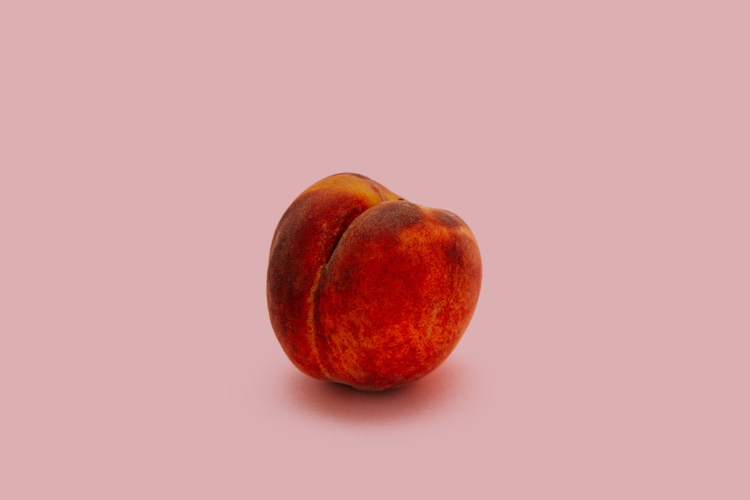
What is peach?
Peach is a pale, warm color that blends orange and pink with a hint of yellow, named after the fruit’s skin. A representative value is #FFE5B4. Its orange-yellow base gives peach a sunny, gentle warmth that feels nurturing and inviting. Peach sits between orange and pink, so it can lean either way depending on the mix — but its defining quality is that golden, fruit-like warmth.
Because peach is orange-based, it harmonizes with corals, apricots, and warm neutrals. For the closely related fruit tones, see peach versus apricot and coral versus peach.
What is pink?
Pink is a tint of red — red lightened with white — and the classic web value is #FFC0CB (“pink”). Its red base gives it a cooler, more romantic character than peach, though pinks themselves range from warm coral-pinks to cool blue-pinks. Pink reads as soft, playful, and tender, and it carries strong cultural associations with sweetness and romance. Explore the family on our pink color meaning page.
What’s the difference between peach and pink?
The difference is undertone and base hue. Peach is orange-based with yellow warmth; pink is red-based. That means peach reads golden and sunny, while pink reads rosy and soft. Here’s the side-by-side with representative values, since both names cover a range.
| Property | Peach | Pink |
|---|---|---|
| Hex code | #FFE5B4 | #FFC0CB |
| RGB | 255, 229, 180 | 255, 192, 203 |
| CMYK | 0, 10, 29, 0 | 0, 25, 20, 0 |
| Undertone | Warm orange-yellow | Red (warm to cool) |
| Hue family | Orange-pink (pastel) | Red tint (pastel) |
| Best used for | Warm, cozy, sunny, organic palettes | Romantic, playful, sweet, feminine palettes |
| Mood/feel | Warm, nurturing, golden, fresh | Soft, romantic, tender, playful |
Is peach a type of pink or a type of orange?
Peach is closer to orange than to pink, even though it contains some pink. Its base is a pale orange with yellow warmth, which is what gives it that golden, fruit-skin glow. A small amount of pink softens it toward the rosy side, but if you desaturate a true pink you get a dusty rose, not peach — peach needs the orange-yellow component. So the most accurate description is a soft, pinkish orange. The warm-versus-cool framing helps here: peach is firmly warm, while pink can sit warm or cool depending on its mix. Our warm vs cool colors guide explains how undertone decides a color’s temperature.
When should you use each?
Use peach when you want warmth, comfort, and an organic, sunny feel. It excels in food, beauty, hospitality, and lifestyle branding, in cozy interiors, and in warm pastel palettes for spring and summer. Peach flatters skin tones and reads approachable without being saccharine.
Use pink when you want romance, playfulness, or a clear feminine signal. Its red base makes it ideal for beauty, fashion, confectionery, and youthful brands. Pink ranges widely, so you can dial it warm and energetic or cool and elegant depending on the exact tint you choose.
A quick decision rule: if you want a color that glows golden and reads as warm comfort food, reach for peach; if you want something rosier that signals sweetness or romance, reach for pink. When you’re unsure, place both candidate swatches against your background and your other brand colors — peach will visibly warm a palette toward orange, while pink will keep it in the red zone. That single test resolves most peach-versus-pink decisions faster than any naming convention.
How do peach and pink show up in design?
In branding, peach communicates warmth, friendliness, and natural softness — popular for wellness, food, and modern lifestyle identities — while pink communicates sweetness, romance, and energy, anchoring beauty and fashion brands. In UI design, both work as gentle background tints and accents; peach adds a cozy warmth and pink adds a soft, friendly pop. In interiors and weddings, peach reads earthy and inviting, while pink reads romantic and celebratory. They also pair beautifully together as a warm gradient. For a related warm comparison in this batch, see coral versus pink and rose versus pink.
Across all three contexts, the practical takeaway is the same: peach contributes warmth and an organic, food-adjacent softness, while pink contributes romance and a youthful pop. Designers who want both often build a gradient that runs from peach through blush into pink, letting the orange-to-red shift carry the eye without any hard edge between the two.
Frequently Asked Questions
What is the hex code for peach versus pink?
A representative peach is #FFE5B4, a warm orange-pink with yellow warmth. The classic web pink is #FFC0CB, a red-based soft tint. Both names span a range, but those values capture the key contrast: peach leans orange-yellow, pink leans red.
Is peach warmer than pink?
Generally yes. Peach is always warm because of its orange-yellow base. Pink can be warm or cool depending on the tint, but classic pinks sit cooler than peach. If you place them side by side, peach reads golden and sunny while pink reads rosier.
Can peach and pink be used together?
Absolutely. Because they’re neighbors in the warm range, peach and pink blend into a soft, harmonious gradient. Use peach for warmth and pink for a romantic pop, then add cream or white to keep the palette light and fresh. The combination is popular in beauty, weddings, and lifestyle design.
Why does peach look more like orange when desaturated?
Because peach’s base hue is orange, not red. Removing the lightness reveals a pale orange core, whereas desaturating pink reveals a dusty rose. That underlying orange is exactly what distinguishes peach from pink and gives it its golden, fruit-skin character.
Which color is more flattering for skin tones?
Peach often flatters a wide range of skin tones because its warm, golden cast mimics natural undertones, which is why it’s common in cosmetics and packaging. Pink can be flattering too, especially warmer pinks, but cooler pinks may read starker against some complexions.


