Cosmetic Packaging Design: Tips and Trends
Cosmetic packaging is the most important salesperson a beauty brand will ever hire. On a crowded shelf or a fast-scrolling feed, the tube, compact or carton has roughly a second to communicate price, promise and personality. This guide covers the practical decisions — substrates, finishes, formats and current trends — that separate packaging that sells from packaging that just contains.
Cosmetic packaging design sits inside a bigger system. If you are building a brand from scratch, start with our pillar guide to beauty brand design, then come back here for the packaging specifics.
Primary, Secondary and Labels
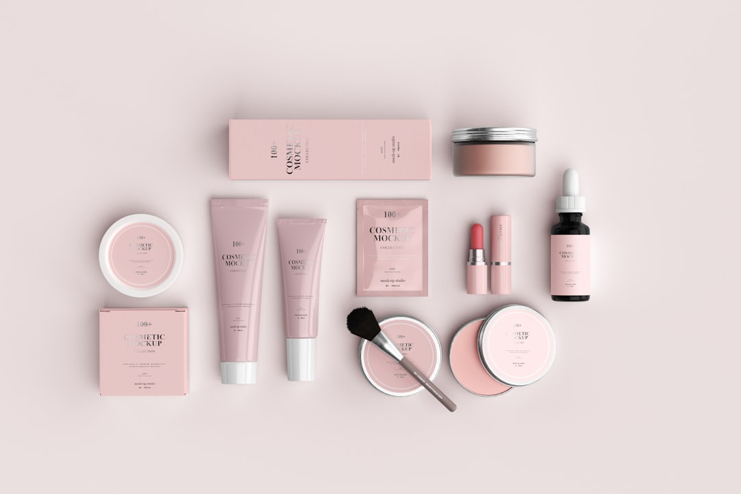
Every cosmetic product involves up to three packaging layers, and each is designed differently:
- Primary packaging — the part that touches the product: the tube, jar, compact, bottle or stick. Material safety and ergonomics dominate here.
- Secondary packaging — the carton or sleeve. This is your storytelling and unboxing surface, and where foil and embossing earn their keep.
- Labels and applied artwork — carry brand and legally required information, and must survive water, oil and handling.
Get the layering right before you obsess over artwork. A beautiful carton wrapped around a cheap-feeling tube undermines the whole experience.
Choosing Substrates
The material is a brand signal as much as an engineering choice. The classic trade-off is glass versus plastic.
| Substrate | Feels | Best for | Watch out for |
|---|---|---|---|
| Glass | Premium, weighty | Serums, prestige skincare, fragrance | Heavy, breakable, shipping cost |
| PET / PP plastic | Light, practical | Shower, travel, mass-market | Can feel cheap without finishing |
| Aluminium | Modern, durable | Deodorants, refill systems, tins | Decoration options more limited |
| Coated board | Tactile, printable | Cartons, palettes, gift sets | Moisture sensitivity |
For shower and bathroom products, prioritise shatterproof, lightweight plastics. For anything positioned as prestige or sitting on a vanity, the weight and clarity of glass does real persuasive work.
Finishes That Signal Price
Two products with the same shape and the same printer can feel a tier apart based on finish alone. The core toolkit:
- Soft-touch lamination — a velvety matte coating that feels expensive and clinical; popular for prestige skincare cartons.
- Matte vs gloss lamination — matte reads understated and modern; gloss reads vibrant, energetic and more mass-market.
- Foil stamping — metallic hits (gold, silver, holographic) for logos and accents; the fastest way to signal luxury.
- Embossing and debossing — raised or recessed type and motifs that add tactile, blind-luxury detail.
- Spot UV — a glossy varnish over a matte base for contrast on a single element.
Restraint matters. One or two finishes used confidently beats a carton that uses every effect at once and ends up looking busy rather than expensive.
Designing for Format
Different cosmetic formats impose different design problems. A tube curves, so artwork distorts and a centred wordmark drifts; design on a flattened dieline and proof on the actual curve. A compact or palette opens to reveal an interior, which is a second design surface (and often where the mirror and pan layout live). A lipstick or stick is tiny and cylindrical — the cap is your branding real estate. A pump bottle needs the actuator, dip tube and overcap to coordinate visually with the bottle.
Always work from a printer-supplied dieline in Illustrator, keep critical content inside the safe area, and account for bleed and the glue/seam zones where artwork must not fall.
Labels and Compliance
Cosmetic labels must survive a bathroom and carry a lot of legally required information in a small space. Use waterproof, oil-resistant label stock and protect printed type with a laminate or varnish so it does not rub off. Keep body type legible at very small sizes — ingredient lists are frequently set at 5–6pt.
Required information commonly includes the INCI ingredient list, net weight or volume, batch code, responsible-person/manufacturer details, warnings, and the PAO (period after opening) open-jar symbol. Requirements vary by region — EU, UK and US rules differ — so always verify current obligations for each market with an official source. The layout mechanics are covered in our product label design guide, and the full production workflow in our packaging design process walkthrough.
2026 Trends Worth Following
Trends should serve positioning, not replace it, but a few current directions are genuinely useful:
- Refillable systems — a durable, beautiful outer with a cheap recyclable inner pod. Good for sustainability and customer lock-in.
- Mono-material packaging — designed so the whole pack is one recyclable material, avoiding hard-to-separate mixes.
- Quiet, typographic minimalism — confident wordmarks, generous white space and restrained colour, especially in skincare.
- Tactile-first luxury — soft-touch and blind embossing over loud colour, letting the hand do the persuading.
- Honest sustainability — specific, substantiated claims and recycled-content callouts replacing vague “eco” badges.
The Production Workflow in Brief
Knowing how a pack actually reaches a printer prevents costly surprises. The typical flow runs like this:
- Get the dieline — the printer or packaging supplier provides a flat template with fold, glue, bleed and safe areas marked. Design on this in Illustrator, not a made-up rectangle.
- Design flat, then mock up — build artwork on the dieline, then render it in Photoshop on the 3D form to check how it reads on a curve or carton.
- Specify colour properly — provide Pantone (spot) and CMYK values, and request a physical proof or drawdown on the actual substrate before signing off.
- Separate finishes — supply foil, emboss and spot-UV areas as clean, labelled single-colour layers the finisher can use directly.
- Proof on the real material — colour and finish behave differently on glass, board and plastic. Approve a sample of the real thing, not a screen.
Skipping the physical proof is the most common way a launch goes wrong: a colour that looked perfect on a monitor can shift noticeably when foil-stamped onto matte board.
Designing the Unboxing
For direct-to-consumer beauty, the box arrives as a moment, not just protection. The secondary packaging — the carton, sleeve, tissue, and any insert card — is a sequence the customer experiences in order. Think about the reveal: a soft-touch outer, a satisfying open, a branded interior, and a clean instruction or thank-you card. This does not require expensive components; a restrained, well-considered sequence on modest materials beats an over-stuffed box of plastic inserts. Keep inserts minimal and recyclable to align with sustainability expectations.
Common Mistakes
The recurring failures are predictable: artwork designed flat and never proofed on the curve; type set too small or too low-contrast to read in bathroom light; too many finishes fighting each other; sustainability claims that cannot be substantiated; and ingredient information crammed in as an afterthought instead of designed in from the start.
Where This Sits in the Cluster
Cosmetic packaging is the broad field. For the cleaner, clinical end, see skincare packaging design; for the high-luxury, bespoke-bottle end, see perfume packaging design. Both apply the same fundamentals with a different accent.
Frequently Asked Questions
What makes cosmetic packaging look expensive?
Material weight and finish do most of the work. Glass, soft-touch lamination, foil stamping and blind embossing all signal premium, especially when used with restraint and plenty of white space. A heavy bottle and a confident wordmark read as expensive far more reliably than busy graphics.
Glass or plastic for cosmetic packaging?
Glass feels premium and is highly recyclable but is heavy and breakable, making it ideal for serums and prestige products. Plastics like PET and PP are light, shatterproof and cheaper, better for shower and travel formats. Match the substrate to the product’s environment and price tier.
What finishes are used on cosmetic cartons?
Common finishes include soft-touch and matte or gloss lamination, foil stamping, embossing and debossing, and spot UV. Each signals a different price tier and personality. Most strong packaging uses just one or two finishes confidently rather than layering every available effect.
What must appear on a cosmetic label?
Typically the INCI ingredient list, net weight or volume, batch code, responsible-person details, warnings, and the period-after-opening (PAO) symbol. The exact requirements differ by region, so verify current rules with an official regulatory source for every market where the product is sold.
How do I design artwork for a curved tube?
Work from the printer’s flat dieline in Illustrator, keep critical content within the safe area away from seams and glue zones, account for bleed, and always proof the design wrapped on the actual tube. Centred elements can drift visually on a curve, so test before committing.


