Beauty Brand Design: A Complete Guide
Beauty brand design is the discipline of turning a cosmetics or skincare company into a recognisable, desirable visual system — one that holds together across a logo, a lipstick tube, an Instagram grid and a shelf at Sephora. Done well, it makes a $12 serum feel like a $60 one. Done badly, it makes a genuinely good product look like a pharmacy own-brand. This guide walks through every layer of the system, in the order a working studio actually builds it.
We will move from strategy and positioning down to the concrete production details — substrates, finishes, label regulations — that separate a polished launch from an amateur one. Treat it as the map; the deeper dives are linked throughout.
What Beauty Brand Design Actually Includes
People often collapse “branding” into “the logo”. In beauty, the brand is the whole sensory package. A complete identity system covers:
- Strategy — positioning, audience, price tier, and the single idea the brand owns (clinical efficacy? clean ingredients? joyful colour? heritage luxury?).
- Verbal identity — the name, tagline, product naming convention, and tone of voice.
- Visual identity — logo, colour palette, typography, photography direction, graphic motifs.
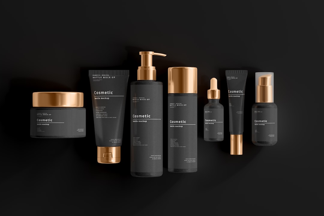
- Packaging — primary packaging (the bottle/jar/tube), secondary packaging (the carton), and the labels.
- Digital and retail expression — site, social templates, ad units, point-of-sale, unboxing.
The trap is to design the logo first and reverse-engineer everything else. Strong beauty work flows the other way: nail the positioning, then let it dictate the typeface, the colour, and whether the jar is heavy frosted glass or lightweight recyclable PET.
Start With Positioning, Not Pinterest
Before any visuals, answer three questions in plain language. Who is this for? What does it do better than the incumbent? What price tier does it live in? A clinical “actives” brand at a mid price and a playful Gen-Z colour-cosmetics brand may use the same designer, but almost nothing else should overlap. Positioning decides your entire toolkit — serif vs sans, white space vs maximalism, glass vs plastic.
Write a one-sentence brand idea you can test every later decision against. “Dermatologist-grade actives without the intimidating clinic vibe” instantly tells you the palette is calm, the type is a clean modern sans, and the copy avoids jargon. That sentence is worth more than fifty reference images.
The Visual Identity System
The visual identity is where positioning becomes something you can see. Four pillars carry most of the weight.
Logo and Wordmark
Most beauty brands lead with a wordmark rather than a pictorial mark, because the name needs to read clearly on a curved tube barely a centimetre tall. Keep it simple and reducible. The deeper craft of marks, monograms and lockups is covered in our guide to cosmetic logo design. Whatever you draw, test it at thumbnail size and embossed in a single colour — beauty logos frequently appear as a blind deboss or a foil hit with no colour at all.
Typography
Type does the heavy lifting of price signalling. As a rough rule: elegant high-contrast serifs (think Didot- or Bodoni-style faces) read as luxury, fragrance and heritage; clean geometric or neo-grotesque sans faces read as modern, clinical and accessible. Pair one display face for the logo and headlines with one highly legible workhorse for ingredients and body copy. For pairing logic, our font pairing guide is the reference. Crucially, your body face must stay legible at 5–6pt, because ingredient lists are tiny and often regulated for minimum size.
Colour Palette
Build a disciplined palette: one or two brand colours, a neutral base, and an accent. Skincare leans toward soft neutrals, off-whites, sage, and clinical blues. Colour cosmetics can go saturated and bold. Always specify colours in the systems you will actually produce in — Pantone (spot) and CMYK for print and packaging, plus Lab values where colour accuracy on a substrate matters. A colour that looks perfect on screen can shift badly when foil-stamped on matte board.
Photography and Art Direction
Decide early between clinical/product-led photography (clean backgrounds, macro texture shots, ingredient hero images) and lifestyle/editorial imagery (skin, models, mood). This choice has to survive contact with a content calendar, so define lighting, crop, and retouching rules, not just a vibe.
From Identity to Packaging
Packaging is where the brand becomes a physical object a customer holds — and it is where most of the budget and most of the risk live. There are three layers, and each has its own rules. For the end-to-end production workflow, see our packaging design process walkthrough.
| Layer | What it is | Design priority |
|---|---|---|
| Primary | Bottle, jar, tube, compact — touches the product | Material safety, ergonomics, shelf presence |
| Secondary | Carton, sleeve, outer box | Storytelling, foil/emboss, unboxing |
| Labels | Applied artwork carrying brand + legal info | Legibility, durability, compliance |
Each beauty sub-category handles these layers differently, and we have dedicated deep dives for the three big ones:
- Cosmetic packaging design — the broad field: tubes, compacts, finishes and trends.
- Skincare packaging design — the clean, clinical, minimal end of the spectrum.
- Perfume packaging design — luxury cues, bespoke bottles and weight.
Substrates and Finishes
The material is a brand decision, not just an engineering one. Glass signals premium and is highly recyclable, but it is heavy and breakable. PET and PP plastics are light, cheap and shatterproof, better for showers and travel but harder to make feel luxe. On the secondary carton, finish choices carry meaning: soft-touch lamination feels expensive and clinical; matte lamination reads understated; gloss reads vibrant and mass-market; foil stamping and embossing/debossing add the tactile luxury cues fragrance and prestige skincare rely on.
Sustainability
Sustainability is now a core design constraint, not a nice-to-have. Consider refillable systems (a durable outer with a cheap inner pod), mono-material packaging that is genuinely recyclable, reduced secondary packaging, and recycled-content substrates. Avoid greenwashing: only make a claim you can substantiate, and check that recyclability claims are accurate for your customers’ actual local waste streams.
Labels, Legibility and Compliance
Beauty labels are some of the most constrained design surfaces in any industry. They must carry brand artwork and a long list of legally required information in a tiny space, on a curved surface, that survives water, oil and friction. Use waterproof and oil-resistant label stocks for anything that lives in a bathroom, and protect printed type with a laminate or varnish.
Required information typically includes the ingredient list (INCI naming), net weight/volume, batch code, manufacturer/responsible-person details, usage warnings, and the PAO (“period after opening”) symbol — the little open-jar icon with a number like “12M”. Regulatory requirements differ significantly by region (EU, UK, US, and others each have their own rules), so always verify the exact obligations for every market you sell in with a current regulatory source. Our broader product label design guide covers the layout mechanics in detail.
Stretching the System: Web, Social and Retail
A beauty brand is now experienced on a phone before it is held in a hand. Your identity has to template cleanly into a product page, a 1080×1350 social post, a story, and a paid ad — all while keeping the type and colour discipline intact. Build a small kit of reusable layouts so a non-designer can stay on-brand. In physical retail, the same system has to win on a crowded shelf from two metres away, which is why the wordmark, the silhouette of the bottle, and the dominant colour matter more than fine detail.
Beyond Cosmetics: Spa and Wellness
The principles extend to the experiential side of beauty too. Service brands — salons, spas, wellness studios — need the same identity rigour but lean harder on atmosphere, signage and printed collateral. If that is your project, see our dedicated spa and wellness branding guide, which adapts this framework for an environment-led, service-based business.
For the underlying identity theory that sits beneath all of this, our visual identity design overview is a useful companion.
Budgeting: Where to Spend and Where to Save
Beauty branding budgets sprawl, so prioritise spend where the customer’s perception is formed. The smartest money tends to go in this order:
- Positioning and the core identity — the cheapest leverage in the whole project. A clear idea and a disciplined logo/type/colour system make everything downstream cheaper and more coherent.
- Primary packaging quality — the object the customer holds. Substrate weight and feel do more for perceived value than almost anything else, so this is rarely the place to economise hard.
- One signature finish — a single well-chosen foil, soft-touch coating or emboss on the secondary carton buys a tier of perceived quality.
- Photography and templates — reusable art direction and social templates that keep the brand consistent without re-hiring a designer for every post.
The expensive items to defer until volume justifies them are custom mould tooling for bespoke bottles and complex multi-finish cartons. Stock packaging with custom decoration gets a new brand to market credibly; bespoke tooling is a scale-up investment, not a launch requirement.
Brand Guidelines: Making It Survive Growth
A brand that lives only in one designer’s head falls apart the moment a second person touches it. Document the system in a concise brand guidelines document: logo usage and clear space, the colour palette in Pantone and CMYK, the type system with sizes and pairings, photography and retouching rules, packaging finish preferences, and tone-of-voice examples. For a beauty brand specifically, include the small-print and compliance layout conventions so every new SKU carries its INCI list, net weight, batch code and PAO symbol consistently. Guidelines are what let a brand add ten products a year without ten different visual personalities.
A Practical Build Order
If you are starting from zero, run the project in this sequence. Each step constrains the next, which keeps the system coherent.
- Lock positioning and the one-sentence brand idea.
- Develop verbal identity (name, tone, product naming).
- Design the core visual identity (logo, type, colour, photography rules).
- Choose packaging architecture, substrates and finishes against budget.
- Produce label artwork with full compliance information, verified per region.
- Template the digital and retail expressions.
- Document everything in brand guidelines so it survives growth.
Hold every decision against that one-sentence idea. The brands that look expensive are rarely the ones that spent the most — they are the ones that stayed disciplined from positioning all the way down to the period-after-opening symbol.
Frequently Asked Questions
What is beauty brand design?
Beauty brand design is the complete visual and verbal identity system for a cosmetics, skincare or fragrance company. It spans positioning, naming, logo, typography, colour, photography, packaging and labels, all built to make the brand recognisable, desirable and consistent across shelf and screen.
How much does it cost to brand a beauty product?
Costs vary enormously with scope and region, from a few thousand for a logo and label kit to six figures for a full prestige launch with custom packaging. Custom glass moulds and foil-finished cartons add the most. Get itemised quotes and prioritise spend where the customer touches the product.
What typography works best for beauty brands?
It depends on positioning. Elegant high-contrast serifs signal luxury and fragrance, while clean modern sans-serifs signal clinical, accessible skincare. Most brands pair one display face for the logo and headlines with one highly legible workhorse for tiny, regulated ingredient lists.
What information is legally required on beauty packaging?
Common requirements include the INCI ingredient list, net weight or volume, batch code, responsible-person details, warnings, and the period-after-opening (PAO) symbol. The exact rules differ by region, so always verify current obligations with an official regulatory source for every market you sell in.
Should beauty packaging be sustainable?
Increasingly, yes — sustainability is now a design constraint customers expect. Consider refillable systems, mono-material recyclable packaging, reduced secondary packaging and recycled content. Only make environmental claims you can substantiate, and confirm recyclability against the waste streams your actual customers can access locally.


