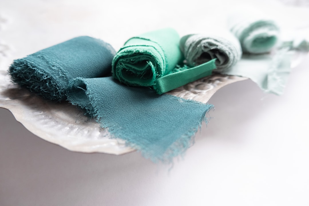
Mint vs Teal: What’s the Difference?
Mint and teal both live in the green-to-blue zone, but they sit far apart. Mint is a pale, refreshing green with just a touch of cool blue, named after the leaf. Teal is a deep, rich blue-green that balances both hues almost equally, named after the duck’s plumage. In the mint vs teal comparison, the differences are depth and hue balance: mint is light and green-leaning, teal is dark and genuinely half-blue.
What is mint?
Mint is a light, cool green with a subtle blue undertone, named after mint leaves. A representative value is #98FF98 (mint green). Its high lightness and soft saturation give it a fresh, clean, airy quality — calming and modern. Mint is mostly green with only a hint of blue, which keeps it firmly in the green family despite its cool feel. For its closest neighbors, see mint versus sage and mint versus seafoam.
Because mint is so light and cool, it works like a refreshing pastel — easy to use across large areas and a natural pairing for white, blush, and soft grays.
What is teal?
Teal is a deep, saturated blue-green and the classic web value is #008080 — an even mix of green and blue with no red. Teal is rich, sophisticated, and grounded, balancing the calm of blue with the freshness of green. It reads as more serious and premium than mint, which is why it anchors so many considered brand palettes. Teal sits between green and blue on the wheel; for the bluer cousin, see cyan versus teal, and browse green variations in shades of green.
What’s the difference between mint and teal?
The difference is value and hue balance. Mint is a light, soft green with a hint of blue; teal is a dark, saturated, even blue-green. Mint reads pale and refreshing, teal reads deep and rich. Here’s the side-by-side with representative values, since mint in particular varies by source.
| Property | Mint | Teal |
|---|---|---|
| Hex code | #98FF98 | #008080 |
| RGB | 152, 255, 152 | 0, 128, 128 |
| CMYK | 40, 0, 40, 0 | 100, 0, 0, 50 |
| Undertone | Cool, slightly blue | Balanced blue-green |
| Hue family | Light green (pastel) | Deep blue-green |
| Best used for | Fresh, calm, modern, airy palettes | Premium, sophisticated, grounded branding |
| Mood/feel | Fresh, clean, light, soothing | Rich, calm, confident, refined |
Is mint a green and teal a blue?
Mint is clearly a green — a light, cool one with only a hint of blue — while teal is a true blue-green that splits the difference almost evenly. So mint sits closer to the green end of the spectrum, and teal sits right on the boundary between green and blue. If you darkened mint and pushed it toward blue you’d move it toward teal, but mint on its own reads green-first. This is why mint feels fresh and botanical while teal feels deeper and more aquatic. The cool temperature both share comes from their blue component, a relationship our color psychology guide ties to feelings of calm and clarity.
When should you use each?
Use mint when you want freshness, lightness, and a clean, modern calm. It excels in wellness, beauty, food, and tech branding that wants to feel airy and approachable, and as a soft UI background or pastel accent. Mint keeps a design feeling open and gentle.
Use teal when you want depth, sophistication, and grounded confidence. Its rich blue-green makes it ideal for primary brand colors, hero sections, and premium identities in finance, healthcare, and tech. Teal reads more serious and authoritative than mint, so reach for it when you want gravity rather than lightness.
How do mint and teal work in design?
In branding, mint signals freshness, calm, and modern approachability — popular for wellness, beauty, and lifestyle brands — while teal signals trust, sophistication, and balance, anchoring premium and professional identities. In UI design, mint makes a soft background tint or success-state accent that keeps interfaces light, whereas teal works as a strong primary or call-to-action color with good contrast. In interiors and fashion, mint reads fresh and retro-modern, while teal makes a rich, jewel-toned statement. They also pair beautifully together as a light-and-deep monochromatic gradient. For a related cool comparison in this batch, see slate versus gray.
Frequently Asked Questions
What is the hex code for mint versus teal?
A representative mint is #98FF98, a light cool green. Standard teal is #008080, a deep even blue-green. Both names span ranges, but those values capture the core contrast: mint is pale and green-leaning, while teal is dark and an equal blue-green mix.
Is teal darker than mint?
Yes, considerably. Teal (#008080) is a deep, saturated blue-green, while mint (#98FF98) is a light pastel. The large value gap is one reason the two pair so well — mint as the bright field and teal as the deep anchor create clear contrast within a shared cool palette.
Can mint and teal be used together?
Absolutely. Because they share a cool blue-green temperature, mint and teal form a natural monochromatic scheme. Use mint as the light background and teal as the saturated accent or anchor, then add white or a soft neutral to balance the saturation difference. The combination reads fresh, modern, and calming.
Is mint a warm or cool color?
Mint is a cool color. Although it’s a green, its hint of blue and high lightness give it a crisp, cool feel rather than the warmth of a yellow-green. That coolness is what makes mint read as fresh and clean, and it’s why mint and the bluer teal sit comfortably in the same family.
Why does teal look both blue and green?
Because teal is a near-even mix of blue and green, sitting right on the boundary between the two. Depending on lighting and surrounding colors, your eye may read it as more blue or more green. That balanced duality is exactly what defines teal and distinguishes it from the green-leaning mint.


