School Design: A Guide for Schools and Teachers
School design is the whole visual system a school puts in front of students, parents, and staff: the crest on the gate, the yearbook on the shelf, the poster above the whiteboard, the worksheet on every desk, and the certificate handed out at the end of term. It is rarely made by one person. A head of department, a PTA volunteer, a part-time marketing coordinator, and a hundred individual teachers all touch it. Get the system coherent and a school feels organized and proud of itself; let it scatter and every flyer looks like a different institution.
This guide maps the entire field of school design in the order it actually matters to most schools, from the permanent identity at the top to the printable worksheet a teacher makes at 9pm the night before class. Each section links to a deeper, hands-on guide for that piece, because none of these jobs is small once you are doing it for real.
Start With the Identity, Not the Flyer
Before anyone designs a single newsletter, a school needs a small visual identity kit: the crest or logo and its variants, two or three official colors, and one or two fonts that everything else uses. This is the difference between a school that looks established and one that looks like a folder of mismatched Word documents. The kit does not need to be elaborate. It needs to be written down, stored somewhere every staff member can reach, and actually used.
A workable school identity package is short: the logo in full-color, one-color, and reversed (white) versions; the exact color values in HEX, RGB, and CMYK; the two approved typefaces with a free Google Fonts fallback for staff who cannot install anything; and three or four example documents showing what “right” looks like. Lock these and 80 percent of your consistency problems disappear, because teachers stop guessing.
Who actually makes this work
Be honest about who will maintain the system. If it is a single overworked office manager, keep the rules to one page and the templates ready-made in tools people already have. The most beautiful brand guidelines in the world are useless if the only person who can apply them left in June.
The School Logo and Crest
The logo is the most permanent decision on this list, and schools have a genuine choice between two traditions: the heraldic crest (a shield, a motto, the year the school was founded, symbolic charges like books, lamps, or lions) and the modern mark (a clean, simplified symbol that reads at any size). Many schools want both moods at once, which is fine, but the practical test is the same either way: the mark has to survive being embroidered onto a polo shirt and printed in a single color. A crest crammed with fine detail looks magnificent on a prospectus cover and turns to mud on a 2cm badge.
If you are weighing a traditional shield against a contemporary symbol, our school logo design guide walks through crest anatomy, motto placement, and how to keep an emblem legible when it is shrunk and stitched. For the broader principles behind building an emblem-style mark, our emblem logo design guide covers the badge and seal forms that crests belong to.
The Yearbook
The yearbook is the single biggest design project most schools produce, and it is unforgiving: hundreds of photos, a hard deadline, and a printer who will not move it. The work is mostly planning, not decoration. You decide a trim size (8.5 x 11 inches is the standard, 9 x 12 gives more room for photo grids), build a ladder that maps every spread before anyone lays out a page, and lock a theme system, color sections, and a consistent portrait grid so 200 student photos do not turn into chaos.
Our yearbook design guide covers ladder planning, spread templates, picture-grid systems, dividing the book into color-coded sections, and the hardcover and binding choices that affect your print budget. If you are running the book as a small committee, that planning structure is what keeps the project from collapsing in the final week.
Classroom Posters
Classroom posters are read across a room by young eyes, often from the back row, and that single fact drives every decision. The type has to be large and the contrast high; decorative fonts that look charming on a screen become unreadable on a wall. Content has to be age-appropriate and, ideally, accessible to students with low vision or reading differences. And because they live in a real classroom, the best ones are laminated so they survive a year of fingers, sun, and tape.
Most teachers build these in Canva, PowerPoint, or Google Slides rather than professional software, and that is the right call for the deadline. Our classroom poster design guide covers minimum type sizes for wall reading, high-contrast color pairs, accessibility for young learners, and how to set up a poster so it prints and laminates cleanly.
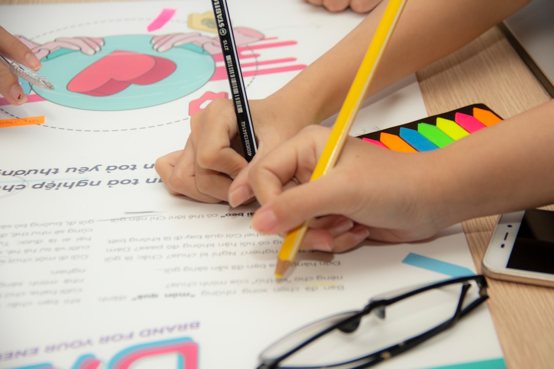
Worksheets
The worksheet is the most-used document in any school and usually the least designed. A good one is mostly about restraint: clear instructions at the top, generous white space so students have room to write, a logical reading order, and type that is easy to decode. Because most worksheets are photocopied, they have to work in plain black and white, which means you cannot rely on color to carry meaning.
There is a real accessibility dimension here. Dyslexia-friendly fonts (clear, evenly weighted letterforms with distinct shapes), left-aligned text, and uncluttered layouts measurably help struggling readers, and they cost nothing to apply. Always make an answer key, and design for the photocopier from the start. Our worksheet design guide covers instruction phrasing, spacing for handwriting, dyslexia-friendly type, and printable black-and-white layouts.
Certificates and Awards
Certificates are the keepsake at the end of all this. A student keeps a well-made certificate for decades, and the design conventions that make one feel official are surprisingly specific: landscape orientation on A4 or US Letter, a defined border, a clear hierarchy (award type, recipient name, reason, date), signature lines, and a seal. The fancier editions add foil stamping or embossing for genuine prestige.
If you are issuing dozens at once, the practical move is a fillable PDF so the office can type names rather than handwrite them. Our certificate design guide covers borders, seal placement, signature lines, fillable templates, and the print-finishing options that lift an award from “printout” to “framed on the wall.” For those finishing choices specifically, our foil stamping guide and the broader print finishing guide explain what is worth paying for.
Choosing Tools That Match Your Team
The right tool is the one your people can actually use under deadline. There is no prize for InDesign if the person making the spring concert poster has never opened it.
| Tool | Best for | Who it suits |
|---|---|---|
| Canva | Posters, flyers, social graphics, simple certificates | Teachers and admins; huge template library, free education tier |
| Google Slides | Quick posters, classroom visuals, collaborative work | Schools on Google Workspace; nothing to install |
| PowerPoint | Posters, certificates, printable handouts | Staff already comfortable in Office |
| InDesign | Yearbooks, prospectuses, multi-page documents | A dedicated coordinator or volunteer with design skills |
| Word / Docs | Worksheets, letters, answer keys | Every teacher; fine when set up with the school fonts |
Typography for Schools
Pick two typefaces and stick to them: one with a bit of character for headings and the crest area, one clean and highly legible for body text, worksheets, and the website. For young readers especially, favor faces with open letterforms and a generous x-height, and avoid tight, decorative scripts in anything students must read to learn. Both fonts should be free or properly licensed for the uses a school actually has, including web and print. For how to choose two faces that work together rather than fight, see our font pairing guide.
Accessibility Is Not Optional
Schools serve every kind of learner, so accessibility is a baseline, not a bonus. The same handful of habits help across every document type: high contrast between text and background, left-aligned body text rather than justified, generous spacing, and type sizes set for the reading distance. Never use color alone to carry meaning, because it disappears on a photocopy and excludes color-blind students. These choices cost nothing and make everything you produce more usable for more children.
Print, Photocopier, and Lamination Realities
Almost everything a school makes meets a photocopier or a laminator, and designing for those machines from the start avoids a lot of wasted toner and reprints. Keep backgrounds white so they do not smear or drink ink, use solid shapes and lines rather than pale screens that disappear in grayscale, and never let color carry meaning on a document destined for a black-and-white copier. For anything that lives on a wall, laminate it; a laminated poster or sign survives a year of tape, sun, and fingers that bare paper never could. Build these habits into your templates and staff inherit them automatically.
Putting the System Together
Build it in this order and it holds: lock the identity (logo, colors, two fonts) first, then make ready-to-use templates for the documents staff produce weekly, then tackle the big set pieces like the yearbook and certificates with the brand already settled. Store everything in one shared folder, label the files plainly, and review the kit once a year. A school’s visual identity is the sum of a thousand small documents made by busy people. Give them good defaults and the whole institution looks the way it deserves to.
Frequently Asked Questions
What software should teachers use for school design?
For most teachers, Canva, Google Slides, or PowerPoint cover nearly everything, including posters, certificates, and handouts, with no learning curve. Reserve InDesign for big multi-page projects like the yearbook, where a dedicated coordinator handles the layout. Use Word or Google Docs for worksheets and answer keys.
Should a school logo be a crest or a modern mark?
Either works, but it must read clearly when embroidered on uniforms and printed in a single color. Traditional crests suit established schools and look strong on prospectus covers; modern marks scale more easily to apps and small badges. Many schools keep a detailed crest plus a simplified version for tiny placements.
How do I make school documents accessible to all students?
Use high contrast, left-aligned text, generous spacing, and type sized for the reading distance. Choose clear, open fonts and consider dyslexia-friendly faces for worksheets. Never rely on color alone to convey meaning, since it vanishes on photocopies and excludes color-blind learners. These habits cost nothing and help everyone.
What is the standard yearbook size?
The most common trim size is 8.5 x 11 inches, which balances cost and layout space. A 9 x 12 inch book gives more room for photo grids and larger images but raises the print price. Decide early, because the trim size shapes every template and the printer’s quote.
How early should a school start its yearbook?
Begin at the start of the school year. Build the ladder (a spread-by-spread plan) first, assign sections and deadlines, and collect photos continuously rather than scrambling in spring. Yearbooks fail on schedule, not on creativity, so the planning structure matters far more than any single page design.


