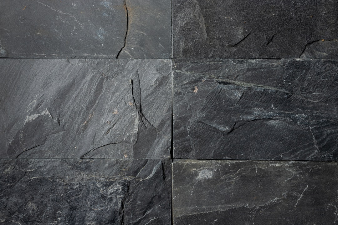
Shades of Slate: Names and Hex Codes
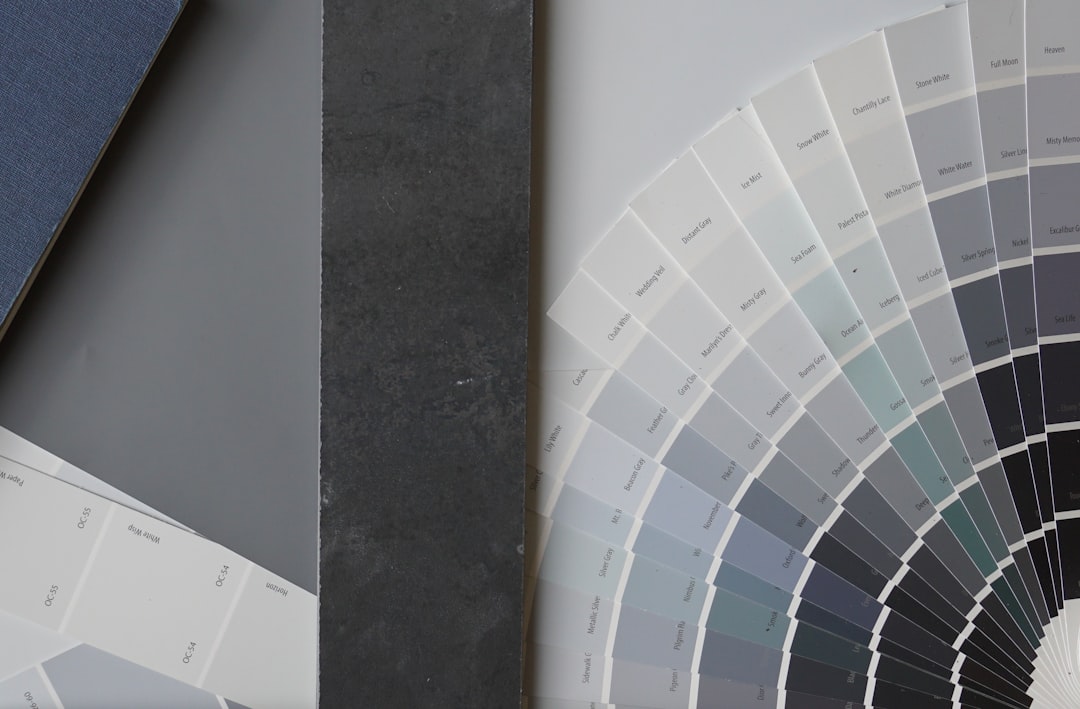
There are many recognized shades of slate, from the classic cool blue-gray to deep dark slate and vivid slate blue. Below is a practitioner reference: each shade with its name, hex code, RGB value, and a note on where it works best. Use it as a swatch library when building a palette, and pair it with our guide to color psychology when you need the symbolism behind the swatch.
A quick note on terminology, because slate spans several CSS-named colors. Slate — commonly cited as #708090 (the CSS color “slategray”) — is a cool blue-gray, named after the stone. It is frequently confused with charcoal (darker) and plain gray (more neutral). If you need those distinctions, see our comparisons of slate vs charcoal and slate vs gray. Throughout this guide, “shades of slate” covers every named variation in that cool, stone-inspired blue-gray family.
Each entry below gives three values so you can use it anywhere: the hex code (for CSS, HTML, and most design tools), the RGB triplet (for screen-based tools that ask for red, green, and blue channels separately), and a short note on the mood and best use of that shade. Several slates — slate gray, light slate gray, dark slate gray, and slate blue — are official CSS named colors, which makes them reliable, autocomplete-friendly choices in code.
Classic slates
These are the core slates most people picture — cool, balanced blue-grays used in modern, corporate, and editorial branding.
| Shade name | Hex | RGB | Notes / use |
|---|---|---|---|
| Slate | #708090 | 112, 128, 144 | Classic cool blue-gray; calm, professional. |
| Slate Gray | #708090 | 112, 128, 144 | CSS named slate gray; versatile, neutral. |
| Slate Storm | #646D7E | 100, 109, 126 | Muted blue-gray; moody, refined. |
| Stone Slate | #7B8794 | 123, 135, 148 | Soft mid slate; natural, calm. |
| Slate Teal | #6E7F80 | 110, 127, 128 | Green-leaning slate; organic, subtle. |
| Pewter Slate | #79898E | 121, 137, 142 | Metallic gray-blue; cool, modern. |
Light slates
The softer, paler slates — light, airy blue-grays that work beautifully as backgrounds and muted accents.
| Shade name | Hex | RGB | Notes / use |
|---|---|---|---|
| Light Slate | #778899 | 119, 136, 153 | CSS light slate gray; airy, cool. |
| Pale Slate | #8C9BAB | 140, 155, 171 | Soft light blue-gray; gentle, fresh. |
| Slate Mist | #9FB6CD | 159, 182, 205 | Pale powder blue-gray; calm, serene. |
| Silver Slate | #A6B3BF | 166, 179, 191 | Light silvery gray-blue; clean, modern. |
| Cloud Slate | #B0BEC5 | 176, 190, 197 | Pale neutral blue-gray; soft, airy. |
| Ash Slate | #90A4AE | 144, 164, 174 | Muted mid-light slate; understated, calm. |
Dark slates
Pushed toward charcoal and teal, these dark slates feel grounded and sophisticated — strong anchors and backgrounds.
| Shade name | Hex | RGB | Notes / use |
|---|---|---|---|
| Dark Slate | #2F4F4F | 47, 79, 79 | CSS dark slate gray; deep, sophisticated. |
| Slate Charcoal | #3A4D54 | 58, 77, 84 | Dark blue-gray; moody, refined. |
| Deep Slate | #4A5D6B | 74, 93, 107 | Rich mid-dark slate; grounded, calm. |
| Storm Slate | #42525E | 66, 82, 94 | Dark stormy blue-gray; atmospheric, deep. |
| Slate Steel | #36454F | 54, 69, 79 | Charcoal-leaning slate; serious, modern. |
| Midnight Slate | #27343B | 39, 52, 59 | Near-black blue-gray; dramatic, deep. |
Blue-leaning slates
Cooler, more saturated slates that tip toward periwinkle and indigo — the most colorful members of the family.
| Shade name | Hex | RGB | Notes / use |
|---|---|---|---|
| Slate Blue | #6A5ACD | 106, 90, 205 | CSS slate blue; vivid blue-purple, modern. |
| Dark Slate Blue | #483D8B | 72, 61, 139 | CSS dark slate blue; deep, regal. |
| Medium Slate Blue | #7B68EE | 123, 104, 238 | CSS medium slate blue; bright, energetic. |
| Blue Slate | #5D6D9E | 93, 109, 158 | Muted denim slate; calm, classic. |
| Payne’s Slate | #536878 | 83, 104, 120 | Muted blue-gray; artistic, atmospheric. |
| Sky Slate | #6699CC | 102, 153, 204 | Bright blue-leaning slate; fresh, open. |
What are the most popular shades of slate?
The most-used named slates in design are slate / slate gray (#708090), light slate (#778899), dark slate (#2F4F4F), and slate blue (#6A5ACD). Classic slate gray dominates modern, corporate, and editorial branding; light slate works as a soft background neutral; dark slate anchors sophisticated palettes; and slate blue adds a vivid, contemporary blue-purple accent. Cooler slates feel crisp and technical, while muted ones feel calm and grounded.
Slate’s appeal is that it is a gray with personality — it carries gray’s neutrality and balance but adds a cool blue undertone that feels more refined and intentional than plain gray. That makes it a favorite for technology, finance, professional services, and minimalist design, where it signals calm competence. Because several slates are official CSS named colors, they are reliable, autocomplete-friendly choices in code. Choosing a slate is really choosing how light, how dark, or how blue you want that cool gray to read.
Slate is one of the few color families with multiple official CSS keywords, which is the single most useful thing to know when specifying it. slategray (#708090), lightslategray (#778899), darkslategray (#2F4F4F), and slateblue (#6A5ACD) all work directly in code. The values in the tables above match these references, but note that slate blue is a true blue-purple, not a gray — so always confirm which “slate” a brief means. This matters in UI work, where slate grays carry a calm, professional tone across an entire interface.
How to use shades of slate in design
Slate is a calm, professional neutral that works as a sophisticated alternative to plain gray. Use classic slate gray for text, borders, and backgrounds where you want cool, understated neutrality, and pair it with white, cream, and a warm accent like amber or coral for balance. Dark slate anchors premium palettes, while slate blue brings a contemporary pop of color.
Practical guidance: slate’s warm complement is a soft amber, terracotta, or coral — pairing cool slate with a warm accent keeps a palette from feeling cold. For type, dark slate (#2F4F4F) and slate gray (#708090) are readable on light backgrounds; light slate works best for secondary text and dividers. To keep slate feeling modern rather than corporate, combine it with crisp white and one saturated accent. Slate also sits beautifully next to its darker cousin; see our comparison of slate vs charcoal, and explore the deeper end of the family in shades of charcoal.
Frequently Asked Questions
What is the hex code for slate?
Slate is most commonly cited as #708090, which is RGB 112, 128, 144 — a cool blue-gray named after the stone. This is the official CSS “slategray” keyword, making it a reliable, autocomplete-friendly value in code and design tools.
What is the difference between slate and charcoal?
Slate (#708090) is a lighter, distinctly blue-gray mid-tone, while charcoal (#36454F) is much darker and closer to near-black. Slate reads as cool and calm; charcoal reads as deep and grounding. See our full slate vs charcoal comparison for examples and palettes.
What is the difference between slate and gray?
Slate (#708090) is a gray with a cool blue undertone, while plain gray (#808080) is fully neutral with no color cast. Slate feels more refined and intentional; gray feels strictly neutral. See our slate vs gray comparison for guidance on which to choose.
Is slate blue the same as slate gray?
No. Slate blue (#6A5ACD) is a vivid blue-purple, while slate gray (#708090) is a muted cool gray. They share the “slate” name but are very different colors — slate blue is saturated and colorful, slate gray is a near-neutral. Confirm which one a brief means.
What colors go well with slate?
Slate pairs beautifully with warm accents like amber, terracotta, and coral, which balance its coolness, and with crisp white and cream for a clean, modern look. Navy deepens it for a corporate feel, while blush and sage give it a softer, contemporary palette.