Theater Poster Design: From Stage to Street
A theater poster has a split personality: it must capture the soul of a live production and, at the same time, sell tickets for a specific run of dates at a specific venue. Unlike a film poster that markets a single release, a show poster often promotes weeks of performances and has to translate the mood of the stage into a static image people see on the street. This guide covers how to do both.
Theater poster work shares its compositional foundation with film. Start with our complete film poster design guide for hierarchy, the billing block, and print fundamentals, then apply the stage-specific thinking below. For non-narrative live events, our event poster design guide is a close companion.
Capturing the Production’s Tone
The first job is interpretation. A theater poster must distill an entire production — its mood, era, and energy — into one image. Is it a stark contemporary drama, a lavish period musical, an absurdist comedy, an experimental fringe piece? The visual language should answer before anyone reads the title.
- Drama — restrained, often a single evocative image or portrait; muted or high-contrast palette; elegant serif type.
- Musical — energetic, colorful, often illustrative or stylized; expressive display lettering.
- Comedy — bright, playful, with type and imagery that signal lightness.
- Classical / period — refined typography, classical proportions, historically sympathetic imagery.
- Experimental / fringe — bold, graphic, type-led, often deliberately unconventional.
The custom title treatment for the show carries much of this tone. The same lettering craft used in movie title design applies: the show’s name is often a bespoke wordmark that recurs on the program, tickets, and merchandise.
The Information a Show Poster Must Carry
Because a theater poster sells a run rather than a single screening, its information hierarchy is distinct:
- Show title — the headline, given the most visual weight.
- Theatre / company name — who is producing and where it plays.
- Run dates — the date range, often spanning weeks; this is critical and must be unambiguous.
- Key credits — playwright/composer, director, and sometimes star names, set in a billing arrangement.
- Ticket / booking info — box office number, website, or QR code.
- Supporting marks — sponsor logos, accessibility symbols, content notes.
Run dates deserve special care. “12 Sept – 4 Oct” must read instantly; ambiguous or stylized date formatting costs ticket sales. Treat the date range with nearly the same priority as the title.
From Stage to Street: Reading at a Distance
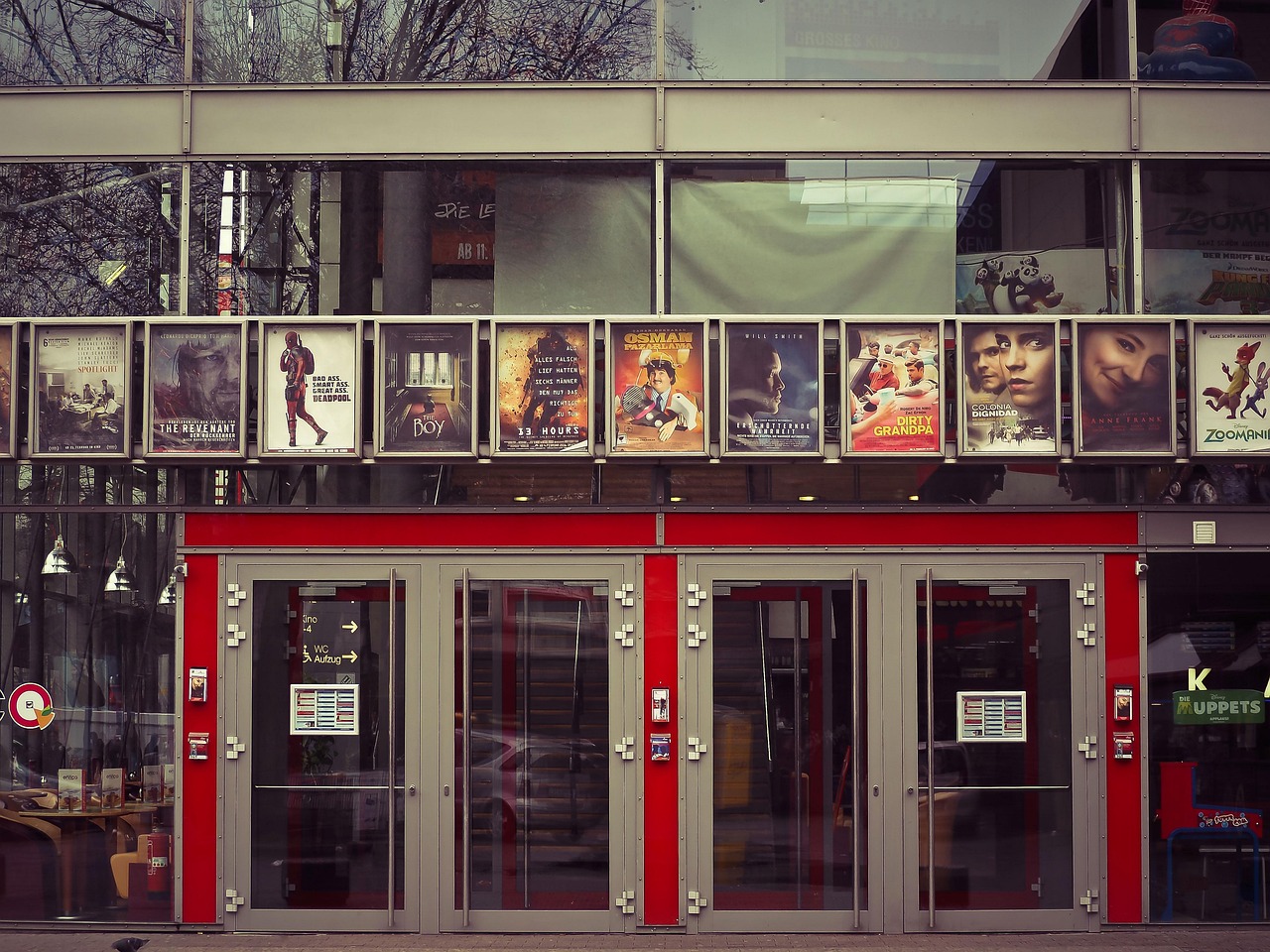
Theater posters appear in lobby cases, on building exteriors, in transit, and on noticeboards — almost always viewed from a distance and in passing. The “from stage to street” challenge is translating an intimate art form into bold, public-facing communication:
- One strong focal image. A single arresting visual beats a cluttered montage. Theater photography or commissioned illustration both work; consistency matters more than medium.
- High contrast, limited type families. One display face for the title plus a clean sans for details. See our font pairing guide for combinations that hold up.
- Protect legibility over imagery. Use solid panels or scrims so the dates and box-office line never disappear into the artwork.
- Keep the call to action obvious. “Book now” plus a URL or QR code, never buried.
The Billing and Credits
Theater has its own billing conventions. Lead actors, the director, the playwright or composer, the producing company, and creative leads are often credited in a structured arrangement near the bottom — a stage equivalent of the film billing block, sometimes with similarly fixed size relationships dictated by contracts and house style. Set this in a clean, condensed sans, centered and tidy, so it grounds the poster without competing with the title.
Theater Poster Sizes and Print Specs
| Size | Use | Notes |
|---|---|---|
| 11 × 17 in | Lobby cards, café and shop windows | Common low-cost handout/display size |
| 18 × 24 in | Lobby and corridor display cases | Strong presence at venue scale |
| 24 × 36 in | Exterior and street posters | Reads from across the street |
| 1080 × 1350 px | Social feed (portrait) | Crop the print art for promotion |
| 1080 × 1920 px | Stories / digital screens | Keep dates and CTA clear of UI overlays |
Apply standard print rules: 0.125″ (1/8″) bleed on all sides, a safe margin of at least 0.25″ for critical text, 300 DPI, and CMYK color. Build the master at the largest format and scale down, bumping small type as needed for the 11 × 17 reduction.
One Look Across the Production
The poster is rarely a standalone. A coherent production identity carries the title treatment, palette, and imagery across the program (playbill), tickets, lobby signage, merchandise, and digital ads. For longer runs and festivals of work, this scales into a full system — the same thinking covered in our festival branding guide and grounded in visual identity design.
Photography vs. Illustration
Theater posters split fairly evenly between photographic and illustrated approaches, and the choice shapes the entire piece. Each has clear strengths:
- Photography works when star casting is the draw, when the production is naturalistic, or when an evocative atmospheric image (a lone figure, a charged moment) can carry the tone. It feels immediate and grounded.
- Illustration shines for musicals, family shows, period pieces, and stylized or fantastical productions. It can suggest a world the camera can’t capture and gives the poster a distinctive, ownable look that recurs across the campaign.
Whichever you choose, commit to a single treatment rather than mixing both. A photographic hero with an illustrated title can work, but the overall art direction must read as one coherent voice. Budget and timeline also matter: commissioned illustration takes longer and costs more than a well-art-directed photo shoot, so factor that into the production schedule early.
Tools
Use Photoshop to composite and grade the hero image, Illustrator for the vector title treatment and any graphic devices, and InDesign for the final layout, the credits block, and multi-size output. For a production with a program and several poster sizes, InDesign’s master pages keep everything consistent and fast to update when dates or casting change.
Frequently Asked Questions
How is a theater poster different from a film poster?
A film poster markets a single release, while a theater poster promotes a run of performances over days or weeks at a specific venue. That makes run dates and box-office information far more prominent, and it requires translating a live, intimate art form into a bold, static image that reads from the street.
What information must a theater poster include?
The essentials are the show title, the theatre or producing company, the run dates, key credits (playwright/composer, director, leads), and ticket or booking info. Run dates deserve special priority and must read instantly. Supporting marks like sponsor logos and accessibility symbols sit in smaller type at the bottom.
What size should a theater poster be?
Common sizes are 11 × 17 inches for lobby cards and windows, 18 × 24 inches for display cases, and 24 × 36 inches for exterior street posters. For promotion, export 1080 × 1350 for social feeds and 1080 × 1920 for stories. Design the master at the largest size with 0.125-inch bleed at 300 DPI in CMYK.
How do I capture a production’s tone in a poster?
Distill the production’s mood, era, and energy into one focal image and a matching title treatment. Drama leans on restrained imagery and elegant serifs, musicals use energetic color and expressive lettering, and experimental work goes bold and type-led. The visual language should communicate the genre before anyone reads the title.
Do theater posters have a billing block like films?
Yes, in a stage-specific form. Lead actors, the director, the playwright or composer, and the producing company are credited in a structured arrangement near the bottom, sometimes with size relationships fixed by contracts or house style. Set it in a clean condensed sans so it grounds the poster without competing with the title.


