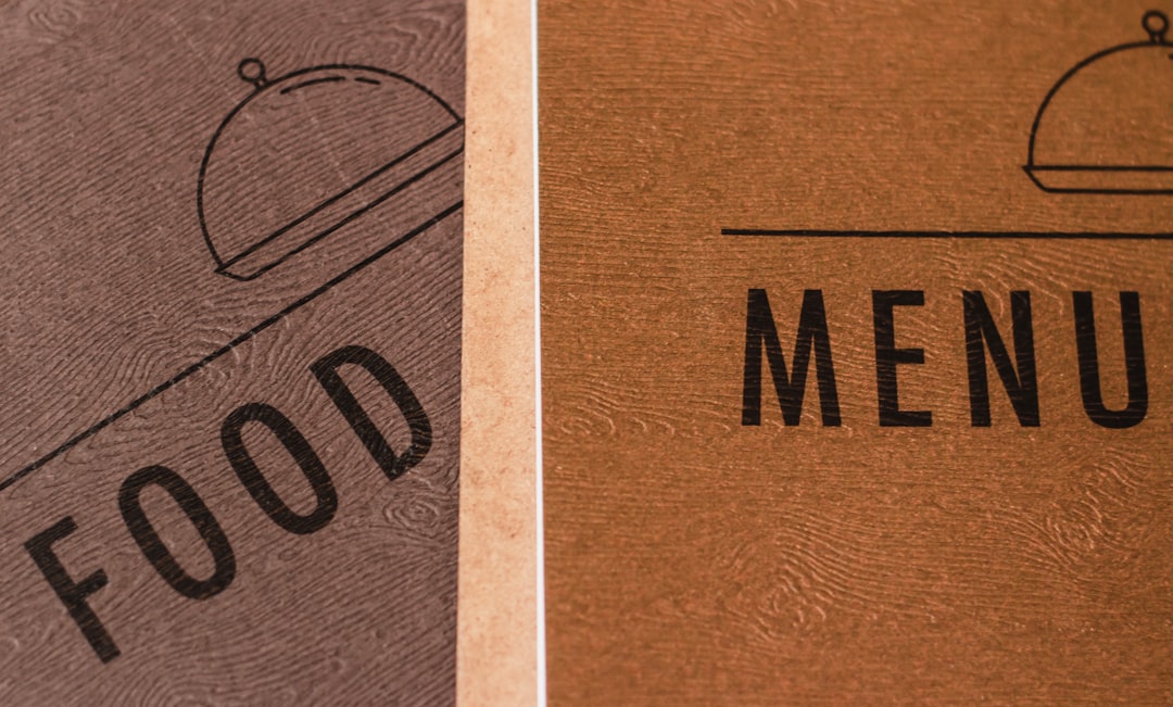
Menu Design: Restaurant Menus That Sell
Menu design is one of the highest-leverage pieces of print a restaurant owns — it is a silent salesperson that every guest reads with a wallet open. A well-engineered menu does not just list food; it steers attention toward the most profitable dishes and quietly downplays price sensitivity. This guide covers the pricing psychology, layout patterns, and typography that turn a menu from a list into a sales tool.
Menu design sits inside the broader craft of event and print stationery — for the fundamentals on sizes, stock, and typography, see our complete guide to invitation design. This article focuses on what makes a restaurant menu actually sell.
Pricing Psychology: The Rules That Move Margin
How prices are presented affects spending as much as the prices themselves. A handful of evidence-backed conventions are now standard practice in menu engineering:
- Drop the currency symbol. Writing “24” instead of “$24” softens the reminder that diners are spending money and consistently nudges spending up.
- Never use leader dots. Dotted lines running from a dish to its price train the eye to scan straight down the price column and order the cheapest item. Place the price quietly at the end of the description instead.
- Avoid a right-aligned price column. Same problem — a tidy column of prices invites price-shopping. Let prices sit inline.
- Use charm pricing sparingly. “.95” endings read as value/casual; whole numbers read as upscale. Match the ending to your positioning.
- Anchor with a high-priced item. One expensive dish makes everything below it feel reasonable by comparison.
Eye-Magnet Placement
Diners do not read a menu top to bottom — their eyes land on specific zones first. Designers exploit this with deliberate placement. On a single-page or tri-fold menu, the upper-right area and the top of each section get the most attention, so the dishes you most want to sell — high-margin items, signatures — belong there.
Reinforce those positions with visual eye magnets: a box or shaded panel, a small icon, an illustration, or extra white space around a dish. The eye is drawn to anything that breaks the pattern, so use that power on your profit drivers — and use it sparingly, because boxing every item cancels the effect.
Layout and Structure
A menu’s structure should make ordering effortless. Group dishes into clear sections (starters, mains, sides, desserts) and keep each section short — long lists cause decision paralysis and push diners toward familiar safe choices. Many high-performing menus deliberately limit each category to around seven items.
- Choose a format that fits service. Single page, bi-fold, or tri-fold for restaurants; a compact card for bars and cafes.
- Lead each section with your strongest seller. The first and last items in a list are remembered most.
- Write descriptions that sell. Sensory, specific language (“slow-braised,” “house-made”) raises both appeal and perceived value.
- Control density. White space signals quality; a cramped menu signals a diner mill.
- Keep it readable in low light. Many restaurants are dim — test contrast and size in the actual room.
Menu Typography
Type sets the tone before a single dish is read. A casual cafe and a fine-dining room call for completely different systems. The reliable formula pairs a display face for section headers and the restaurant name with a highly legible text face for dish names and descriptions. A refined serif signals upscale; a clean sans signals modern and casual; a calligraphic script paired with a serif reads elegant and warm.
Keep body text at a comfortable size — menus are read in poor light, so do not go below roughly 10pt — and maintain strong contrast between dish names (bolder or larger) and descriptions (lighter, smaller). Limit yourself to two type families. For combinations that hold together across headers and body, see our font pairing guide.
Paper, Format, and Durability
Menus take abuse — fingerprints, spills, constant handling — so material choice is practical, not just aesthetic. For frequently reprinted menus, a sturdy cardstock (110–130lb) with a light coating resists smudges. For permanent menus, a laminate or a menu cover/folder protects the printed sheet and allows easy page swaps. Restaurants that change offerings often print the food list on an inexpensive insert inside a durable, branded cover.
| Menu type | Best format | Material |
|---|---|---|
| Fine dining | Single sheet in a cover | Heavy uncoated or cotton insert |
| Casual / bistro | Bi-fold or tri-fold | Coated 110lb cardstock |
| Cafe / bar | Compact card or table tent | Laminated cardstock |
| Daily specials | Printed insert | Light text stock, frequent reprint |
Writing Descriptions That Sell
Copy is part of menu design, and the wording around a dish measurably changes how appealing and how valuable it feels. Vague names (“chicken sandwich”) leave money on the table; sensory, specific language (“buttermilk-brined fried chicken, house pickles, brioche”) raises both appeal and the price a diner will accept. A few habits that consistently lift perceived value:
- Lead with the hero ingredient or technique — “slow-braised,” “wood-fired,” “hand-rolled.”
- Name provenance sparingly — a farm or region adds credibility, but only where it is true.
- Keep descriptions tight — one evocative line beats a paragraph that slows scanning.
- Stay honest — overpromising in copy and underdelivering on the plate erodes trust fast.
Menu Engineering: Mapping Profit and Popularity
Beyond layout, menu engineering is the practice of plotting each dish on two axes — how profitable it is and how often it sells — and then designing the menu around the result. High-profit, high-popularity dishes are your stars: give them eye-magnet placement and strong descriptions. High-profit but low-popularity dishes are puzzles worth promoting up the page. Low-profit but popular items can be repositioned or repriced, and low-profit, low-popularity items are candidates to cut entirely. The point is that design and data work together: the menu’s visual hierarchy should follow the margin map, not the chef’s personal favorites.
Tools for Designing Menus
For full control over typography, columns, and print output, Adobe InDesign is the standard — it handles multi-section layouts and styles efficiently when you reprint often. Illustrator suits a single-page graphic-led menu, and Canva works for small cafes and table tents with print-ready export. Always export a 300 DPI PDF with bleed and order a printed proof to check contrast in the actual dining-room lighting.
Designing a full event? Coordinate the menu with the rest of the stationery — pair it with matching event program design and, for celebrations, your wedding invitation design so the table tells one visual story.
Frequently Asked Questions
Should you put dollar signs on a menu?
No. Removing the currency symbol and writing “24” instead of “$24” softens the reminder that diners are spending money and consistently nudges spending higher. Pair this with prices placed quietly at the end of each description rather than in an aligned column to discourage price-shopping.
Why are leader dots bad in menu design?
Dotted leader lines that connect a dish to its price train the eye to scan straight down the price column, encouraging diners to compare prices and order the cheapest option. Instead, place the price quietly inline at the end of the dish description so the food, not the cost, leads attention.
Where should you place high-profit dishes on a menu?
Diners’ eyes land first on the upper-right area and the top of each section, so put your highest-margin and signature dishes there. Reinforce them with eye magnets like a shaded box, a small icon, or extra white space — used sparingly, since boxing every item cancels the effect.
How many items should a menu section have?
Keep each section short — around seven items is a common target — because long lists cause decision paralysis and push diners toward safe, familiar choices. Shorter sections make ordering effortless and let you highlight your strongest, most profitable dishes rather than burying them in a long list.
What font size should a menu use?
Keep body text comfortably readable, generally no smaller than about 10pt, because restaurants are often dimly lit. Maintain strong contrast between dish names, set bolder or larger, and descriptions, set lighter and smaller. Always proof the printed menu in the actual dining-room lighting before finalizing.


