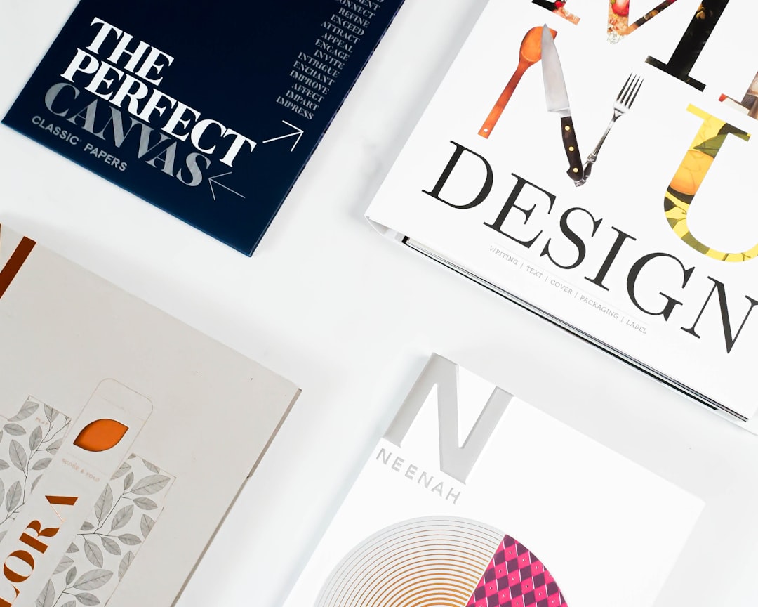
Type Design: How Typefaces Are Made
Type design is the discipline of drawing the letters, numbers, punctuation, and symbols that make up a typeface — then spacing them, refining them, and exporting them as a working font file. It sits at the intersection of drawing, engineering, and language: a single well-made family can take a year or more to complete. This guide walks through the full process the way a working type designer experiences it, from the first pencil sketch to the final exported font.
Whether you want to understand the craft, hire a type designer, or eventually draw your own letters, knowing how typefaces are made changes how you see every word on screen and in print.
What Type Design Actually Is
It helps to separate three words people use loosely. A typeface is the design — the shared visual logic across every character, like Helvetica or Garamond. A font is a specific file or instance of that design at a given weight and style, such as Helvetica Bold Italic. A type family is the full set of related fonts — regular, bold, italic, condensed, and so on — that ship together.
The distinction once had a physical basis: in metal type, a “font” was literally one drawer of cast letters at a single size and weight, while the “typeface” was the design shared across every size. Digital type collapsed the size constraint, but the relationship survives — one typeface, many fonts. Type designers think and work at the level of the typeface, making decisions that must hold true across every weight and style they will eventually produce.
Type design is the work of creating the typeface and producing those fonts. It is not the same as choosing and pairing existing fonts, which is what most designers do day to day. Type design is making the raw material everyone else uses.
Good type design is invisible. When a paragraph reads effortlessly, that ease is the product of thousands of micro-decisions about shape, weight, rhythm, and spacing. If you want a structured starting point for trying it yourself, our beginner’s guide to making a font takes the same workflow below and turns it into a first project you can actually finish.
The Type Design Workflow, Step by Step
Nearly every typeface, regardless of style, moves through the same five-stage workflow: sketch, digitize, space and kern, hint, and export. The order matters — skip ahead and you pay for it later.
- Sketch and define the concept. Decide what the typeface is for and what makes it distinct, then draw a small set of key letters by hand.
- Digitize the drawings. Convert sketches into precise vector outlines inside font-editing software.
- Space and kern. Tune the white space between every pair of letters so words read evenly.
- Hint for screens. Add instructions that keep letters crisp at small pixel sizes.
- Test and export. Proof the design in real text, then generate the final font files.
Stage 1: Sketching and the design brief
Every typeface starts with a question: what is it for? A face for long-form book reading needs a generous x-height, open counters, and modest contrast. A display face for posters can be eccentric because it only ever appears large. A designer writes a short brief — intended use, mood, technical constraints, language coverage — before drawing a single curve.
Sketching usually begins with a handful of “control characters” rather than the whole alphabet. The lowercase n and o establish the stem weight, the curve logic, and the proportions; H and O do the same for capitals. Designers often sketch the test words “hamburgevons” or “adhesion” because together those letters contain straights, curves, joins, and diagonals — enough to judge the whole system early.
This is also where the typeface’s contrast model is set. Will the strokes be uniform in weight, as in a geometric sans like the lineage of Futura? Or will they swell and thin like a traditional serif, where the contrast echoes the angle of a broad-nib pen? That single decision ripples through every glyph, so designers resolve it on a few letters before committing the whole alphabet. Getting it wrong here means redrawing hundreds of glyphs later.
Stage 2: Digitizing the letterforms
Sketches become vectors. Many designers draw initial shapes in Adobe Illustrator for its familiar drawing tools, but the real work happens in dedicated font editors, because they understand the coordinate systems, metrics, and family structure a typeface needs. The goal is clean outlines built from as few points as possible, placed at curve extremes, with consistent stroke modulation across the family.
This is where the abstract design logic becomes concrete. To do it well you need to be fluent in the vocabulary of letterforms — the baseline, bowl, stem, serif, terminal, and the rest. Our full breakdown of font anatomy and the parts of a letter is essentially the working vocabulary type designers use every hour.
Stage 3: Spacing and kerning
This is the stage beginners underestimate and professionals obsess over. Spacing sets the default white space on the left and right of each glyph (its sidebearings) so that the rhythm of a word feels even. Kerning then corrects specific problem pairs — the gap in “AV”, “To”, or “We” — that look wrong with default spacing.
A useful way to grasp the difference: spacing is the rule, kerning is the exception. Spacing handles every letter’s default fit; kerning steps in only where a particular pair of shapes defeats that default. A well-spaced typeface needs relatively few kerning pairs, because the underlying fit is already even. A poorly spaced one needs hundreds of kerns to paper over the cracks — a sign the foundation was never solid. Professionals get spacing right first and treat kerning as a finishing pass, not a rescue operation.
Even, confident spacing is the single biggest factor separating an amateur font from a professional one. A beautifully drawn alphabet with poor spacing reads badly; an averagely drawn alphabet with excellent spacing can read well. It is tedious, judgment-heavy work that no algorithm fully replaces.
Stage 4: Hinting
Hinting is a set of instructions embedded in the font that tells the rasterizer how to render outlines on a low-resolution pixel grid. At 11px on a screen, an unhinted stem might land between two pixel rows and turn blurry or uneven. Hinting snaps key features to the grid so text stays sharp. High-resolution displays have reduced how much manual hinting matters, but it is still essential for fonts that will appear small on older or lower-density screens.
Stage 5: Testing and export
Before release, a typeface is proofed in real settings — body paragraphs, headlines, all-caps, numbers in tables, multiple languages. Designers print proofs, view them on several screens, and stress-test edge cases. Only then are the final fonts exported. Understanding the output side matters too; our guide to font file formats explains why you ship OTF, TTF, and WOFF2 for different uses.
The Tools Type Designers Use
Choosing software is one of the first practical decisions. The serious options are mature and specialized; the table below compares the main editors.
| Tool | Platform | Cost | Best for |
|---|---|---|---|
| Glyphs | macOS | Paid (one-time) | The most popular modern editor; fast, approachable, huge plugin ecosystem |
| FontLab | macOS / Windows | Paid | Deep, professional, cross-platform; long industry pedigree |
| RoboFont | macOS | Paid | Minimal, scriptable, favored by designers who automate with Python |
| BirdFont | Cross-platform | Free | The best free entry point for learning the basics |
| Adobe Illustrator | macOS / Windows | Subscription | Initial letter shapes only — not a font editor |
A common mistake is trying to build an entire font in Illustrator. It is excellent for drawing a logo wordmark or a few display letters, but it has no concept of metrics, kerning, or family structure. Draw in Illustrator if you like, then move into a real editor like Glyphs or free BirdFont for everything after the shapes.
What Separates Good Type Design from Bad
The qualities that define a professional typeface are concrete and learnable. They include consistent stroke modulation across every glyph, even spacing and clean kerning, generous and legible counters, a unified treatment of details like terminals and serifs, and design choices appropriate to the intended use. A typeface also needs adequate glyph coverage for the languages it claims to support — accents, currency, punctuation, and alternates.
These are exactly the criteria we expand on in our piece on what makes a good font, which is the evaluator’s-eye companion to this maker’s-eye guide. If you ever assess fonts before buying or licensing, read it alongside this one.
Custom and Bespoke Type Design
Type design is not only about retail fonts sold to anyone. A large share of professional work is custom type design: a typeface commissioned by a single brand for its exclusive use. Major brands across tech, media, and retail commission proprietary typefaces because owning the type strengthens visual recognition and, at scale, removes recurring licensing fees across thousands of uses.
A bespoke face can be a fully original design or a customized version of an existing one. Either way, the workflow above still applies — it is just scoped to one client’s voice. We cover the business and brand logic of this in detail in our guide to custom font design for brands.
How to Start Learning Type Design
You do not need a degree to begin, though formal type-design programs exist and are excellent. A practical path:
- Learn letterform anatomy first. You cannot draw what you cannot name.
- Study existing typefaces closely. Set the same word in several fonts and articulate the differences.
- Start small. Design a single weight of a limited character set before attempting a full family.
- Pick one editor and learn it deeply — free BirdFont to learn, or Glyphs if you are committed.
- Space obsessively. Spend more time on spacing than you think you need to.
When you are ready to build something end to end, follow our step-by-step guide to making your first font. And when you need fonts to study or use in the meantime, our roundup of where to download fonts, free and paid points you to reputable sources — and reminds you to check the license every time.
Frequently Asked Questions
How long does it take to design a typeface?
A single weight with a basic Latin character set can take a few weeks of focused work. A complete, professionally spaced family with multiple weights, italics, and broad language coverage typically takes six months to over a year. Most of that time goes into spacing, kerning, and testing rather than drawing.
Do I need to know how to draw to do type design?
You need drawing judgment more than drawing skill. Type design is precise vector editing guided by a trained eye for curves, weight, and rhythm. Many strong type designers are not illustrators, but they all develop a deep sensitivity to letterform shapes and the white space between them.
What software do professional type designers use?
The most common professional editors are Glyphs (macOS), FontLab (cross-platform), and RoboFont (macOS). Beginners often start with free BirdFont. Adobe Illustrator is used only to draw initial letter shapes, not to build the actual font.
Is type design the same as graphic design?
No. Graphic design uses type to communicate; type design creates the type itself. It is a specialized field closer to a blend of drawing and engineering, with its own tools, vocabulary, and standards. Many graphic designers never design a typeface, and many type designers do little general graphic design.
Can I sell a font I design?
Yes. You can sell fonts directly, through marketplaces, or through a type foundry. Before selling, make sure every glyph is your original work and choose a clear end-user license agreement. Our font licensing guide explains the license types buyers expect.


