Symmetry in Design Explained
Symmetry in design is one of the oldest tools for creating a sense of balance and order, because the human eye reads mirrored, repeating arrangements as stable and intentional. There are four main types — reflective, rotational, translational, and radial — and each produces a distinct feeling. Understanding when to use symmetry, and when to break it for asymmetry, is a core part of our wider design principles guide and connects closely to balance in design.
What are the main types of symmetry?
Symmetry comes in four classic forms. Recognizing them lets you describe exactly what kind of order a design uses — and choose the right one for the effect you want.
| Symmetry type | How it works | Effect / common use |
|---|---|---|
| Reflective (bilateral) | Mirrored across an axis | Formal, stable — logos, certificates |
| Rotational | Repeats around a central point | Dynamic order — pinwheels, badges |
| Translational | Repeats by shifting position | Rhythm — patterns, backgrounds |
| Radial | Radiates from a center outward | Focus, energy — mandalas, emblems |
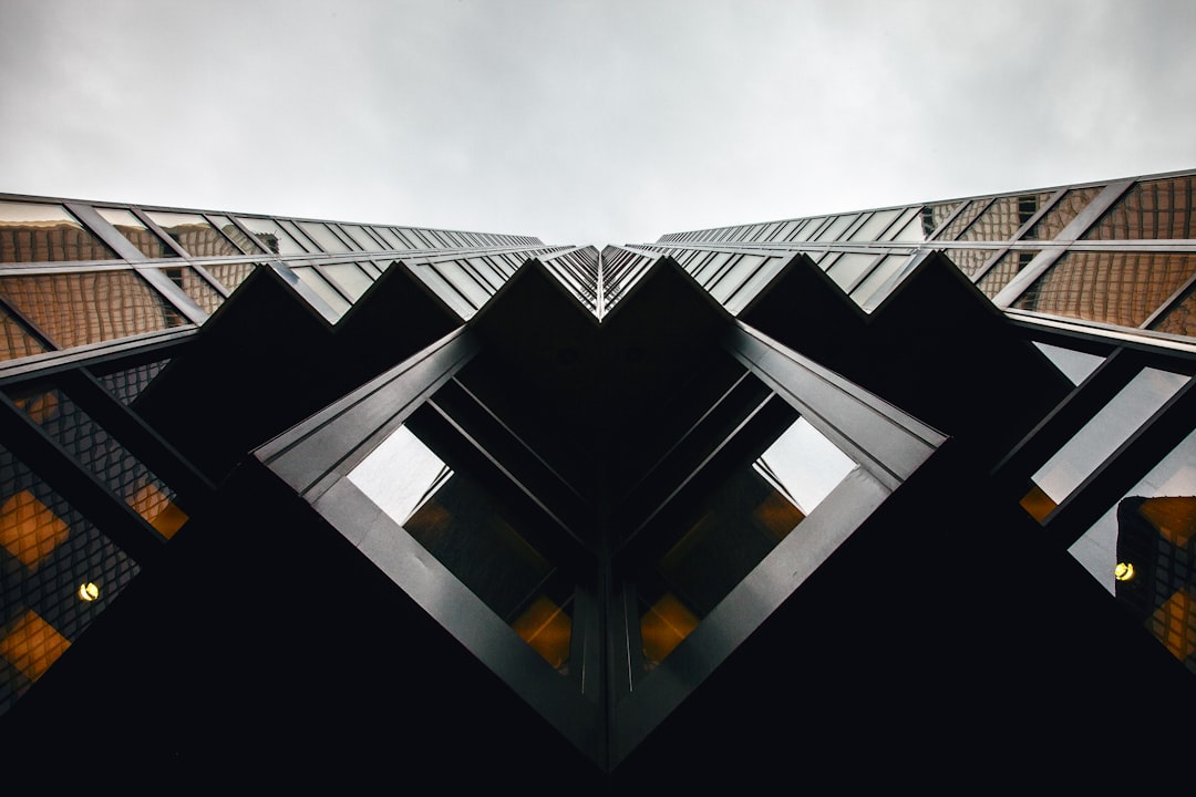
Reflective symmetry, also called bilateral symmetry, is the most familiar: one half mirrors the other across a vertical or horizontal axis, the way a butterfly’s wings match. It reads as formal and trustworthy, which is why so many emblems and crests use it.
How does rotational symmetry work?
Rotational symmetry exists when a design looks the same after being rotated around a central point by some angle less than a full turn. A three-blade fan has rotational symmetry every 120 degrees; a pinwheel logo repeats as it spins. The effect feels ordered but more energetic than reflective symmetry, because the rotation implies motion even in a static image.
Designers reach for rotational symmetry when they want structure with a sense of movement — recycling icons, propeller and turbine marks, and many tech logos use it to feel both organized and dynamic. It pairs naturally with ideas covered in movement in design, since the implied rotation guides the eye in a circle.
What is translational symmetry?
Translational symmetry repeats an element by moving it a fixed distance without rotating or mirroring it — think of a row of identical fence posts or a repeating wallpaper motif. It is the engine behind most patterns and is fundamental to creating rhythm, the regular, predictable repetition that the eye finds satisfying.
Because the repeated element stays in the same orientation, translational symmetry feels calm and continuous rather than focal. It is ideal for backgrounds, textiles, packaging patterns, and any surface where you want consistent texture without a single dominant point of interest. This makes it a close relative of texture in design, where repetition builds visual surface.
What is radial symmetry?
Radial symmetry arranges elements around a central point so they radiate outward like spokes on a wheel or petals on a flower. It combines aspects of rotational and reflective symmetry and is exceptionally good at creating a strong central focal point, because everything in the composition points back to the middle.
You see radial symmetry in mandalas, compass roses, sunburst graphics, and many sports and institutional emblems. Its built-in focus and sense of completeness make it powerful for badges and seals — anywhere you want a self-contained, authoritative mark. The trade-off is that radial designs can feel rigid, so they suit identity marks more than flexible page layouts.
Radial symmetry also lends itself to data and diagram work — pie charts, sunburst charts, and circular infographics all borrow its centered logic, using the shared center to imply that every segment belongs to one whole. When you need to communicate parts of a unified system rather than a linear sequence, the radial form does that almost automatically.
Symmetry vs asymmetry: which should you choose?
Asymmetry is the deliberate absence of mirrored balance — elements of different sizes and positions arranged so they still feel counterweighted. Where symmetry feels stable, formal, and traditional, asymmetry feels dynamic, modern, and energetic. Neither is better; they serve different goals.
This maps onto two related terms: formal balance (symmetrical, even, dignified) and informal balance (asymmetrical, achieved by counterweighting different elements). A wedding invitation usually wants formal, symmetrical balance; a sports brand or a tech startup usually wants the energy of asymmetry. The skill is matching the balance type to the message — and remembering that asymmetric layouts still need to feel balanced, just not mirrored. For more on distributing visual weight either way, see our guide to balance in design.
When does symmetry strengthen a design?
Reach for symmetry when you want to communicate stability, trust, tradition, or premium quality — banks, luxury brands, government bodies, and formal documents all lean symmetrical for exactly this reason. Reflective symmetry in particular reads as honest and dependable, which is why so many wordmarks and crests are built around a central axis.
The risk is that perfect symmetry can feel static or even boring if overused, since it gives the eye little to explore. A common professional move is to establish a largely symmetrical structure, then introduce one small asymmetric element to add interest without sacrificing the stable foundation — the same establish-then-break logic that governs grid principles.
It also helps to remember that symmetry operates at different scales within one design. A layout can be symmetrical overall — a centered logo, balanced margins — while individual components inside it are arranged asymmetrically for energy. This layering lets you keep the reassuring stability of an overall symmetrical frame while still giving each section the dynamism that pure mirror symmetry would flatten. Matching the right kind of balance to each level of the design is what makes the final result feel both composed and alive.
Frequently Asked Questions
What is symmetry in design?
Symmetry in design is the balanced arrangement of elements so that one part mirrors or repeats another around an axis or central point. It signals order, stability, and trust, which is why it appears so often in logos, architecture, and formal branding. Its opposite, asymmetry, brings energy and movement instead.
What are the four types of symmetry?
The four types are reflective (bilateral) symmetry, which mirrors across an axis; rotational symmetry, which repeats around a center point; translational symmetry, which repeats by shifting position; and radial symmetry, which radiates outward from a center. Each creates a different feeling, from formal stability to dynamic energy.
What is the difference between symmetry and asymmetry?
Symmetry arranges elements so parts mirror or repeat each other, creating stability and a formal, traditional feel. Asymmetry deliberately avoids mirroring, using different sizes and positions that are counterweighted to feel balanced yet dynamic and modern. Symmetry equals formal balance; asymmetry equals informal balance achieved through counterweighting.
Is symmetry or asymmetry better in design?
Neither is universally better — they serve different goals. Symmetry suits brands wanting trust, tradition, and premium calm, like banks and luxury labels. Asymmetry suits brands wanting energy and modernity, like tech startups and sports brands. The right choice depends on the message and emotion you want the design to convey.
What is radial symmetry used for?
Radial symmetry arranges elements around a central point so they radiate outward, creating a strong central focal point and a sense of completeness. It is common in mandalas, compass roses, sunburst graphics, and institutional emblems or seals, where a self-contained, authoritative mark with built-in focus is desired.


