15 Illustration Styles Every Designer Should Know
Naming the look you want is half the battle. When a client says “make it friendlier” or “more premium,” they are reaching for an illustration style they cannot name, and your job is to translate that into a concrete visual language. This guide breaks down 15 illustration styles in active use in 2026, what each one signals, where it works, and what it costs you in production time, so you can choose deliberately instead of defaulting to whatever your last project used.
These styles are not rigid boxes; the best work often blends two or three. But you cannot mix what you cannot identify, so treat this as a vocabulary you build on. We will move roughly from the simplest, fastest styles to the most labor-intensive, and point you to deeper guides on the techniques and tools behind them.
How to Think About Illustration Style
Before the list, a framing that will save you grief: a style is a set of constraints, not a coat of paint. Flat illustration is defined by what it leaves out (gradients, perspective, fine detail); a painterly style by what it commits to (texture, light, brushwork). When you pick a style, you are picking a production budget and a mood at the same time.
Three questions decide the right style for any brief: Who is the audience, and what feels native to them? What is the production budget and timeline? And does it need to scale, animate, or sit beside an existing brand system? A style that looks great as a single hero image can be a nightmare to extend across 40 spot illustrations. Keep that tension in mind as you read.
1. Flat Illustration
Flat illustration strips away gradients, shadows, and perspective in favor of solid color shapes and clean outlines. It dominated the 2010s and remains a workhorse because it is fast to produce, scales as vector art, and reads instantly at small sizes. Use it for onboarding screens, explainer graphics, and editorial spots where clarity beats realism. The trade-off is ubiquity: pure flat can feel generic, which is why most teams now add a touch of texture or depth. For a full comparison of where flat shines and where dimensional work wins, see our breakdown of flat vs 3D illustration.
2. Flat 2.0 (Semi-Flat)
Flat 2.0 keeps the simplicity of flat but reintroduces subtle shadows, long shadows, highlights, and restrained gradients to add a sense of depth. It is the dominant editorial and SaaS style of the mid-2020s because it photographs well in marketing, scales cleanly, and avoids the sterile feeling of pure flat. If a client wants “modern and approachable,” this is usually the safest starting point.
3. Line Art
Line art reduces a subject to outlines, often a single consistent stroke weight, with little or no fill. It feels light, elegant, and confident, which is why it suits premium brands, packaging, and minimalist UI. Monoline (uniform-width) line art is the most common variant; weighted line art varies stroke thickness for a more hand-drawn feel. Line art pairs beautifully with generous white space and is cheap to recolor since there is little fill to manage.
4. Isometric Illustration
Isometric illustration uses a fixed 30-degree angle to depict objects in pseudo-3D without true perspective. It excels at showing systems, networks, floor plans, infrastructure, app ecosystems, where you need to convey “how the parts fit together.” It is heavily used in tech and B2B marketing. Building isometric art on a proper grid is essential; freehanding the angles will read as subtly wrong. It is more time-consuming than flat, but the payoff in clarity for complex topics is large.
5. Outline / Stroke Illustration
A close cousin of line art, outline illustration combines line work with selective flat fills, often a single accent color filling key shapes while everything else stays as a stroke. This hybrid is popular in feature sections and icon-adjacent spot art because it carries more information than pure line art while staying light. It is the natural bridge between an icon set and full illustration, which is why teams building a cohesive visual system often adopt it; our icon design guide covers how to keep stroke weights consistent across both.
6. Hand-Drawn / Sketch Style
Hand-drawn illustration embraces visible imperfection, pencil texture, wobbling lines, organic shapes. It signals warmth, craft, and human authorship, which makes it a favorite for food brands, lifestyle products, and anything positioning itself against polished corporate sameness. The risk is consistency: a hand-drawn system needs a defined “hand” (stroke character, level of roughness) or it looks accidental rather than intentional. Done well, it is one of the most disarming and ownable styles available.
7. Textured / Grain Illustration
Texture illustration layers grain, noise, paper texture, or grit over otherwise clean shapes to evoke print, risograph, or mid-century work. The texture does emotional heavy lifting: it makes digital art feel tactile and a little nostalgic. This style surged with the broader retro revival and works well for editorial, music, and culture brands. Practically, you build clean flat or semi-flat shapes first, then apply texture as an overlay, so the underlying art stays editable.
8. Geometric Illustration
Geometric illustration constructs subjects from basic shapes, circles, triangles, rectangles, often on a visible grid. It feels structured, modern, and systematic, which suits fintech, architecture, and brands that want to signal precision. Because the building blocks are simple and reusable, geometric systems scale efficiently across large illustration libraries. The discipline here is restraint: a tight shape vocabulary and consistent corner radii hold the whole set together.
9. Character Illustration
Character-driven illustration centers on people or mascots and is the connective tissue of most product and brand storytelling. A strong cast of characters humanizes abstract products and gives marketing a recurring, recognizable presence. The challenge is building characters that stay on-model across many poses and scenes. If you are starting from scratch, our primer on character design basics walks through silhouette, proportion, and expression, the fundamentals that keep a character recognizable from frame to frame.
10. Corporate Memphis (Humanist Flat)
Love it or loathe it, “Corporate Memphis”, flat figures with oversized limbs, simplified faces, and bright palettes, defined a decade of tech marketing. It is fast, friendly, and infinitely scalable, which is exactly why it became a cliché. In 2026 the smart move is to borrow its efficiency while differentiating: distinctive proportions, a unique palette, or added texture pull you out of the sameness. Mention it to a client and they will know the look immediately, even if they cannot name it.
11. Detailed / Editorial Illustration
Editorial illustration is conceptual and idea-led, the kind of single, considered image that accompanies a long-form article or opinion piece. It prizes metaphor and composition over decoration, often blending styles to serve the concept. This is where illustration becomes closest to fine art and commands the highest craft. It rarely needs to scale into a system; each piece is bespoke, which changes both the budget and the brief.
12. Vector Pattern & Spot Illustration
Not every illustration is a hero image. Spot illustrations, small, repeatable vector elements, and seamless patterns do enormous work across packaging, backgrounds, and UI accents. Because they are vector, they recolor and tile effortlessly. Understanding why they stay crisp at any size comes down to how vectors are built; if that is fuzzy, our explainer on vector graphics covers the math that makes infinite scaling possible.
13. 3D Illustration
3D illustration builds and renders objects in three-dimensional software, producing the soft, claymation-like or hyper-glossy looks that flooded tech branding in the 2020s. It carries unmatched depth, realism, and a premium feel, and it has become dramatically more accessible thanks to tools like Spline and Blender. The cost is real: 3D has a steep learning curve and heavier production time than any 2D style. It is the headline example in our deeper flat vs 3D illustration comparison.
14. Painterly / Digital Painting
Painterly illustration uses brushwork, blended color, and lighting to approximate traditional painting on a tablet. It delivers richness and atmosphere that vector styles cannot touch, which is why it dominates book covers, game art, and editorial features. It is raster-based, so it does not scale infinitely, and it demands genuine drawing and painting skill plus a pressure-sensitive tablet. This is craft-forward illustration in its purest digital form.
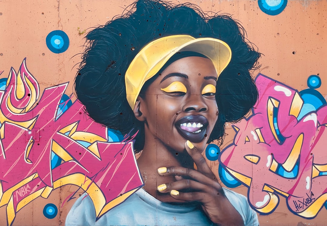
15. Collage & Mixed Media
Collage illustration assembles photography, scanned textures, cut-paper shapes, and vector elements into a single composition. It feels expressive, contemporary, and a little anarchic, which suits culture, fashion, and campaign work that wants to stand out. Because it mixes raster and vector sources, file management and consistency take more planning, but the upside is a look that is genuinely hard to replicate generically.
Choosing the Right Style for the Job
With the vocabulary in hand, the decision gets practical. A few rules of thumb:
- Need speed and scale across many images? Flat, flat 2.0, line art, or geometric. They are vector, fast, and systematic.
- Explaining a complex system or product? Isometric carries structure better than any flat layout.
- Want warmth and human craft? Hand-drawn, textured, or collage signal authorship and stand apart from corporate defaults.
- Selling a premium or immersive experience? 3D or painterly deliver depth, at a higher production cost.
- Building a brand presence over time? Character illustration gives you a recurring, ownable cast.
Whatever you choose, commit to its constraints. The fastest way to make any illustration system look amateur is to mix incompatible styles without intention, glossy 3D next to scrappy hand-drawn with no connective logic. Pick a lane, define the rules, and let the consistency do the heavy lifting.
The Tools Behind These Styles
Style and tool are linked but not identical. Vector styles (flat, line art, isometric, geometric) live in Adobe Illustrator, Affinity Designer, or free Inkscape. Painterly and textured work happen in Procreate, Photoshop, or Krita on a tablet. 3D illustration runs on Blender (free) or Spline (web-based and beginner-friendly). For a current rundown of what to actually buy or download, see our guide to the best digital illustration tools in 2026, which maps each tool to the styles it handles best.
If you are building skill from the ground up, start narrow. Master one vector style and one tool before sprawling. Drawing clean icons is a deceptively good on-ramp because it forces precision in a small frame; our walkthrough on how to draw icons is a low-stakes way to build the path-and-curve fundamentals every style above depends on.
Frequently Asked Questions
What are the main types of illustration styles?
The most common illustration styles include flat, flat 2.0 (semi-flat), line art, isometric, geometric, hand-drawn, textured, character, 3D, painterly, and collage. Vector-based styles like flat and line art are fast and scalable, while painterly and 3D styles offer depth and realism at a higher production cost.
Which illustration style is most popular in 2026?
Flat 2.0 (semi-flat) and 3D illustration are the two dominant styles in 2026. Semi-flat remains the default for SaaS and editorial because it is scalable and approachable, while 3D illustration has surged thanks to accessible tools like Spline and Blender that give brands a premium, dimensional look.
How do I choose the right illustration style for a project?
Match the style to three things: your audience, your production budget, and whether the art needs to scale or animate. Choose flat, line art, or geometric for speed and large systems; isometric for explaining complex products; and 3D or painterly when you need depth and a premium feel.
Do I need to draw to create illustrations?
Not for every style. Vector styles like flat, geometric, and isometric rely on construction and shape-building more than freehand drawing, so they are accessible to designers with limited drawing skill. Painterly and detailed character work, however, do require genuine drawing ability and a pressure-sensitive tablet.
What software do illustrators use?
Vector illustration uses Adobe Illustrator, Affinity Designer, or free Inkscape. Raster and painterly work happens in Procreate, Photoshop, or Krita. For 3D illustration, Blender (free) and Spline (web-based) are the standards. The right tool depends on the style you are working in rather than the other way around.


