Web Design Trends to Watch in 2026
The most useful web design trends are not the ones that look novel in a portfolio shot; they are the ones that quietly raise conversion, speed, and trust. In 2026 the dominant direction is consolidation: teams are stripping back the gimmicks of the last few years and doubling down on legible type, fast loads, real accessibility, and interfaces that respect attention. This is the hub for our Web and UI Design Patterns cluster, and it links down to every deep dive below.
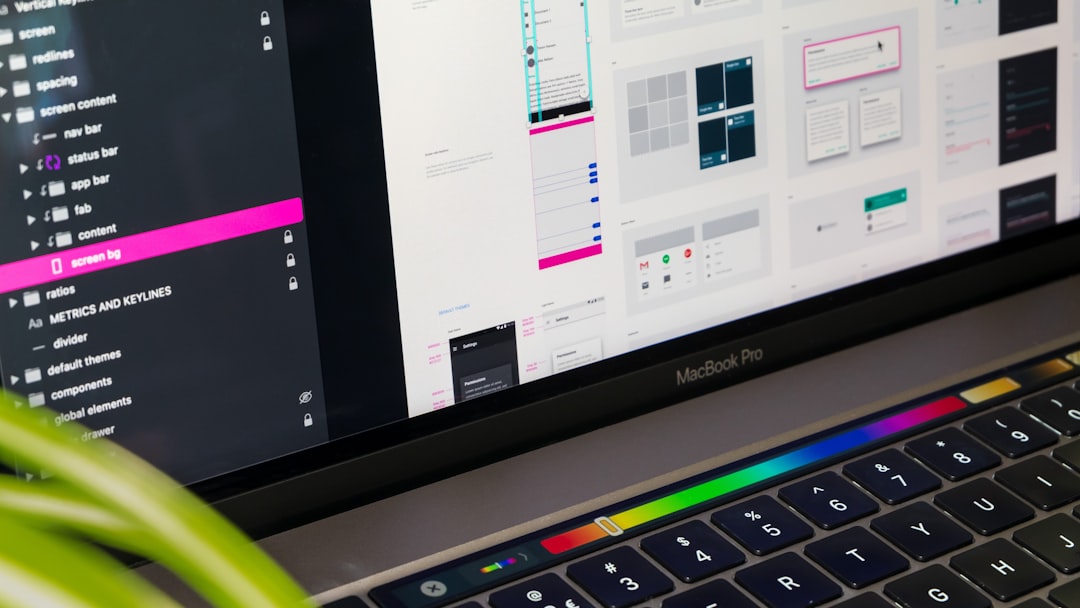
Below we walk through the directions worth your time this year, why each is gaining ground, and where to read the full practitioner guide for each topic. Treat this page as a map: skim the sections, then follow the links to the articles where we get specific about ratios, breakpoints, and component patterns.
The Big Picture: Restraint Over Spectacle
The clearest theme of 2026 is functional minimalism. After years of heavy parallax, autoplaying video backgrounds, and scroll-jacking, designers are returning to interfaces that load fast and get out of the way. Core Web Vitals, especially Largest Contentful Paint (LCP), have made performance a design constraint rather than an engineering afterthought, and a single oversized hero video is often the thing standing between a site and a good score.
Restraint shows up everywhere: fewer fonts, tighter color systems, generous white space, and motion used to communicate state rather than to impress. The sites that feel current in 2026 are not the busiest ones; they are the ones where every element earns its place. That mindset underpins each trend below.
Dark Mode Becomes the Default Consideration
Dark mode is no longer an optional toggle bolted on at the end. Teams now design light and dark in parallel, using the CSS prefers-color-scheme media query to respect the operating system setting and offering a manual override on top. The craft has matured too: good dark interfaces use elevated dark greys such as Material’s #121212 rather than pure black, because pure black against bright text creates harsh halation and makes shadow-based elevation impossible to read.
Done well, dark mode reduces eye strain in low light, can save power on OLED screens, and signals a modern, considered product. Done badly, it produces unreadable low-contrast text and washed-out brand colors. For the full system, including contrast targets and a tested dark palette, read our guide to dark mode design best practices.
Mobile-First Is the Baseline, Not a Feature
Designing for the smallest screen first stopped being a trend and became the baseline, but in 2026 the discipline around it is sharper. Mobile-first design means starting layout, content priority, and interaction at a narrow breakpoint, then progressively enhancing upward to tablet and desktop. The payoff is forced prioritization: when you only have a 360px column to work with, you cannot hide a weak value proposition behind a wide hero.
Practical mobile-first work now revolves around fluid type with clamp(), container queries for component-level responsiveness, and touch targets that meet the 44 by 44 pixel (Apple) and 48dp (Material) minimums. For breakpoints, content strategy, and a step-by-step approach, see our explainer on mobile-first design.
Accessibility Moves From Compliance to Craft
The strongest shift in 2026 is that web accessibility is being treated as design quality rather than a legal checkbox. WCAG 2.2 AA sets the practical bar most teams work to: a contrast ratio of at least 4.5:1 for normal body text and 3:1 for large text and UI components, visible focus indicators, keyboard operability, and form fields with persistent labels.
Accessible design overlaps almost completely with good design. High contrast helps everyone in sunlight; clear focus states help keyboard and mouse users alike; descriptive labels reduce errors for all. The teams winning in 2026 bake these requirements into components from the start. Our complete walkthrough is the web accessibility designer’s guide.
Forms Get Shorter, Smarter, and Single-Column
Forms are where conversion is won or lost, and 2026 has settled some long-running debates. The consensus pattern is the single-column layout with top-aligned labels, which scans faster than left-aligned labels and survives translation and small screens without breaking. Labels stay visible (placeholder-only fields fail accessibility and increase errors), and validation runs inline with specific, human error messages rather than a single red block at the top.
The trend is toward asking for less: every field you remove lifts completion. Where you must collect more, progressive disclosure and clearly chunked steps keep the form from feeling like a wall. The full pattern library lives in our guide to form design best practices.
Hero Sections That Say One Thing
The hero section is the most-edited piece of any homepage, and 2026 favors clarity over cleverness. The winning structure is consistent: a specific value proposition users can grasp in a few seconds, one primary call to action, supporting proof, and an image or illustration that reinforces rather than decorates. The retreat from heavy hero video is largely an LCP story; a fast, optimized image almost always beats an autoplaying background.
The discipline is subtraction. A hero with three competing buttons has no primary action; a headline that describes the company instead of the user’s outcome wastes the most valuable real estate on the page. For examples and a reusable checklist, read our breakdown of hero section design.
Type and Color Systems Get Tighter
Typography continues to carry more of the design weight. Variable fonts let teams ship a single file that covers many weights and widths, cutting requests and enabling responsive type that adjusts weight or optical size at different sizes. For UI body text, neutral grotesques with high x-heights, such as Inter (free, open source, available from Google Fonts), remain the dependable default because they read cleanly at small sizes across many languages.
Color systems are shrinking to disciplined tokens: a small set of semantic roles (surface, on-surface, primary, error) defined once and mapped to both light and dark themes. This token approach is what makes dual-theme design maintainable instead of a duplicated mess.
Motion With a Job to Do
Animation in 2026 is purposeful. Microinteractions confirm that a button was pressed, a field validated, or content loaded; transitions preserve spatial context as users move between views. The rule of thumb is that motion should reduce uncertainty, not add spectacle, and it must respect the prefers-reduced-motion setting for users who experience discomfort or distraction from movement.
The table below summarizes where each trend pays off and where to read more.
| Trend | Primary benefit | Deep dive |
|---|---|---|
| Dark mode | Comfort, modern feel, OLED savings | Dark mode design |
| Mobile-first | Forced prioritization, performance | Mobile-first design |
| Accessibility | Wider reach, lower legal risk, better UX | Web accessibility |
| Form UX | Higher completion and conversion | Form design |
| Hero clarity | Faster comprehension, better LCP | Hero section design |
AI in the Workflow, Not on the Page
The loudest topic of the year is the quietest on the actual interface. The durable use of AI in web design in 2026 is in the workflow, not as a visible gimmick: generating layout variations to react against, drafting copy that a designer then sharpens, producing alt text first drafts, and writing boilerplate component code. In Figma and similar tools, AI features accelerate the boring parts of production so designers spend more time on judgment.
What is not winning is AI as spectacle: auto-generated stock illustration that all looks the same, or chat widgets bolted onto pages that do not need them. The pattern to copy is using AI to move faster on the parts that do not require taste, while keeping human judgment on hierarchy, voice, and the value proposition. The interface a user sees still has to be designed, not generated.
Performance as a First-Class Design Constraint
Speed is no longer purely an engineering concern handed off after design. In 2026, designers own performance decisions because the heaviest costs originate in design choices: an oversized hero image, a carousel of high-resolution photos, four custom font weights, or autoplaying video. Core Web Vitals, particularly Largest Contentful Paint and Interaction to Next Paint, reward pages that paint fast and respond instantly, and they reward exactly the restraint described throughout this guide.
Concrete habits define performant design this year: ship variable fonts instead of many static weights to cut requests, serve images in WebP or AVIF sized to the viewport, prioritize the hero image and lazy-load everything below the fold, and resist any pattern whose only justification is that it looks impressive. A site that loads in under a second on mobile outperforms a flashier competitor that makes users wait, and that performance gap is increasingly visible in both rankings and conversion.
How to Apply These Trends Without Chasing Fashion
Trends are inputs, not instructions. The way to use this list is to map each direction to a measurable goal: dark mode and accessibility to comfort and reach, mobile-first and hero clarity to conversion, form UX directly to completion rate. Then test. A pattern that lifts conversion on one product can flatten it on another, so treat each adoption as a hypothesis you validate rather than a box you tick because the rest of the industry did.
- Start with measurement. Know your current LCP, conversion rate, and accessibility audit score before you change anything.
- Adopt the durable trends first. Accessibility and performance compound; they rarely go out of style.
- Ship small, theme-aware components. Build dark and light together using tokens so you are not retrofitting later.
- Validate with real users. Trends are directions; your analytics decide whether each one belongs on your site.
Frequently Asked Questions
What are the most important web design trends in 2026?
The most consequential web design trends in 2026 are functional minimalism, mature dark mode, mobile-first layouts, accessibility treated as craft, shorter single-column forms, and clearer hero sections. They share one theme: improving speed, comprehension, and trust rather than adding visual novelty for its own sake.
Is dark mode still a trend or now a standard?
Dark mode has moved from trend to standard expectation. Teams now design light and dark themes in parallel using prefers-color-scheme, with a manual toggle on top. The remaining differentiator is craft: using elevated dark greys like #121212 and maintaining WCAG contrast rather than slapping a dark filter on a light design.
Do design trends hurt performance and Core Web Vitals?
Some can. Heavy hero video, large unoptimized images, and excessive animation hurt Largest Contentful Paint and responsiveness. The 2026 trend toward restraint exists partly because Core Web Vitals reward fast, lightweight pages. Choose trends that align with performance, and measure LCP before and after adopting any visually heavy pattern.
How do I know which trends fit my website?
Map each trend to a goal and test it. Accessibility and performance benefit nearly every site, so adopt them first. For more situational patterns like specific hero layouts or motion, run A/B tests against your conversion and completion metrics. Trends are hypotheses; your own data confirms whether each belongs.

