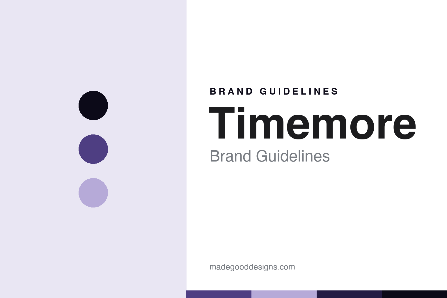
Timemore Brand Guidelines
China’s design house.
Aa
Two constants: a violet palette and a design-sans register. Abstract homage — not a Timemore product or mark.
China’s design house
Timemore is the Chinese coffee-gear design house behind the Chestnut grinders and Black Mirror scale, designed and made in China.
Timemore is the round’s design house — a Chinese maker that put award-winning industrial design at the centre of coffee gear. Timemore makes hand grinders, scales and brewing gear, and it is known for the Chestnut grinders and the Black Mirror scale. Its answer to how a maker becomes a name is design from home: build good-looking, well-made gear, design and manufacture it in China, and let the design speak. Coffee gear, designed and made in China.
Its identity is China’s design house. Timemore’s Chestnut grinders, its Black Mirror scale and its Chinese design are the work it is known for. Gear, made in China. China’s design house.
(Honest notes, so the story stays precise. Timemore — at timemore.com, styled in capitals — makes hand grinders (the Chestnut series), coffee scales (the Black Mirror is the signature), kettles and brewing accessories; its Sculptor line is now an electric-grinder range, so in a grinder round we note that the Chestnut is the manual series and the Sculptor is electric. It is reported to have been founded around 2012 and based in China; we present the year and city as reported. On where it is made — a theme of this round — Timemore both designs and manufactures in China, describing itself as a specialty-coffee brand from the Chinese mainland, so it is a straightforward Chinese design-and-make, not a name-isn’t-origin case. On ownership, it is an independent Chinese company, which we present as reported; its design director has twice won a Red Dot award, and its gear was chosen for a Shanghai Starbucks Reserve Roastery. Its name and marks are IP, described but never reproduced, and there is no official brand hex; these tones are an unofficial interpretation. This is design commentary and does not promote any product.)
Colour
Timemore lives in a violet palette. Click a swatch to copy the hex.
Timemore’s identity is design-led, made and modern — a violet, an ink, a lilac, a deep violet, and a paper. The palette leans violet and lilac: a modern, design-forward register for a maker built on industrial design. It signals a design-led coffee-gear house. The honest caveat: with no published brand hex, these values are an original, unofficial interpretation, not first-party colours.
The lesson is a violet palette signals a design-led, modern identity. Timemore’s world is a design-led, well-made object. For designers, it is a reminder that a modern violet and a soft lilac can carry a coffee-gear maker — a contemporary register for a brand that leads with design. Because these tones can fail as small text, keep type dark and let the colour live in the accents, palette and band. The takeaways: lead with design; design and make at home; win on looks and build; and treat any single hex as unofficial.
Typography
The register is a design sans — modern, clean, made.
Timemore’s identity carries a modern, clean, made spirit — a design-led house, not a commodity maker. A design sans captures the mood: contemporary, tidy and considered, the register of a Chinese maker that leads with industrial design. Set in a violet palette, the design sans feels modern and clean — exactly the personality Timemore carries. It is design from home rather than a logo, mirroring a well-made grinder. (Timemore’s real wordmark, and its product shapes, are things we describe but do not reproduce, and the exact typeface is not ours to use.) Because it is not ours to use, the honest description is “a design-sans spirit,” shown here in a stand-in. The type behaves like the gear: modern, clean and made.
Aa
A design-sans spirit — modern and made. (Specimen set in Mulish, a design-sans STAND-IN; NOT the Timemore logo.)
The grinder makers
Timemore stands for China’s design house, made at home.
Timemore is a lesson in how design from home can be an identity. A violet palette, a design sans and a well-made grinder make one thing — China’s design house — the whole identity: design-led, made and modern. The award-winning industrial design is the differentiator, and the Chinese design-and-make is the meaning. The point is a Chinese maker that leads with design, both designs and manufactures at home, and won a place on the specialty bench on looks and build.
Put to work, the identity is design from home, told straight, as design. A maker in this spirit would lead with design and make at home — the Chestnut, in China. A reader in this spirit would place it clearly in the round’s where-made thread: unlike the name-isn’t-origin makers, Timemore both designs and manufactures in China, so it is the round’s clearest Chinese design-and-make. Timemore holds the round’s new pole with Niche and Option-O against the heritage houses, and its ownership thread at the independent end. The honest editorial moves are to present the founding and ownership as reported, to note the Chestnut-manual-versus-Sculptor-electric distinction in a grinder round, and to keep the design credentials factual. The lesson Timemore teaches is that design from home can hold an identity: the Chinese design-and-make gives it substance, and the award-winning design keeps it credible. China’s design house is the personality, and the Chestnut is the proof.
For designers and brand-builders, Timemore holds a China pole in the grinder makers: lead with design — and make it at home. The lessons: put design first; design and manufacture in-country; note a product distinction that matters; present unpublished facts as reported; and never reproduce a logo. It is also a reminder to stay precise: Timemore is the Chinese coffee-gear design house behind the Chestnut grinders and Black Mirror scale, designed and made in China — with the palette here an unofficial interpretation. The Chinese design-and-make carries the substance, and the award-winning industrial design carries the reputation; together they show that a maker can both design and build at home and win a place on the specialty bench on merit, a straightforward answer to the round’s question that needs no asterisk about where the work is really done. Timemore made China’s-design-house the identity — proof that a grinder, honestly made, can be the difference.
Explore & save
Keep Timemore’s identity on hand — save it to a board in the Made Good inspiration library.
Timemore identity set
Pin the violet palette and the design-sans register to your own board.