Tech Logo Design: Modern Marks
A great tech logo survives everywhere: a 16px browser favicon, a circular avatar, a dark dashboard, a printed invoice. Modern tech marks win by being geometric, simple, and ruthlessly scalable — not by being clever. This guide covers how those marks are built, when gradients help versus hurt, and the accessibility caveats most founders miss.
If you are at the start of building a company identity, read this alongside our founder’s guide to startup branding, which covers when a logo is even worth investing in. This piece is the deep dive on the mark itself.
What Makes a Tech Logo “Modern”
The dominant tech aesthetic is geometric minimalism: marks built from circles, squares, and consistent line weights, often with a single conceptual idea (a path, a node, a layer). Modern tech logos tend to share a few traits — they read instantly, they work in one color, and they hold up when shrunk to a tab icon.
- Simple geometry over illustrative detail.
- One idea, executed cleanly — not three metaphors stacked together.
- Scalability first — designed at small size, not just admired at large size.
- A confident wordmark as a fallback, since symbols take years to earn recognition.
Geometric vs Abstract Marks
Most tech symbols fall into two camps. A geometric mark is constructed on a grid from primitive shapes — predictable, balanced, and easy to reproduce. An abstract mark uses non-literal form to suggest a feeling (motion, connection, intelligence) without depicting a thing. Abstract marks give you ownership and flexibility but ask more of your design skill; if you want to go that route, our deep dive on abstract logo design covers the method.
| Aspect | Geometric mark | Abstract mark |
|---|---|---|
| Construction | Grid + primitive shapes | Free-form, concept-driven |
| Reads as | Precise, engineered | Dynamic, expressive |
| Risk | Can look generic | Can be hard to “get” |
| Best for | Infra, dev tools, fintech | Platforms, AI, consumer apps |
Designing for the Favicon First
The favicon is the harshest test your logo will face — roughly 16 to 32 pixels, often against a busy tab strip. If your mark is unreadable there, it is unreadable in the place users see it most. Design the small version first, then scale up, not the reverse.
- Build the mark in vector (SVG) in Figma or Illustrator.
- Export a 16px and 32px PNG and look at them at actual size on a real screen.
- Strip detail until the silhouette is unmistakable at 16px.
- Test it inside a circle — many platforms crop avatars to circles.
Gradients: When They Help and When They Hurt
Gradients have been the defining tech-logo trend of recent years — they signal energy and dimensionality. Used well, a gradient adds depth; used carelessly, it destroys legibility at small sizes and breaks in single-color contexts. Always design a flat, single-color version first, then add the gradient as an enhancement for hero placements.
- Keep gradients to two or three close hues; rainbow gradients age fast and crop badly.
- Ship a solid fallback for favicons, embroidery, faxed documents, and monochrome print.
- Test the gradient on both light and dark backgrounds — many tech UIs are dark by default.
Accessibility Caveats Founders Miss
Logos are not exempt from accessibility thinking. If your wordmark or tagline relies on a low-contrast gradient, low-vision users lose it. Two practical rules: ensure any text in the logo meets reasonable contrast against its background, and never rely on color alone to carry meaning — the mark should still make sense in pure black or white.
Provide proper alt text wherever the logo appears on the web, and keep an accessible monochrome variant in your asset kit so engineers always have a safe option.
Building a Tech Logo: Practical Workflow
Figma is the fastest path for most teams — vector pen, grids, and one-click multi-size export. Adobe Illustrator remains the professional standard for precise curve control and Pantone work if you will ever print. Avoid building logos in Photoshop; raster marks do not scale.
A repeatable sequence: sketch the concept on paper, build the geometric grid, draft three to five directions, kill the weak ones early, then refine one direction across favicon, avatar, light/dark, and monochrome before you call it done. For the full end-to-end method including the brief and presentation, follow our logo design process.
Paper sketching matters more than founders expect. Jumping straight into Figma tends to produce safe, software-default shapes because the tool nudges you toward its primitives. Twenty rough thumbnails on paper in fifteen minutes will surface ideas the cursor never would, and they cost nothing to throw away. Only commit a concept to vector once the idea is sound — the software is for execution, not invention.
When you refine, work at real sizes the whole time. Keep a panel on your canvas showing the mark at 16px, 32px, and inside a circle, and glance at it constantly. The mistake that ruins otherwise good marks is admiring them at 800 pixels and never checking the size users actually see. If a curve or notch only reads when the logo is huge, it is decoration, not identity — cut it.
Delivering the Logo Files
- SVG — the master vector for web and scaling.
- PNG exports at 16, 32, 64, 256, and 512 px.
- Monochrome (pure black and pure white) versions.
- Light and dark background variants.
- A favicon set and an app-icon-ready square.
If your company also ships a mobile product, the same mark usually feeds your app icon and store assets — see our SaaS branding guide for how the logo lives inside a product UI and design system.
Avoiding the “Generic Tech Logo” Trap
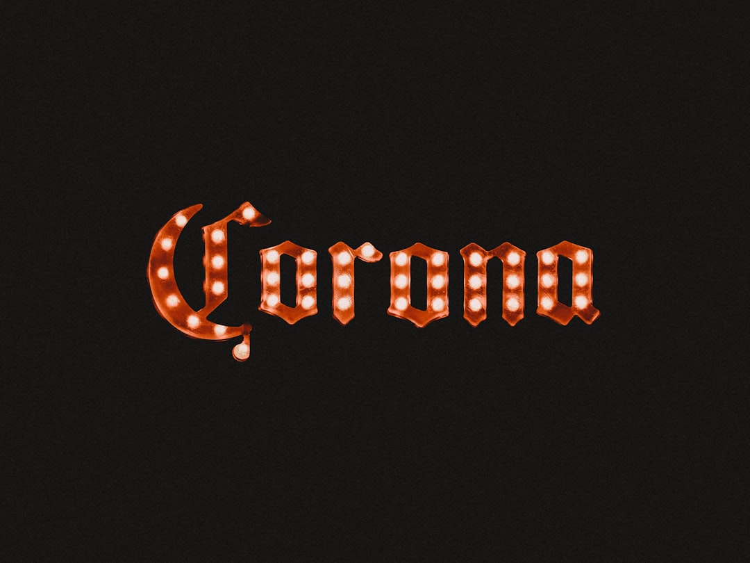
The flip side of geometric minimalism is sameness. A whole generation of tech logos converged on the same vocabulary — soft-cornered abstract swooshes, overlapping translucent shapes, the lowercase geometric sans wordmark — to the point that many are interchangeable. Minimal does not have to mean anonymous. The way out is a single distinctive idea executed with restraint, rather than restraint with no idea behind it.
- Find one ownable concept tied to your product, not a generic “connection” or “growth” metaphor everyone uses.
- Give the wordmark a small custom detail — a modified letterform, a distinctive ligature — so it is yours even without the symbol.
- Pressure-test against competitors: line your draft up beside three rivals’ marks and ask whether anyone could tell them apart.
Trends are fine to borrow from, but anchor the mark in something that will still make sense when the trend passes. A logo is one of the few brand assets that is genuinely expensive and disruptive to change, so design it to outlast the aesthetic of the year it was made in.
Frequently Asked Questions
What size should a tech logo be designed for?
Design it to read at 16 to 32 pixels — favicon and avatar scale — then scale up. Most logos fail because they were designed large and admired large, only to collapse into mush in a browser tab. If the silhouette works tiny, it works everywhere.
Are gradient logos still a good idea in tech?
Gradients can add depth and energy, but always build a flat single-color version first and use the gradient only for large hero placements. Keep it to two or three close hues, ship a solid fallback, and test on both light and dark backgrounds.
Should my tech logo be a symbol or a wordmark?
Start with a strong wordmark — symbols take years and marketing spend to become recognizable. Add a compact symbol once you need something that fits a favicon, app icon, or circular avatar where a full name will not. Many tech brands ship both and use them contextually.
What tools do professionals use for tech logos?
Figma is the fastest modern choice for vector marks, grids, and multi-size export. Adobe Illustrator remains the standard for precise curve control and print/Pantone work. Avoid Photoshop for logos — it produces raster art that will not scale cleanly.
How many logo variations do I need to deliver?
At minimum: an SVG master, PNGs from 16px to 512px, pure black and white monochrome versions, light and dark background variants, and a square app-icon-ready file. This kit covers favicons, avatars, dark dashboards, print, and store listings without anyone redrawing the mark.