Startup Branding: A Founder’s Guide
Startup branding is not a logo you commission once and forget. It is the set of decisions — name, mark, voice, color, and design system — that lets a stranger trust an unproven company. The trick for founders is sequencing: spend almost nothing at pre-seed, then invest deliberately as the product finds its market.
This guide walks through both stages: the lean MVP brand you ship in a weekend, and the scale-up identity worth real money once you have customers to lose. Everything below assumes you are a founder or early operator, not a brand agency — so the advice is about leverage, not perfection.
What Startup Branding Actually Covers
Branding is broader than visuals. At minimum, a usable startup brand includes a name, a logo (wordmark or simple symbol), a color system, one or two typefaces, and a clear verbal voice — how you sound in a landing page headline versus an error message. The visual layer is what people screenshot; the verbal layer is what they quote.
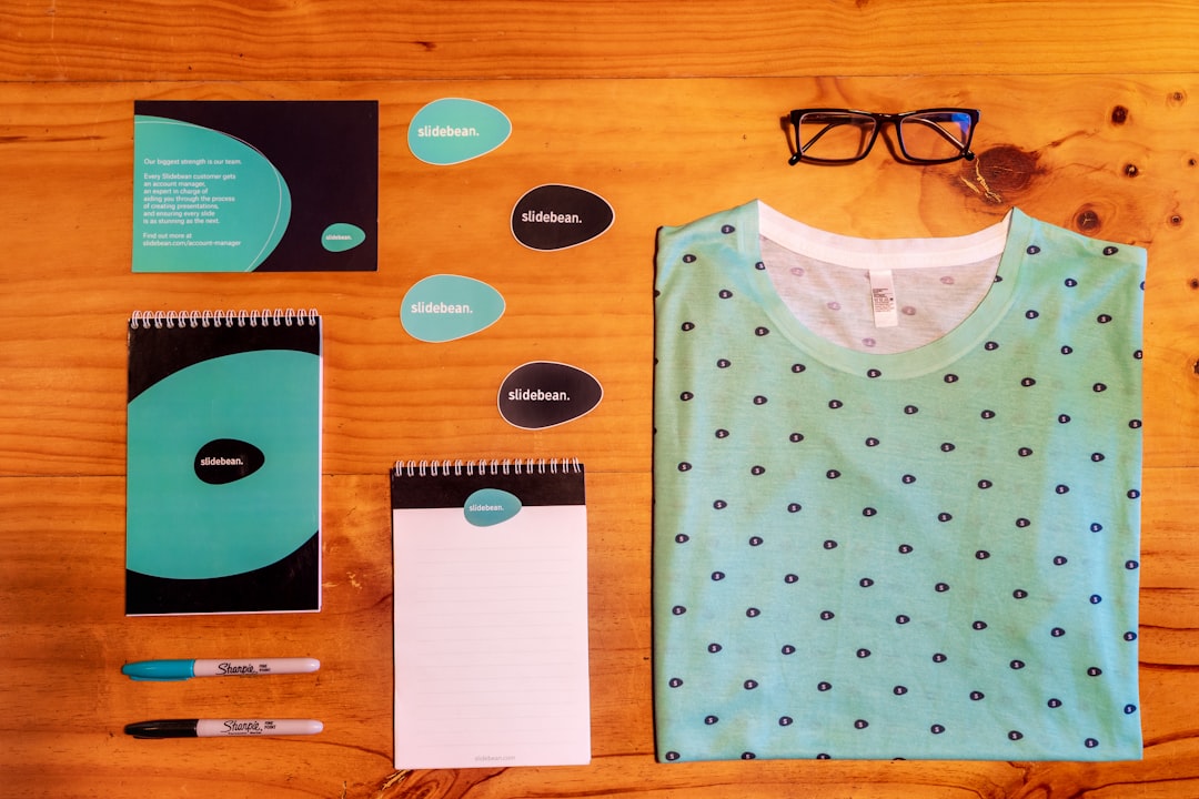
For a deeper structural breakdown of how these pieces fit into one coherent system, see our guide to building a visual identity system. The short version: every asset should be reducible to a one-page set of rules so a new hire or contractor can stay on-brand without asking you.
MVP Brand vs Scale Brand: When to Invest
The single most expensive branding mistake is spending scale-up money at the MVP stage. Before product-market fit, your brand will change because your product will change. Spend the minimum that makes you look legitimate, and keep your powder dry.
| Dimension | MVP brand (pre-PMF) | Scale brand (post-PMF) |
|---|---|---|
| Goal | Look credible, ship fast | Differentiate, defend the category |
| Logo | Clean wordmark in a good typeface | Custom mark + full system |
| Budget | $0–$500 (DIY / template) | $5k–$50k+ (studio or senior contractor) |
| Color | One primary + neutrals | Full accessible palette + tokens |
| Voice | One paragraph of guidelines | Documented tone, examples, do/don’t |
| Who does it | Founder + Figma | Design hire or external studio |
A reasonable trigger for the scale-brand investment: you have repeatable revenue, you are hiring people who need to produce on-brand work without you, and your current visuals are actively embarrassing you in sales calls. If two of those three are true, it is time.
The deeper reason to delay is that branding done before you understand your customer is mostly guesswork. The MVP stage is for learning who actually buys, what language makes them nod, and which competitor they are mentally comparing you against. Every one of those answers should feed the scale brand. Founders who commission an expensive identity at pre-seed almost always rebrand within two years, having paid twice and confused their early audience in between. Treat the MVP brand as a deliberately temporary scaffold, not a foundation you are ashamed of.
There is also a cultural cost to over-polishing early. A scrappy, honest brand can be an asset when you are selling to other builders who distrust slickness; an overproduced identity on a three-person company can read as inauthentic or even as a warning sign. Match your brand’s level of finish to your stage and audience, and let it mature with the company rather than pretending you have already arrived.
Naming Your Startup
A good name is short, sayable, and clears two checks: a registrable domain (a clean .com still helps, but a strong .io or .ai is now widely accepted in tech) and no obvious trademark collision in your category. Avoid clever misspellings that force people to spell it out loud — every support call and podcast mention becomes friction.
- Generate broadly. Real words, invented words, compounds, and metaphors. Aim for 30–50 candidates.
- Say each one out loud. If you stumble, cut it.
- Check the domain and social handles before you fall in love.
- Run a basic trademark search in your jurisdiction; consult a lawyer before you commit money to packaging or signage.
Two patterns are worth weighing deliberately. Descriptive names (something that says what you do) are easy to understand but hard to own and hard to trademark, and they box you in if you expand beyond the original product. Abstract or invented names are blank canvases — meaningless until you give them meaning — which is more work upfront but far more defensible and flexible long-term. Most enduring tech brands sit at the abstract end for exactly that reason. Pick based on how broad your ambitions are: a focused tool can afford to be descriptive; a future platform should not paint itself into a corner.
The Startup Logo
At the MVP stage, a wordmark — your name set in a strong, slightly customized typeface — beats a generic icon every time. It is cheap, scalable, and impossible to confuse with a stock symbol. If you do want a mark, keep it geometric and simple enough to read as a favicon.
Tech companies in particular lean on clean, scalable symbols; our breakdown of modern tech logo design covers geometric construction, gradient caveats, and favicon legibility in detail. If your startup is software-first, also read how product-led companies handle identity in our SaaS branding guide, where the UI itself becomes the brand. For the underlying method any founder can follow, our logo design process walks from brief to final files.
Whatever you choose, deliver it in vector (SVG) so it stays crisp everywhere, plus PNG exports at common sizes and a monochrome version for single-color contexts like invoices and stamps.
Color and Type for a Startup
Pick one primary brand color with personality and a neutral palette (a near-black, a couple of grays, a white) around it. Run every text/background pairing through a contrast checker so you meet WCAG AA from day one — accessibility is cheaper to build in than to retrofit, and it widens your market.
For type, two families is plenty: one for headlines, one for body and UI. Reliable, free, broad-coverage workhorses include Inter (excellent UI body text, high x-height, huge language support) and Söhne or Geist if you have budget for something with more character. Resist adding a third font until you have a real reason.
Brand Voice and Messaging
Your voice is the cheapest differentiator you have. Write a one-line positioning statement — “We help [audience] do [job] without [pain]” — and three voice attributes (e.g. “plain-spoken, confident, never hype-y”). Then write your homepage headline as if explaining the product to a smart friend who is in a hurry. If a sentence could appear on a competitor’s site unchanged, it is too generic.
The fastest way to sharpen messaging is to write down the exact words your best customers use to describe their problem, then borrow them. Sales calls, support tickets, and onboarding interviews are a goldmine — people rarely describe their pain in the polished language marketers reach for. A headline built from a real customer’s phrasing converts because it sounds like recognition, not advertising. Audit your homepage against this test regularly; messaging drifts toward abstraction over time as teams get bored of their own words and reach for cleverness over clarity.
Decide too on a small set of words you will and will not use. A short banned-words list (“revolutionary,” “seamless,” “cutting-edge”) keeps the whole team from defaulting to hype, and a few signature phrases give your copy a recognizable texture across channels. This is the verbal equivalent of a color palette — constraints that make everything you ship feel like it came from the same company.
Applying the Brand Across Channels
Consistency is what makes a small company look bigger than it is. The same logo, color, type, and voice should appear on your website, app, app store listings, social profiles, decks, and email. Two channels deserve special attention because they drive growth directly:
- App store presence. Your icon and first screenshots are conversion surfaces, not decoration — see our guide to app store screenshot design that converts downloads.
- Web3 / token surfaces. If you issue a token or mint assets, the brand has to survive 32px wallet avatars and circular crops; our guides to crypto logo design and NFT art design cover those constraints. Note that the crypto and NFT space moves fast and carries real volatility and scam risk — verify anything platform-specific before you build on it.
Tools and a Realistic Workflow
You can build a credible MVP brand with free or cheap tools. Figma is the default for logo layout, color tokens, and exporting assets; Adobe Illustrator is the professional standard for true vector mark construction if you have it. Photoshop is for raster mockups and store imagery, not logos.
- Lock the name and secure domain + handles.
- Set the wordmark or simple mark in Figma; export SVG + PNG + monochrome.
- Define one primary color, neutrals, and two typefaces; document on one page.
- Write the positioning line and three voice attributes.
- Apply consistently to site, app, and store listings.
- Revisit at scale — rebrand deliberately, not reactively.
Common Startup Branding Mistakes
- Over-investing too early in a brand the product will outgrow.
- A logo that dies at small sizes — always test at favicon and avatar scale.
- Trend-chasing (heavy gradients, the moment’s micro-style) on assets you cannot easily change later.
- Inconsistency across channels, which reads as “small and disorganized.”
- Ignoring accessibility, which quietly costs you users and, increasingly, legal exposure.
Frequently Asked Questions
How much should a startup spend on branding?
Before product-market fit, keep it under a few hundred dollars: a strong wordmark, one color, two typefaces, built in Figma. After you have repeatable revenue and a team, a fuller identity from a studio or senior contractor typically runs $5,000 to $50,000 depending on scope.
Should a startup hire an agency or do branding in-house?
Do the MVP brand in-house with Figma — it is fast and disposable. Bring in an agency or experienced freelancer once you have customers to retain, hires who need clear guidelines, and a brand whose limitations are showing up in sales and recruiting.
What makes a good startup name?
Short, easy to say and spell, with an available domain and clear social handles, and no obvious trademark conflict in your category. Avoid clever misspellings that force people to spell it out. Test every candidate by saying it aloud in a sentence.
When should a startup rebrand?
Rebrand when your current identity actively undermines you — it looks amateur in sales calls, fails at small sizes, or no longer fits your audience. Do it deliberately around a meaningful milestone, not reactively because a competitor shipped something shiny.
Do I need a custom logo or is a wordmark enough?
A clean wordmark in a strong typeface is plenty for most early startups and beats a generic stock icon. Invest in a custom symbol once you can afford it and want a compact mark for favicons, app icons, and avatars where a full name will not fit.