Healthcare Branding: A Complete Guide
Healthcare branding is the discipline of making a clinic, hospital, or medical service feel trustworthy, competent, and human before a patient ever speaks to a person. It is not a logo and a blue swoosh. It is a coordinated identity system — color, typography, symbolism, language, and accessibility — that lowers anxiety and signals safety at the exact moment people feel most vulnerable. This guide walks through every layer, from palette psychology to WCAG-compliant type, so you can build a medical brand that earns trust on sight.
Because health decisions carry real stakes, the bar is higher than in most categories. A confusing sign, an unreadable form, or a clinical-yet-cold logo doesn’t just look bad — it costs comprehension and confidence. Treat every design choice as a patient-experience decision.
What Healthcare Branding Actually Includes
A complete healthcare identity is a system, not an asset. Before you open Illustrator, define the full scope so nothing is bolted on later. A strong program covers:
- Brand strategy — positioning, audience (patients, caregivers, referring physicians), and the core promise (e.g., “calm, modern, unhurried care”).
- Visual identity — logo, color system, typography, iconography, and photography direction. See our broader guide to visual identity design for the foundational principles.
- Verbal identity — tone of voice, plain-language standards, and how the brand explains scary things gently.
- Environmental design — clinic signage and wayfinding that guides anxious, sometimes disoriented patients through a building.
- Patient communications — forms, medical brochures and patient-facing layouts, intake packets, and digital touchpoints.
Each of these deserves its own deep dive, and this cluster covers them — but they must share one DNA. Consistency is what turns a collection of materials into a brand patients recognize and remember.
Color: Why Healthcare Leans Blue, Green, and Teal
The healthcare palette is one of the most conventionalized in all of branding, and for good reason. Blue reads as calm, reliable, and clinical-clean; it dominates hospital systems and insurers because it signals competence without aggression. Green evokes recovery, balance, and the natural — common in wellness, pharmacy, and primary care. Teal splits the difference: modern, fresh, and increasingly the default for digital-first health brands that want to feel approachable rather than institutional.
Convention is a tool, not a cage. The risk with blue-green is sameness — a sea of interchangeable teal logos. Earn distinction through a deliberate accent, a specific tint, or a warm secondary that humanizes the cool base.
| Color | Signals | Best for | Watch out for |
|---|---|---|---|
| Blue | Trust, calm, competence | Hospitals, insurers, diagnostics | Coldness, overuse |
| Green | Health, recovery, nature | Wellness, pharmacy, primary care | Reading as “eco” not “medical” |
| Teal | Modern, fresh, approachable | Telehealth, dental, clinics | Cliché if undifferentiated |
| Warm accent (coral, amber) | Humanity, energy, care | Pediatrics, mental health | Too playful for serious specialties |
Whatever palette you choose, it must pass contrast checks. A beautiful pale-teal-on-white logo that fails on signage and forms is a liability — accessibility is non-negotiable, and we cover it in its own section below.
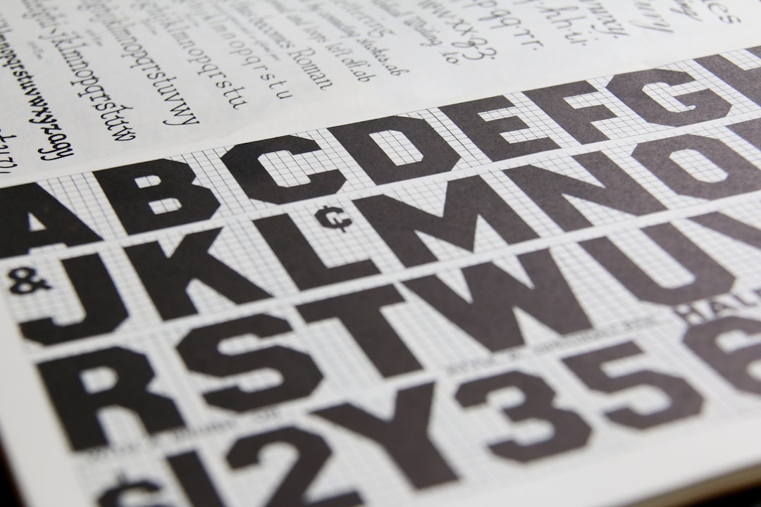
Typography for Medical Brands
Healthcare typography prioritizes legibility above personality. Your audience skews older, more stressed, and more likely to have low vision than the average consumer base, so clarity is a clinical requirement.
Default to clean, humanist or neo-grotesque sans-serifs with a generous x-height and open apertures. Inter (free, Google Fonts) is an excellent UI and body workhorse — high x-height, wide language coverage, and a true tabular-figures set useful for dosages and dates. Source Sans 3 (free, Adobe/Google) is warm and highly readable at small sizes. For a more institutional, trustworthy tone, IBM Plex Sans (free) carries quiet authority. When a brand wants warmth, a humanist sans like Mulish or Public Sans (free, designed by USWDS for government accessibility) keeps things friendly and accessible.
Serifs aren’t off-limits — a calm transitional serif can add gravitas to a hospital wordmark or a brochure’s display type — but keep body copy in a sans for the highest readability across patients and devices. For more on choosing typefaces, our visual identity design guide covers type-system construction in depth.
Type rules specific to healthcare
- Set patient-facing body text no smaller than 16px on screen; consider 12pt minimum in print, larger for senior-focused services.
- Use tabular figures for any numbers patients must read accurately — appointment times, dosages, phone numbers.
- Avoid thin/light weights for body copy; they shimmer and fail at low contrast.
- Limit to two families (one display, one text) for consistency across signage, forms, and digital.
Logo and Symbolism: Beyond the Overused Cross
Medical logos lean on a small vocabulary of symbols — and that’s the problem. The cross (and its cousin the caduceus) is so overused it has become visual wallpaper; it also carries religious and Red Cross legal connotations you may not want or be allowed to use. The heart, shield, and abstract “care” gestures (hands cradling a form, a leaf, a pulse line) round out the cliché set.
The way out is abstraction and meaning. The strongest medical marks take a familiar idea — protection, growth, connection, the human form — and render it in a way no competitor owns. Think a shield formed from negative space, a pulse line that becomes a smile, or a monogram built from an abstract human silhouette. We unpack this in detail in our medical logo design guide, with examples and the symbolism traps to avoid.
Whatever the concept, follow a disciplined logo design process: research the competitive set, sketch broadly, test the mark in monochrome and at sign size, and confirm it works embroidered on a scrub, stamped on a pen, and 40 feet up on a building.
Accessibility Is the Brand
In healthcare, accessibility isn’t a compliance checkbox tacked on at the end — it is a core expression of the brand promise. A brand that claims to care but produces unreadable forms is contradicting itself in every interaction.
- Contrast: meet WCAG 2.1 AA at minimum — 4.5:1 for normal text, 3:1 for large text and meaningful UI elements. Aim for AAA (7:1) on critical patient instructions.
- Type size and weight: larger, heavier defaults than consumer brands; never rely on color alone to convey meaning (color-blind and low-vision patients).
- Plain language: write at roughly a 6th–8th grade reading level. Replace “utilize” with “use,” “hypertension” with “high blood pressure (hypertension).”
- Multilingual and low-literacy support: pictograms, icons, and translated materials for the actual communities served.
- Touch and motor: large tap targets and clear focus states in digital products.
Designing for the most vulnerable patient raises the floor for everyone. Accessibility is good branding because it is good care.
Voice, Language, and Privacy
Tone of voice matters more in healthcare than almost anywhere, because the brand is often delivering frightening or confusing information. The right voice is calm, plain, and respectful — never patronizing, never hype. Define a few rules: lead with the patient’s question, explain before you instruct, and acknowledge feelings without melodrama.
Privacy is part of the brand too. In the United States, patient materials touch HIPAA rules — be careful with how testimonials, photos, and case stories are gathered and shown, and always obtain documented consent. Note that privacy regulations vary by region (GDPR in the EU, PIPEDA in Canada, and others), so verify the specific requirements for where you operate. When in doubt, design as if every piece could be seen by a regulator and a nervous patient at the same time.
Photography and Imagery Direction
Imagery is where healthcare brands most often fall back on cliché — fake-smiling models, blinding-white rooms, gloved hands holding nothing. Define a direction that feels real: natural light, genuine expressions, diverse and age-representative patients, and calm color grading that matches the palette. Avoid stock that screams “stock.” Where budget allows, art-direct a custom shoot; even a small, authentic library beats a large generic one.
Iconography deserves the same intentionality. Beyond wayfinding pictograms, a healthcare brand benefits from a small, consistent icon set for services, conditions, and instructions. Keep the style unified — same stroke weight, same corner radius, same level of abstraction — so a vaccination icon and a billing icon clearly belong to the same family. Mixed icon styles read as a brand that’s been assembled by committee, which quietly undercuts the impression of competence.
Digital Touchpoints and the Patient Portal
Increasingly, the first and most frequent brand experience is digital — the website, the appointment booker, and the patient portal. These deserve the same rigor as anything printed, with one extra demand: they have to be usable by stressed people on phones in waiting rooms. Carry the palette and type system into the interface, set body text at 16px or larger, use generous tap targets, and write microcopy in the same calm, plain voice as the rest of the brand. A confusing booking flow can undo all the trust a beautiful logo built. Treat the portal as a flagship brand surface, not an IT afterthought, and test it with real patients across ages and devices.
Building the Brand Guidelines
Pull everything into a single source of truth so the brand survives contact with the real world — multiple locations, vendors, and front-desk printers. A practical healthcare brand guide includes:
- Logo: variations, clear space, minimum sizes, misuse examples.
- Color: primary, secondary, accents, with HEX/RGB/CMYK and contrast-pair guidance.
- Typography: families, weights, sizes, and accessibility minimums.
- Iconography and pictograms (especially for wayfinding).
- Photography do’s and don’ts.
- Voice and plain-language standards.
- Templates: signage, brochures, forms, social, and email.
Apply It Across Specialties
The principles flex by specialty. Dental branding can run brighter and friendlier to counter dental anxiety. Pharmacy branding lives or dies on clarity and trust at the shelf and counter. Pediatrics earns warmer accents; mental health leans soft and human; diagnostics and surgery lean precise and clinical. Same DNA, different dose.
Frequently Asked Questions
What colors are best for healthcare branding?
Blue, green, and teal dominate because they signal trust, recovery, and calm. Blue suits hospitals and insurers, green fits wellness and pharmacy, and teal feels modern for clinics and telehealth. Add a warm accent to avoid the generic blue-green sameness — and always confirm your palette passes WCAG contrast.
Why are crosses overused in medical logos?
The cross is instantly readable as “medical,” so designers reach for it by default, creating a sea of interchangeable marks. It also carries religious and Red Cross legal connotations. Stronger logos abstract ideas like protection, growth, or the human form into a mark no competitor owns.
How important is accessibility in healthcare branding?
It is essential. Patients skew older and more likely to have low vision, so meeting WCAG AA contrast, using legible 16px+ type, writing in plain language, and adding pictograms aren’t optional extras — they’re the brand promise of care made visible in every touchpoint.
What typefaces work well for medical brands?
Clean, high-x-height sans-serifs read best. Inter, Source Sans 3, IBM Plex Sans, and Public Sans (all free) offer excellent legibility, wide language coverage, and tabular figures for dosages and times. Reserve serifs for display or wordmarks; keep body copy in a sans for clarity.
Do healthcare brands need to consider HIPAA in design?
Yes, in the US. Patient photos, testimonials, and case stories require documented consent and careful handling under HIPAA. Privacy rules differ by region (GDPR, PIPEDA, and others), so verify local requirements. Design every patient-facing piece as if both a regulator and an anxious patient will read it.