Pharmacy Branding: Trust and Clarity
Pharmacy branding lives or dies on two words: trust and clarity. People hand a pharmacy their health and their data, then rely on its labels to take medication safely. So the brand has to feel rock-solid trustworthy at the storefront and crystal-clear at the shelf and counter. This guide covers the palette, type, logo, and labeling decisions that make a pharmacy brand feel both reassuring and unmistakably easy to read.
Pharmacy sits inside the wider rules of healthcare branding, but it leans harder on clarity than almost any other medical category — because here, legibility is literally a safety issue.
Trust and Clarity: The Two Pillars
Every pharmacy branding decision should pass two tests. Does it build trust? (Is it credible, consistent, professional, and reassuring?) And does it improve clarity? (Can a stressed, possibly low-vision customer instantly read and understand it?) A choice that’s beautiful but reduces clarity loses every time. A choice that’s clear but cheap-looking erodes trust. The craft is holding both.
This dual mandate shapes everything from the logo’s legibility to the contrast on a medication label. When in doubt, clarity wins — but never at the expense of looking trustworthy.
Color Palettes for Pharmacy
Pharmacy branding draws on the healthcare staples — green most of all (the near-universal “pharmacy” signal, evoking health, recovery, and the green cross used in many countries), plus blue for trust and teal for a modern, approachable feel. White and clean neutrals do heavy lifting, signaling hygiene and order.
| Color | Signals | Notes |
|---|---|---|
| Green | Health, pharmacy, recovery | Strong category signal; differentiate the tint |
| Blue | Trust, reliability, calm | Common for chains and clinical pharmacies |
| Teal | Modern, approachable | Good for independent and digital-first pharmacies |
| Warm accent | Friendliness, retail energy | Use sparingly; keep clinical credibility |
Because pharmacies are partly retail, there’s some room for warmth and personality — but never at the cost of contrast and clarity. Every color pairing used for text must pass WCAG AA, especially on labels and signage older customers depend on.
Legible Typography Is Non-Negotiable
If there’s one category where type legibility is a safety requirement, it’s pharmacy. Customers must read dosage, frequency, and warnings without error. Use clean, high-x-height sans-serifs with unambiguous letterforms — crucially, ones that clearly distinguish similar characters (the digit 1, lowercase l, and capital I; 0 and O). Inter, Source Sans 3, and Public Sans (all free) handle this well and read cleanly at small sizes.
- Use tabular figures for dosages, quantities, and dates so numbers align and read accurately.
- Set body and label text large enough for older eyes; never use thin weights on labels.
- On medication labels, prioritize the drug name, dosage, and directions with strong hierarchy and high contrast.
- Avoid all-caps blocks for warnings longer than a few words — sentence case with bold key terms reads faster.
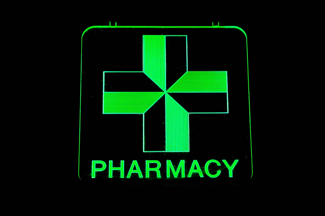
Pharmacy Logo Design
Pharmacy logos lean on the green cross, the mortar and pestle, and the Rx symbol — all instantly recognizable, all heavily used. As with the medical cross, you can use these, but make them distinctive: an abstracted mortar and pestle, a cross built from negative space, or a clean wordmark that signals pharmacy through color and type rather than a literal icon. Note that in some regions the green cross is regulated, so verify what you’re allowed to use.
Apply the same discipline as any medical logo design project: test the mark in one color, confirm it reads at sign size and on tiny label corners, and make sure the wordmark stands alone when the icon won’t fit.
Signage and Store Experience
Inside the store, clarity is wayfinding. Customers need to find the prescription counter, OTC categories, and consultation areas fast. Clear, high-contrast signage with consistent type and pictograms reduces confusion and pressure on staff. The same principles that govern clinic signage and wayfinding apply directly: strong hierarchy, accessible contrast, pictograms for multilingual customers, and a consistent system that matches the brand.
Labeling, Packaging, and Privacy
Medication labels and packaging are where pharmacy branding does its most important work. Beyond looking professional, they must be unmistakably clear: prominent drug name and dosage, plain-language directions, legible warnings, and tabular figures. This is patient-safety design first and branding second.
Privacy is also part of the pharmacy brand. Handling prescription data responsibly — and being seen to do so — builds the trust the whole brand rests on. In the US, this intersects with HIPAA; other regions have their own rules (GDPR, PIPEDA, and more), so verify local requirements. Consultation areas, signage, and forms should all reflect a culture of discretion.
Independent vs. Chain Pharmacy Branding
Branding strategy differs sharply by scale. A chain pharmacy must build a system that survives mass replication across hundreds of locations, vendors, and printers — so it leans on tight, rigid guidelines, simplified marks, and ruthless consistency. An independent pharmacy, by contrast, competes on the very thing chains struggle to fake: personal trust and local character. Its branding can be warmer, more distinctive, and more human, signaling the pharmacist who knows your name.
Independents should resist mimicking chain aesthetics, which only makes them look like a worse version of a big competitor. Instead, lean into approachability, community, and the relationship — while never compromising the clarity and professionalism that keep the brand credible. A digital-first or compounding pharmacy can push further toward modern, teal-forward identities. The right answer always traces back to the two pillars: does it build trust, and does it improve clarity, for this specific audience.
Digital and App Experience
Refills, reminders, and consultations increasingly happen on a phone, making the app and website core brand surfaces. The same clarity rules apply, amplified: large legible type, unambiguous numerals for dosages, high contrast, and a refill flow simple enough for an anxious or older user to complete on the first try. Privacy must be visibly respected in the digital experience too. A clean, trustworthy app reinforces the in-store brand; a confusing one quietly erodes the trust the storefront worked to earn.
Bringing the System Together
A strong pharmacy brand is consistent and clear across every surface: storefront, signage, uniforms, labels, bags, website, and app. Document it so every location and vendor stays aligned, and pressure-test each element against the two pillars — trust and clarity.
- Define the palette around green/blue/teal with accessible contrast.
- Choose ultra-legible type with unambiguous letterforms and tabular figures.
- Design a distinctive, reproducible logo that avoids the literal-cross trap.
- Build clear, accessible signage and labeling systems.
- Bake privacy and patient safety into every patient-facing piece.
Frequently Asked Questions
What colors are best for pharmacy branding?
Green is the near-universal pharmacy signal (health, recovery, the green cross), supported by blue for trust and teal for a modern feel, with clean neutrals for hygiene. Differentiate your green tint to stand out, allow some retail warmth, and confirm every text-on-color pairing passes WCAG contrast.
Why is typography so important in pharmacy branding?
Because legibility is a safety issue — customers must read dosage, frequency, and warnings without error. Use clean sans-serifs with unambiguous letterforms (distinct 1/l/I and 0/O), tabular figures for dosages, generous sizes, and strong contrast. Inter, Source Sans 3, and Public Sans (free) all work well.
How do I design a pharmacy logo without the cliché cross?
Make the familiar symbols distinctive or drop them. Try an abstracted mortar and pestle, a negative-space cross, or a clean wordmark that signals pharmacy through color and type. Note the green cross is regulated in some regions, so verify usage, and always test the mark in one color and at tiny sizes.
What does “clarity” mean in pharmacy branding?
It means a stressed, possibly low-vision customer can instantly read and understand every element — from shelf signage to medication labels. Clarity shows up as strong hierarchy, high contrast, legible type, plain-language directions, and pictograms. In pharmacy, clarity is patient safety, so it wins over decoration.
How does privacy factor into pharmacy branding?
Handling prescription data responsibly, and visibly so, is core to the trust a pharmacy brand depends on. In the US this intersects with HIPAA; other regions have GDPR, PIPEDA, and similar rules, so verify locally. Reflect discretion in consultation areas, signage, and forms across every touchpoint.