Consulting Brand Design: Look the Part
In consulting, you are selling judgment you cannot put in a box, so consulting branding has to do the convincing that a product photo would do in other industries. Clients buy the consultant they believe is smart, credible, and worth a premium fee, and a great deal of that belief forms before the first meeting, from the website, the deck, the proposal. This guide shows how to build an identity that signals authority, clarity, and expertise so the brand earns the engagement before you walk in the room.
Consulting belongs to the professional-services family, where trust and authority drive everything. For the foundational framework, our guide to law firm branding lays out principles that translate cleanly to advisory work.
What a consulting brand has to communicate
Because the deliverable is intangible, the brand carries the credibility load. Three signals do the work. Authority says this consultant knows the field deeply. Clarity says they can cut through complexity, the core value clients are paying for. Confidence says they are worth the rate. A sharp, restrained, well-structured identity demonstrates clear thinking; a cluttered or generic one suggests the opposite, which is fatal when clarity is the product.
Positioning: the brand follows the expertise
Consulting is enormous, from solo strategists to global firms, and the brand should mirror exactly what you offer and to whom.
- Strategy and management consulting: leans authoritative, polished, and corporate; the brand should feel boardroom-ready.
- Boutique and specialist consultants: can afford a sharper, more distinctive identity because the niche is narrow and the expertise is the differentiator.
- Independent and fractional consultants: the brand is essentially personal; it should feel credible and senior while staying clearly human.
- Creative, tech, or innovation consulting: can be more modern and expressive, since the positioning is forward-looking rather than traditional.
State your positioning in one line first, such as “operations consulting for mid-market manufacturers” or “brand strategy for DTC founders.” The visual decisions get much easier once the promise is explicit.
Color: authoritative, with room to differentiate
Consulting palettes skew professional, but the category tolerates more range than law or accounting, especially for innovation-focused practices.
- Navy and deep blue: the classic authority choice, dependable and corporate.
- Charcoal and near-black: sophisticated and premium, excellent with generous white space.
- Deep green or burgundy: distinctive yet still serious, useful for standing apart from a sea of blue competitors.
- A single confident accent (a sharp orange, electric blue, or warm gold): signals energy and modernity, especially for innovation and tech consultancies.
The differentiator in premium consulting branding is often restraint plus space rather than color itself, a disciplined palette with lots of breathing room reads as expensive and confident. Build it into a documented visual identity design system so it stays consistent across decks and the site.
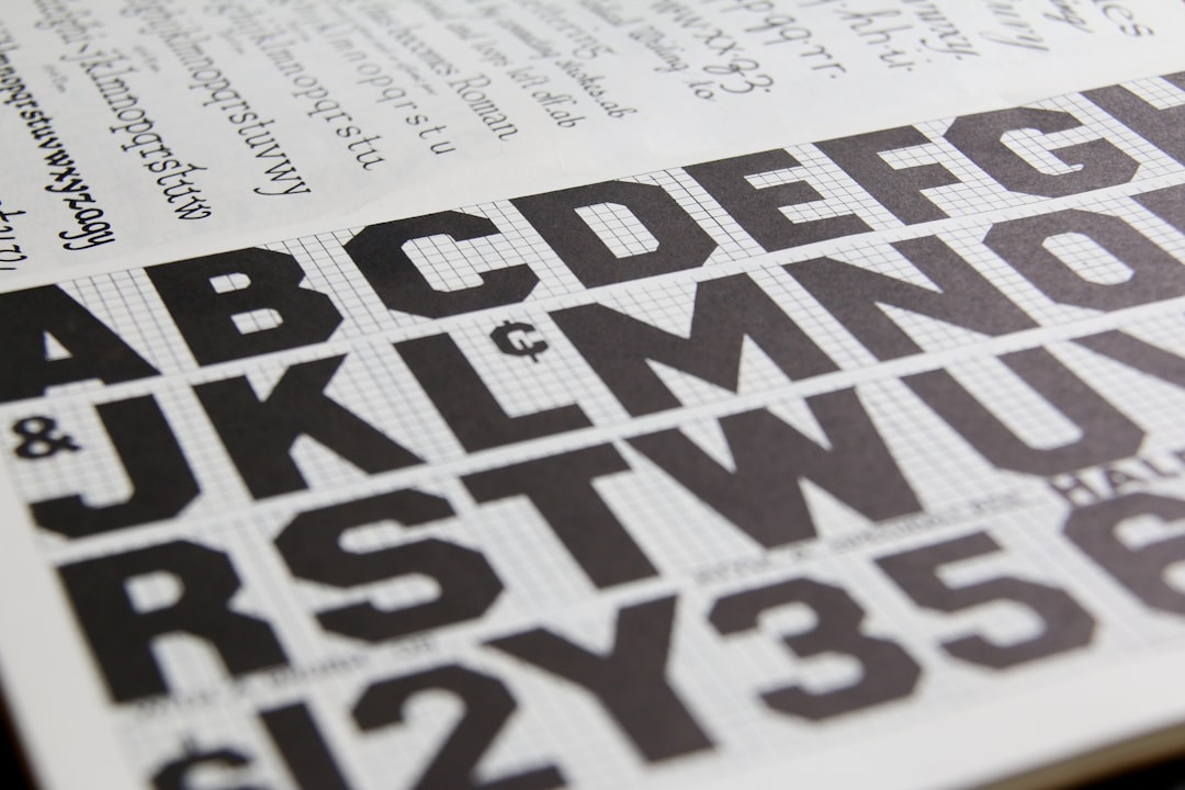
Typography: clarity signals thinking
For a profession that sells clarity, type choice is unusually meaningful.
- Modern sans-serifs read as clear, contemporary, and structured, the dominant choice for consulting because they suit slides, data, and digital work.
- Serif typefaces add gravitas and a thought-leadership, editorial feel, strong for headlines, reports, and firms positioning around deep expertise.
- A serif-headline plus sans-body pairing is a reliable consulting formula: authority up top, legibility throughout. Our font pairing guide helps you choose a pair that reinforces the brand.
Whatever you pick, use it with discipline, especially in decks. A consistent type system across slides is one of the strongest, cheapest signals of a firm that thinks in an organized way.
The logo
Consulting logos are usually wordmarks or lettermarks, fitting since firms are often named after founders or built around a single coined name. A clean, confident wordmark suits most consultancies; an abstract mark, a geometric form suggesting structure, connection, or upward movement, can add a reusable symbol for firms that want one. Avoid the cliches: puzzle pieces, lightbulbs, arrows-as-people, and generic globes signal “generic consultant” instantly. Build the mark in Illustrator and confirm it works in one color and at small sizes; our logo design process guide covers the full workflow.
| Consultant type | Logo direction | Tone |
|---|---|---|
| Strategy / management | Restrained wordmark | Boardroom authority |
| Boutique specialist | Distinctive wordmark or mark | Sharp, expert |
| Independent / fractional | Name-led personal brand | Senior but human |
| Innovation / tech | Modern wordmark + accent | Forward-looking |
The touchpoints that win consulting work
Consulting is sold through documents and conversations, so the brand has to be flawless on the materials that carry the pitch.
- The pitch deck and proposal: the single most important brand asset in consulting; this is where most engagements are won or lost.
- The website: the credibility check almost every prospect performs before reaching out.
- Reports and frameworks: the visible output of the work, and a recurring brand impression.
- LinkedIn and thought-leadership content: for many consultants, the primary discovery channel.
- Letterhead, business cards, and email signatures: the quieter touchpoints that still need to align. See our letterhead design guide.
A template-driven approach matters here. A polished, consistent deck and proposal template, typically built in InDesign or a slide system, ensures every consultant in the firm presents the same credible brand under deadline pressure.
Personal brand versus firm brand
A defining tension in consulting is how much the brand should rest on a named individual. For independent and fractional consultants, the personal brand is the business, the consultant’s name, face, writing, and track record are the primary trust signals, and the visual identity should support that rather than hide it behind a faceless corporate look. For growing firms, the opposite pressure applies: an identity tied too tightly to one founder is hard to scale and risky if that person steps back.
The practical answer depends on growth plans. If you intend to stay solo or small, lean into the personal brand: a clean name-led wordmark, strong professional photography, and a consistent presence on the channels where your clients actually look. If you intend to build a firm, invest earlier in an identity that can outlive any single consultant, a coined name or an abstract mark, a documented system, and templates anyone in the firm can use. Many consultancies live in the middle for years, balancing the founder’s visibility with a firm identity that can gradually take on more of the weight as the team grows.
Restraint over gimmicks
The temptation in consulting branding is to over-signal innovation with busy graphics and buzzword-heavy visuals. Resist it. The brands that read as genuinely premium do less: a disciplined palette, one or two typefaces, generous space, and a clean wordmark. That restraint is itself the message, this is a firm confident enough not to shout. If you work alongside finance and insurance advisors, our companion guides to financial services branding and accounting firm branding apply the same discipline to those fields.
Frequently Asked Questions
What makes good consulting branding?
Good consulting branding signals authority, clarity, and confidence, because clients are buying intangible judgment and form their impression before the first meeting. It relies on a disciplined palette, one or two typefaces, generous white space, and a clean wordmark. Restraint reads as premium; cluttered, gimmicky design undermines the very clarity consultants sell.
What colors should a consulting firm use?
Navy and charcoal lead because they read as authoritative and premium, while deep green or burgundy help a firm stand apart from blue-heavy competitors. A single confident accent can signal energy for innovation-focused practices. In premium consulting, restraint and white space often differentiate a brand more than color itself.
What should a consulting logo look like?
Most consulting logos are wordmarks or lettermarks, since firms are named after founders or a coined name. A clean, confident wordmark works for most; an abstract geometric mark can add a reusable symbol. Avoid cliches like puzzle pieces, lightbulbs, and generic globes, which immediately signal a generic, undifferentiated consultant.
Serif or sans-serif for a consulting brand?
Modern sans-serifs dominate because they read as clear and structured and suit slides and data, which is the heart of consulting work. Serif typefaces add gravitas and a thought-leadership feel, strong for reports and headlines. A serif-headline, sans-body pairing is a reliable formula that balances authority with everyday legibility.