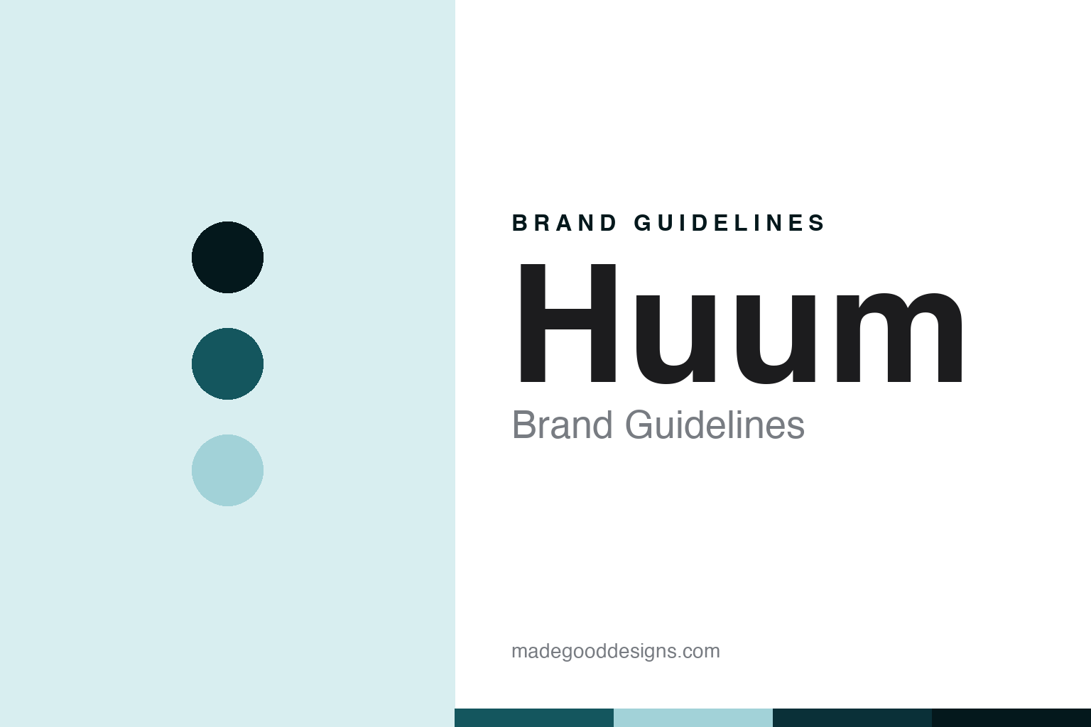
Huum Brand Guidelines
Entirely in Estonia, with partners.
Aa
Two constants: a Huum-basalt-teal palette and a monogram-sans register. Abstract homage — not a Huum product or mark; no heater, stone, monogram or logo is reproduced.
Entirely in Estonia, with partners
Huum’s site says its heaters are made entirely in Estonia, in three languages. Its own filed annual report says heater-body production began with Ukrainian partners.
Huum is the round’s qualified-origin node, and both halves of the qualification are its own words. Its craftsmanship page, in English, Estonian and German alike, says its heaters and controllers are made entirely in Estonia, with the help of skilful partners — and concedes in the next breath that the stainless steel and the electronics are imported from unnamed sources. Its filed management report for 2022 says something the website does not: that cooperation had begun with Ukrainian partners for the production of bodies, located outside the direct war zone, with Estonian partners continuing alongside. A trade publication independently reported the contract signing near Kyiv in March 2023 and named the Ukrainian company. Across twenty-three of its own pages in three languages, Ukraine appears only as a charity and a sales territory. Its answer to a round about who makes and who brands the product is a claim with a clause: entirely in Estonia, with partners.
Its identity is entirely in Estonia, with partners. The 2013 company, a stacked monogram and one verifiable factory are the story here. The qualification. Entirely in Estonia, with partners.
(Honest notes, because the framing here has to be exact. On the making, what this is not: there is no Asian manufacturing anywhere in the record. No Chinese or Asian production appears in twenty-three pages, the Estonian register, the filed report or the trade press — China and Japan are sales markets only. So this is not the designed-here, made-cheaply-elsewhere pattern this series exists to catch; it is a milder and more interesting gap, and the Ukrainian arrangement is documented for 2022 and 2023 and simply undetermined after that, because the later management reports sit behind a paid download. What is verifiable is one factory and one town: the controllers are built by a named contract electronics manufacturer in Pärnu — which has itself been German-owned since 2023 — and the software was written in the company’s home city. On founding: the company was registered in October 2013 with no predecessor name on the register at all, while the design story begins in 2011 with an approach to the national art academy and students proposing a wall-mounted heater shaped like a falling drop. No statement anywhere identifies what held the business in between, and the company makes no founded-in claim of any kind: twenty-three pages grepped, zero occurrences. And its home city is Tartu, not the capital. On ownership: founder-owned, disclosed, no trade buyer. Its marks are IP we describe but do not reproduce; there is no official brand hex.)
Colour
Huum lives in a Huum basalt teal. Click a swatch to copy the hex.
Huum’s identity is Estonian, sculptural and qualified — a Huum basalt teal, an ink, a pale mineral, a deep slate, and a paper. The palette leans Huum basalt teal and deep slate: a mineral register that stands in for stone and formed steel rather than a loud logo colour. It signals entirely in Estonia, with partners — Estonian, sculptural and qualified. The honest caveat: the brand offers finishes rather than a house colour, from stainless through a black metal casing to controller enclosures in black, mirror and gold, and we describe those rather than restating any as ours.
The lesson is a naming system can put its one native word on its one clever product. Every heater this company makes is a single short English common noun in capitals, drawn from nature, geology or material — a drop, a hive, a cliff, a core, steel, flow — with plain English modifiers and a kilowatt number after it. No coinages, no registered symbols, no numbers inside the base name. The one exception is the controller, which carries a short Estonian proper noun instead. So the universal nature words go on the objects anyone can understand at a glance, and the native word goes on the brain of the system. That is a deliberate and rather elegant split, and it is the opposite of the German house later in this round, which layers a coined Latinate name, an alphanumeric code and a trademarked sub-brand onto a single product. The mark follows the same instinct: four heavy capitals stacked two by two into a solid square block, the two Us set diagonally opposite with no ligature between them, and a single detached teardrop below the M’s apex — a monogram for a word that means glow, with the drop tying it to the heater that started the company. Because a strong hue can fail as small text, keep type dark and let the colour live in the accents, palette and band. The takeaways: say Tartu; date the company to 2013 and the design to 2011; report the Ukrainian sourcing as documented then undetermined; and never write that three products won the Red Dot.
Typography
The register is a monogram sans — Estonian, geometric, compact.
Huum’s identity carries an Estonian, geometric spirit — a young firm whose products are sculptural and whose mark is a solid block of letters. A monogram sans captures the mood: heavy, flat-terminal and compact, the register of four capitals locked into a square. Set in a Huum-basalt-teal palette, the monogram sans feels built rather than styled — exactly the personality the record supports. It behaves like a stacked monogram rather than a loud logo, mirroring a stone face and a formed arc. (Huum’s real products, its stacked monogram and its teardrop, its model names and the name itself are things we describe but do not reproduce, and the exact typeface is not ours to use.) Because it is not ours to use, the honest description is “a monogram-sans brand,” shown here in a stand-in. The type behaves like the brand: Estonian, geometric and compact.
Aa
A monogram-sans brand — heavy and compact. (Specimen set in Manrope, a monogram-sans STAND-IN; NOT the Huum logo, monogram or products.)
The qualified-origin node
Huum stands for entirely in Estonia, with partners.
Huum holds the round’s qualified-origin node. A Huum-basalt-teal palette, a monogram sans and a 2013 company make one thing — entirely in Estonia, with partners — the whole identity: Estonian, sculptural and qualified. The claim is the frame, one Pärnu contract factory is the substance, and a clause is the signature. The point is a brand whose origin statement is not false but is doing more work than it looks like, and whose own filings supply the missing half.
Put to work, the identity is the clause taken seriously. A brand in this spirit would name Tartu as its home city, date the company to 2013 and the design story to 2011 while admitting nobody has explained the gap, quote its own concession that steel and electronics are imported, report the Ukrainian body sourcing as documented for two years and undetermined thereafter, name the Pärnu contract manufacturer that actually builds its controllers, and stop describing an honourable mention as an award. A reader in this spirit would keep the facts right: Huum makes electric and wood-burning heaters and controllers, sells no cabins at all, is founder-owned, and grew from one million euros of revenue to nineteen in six years. Huum follows Kastor, before Klafs. The honest editorial moves are to fix the city, to split the dates, to report the clause, and to correct the award tier.
For designers and brand-builders, Huum holds the qualified-origin node: the phrase to read in any origin claim is the one after the comma. The lessons: a category can include a firm whose made-in statement is literally true and materially incomplete, since made entirely in Estonia with the help of our skilful partners is a sentence whose second clause does all the work, and whose own filed report names a foreign partner the website never mentions; a manufacturing base is verified down to one named contract factory in one named town, which is more than most firms in this round disclose and is more honest than a vague claim to a works of its own; a founding is split between a 2013 registration with no predecessor on the register and a 2011 design story with no vehicle identified, and the company’s complete silence on the question — no founded-in claim on any of twenty-three pages — is itself reportable; an ownership is described as founder-held and disclosed, while noting that the trade press has reported a contested buy-out in which small investors were pushed out on the basis of an external buyer who has not since appeared, which is that publication’s dated reporting and not established wrongdoing; and an award is corrected against the awarding body, because two of its three Red Dot entries are wins and the third is an honourable mention, so the claim that three products have won cannot stand — though both jury statements it quotes match word for word, which makes this a tier error rather than a pattern of invention. Three cautions close it. A separate prize it pairs with Red Dot on every page is a fee-charging open-submission programme, so the two should never be presented as equals. Its certification page shows logos without numbers or holders, and the quality-management mark is served in a version deliberately cropped of the code that would let a reader verify it. And its wellness writing needs splitting by date: posts from 2022 to 2025 assert detox and skin benefits and name journals without naming studies, and the catalogue still carries an unstudied claim that minimal metal maximises beneficial ions as the secret to healthy steam — while its 2026 posts hedge properly and actively tell readers they cannot sweat out a virus. That improvement is real and worth crediting, and every claim on either side of it is attributed here rather than repeated. The hook is that clause: Huum is entirely in Estonia, with partners. Read that way, Huum is less a factory than a design office with a very good supply chain and one sentence that needs reading twice: Estonian, geometric, compact. The lesson for a brand is that the qualifier you add to protect a claim is also the qualifier that reveals it. Huum made the-honest-clause the identity — proof that a caveat can be the most informative thing on the page.
Explore & save
Keep Huum’s identity on hand — save it to a board in the Made Good inspiration library.
Huum identity set
Pin the Huum-basalt-teal palette and the monogram-sans register to your own board.