Checkout page design examples
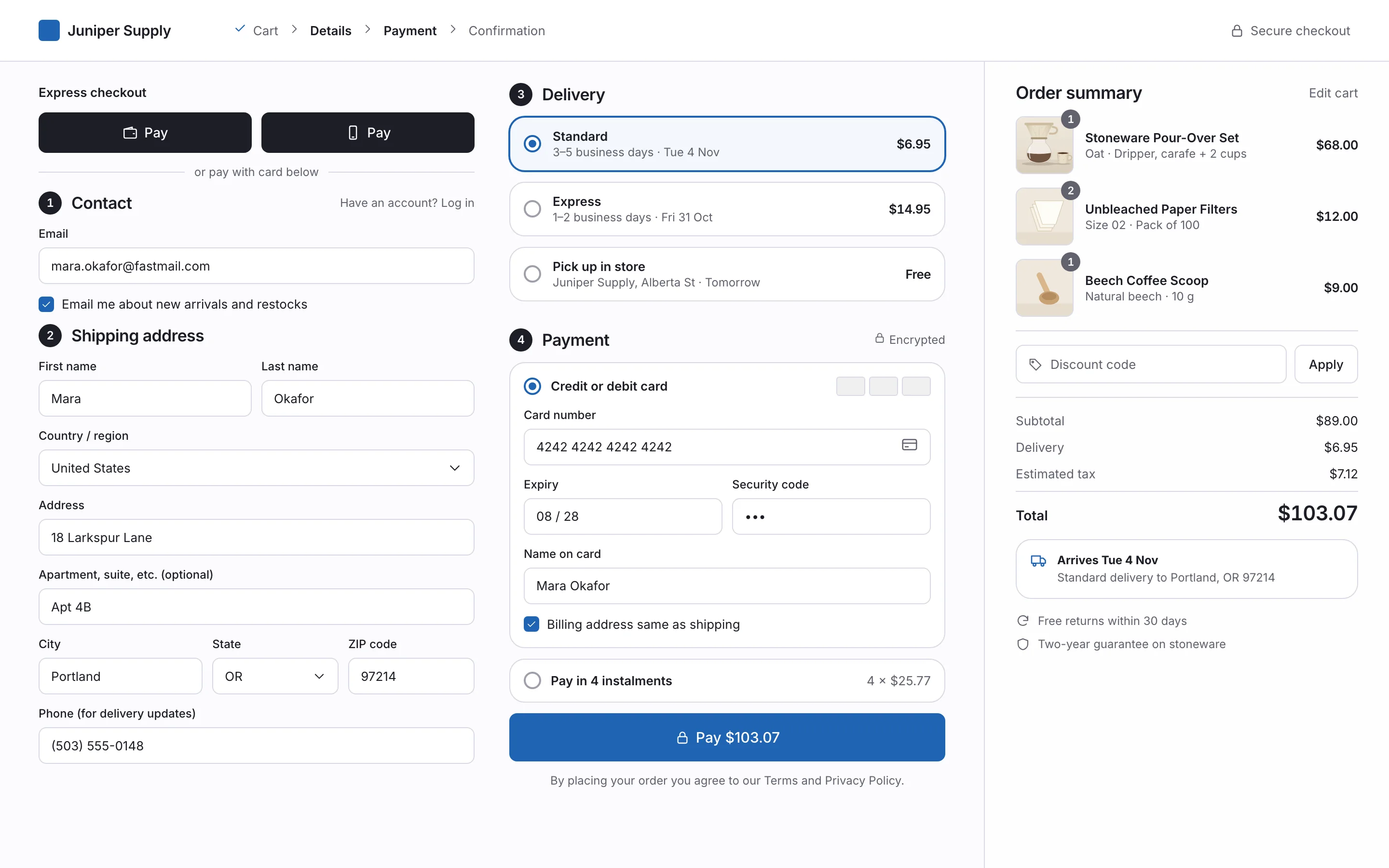
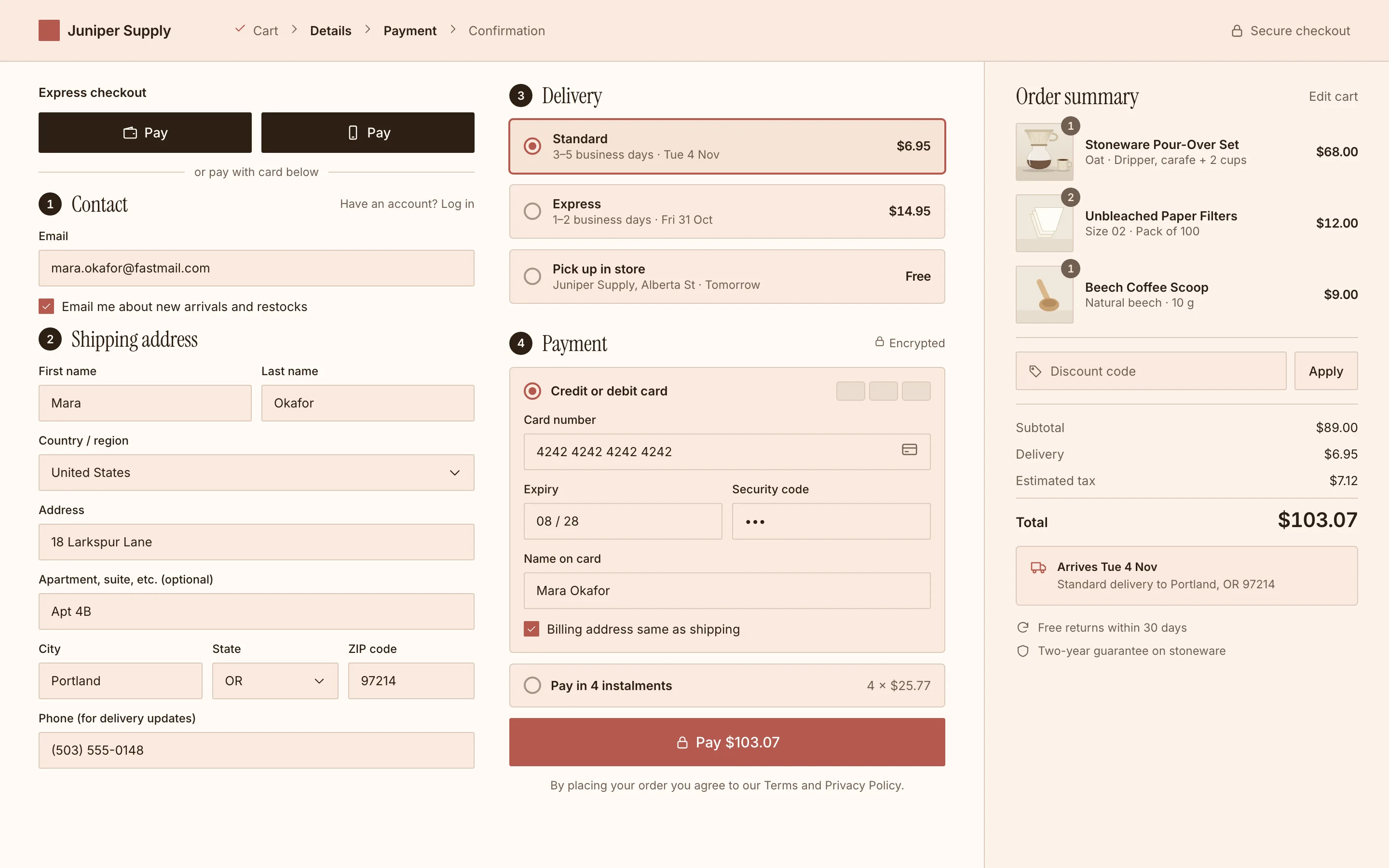
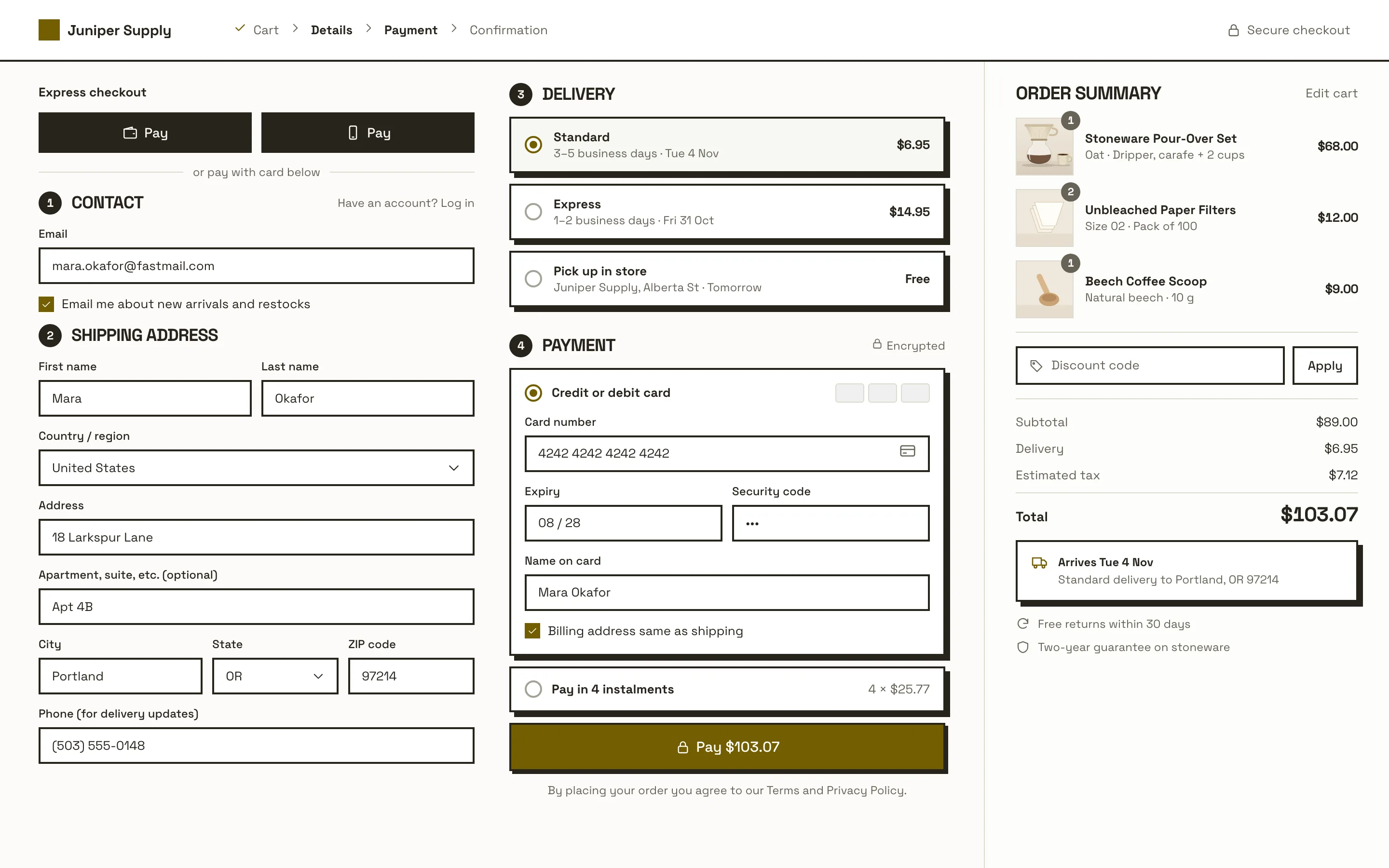
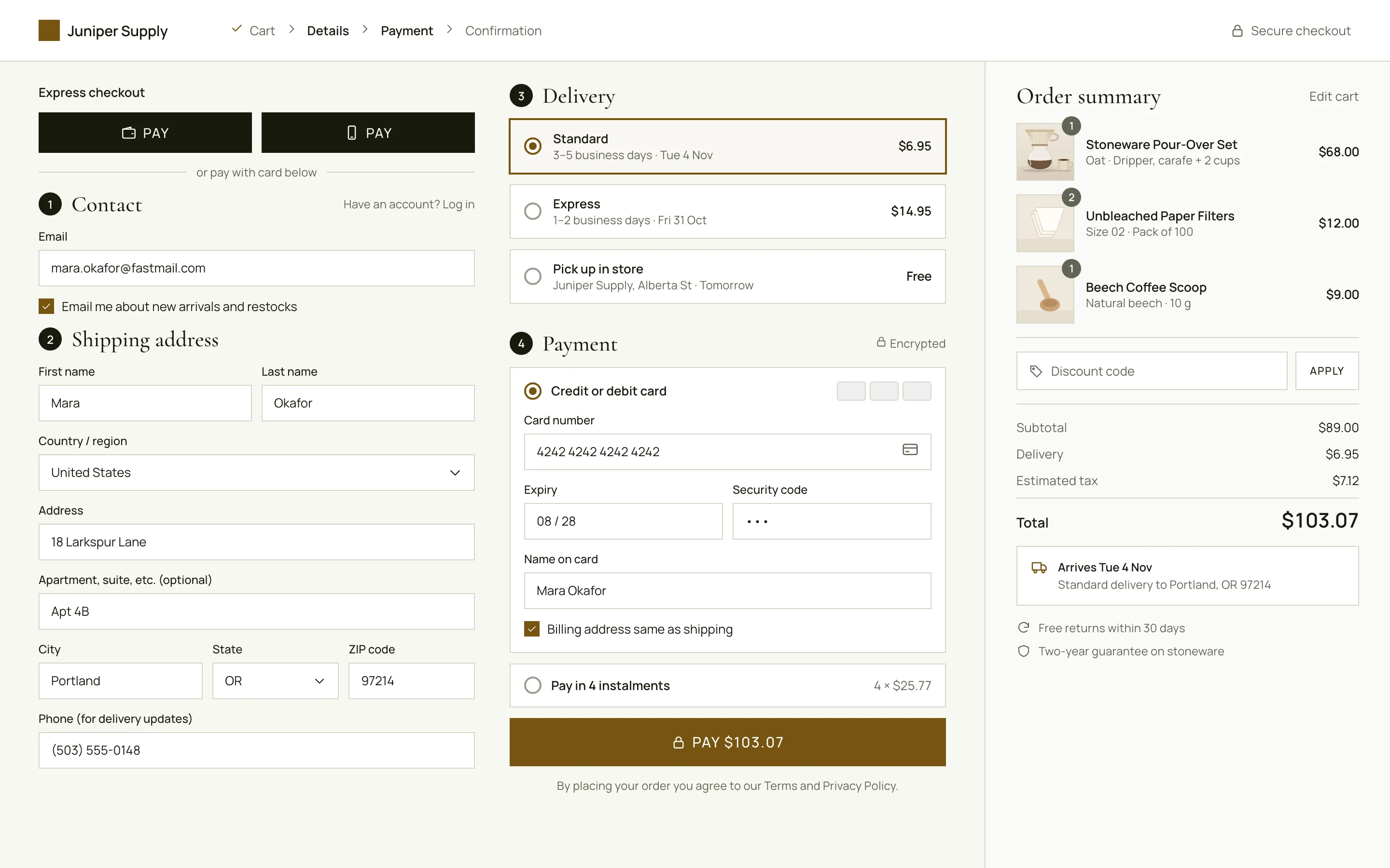
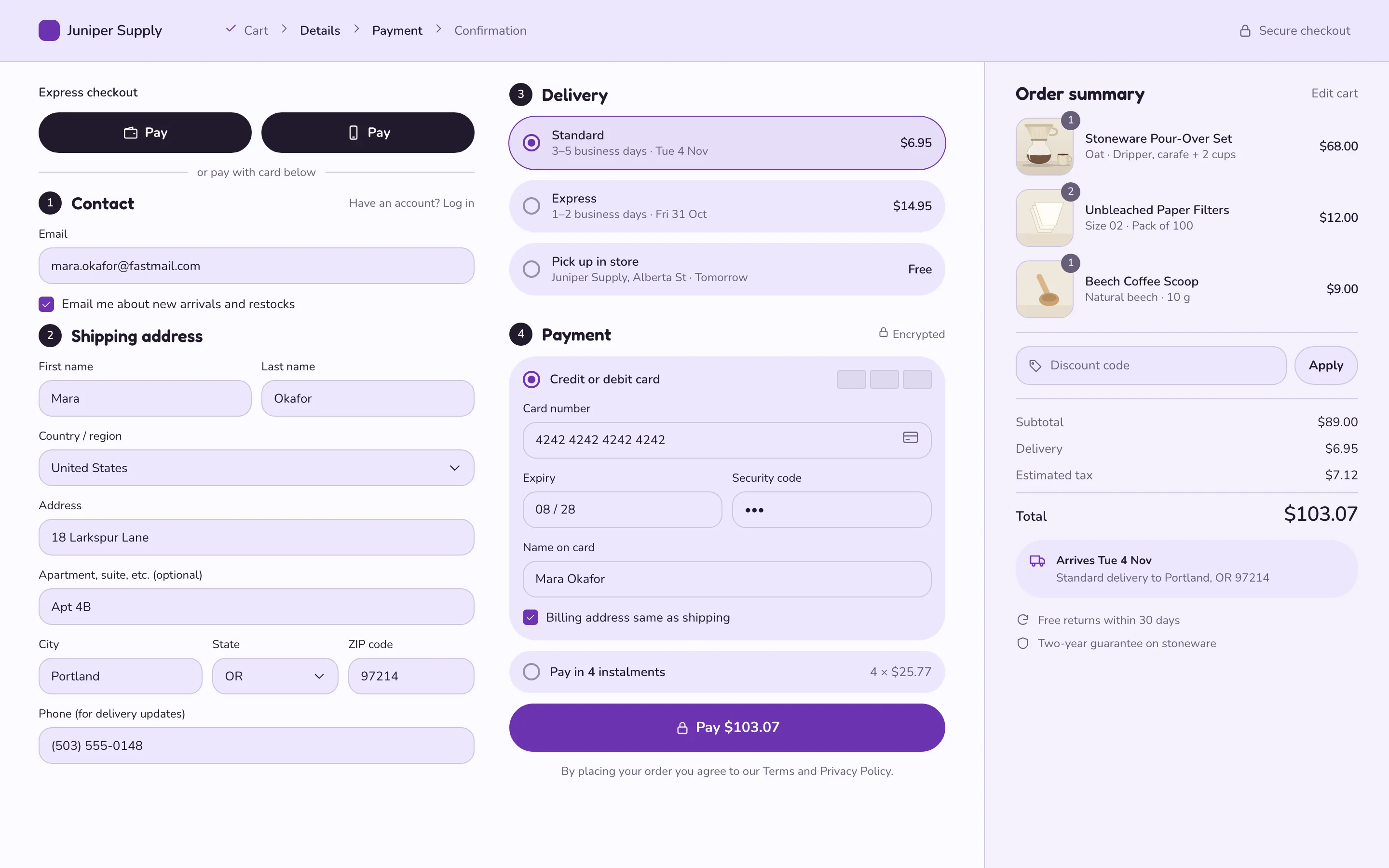
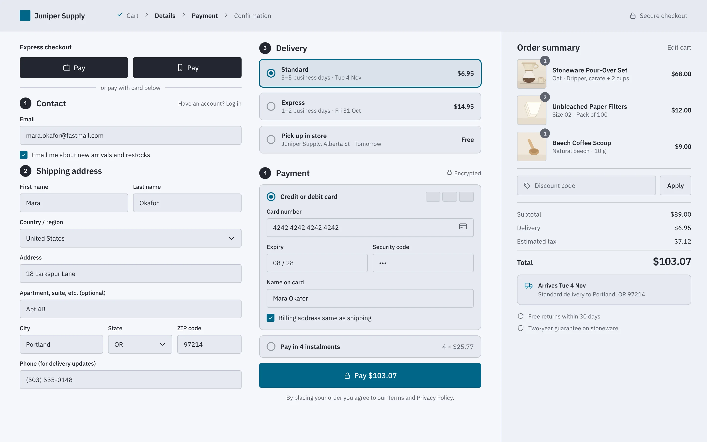
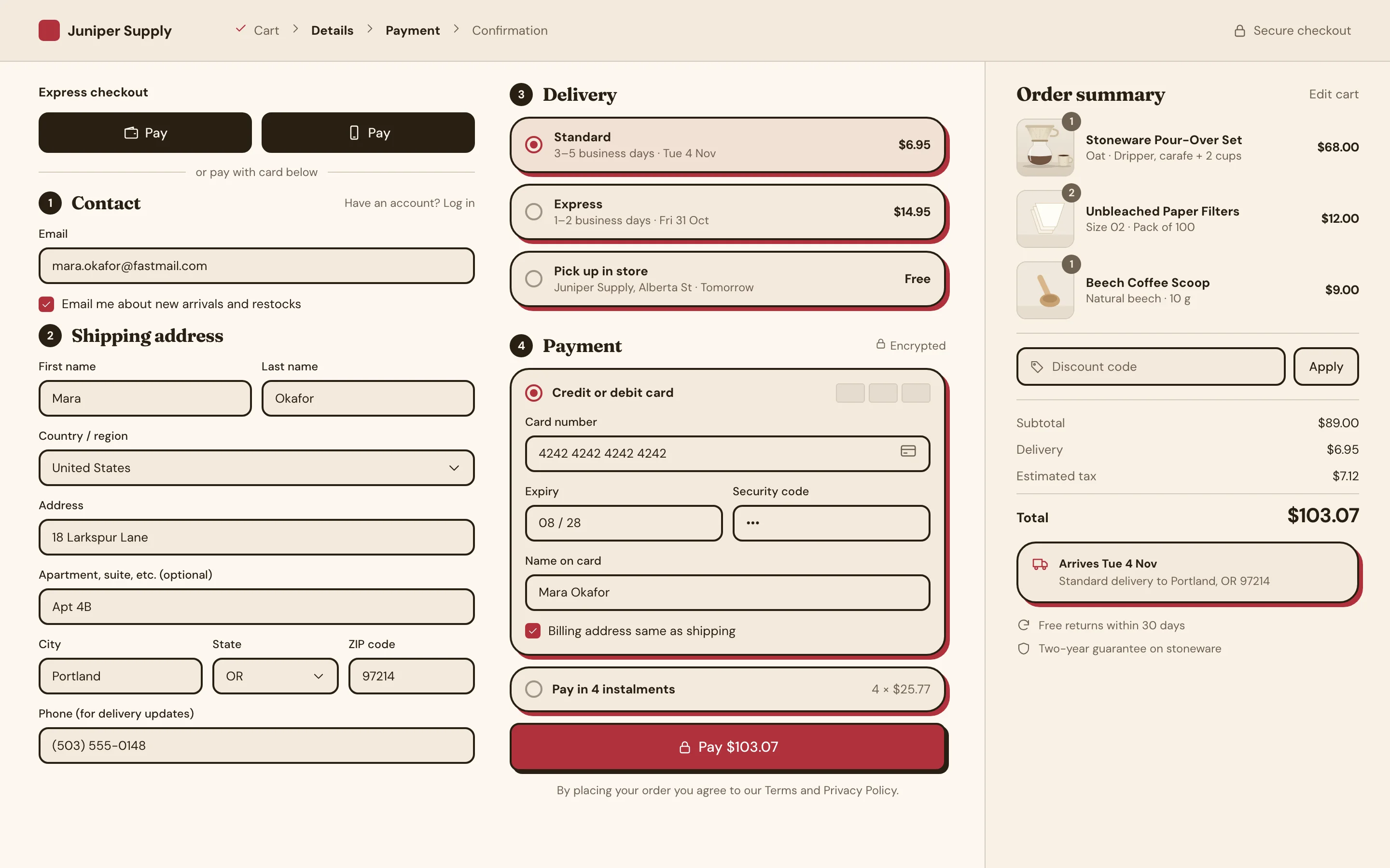
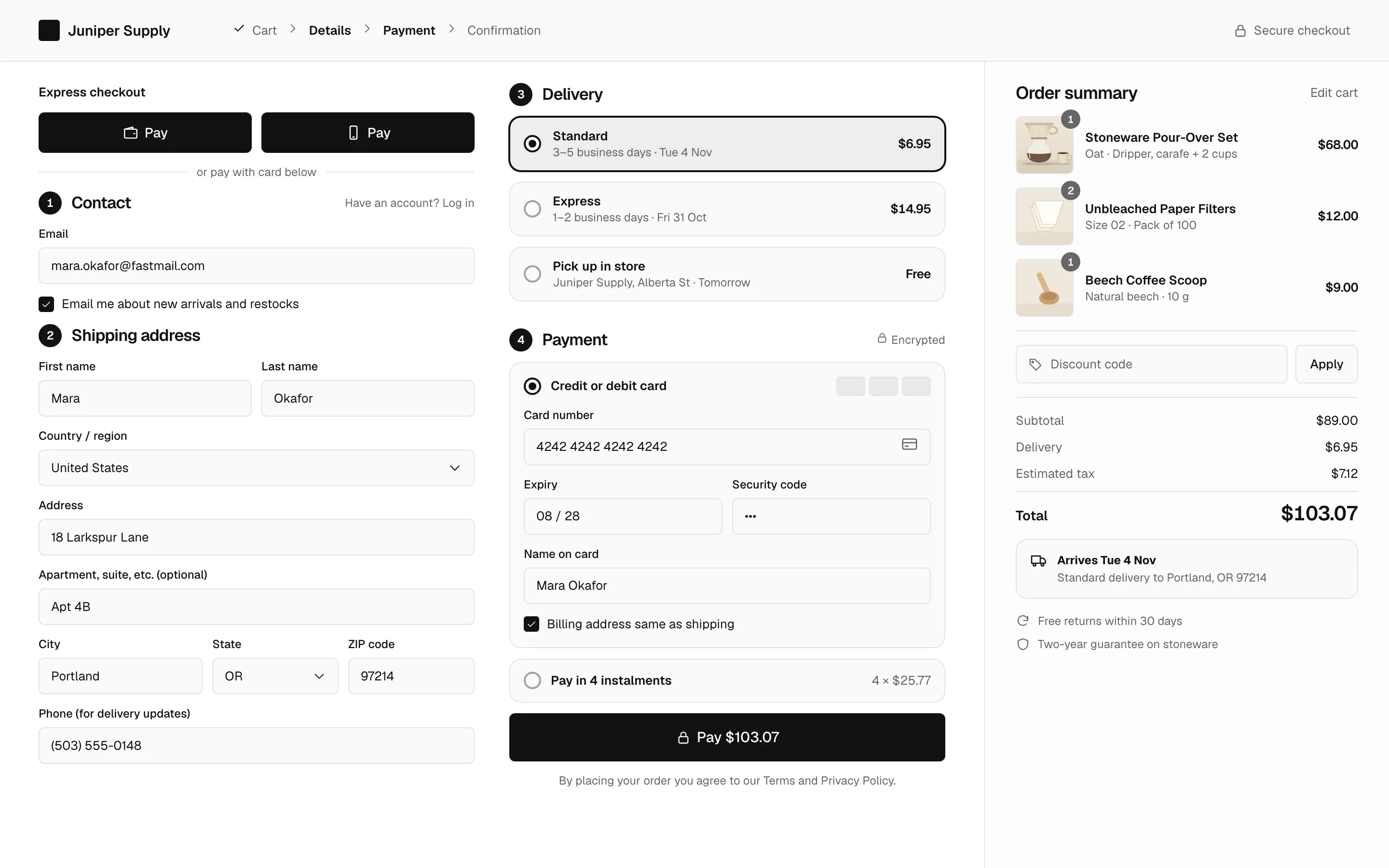
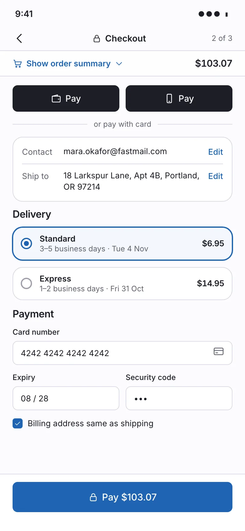
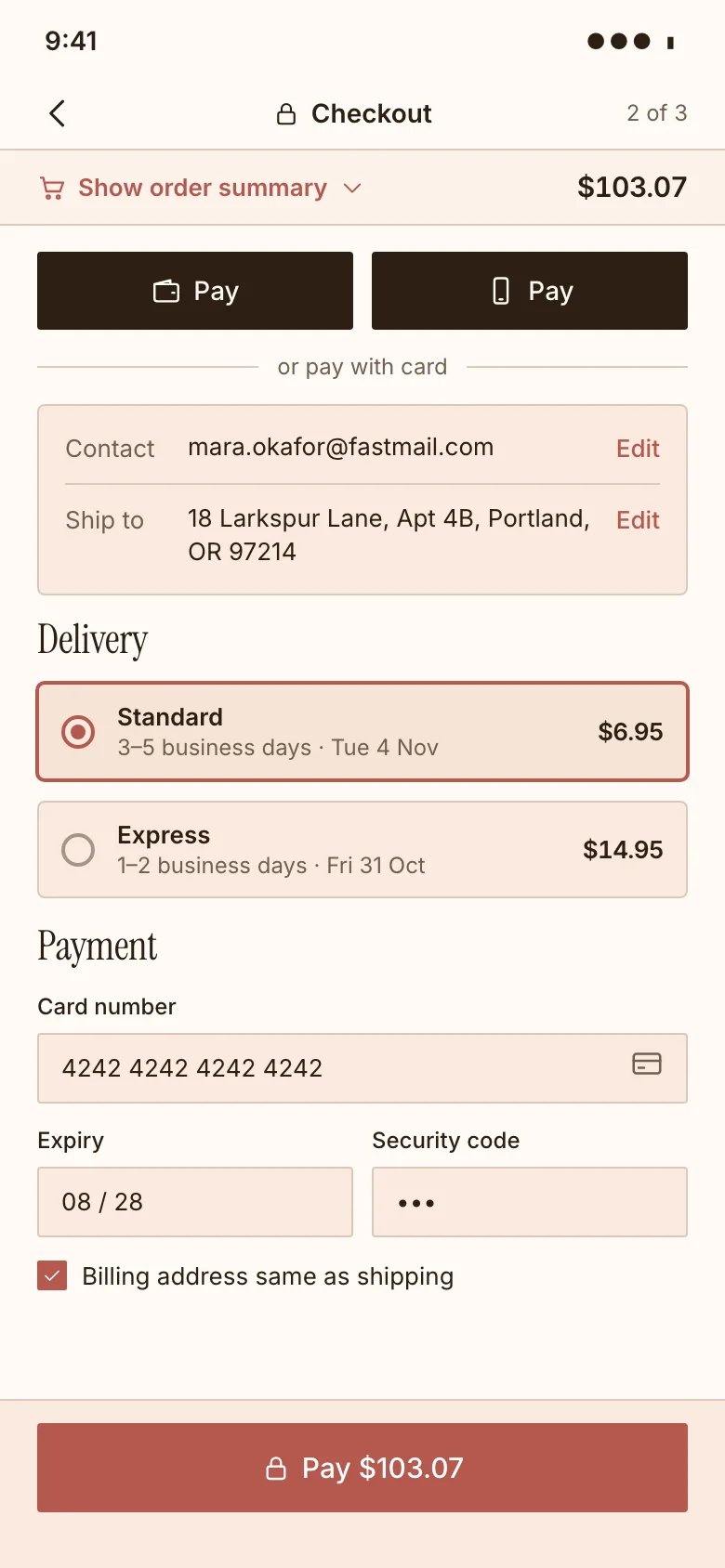
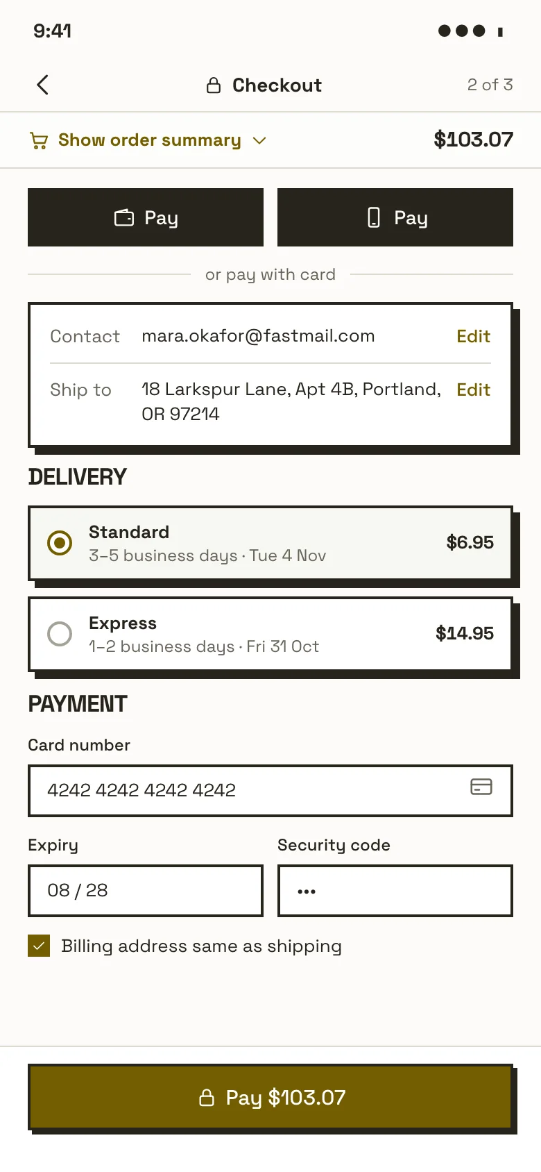
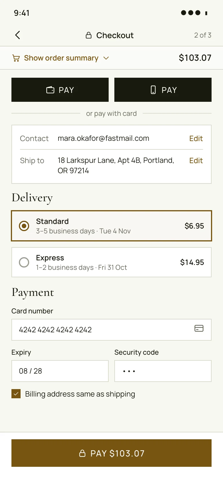
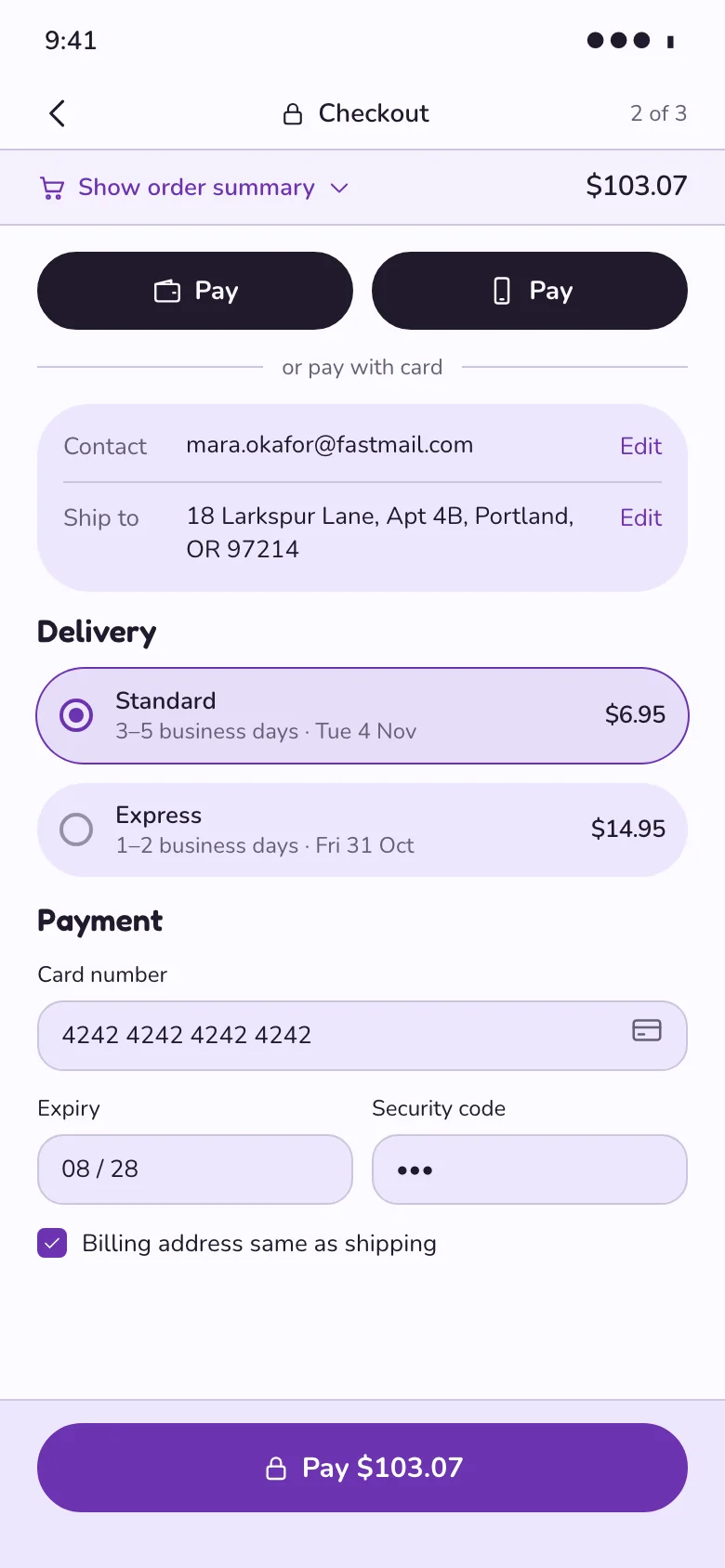
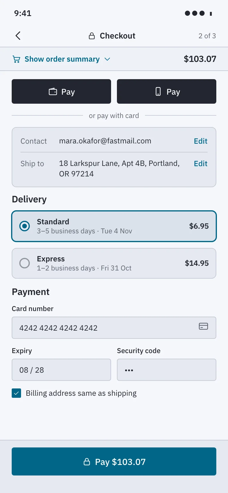
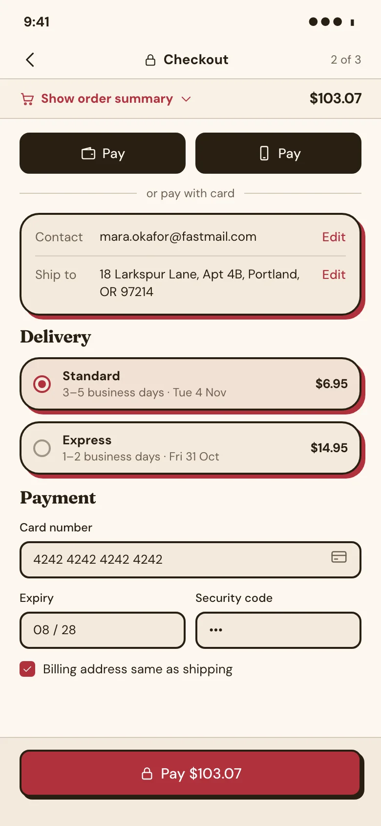
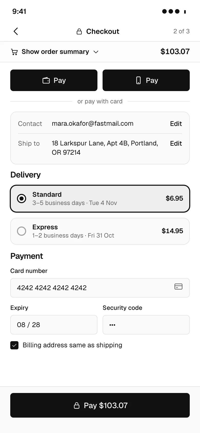
Checkout is where a purchase is either completed or abandoned, so every field must earn its place. Our examples start with express pay buttons, then contact and shipping address forms, delivery options and card payment fields, with an order summary sidebar that stays visible, shown on web and mobile across eight visual styles in light and dark. Every example is an original design that comes with its HTML code and a DESIGN.md of colour, type and spacing tokens, in light and dark. Free to use and adapt.
16 examples
See it in a flow
Checkout design tips
- Put express payment buttons at the top so returning buyers can skip the forms entirely, with the standard form clearly continuing below.
- Use correct autocomplete attributes and input types on every field, so browsers and password managers can fill addresses and cards accurately.
- Show delivery options with price and an estimated arrival date, not just a carrier name, because buyers choose on cost and timing.
- Keep the order summary visible beside the form on desktop and collapsible at the top on mobile, so totals never feel hidden.
Questions
Should checkout be one page or multiple steps?
Either can work well. A single page shows everything at once and suits short forms, while a multi-step flow keeps each screen focused and suits complex orders. What matters more is a short form, clear progress, guest checkout and no surprise costs at the final step.
How many fields should a checkout form have?
As few as you need to fulfil the order. Combine first and last name where possible, use address lookup, hide the second address line behind a link and make the billing address default to the shipping address. Every optional field you remove reduces effort for every buyer.
Where should promo codes go in checkout?
Place them near the order summary as a collapsed link such as Add discount code. A large open field invites buyers without a code to leave and search for one. Apply the code inline and show the updated total immediately, with a clear error if it fails.
Browse by pattern
App screens
Data table
Analytics charts
Login
Sign up
Forgot password
Two-factor code
Welcome
Onboarding step
Permissions request
Home
Feed
List view
Detail view
Kanban board
Calendar
File manager
Search results
Editor toolbar
AI chat assistant
Chat list
Chat thread
Video call
Image viewer
Map view
Video player
Create post
Class schedule
Booking details
Booking confirmed
Product detail
Cart
Checkout
Order confirmation
Settings
Profile
Notifications center
Team members
Roles permissions
Audit log
API keys
Integrations
Billing plans
Invoice
Paywall upgrade
Cancel subscription
Empty state
404 error
Loading skeleton
Success confirmation
AI workspace
AI settings
Version history
Approval queue
Doctor directory
Telehealth visit
Clinic home
Music player
Playlist
Portfolio home
Case study
Security dashboard
Project tracker
Course dashboard
Multi-step form wizard
Bank onboarding
Product scan
Split view (master-detail)
Canvas editor
Floor plan
Voice call
Toast / snackbar with undo
Confirm dialog (destructive)
Side drawer
Command palette
Date range picker
Form validation errors
Sign-in error
Card declined at checkout
Find a pro (home services)
Book a home-service visit
Job tracker
Account email
Order email
Shift scheduler
Leave calendar
Time-off request
Multi-location operations dashboard
Inventory stock
Savings goal
Onboarding carousel
UI components
Cards
Pagination
Popover
Tooltip
Dropdown menu
Accordion
Radio buttons
Breadcrumbs
Toggle switch
Stepper
Sidebar navigation
Loading spinner
Website sections
Navigation header
Feature grid
Bento features
How it works
Logo cloud
Stats band
Testimonials
Pricing
Comparison table
Scored comparison table
Integrations grid
Security and trust
FAQ
CTA banner
About team
Careers
Blog index
Changelog
Contact form
Footer
Website templates
Agency website templates
Architecture website templates
Wedding website templates
Ecommerce website templates
Cafe and coffee shop website templates
Salon website templates
Real estate agency website templates
Construction website templates
Law firm website templates
Dental website templates
Gym website templates
School and education website templates
Nonprofit website templates
Travel website templates
Hotel website templates
SaaS landing page templates
AI website templates
Medical website templates
Cardiology website templates
Dermatology website templates
Therapist website templates
Physical therapy website templates
Veterinary website templates
Financial advisor website templates
Cleaning service website templates
HVAC website templates
Cybersecurity website templates
CRM landing page templates
Coaching website templates
Pest control website templates
Solar website templates
AI agent website templates
Preschool website templates
Apartment community website templates
Pediatric website templates
Orthodontics website templates
Fertility clinic website templates
Hospital website templates
Mental health clinic website templates
Optometry website templates
Pharmacy website templates
Real estate agent website templates
Property management website templates
Luxury real estate website templates
Commercial real estate website templates
Vacation rental website templates
Home builder website templates
Bakery website templates
Pizzeria website templates
Bar and pub website templates
Catering website templates
Food truck website templates
Fine dining website templates
search_ui_screens (e.g. “billing settings, editorial style”), get_ui_flow for a whole journey, and get_ui_screen_code to pull the HTML and DESIGN.md straight into your project.