What Font Does Citibank Use?
If you are searching for the exact citibank font, the honest answer is that the wordmark you recognize from cards, ATMs, and statements is not a font you can download. It is drawn lettering, refined over decades so that one simple red arc can stand in for an entire global bank. Below we break down the logo, the brand typeface that surrounds it, and the closest free substitutes you can use right now. For more breakdowns like this, see our famous brand fonts hub.
What font is the Citibank logo?
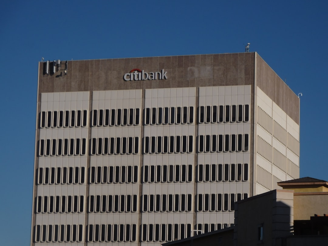
The Citi wordmark is custom lowercase lettering, not a system font. When Pentagram (with Paula Scher) reworked the identity around the year 2000, the breakthrough was the red arc that sweeps over the two “t” letters like a sunshade, suggesting an umbrella of protection over your money. The letters themselves are an even-weight, low-contrast sans with humanist proportions, generous spacing, and soft, open counters. There are no flourishes; the personality lives entirely in that arc. Because the lettering is trademarked and hand-tuned, no commercial font will match it character-for-character, though a clean grotesque gets close in spirit.
It is worth noting how few elements carry the whole identity. Strip away the arc and the lowercase letters could belong to almost any modern company, which is precisely the point: the bank wanted equity to live in something ownable and trademark-protectable rather than in a typeface that competitors could license too. That decision has aged well, surviving mergers, app redesigns, and a quarter-century of fashion shifts without looking dated, a rare feat in financial branding where rebrands are frequent and rarely improve on what came before.
What is Citibank’s brand typeface?
Across its broader marketing, Citi has reportedly relied on clean, no-nonsense sans-serif families. For many years observers associated the bank’s collateral with an Interstate-style grotesque, valued in finance for its legibility on signage and small print. More recently the brand is understood to use a custom “Citi” sans tailored for digital and global use. Either way, the through-line is restraint: tall x-heights, neutral letterforms, and tight, confident spacing. Treat any single name as an approximation rather than gospel, since large banks license and customize type quietly and update systems without announcement.
Free fonts that look like the Citibank font
You will not find the licensed Citi typeface in a free library, but you can recreate the clean, banked, trustworthy feeling with open-source sans-serifs. The table pairs each Citi use case with a free stand-in.
| Use case | Citibank uses | Free alternative |
|---|---|---|
| Logo / wordmark | Custom lowercase lettering + red arc | Overpass or Inter, lowercased and tightly tracked |
| Headlines | Clean grotesque (Interstate-like / custom Citi sans) | Inter or Arimo, semibold |
| Body / UI | Neutral humanist sans | Inter, Source Sans, or Arimo, regular |
Overpass is especially handy because it descends from the same highway-signage DNA that gives Interstate its calm authority. For a deeper menu of options, browse our best sans-serif fonts guide.
Why does Citibank use this kind of type?
Banks sell trust, and type is how they whisper it. A clean grotesque sans reads as modern, transparent, and global, working equally well in English, on a credit card embossed in millimeters, and on a billboard read at speed. The lowercase wordmark deliberately softens the institution, trading buttoned-up authority for approachability, while the red arc supplies warmth and memorability that neutral letters alone could not. The result is a system that scales from a phone app to a skyscraper without ever feeling cluttered, which is exactly what a worldwide financial brand needs.
Can I use the Citibank font for my own project?
No. The Citi wordmark and its custom type are protected by trademark and licensing, so copying them for your own bank, fintech, or even a parody risks legal trouble and is not something we recommend. What you can freely borrow is the recipe: a neutral grotesque, generous spacing, a lowercase treatment, and one bold accent color or shape. Inter, Arimo, and Overpass let you build that look with proper licenses. Before you ship anything commercial, read our font licensing guide so you understand desktop, web, and app rights.
Frequently Asked Questions
Is the Citibank logo a real font?
No. The “citi” wordmark is custom-drawn lowercase lettering paired with the trademarked red arc, created by Pentagram around 2000. It was never released as a downloadable typeface, so any font you find online only approximates the look rather than reproducing the official logotype exactly.
What font is closest to the Citi logo for free?
Overpass and Inter are the closest free matches. Both are clean, even-weight grotesque sans-serifs with humanist warmth. Set them in lowercase, tighten the tracking slightly, and add a single bold accent shape to echo the arc, and you will land very near the Citi feeling.
Did Citibank change its font?
The brand has evolved its system over time, reportedly moving from an Interstate-style grotesque toward a custom “Citi” sans for digital and global consistency. The iconic logo lettering and red arc, however, have stayed remarkably stable since the 2000 redesign, which is part of their lasting strength.
What color and shape define the Citi brand?
The defining element is the red arc that vaults over the “t” letters, often paired with Citi blue. The arc functions as a protective umbrella metaphor, and that single graphic gesture does more brand work than the typography itself, which is intentionally neutral.
Can I use Inter to mimic a banking brand?
Yes. Inter is licensed under the SIL Open Font License, so it is free for commercial use including bank-style branding. Just avoid copying Citi’s exact wordmark, colors, or arc. Use Inter as a clean base, then design your own distinctive logo and accent to stay clear of trademark issues.