What Font Does SpongeBob Use?
From the wobbly main logo to the wavy ocean-blue time cards, Bikini Bottom has one of the most distinctive type identities in animation. If you searched for the spongebob font, the answer is actually two free fan fonts that cover the two different lettering styles. Below we break down the logo, the title cards, and how to recreate each for free. For more wordmark teardowns, visit our famous brand fonts hub.
What font is the SpongeBob logo?
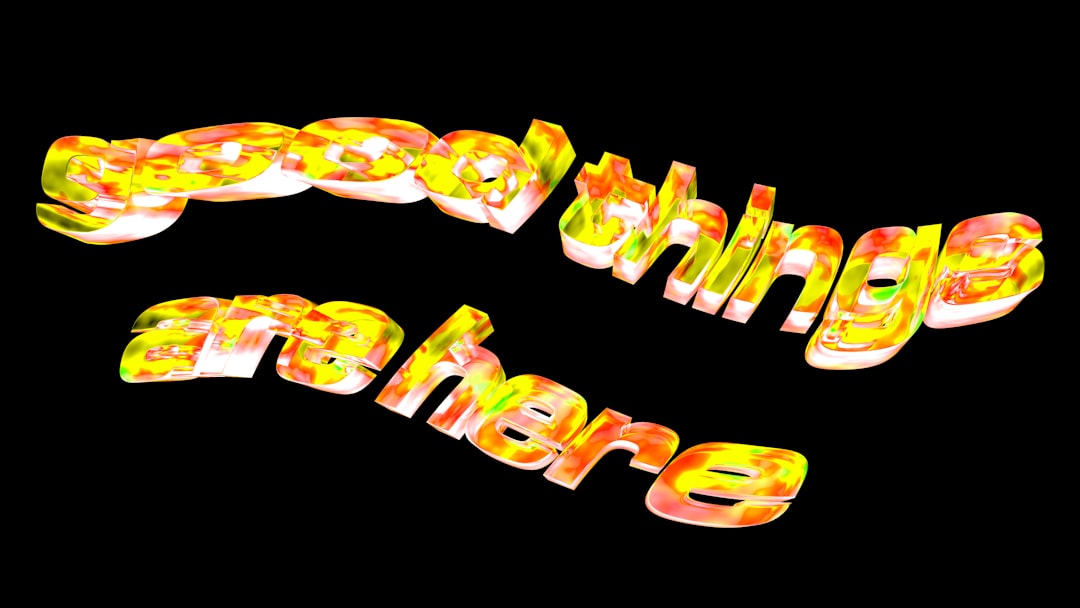
The SpongeBob SquarePants logo is custom hand-drawn lettering with a deliberately wonky, uneven feel — letters lean, squash, and stretch, with chunky outlines and a slightly rubbery cartoon weight. It is not a typed font; it was illustrated to feel goofy and aquatic, matching the show’s underwater silliness. There are really two type personalities in the brand. The first is the main title wordmark — bold, playful, hand-lettered. The second is the famous blue, wavy “time card” lettering used for gags like “Two Hours Later…,” which has a wobbly, watery, almost dripping quality. Each calls for a different free font to recreate. The two styles share a DNA — both are hand-drawn and intentionally imperfect — but they do very different jobs: the logo shouts the brand, while the time cards are a recurring sight gag that pokes fun at the formal “Later…” convention used by old films and other cartoons. Getting both right is the key to a layout that feels genuinely SpongeBob rather than merely cartoonish.
Is there a free SpongeBob font?
Yes — two of them, both popular fan recreations. For the main logo look, Krabby Patty is the go-to free font: it captures the bouncy, chunky, hand-drawn capitals of the SpongeBob wordmark, perfect for titles and fan posters. For the wavy blue interstitial cards, the free font Some Time Later (sometimes shared under similar names) imitates that wobbly, watery lettering used for the show’s time-jump jokes. Between them you can reproduce the entire SpongeBob type system without paying a cent. As with most TV fan fonts, keep them to personal and parody use rather than commercial products. A quick tip when downloading: these fan fonts sometimes circulate under slightly different names or in multiple versions with uneven letter coverage, so test the full alphabet — including numbers and punctuation — before committing to one for a project. If a character is missing or looks wrong, grab an alternate version rather than fighting the file. With both fonts installed you can switch instantly between the bouncy logo voice and the watery time-card voice depending on the joke you are making.
Free fonts that look like the SpongeBob font
SpongeBob has two distinct lettering jobs, so match each one separately, then add a soft sans for any small print.
| Use case | SpongeBob uses | Free alternative |
|---|---|---|
| Logo / title | Wonky hand-drawn chunky cartoon caps | Krabby Patty (free fan font) |
| Marketing / credits | Wavy blue “time card” lettering | Some Time Later (free fan font) |
| Body | Friendly, rounded sans | Baloo 2 or Fredoka (free, Google Fonts) |
Color the logo lettering in the show’s yellows and warm tones, and set the time-card font in ocean blue on a pale background for that classic Bikini Bottom gag look. For more playful options, our best bubble fonts roundup lists free rounded faces that pair nicely.
Why does SpongeBob use this kind of type?
Hand-drawn, wonky lettering is comedy in visual form. The uneven, rubbery letters feel as silly and elastic as the character himself, and they match an animation style that delights in squash, stretch, and absurdity. The separate wavy blue time cards add their own joke: that watery, hand-wobbled lettering is itself part of the punchline, gently mocking the convention of formal “Later…” title cards. A clean, mechanical font would have killed the goofiness; the imperfection is what makes it funny and instantly recognizable as Bikini Bottom.
Can I use the SpongeBob font for my own project?
Free fan fonts like Krabby Patty and Some Time Later are fine for personal and parody work, but SpongeBob SquarePants, its logo, and its characters are trademarked by Nickelodeon/Paramount. You cannot use them on merchandise or anything implying official endorsement. Keep recreations to fan art and personal projects, and always check each font’s individual license before any commercial use. Our font licensing guide explains the line between a free font and a protected brand, and you can compare another cartoon wordmark in our Simpsons font guide.
Frequently Asked Questions
What font is the SpongeBob logo?
It is custom hand-drawn lettering rather than a typed font, with chunky, uneven, cartoon-rubbery capitals. The closest free recreation is the fan font Krabby Patty, which mimics the bouncy, wonky look of the title and is widely used for SpongeBob-themed fan posters and graphics.
What is the SpongeBob time card font?
The wavy blue lettering on cards like “Two Hours Later…” is matched by the free fan font Some Time Later. Its wobbly, watery letterforms recreate that interstitial gag style, so setting your text in ocean blue with this font reproduces the show’s iconic time-jump joke.
Where can I download SpongeBob fonts for free?
Krabby Patty and Some Time Later are both available free on major free font sites. Download Krabby Patty for the main logo look and Some Time Later for the blue time cards. Both are fan-made, so treat them as personal and parody resources rather than commercial assets.
What goes well with the SpongeBob font?
Pair the display fonts with a soft, rounded sans like Baloo 2 or Fredoka for body text and captions. These free faces keep the friendly, cartoon energy without competing with the wonky title lettering, giving you a balanced Bikini Bottom layout.
Is the SpongeBob font hand-drawn?
Yes. The original logo and the wavy time cards are both hand-lettered, which is why the strokes are uneven and rubbery. The free fonts Krabby Patty and Some Time Later digitize that hand-drawn wobble so you can recreate the look without illustrating each letter yourself.


