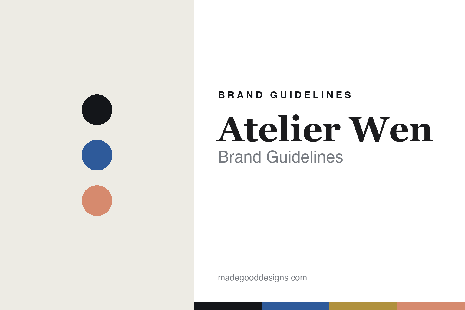
Atelier Wen Brand Guidelines
Porcelain & guilloché.
Aa
Two constants: a porcelain-blue-and-salmon palette and a cultured serif register. Abstract homage — not the Atelier Wen dials.
Porcelain and guilloché
Atelier Wen makes the case for Chinese watchmaking.
Atelier Wen is a lesson in a culture as identity. Founded in 2018 via Kickstarter by two Frenchmen, Robin Tallendier and Wilfried Buiron, it is a French-founded, China-made brand whose mission is to elevate the perception of Chinese watchmaking. The name pairs the French atelier (workshop) with the Chinese 文 (Wen, “culture”).
Its identity is Chinese craft and culture, across two distinct collections. Porcelain Odyssey uses fired porcelain dials (the white Hao and deep-blue Ji, fired near 1400°C, most rejected), while the separate Perception collection uses hand-turned guilloché dials by China’s sole guilloché master. The motifs are cultural — Qinghua Ci blue-and-white porcelain, Bagua and Dizhi references — and the logo is inspired by the mythological Kunpeng. Movements are top-grade Chinese calibres (with a Swiss Girard-Perregaux in the newer Inflection).
(Honest notes: it’s French-founded and China-made. Keep the collections distinct: porcelain (Porcelain Odyssey) and guilloché (Perception) are separate. Chinese movements aren’t universal (the Inflection uses a Swiss GP). Design is founder-led with Chinese artisans (no external studio), and there’s no official brand hex, so these tones are an unofficial interpretation.)
Colour
Atelier Wen lives in a porcelain-blue-and-salmon palette. Click a swatch to copy the hex.
Atelier Wen’s identity is cultural, refined and crafted — an ink, a porcelain blue, a salmon, a gold, and a white. The palette pairs a Qinghua porcelain blue with a guilloché salmon — the register of Chinese-culture craft. It signals heritage and refinement rather than trend. The honest caveat: with no published brand hex, these tones are an original, unofficial interpretation, not first-party values.
The lesson is a porcelain blue with a guilloché salmon signals Chinese-culture craft. Atelier Wen’s world is blue-and-white porcelain and a turned dial. For designers, it is a reminder that a palette drawn from a culture reads as rooted and refined — right for a brand elevating Chinese watchmaking. The takeaways: source the palette from the culture (Qinghua porcelain); keep the crafts distinct (porcelain vs guilloché); encode meaning in the details (Kunpeng, Bagua); and treat any single hex as unofficial.
Typography
The register is a cultured serif — refined, heritage, considered.
Atelier Wen’s identity carries a refined, heritage, considered spirit — porcelain, guilloché and Chinese culture. A cultured serif captures the mood: it is elegant and storied, the register of a culture-first brand. Set in a porcelain-blue-and-salmon palette, the cultured serif feels refined and heritage — exactly the personality Atelier Wen carries. It is considered rather than trend-driven, mirroring fired porcelain dials. (Atelier Wen’s real dials and Kunpeng mark are works we describe but do not reproduce, and the exact typeface is not ours to use.) Because it is not ours to use, the honest description is “a cultured serif spirit,” shown here in a stand-in. The type behaves like the brand: refined, heritage and considered.
Aa
A cultured serif spirit — refined and heritage. (Specimen set in Playfair Display, an elegant serif STAND-IN; NOT the Atelier Wen dials.)
Culture as identity
Atelier Wen stands for Chinese craft, elevated.
Atelier Wen is a lesson in making a culture the identity. A porcelain-blue-and-salmon palette, a cultured serif and fired porcelain dials make Chinese craft the whole brand — refined, heritage, purposeful. The culture is the differentiator. The differentiator is a porcelain-and-guilloché, Chinese-culture identity.
For designers and brand-builders, Atelier Wen offers a clear takeaway: elevate a culture through craft. The lessons: use real crafts (fired porcelain, hand-turned guilloché); encode cultural meaning (Qinghua, Bagua, Kunpeng); collaborate with masters (China’s sole guilloché master); and be honest about origin (French-founded, China-made). It is also a reminder to stay accurate: porcelain and guilloché are separate collections, movements aren’t all Chinese, and the palette here is an unofficial interpretation. Atelier Wen made a culture the brand — proof that craft can be the difference.
Explore & save
Keep Atelier Wen’s identity on hand — save it to a board in the Made Good inspiration library.
Atelier Wen identity set
Pin the porcelain-blue-and-salmon palette and the cultured-serif register to your own board.


